Based on IBCS Standards 1.1 by IBCS Association, licensed under CC BY-SA 4.0. Adapted for the web and other formats by Anton Zhiyanov.
This is a highly practical and example-based guide on visually representing data in reports and dashboards. It is based on the work of authors such as Barbara Minto, Edward Tufte, and Stephen Few.
The guide consists of seven chapters:
Applied together, they will help you to design concise, clear, and actionable reports.
SAY covers all aspects of conveying messages to the recipients of reports and presentations.
Conveying messages means that reports and presentations, both as a whole as well as within their individual components, intend to say something to the recipients. Messages in this sense can be determinations, explanations, clarifications, recommendations, and other forms of statements.
This chapter covers introducing, delivering, supporting, and summarizing messages with respect to the objectives of senders and receivers.
Good reports (presentations) successfully achieve both the goals of the writer (speaker) and of the readers (audience).

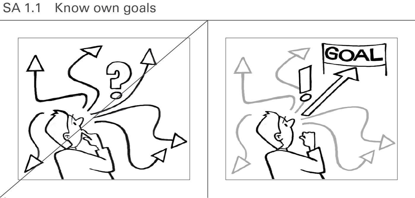
Do not start creating a report or presentation without a clear vision of what to achieve with it. The least goal is to inform about an interesting detection. A higher goal is to make the reader (audience) understand a problem by explaining it. The ultimate goal is to get a decision on a suggestion provided and to cause corresponding actions.
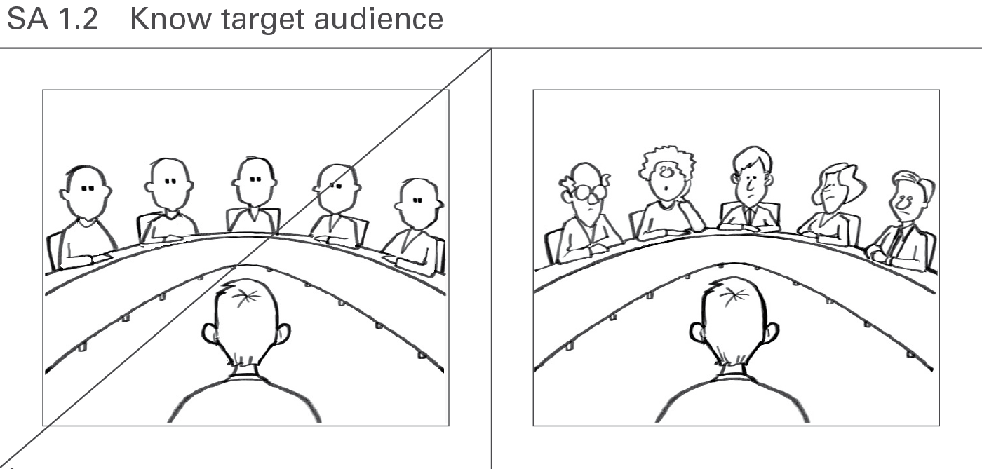
A good report (presentation) will try to answer the questions of the readers (audience). So it is important to know the target audience (e.g. their function, position, network, knowledge, experience, attitude, behavior, worries, cultural background) and their goals, preferences, and expectations. Do they only want to get informed about interesting detections, or are they looking for an explanation to a problem? Are they willing to make decisions and to act accordingly? Who might object to the message and why?
The addressees appreciate an introduction mapping the actual situation followed by an explanation of the given problem. Raising a question will focus on the given message.
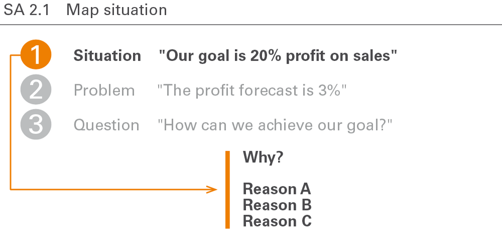
Mapping the situation means compiling and presenting the related facts. Be sure to cover all relevant aspects and obtain a general consensus concerning the facts. In general, this means not yet describing the given problem but presenting facts and goals already known to the reader or audience. It is advisable to begin with a positive and generally accepted description of the situation in order to prevent early contradictions.
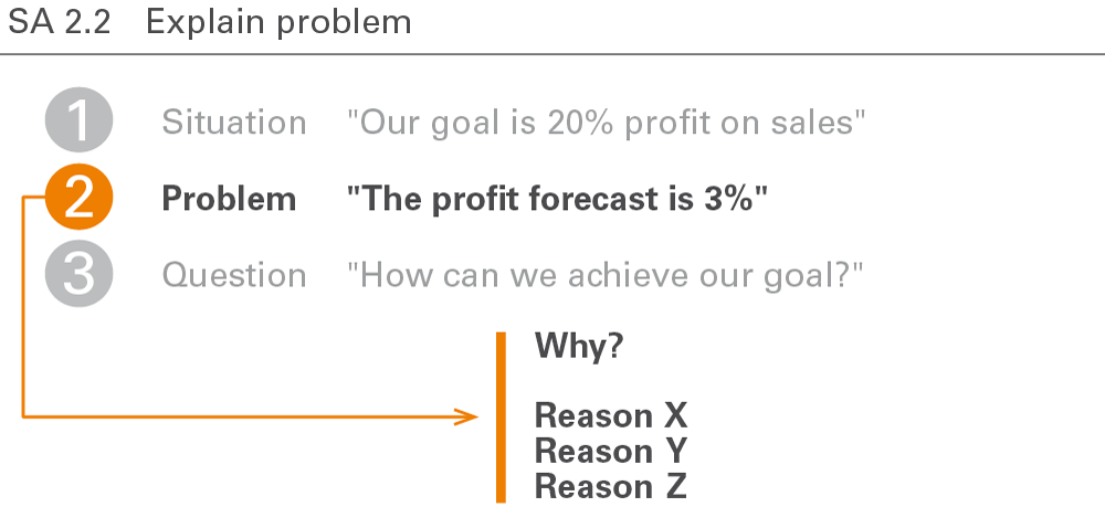
After mapping the situation, introduce the challenge or complication, affecting the reader or the audience. It should make everyone aware of an interesting, critical, or even dangerous problem.
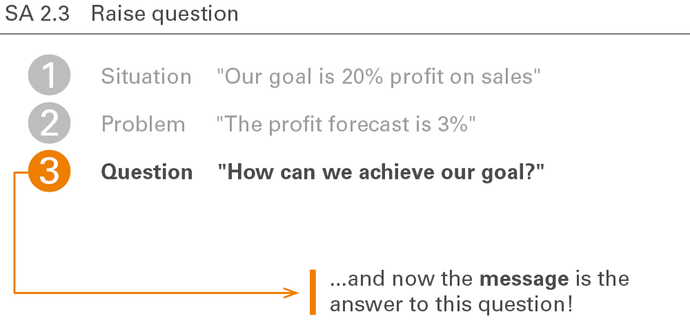
A good introduction raises the relevant question from the perspective of the recipient of how to solve the complication in the described situation. The question at the beginning of each report or presentation then leads to the message, i.e. the answer to the question.
Delivering the message means answering the question asked at the end of the introduction. Messages detect, explain, or suggest something the report or presentation later explains in detail.
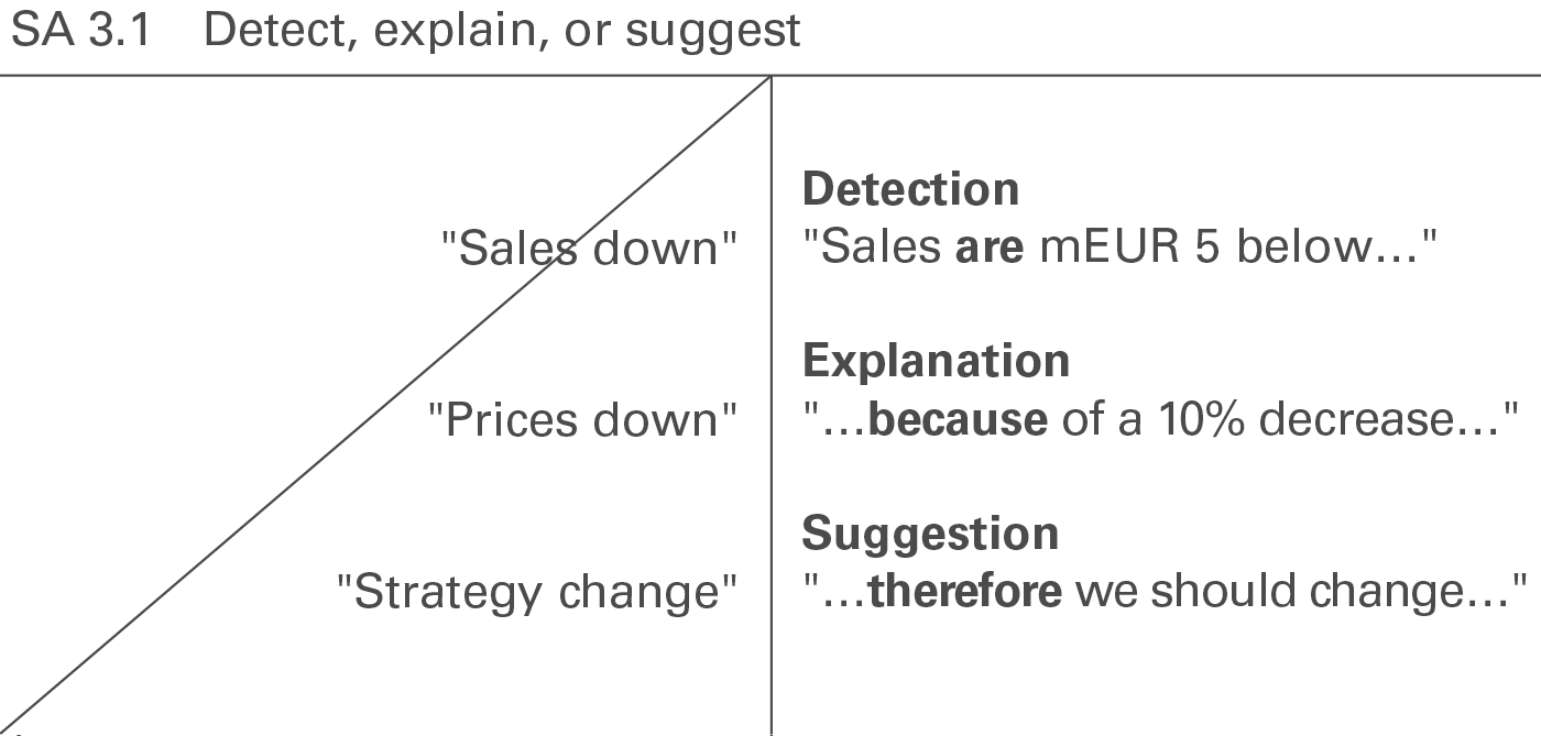
Messages in reports and presentations can detect, evaluate, explain, warn, complain, threaten, excuse, suggest, or recommend something interesting. Make sure to deliver these messages in a complete sentence in order to be understood.
Today, many messages in business reporting are pure detections. Since detections are statements that can be checked whether they are true or false, they should be formulated as precisely as possible.
Explaining the reasons for a detection (explanation) or even deriving a suggestion on how to solve the problem or at least on how to further proceed can add value.
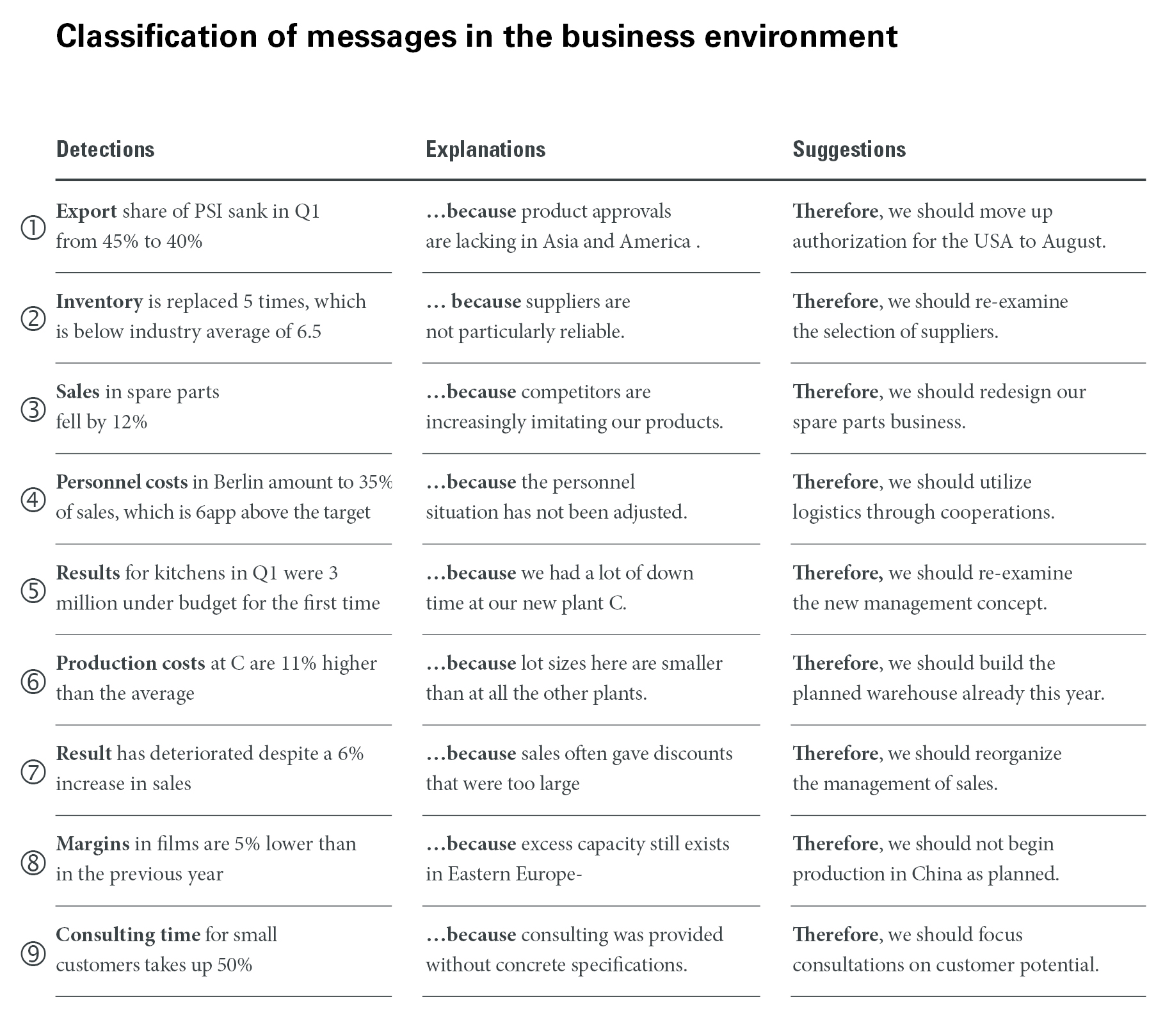
This figure shows a classification of messages with examples from the business environment (Source: Hichert, R. and Kornwachs, K.)
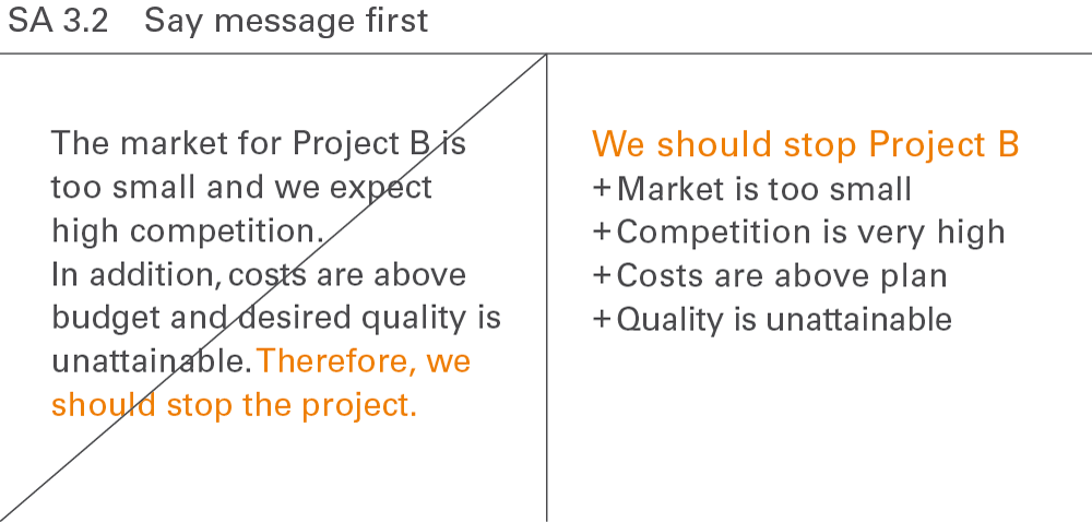
Every report, every presentation, and every single page or exhibit can be summed up with a clear overall message. This message usually comes first and is proven afterwards. For the readers or the audience it is more difficult to follow the storyline if the message comes at the end.
Be cautious applying this rule in presentations (not in reports) with bad, unexpected, or unpleasant messages (e.g. layoffs) or in a cultural environment, where directness is considered impolite.
Supporting the message covers some technical and practical aspects of message conveyance.
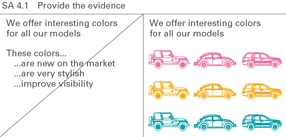
Substantiate the message in order to prove the message by facts and figures. If possible, a presentation slide should itself explain or prove the speaker’s message and not – as very often seen in practice – be explained by the speaker. This can be done by spoken sentences possibly supported by charts, tables, and pictures.
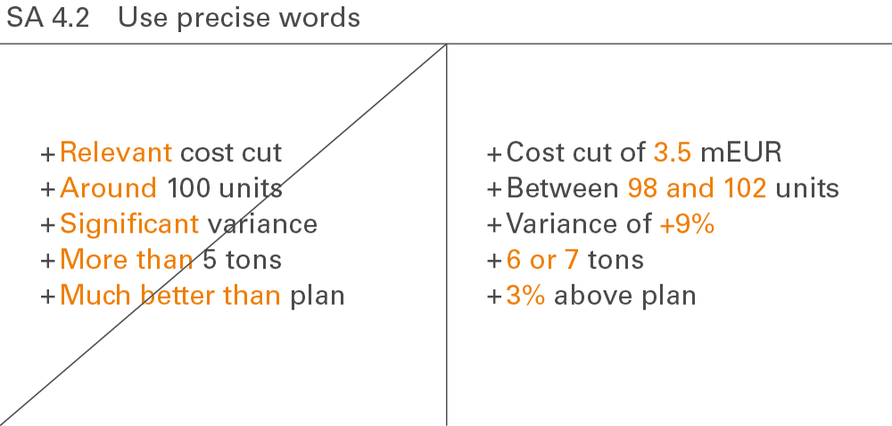
The more unambiguous the language, the clearer the message. Only precise words will be understood. Speaking about “relevant” or “significant” (in common speech, not as a statistical term) content leads to misinterpretations and misunderstandings. Speaking about facts and figures will prevent them.
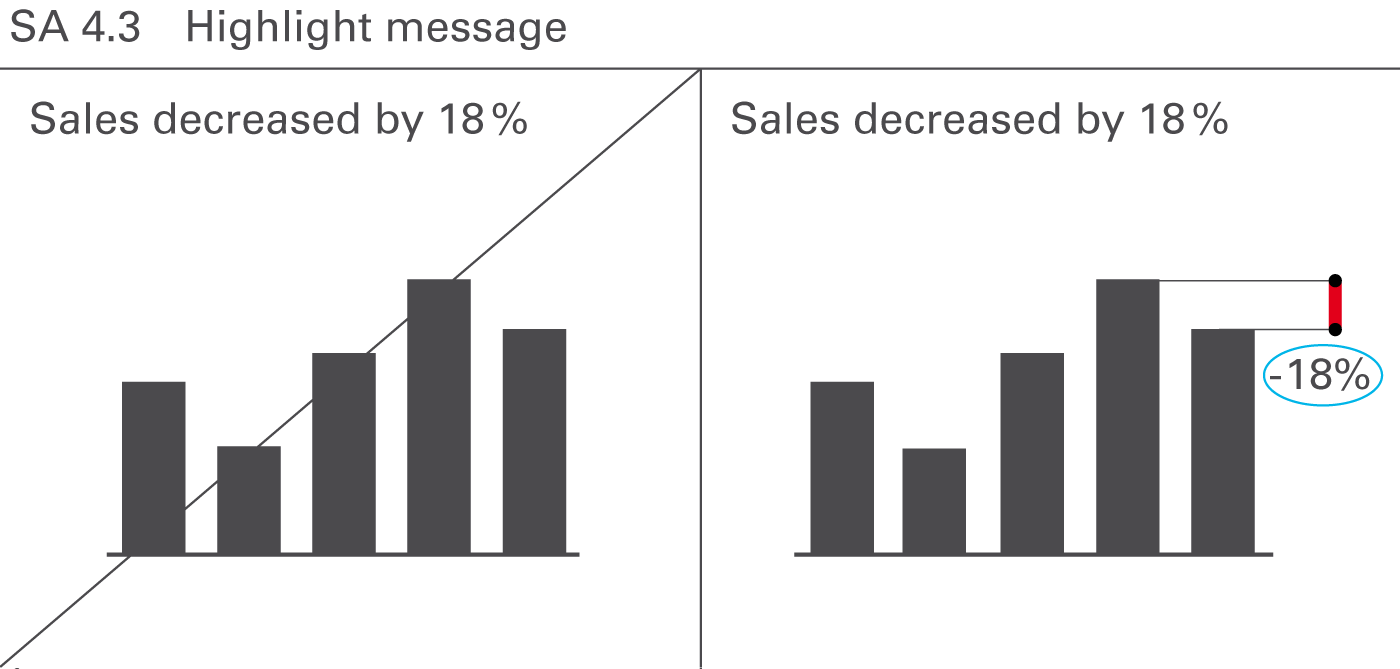
Visually highlight messages in the communication objects presented – namely in charts, tables, graphs, and pictures. This facilitates comprehension and reduces the time needed to understand complex situations. In most cases, it should be possible to highlight the important parts of the content by underlining the most important facts or emphasizing interesting details. Objects and pages without highlighting indicators tend to be a statistic rather than a report.
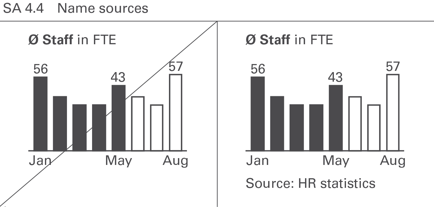
Naming sources for the material presented increases the credibility. Projected slides can omit them but written reports and handouts must include them.
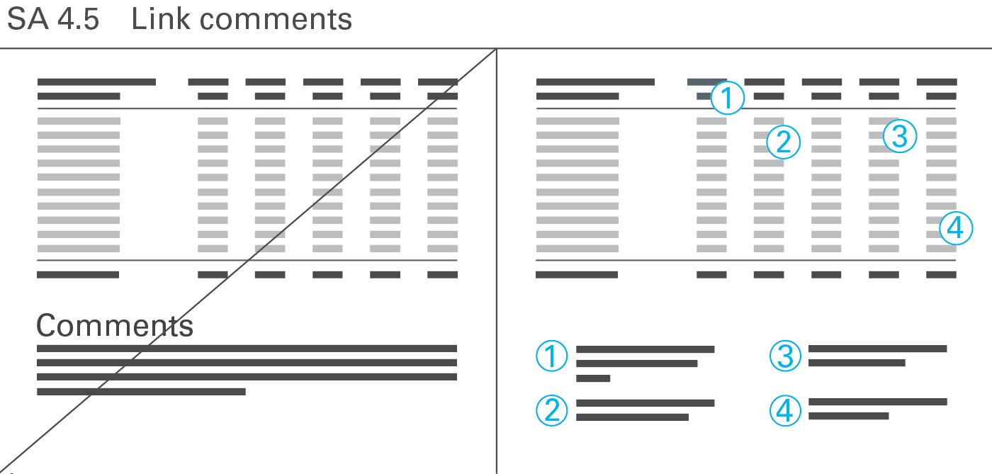
Use comments in written reports and handouts to add explanations, conclusions, and similar statements. Projected slides in presentations rarely need any comments because the comments are given by the speaker.
Number comments related to specific parts of a page (e.g. words, numbers, or visualization elements) and link them to the respective parts. Post numbered comments in text boxes on free areas of a page. General comments concerning the whole page are not numbered. Post them as a footnote at the bottom of a page.
Conclude a presentation with the overall message, including the next steps and an explanation of the consequences.
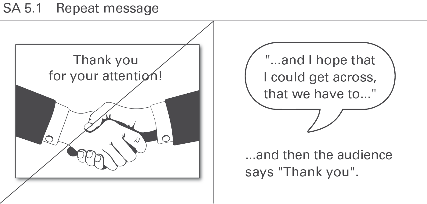
Avoid the phrase “Thank you for your attention” at the end of a presentation. Instead, presenters should briefly sum up their message one last time – in one sentence, if possible. At the conclusion of a successful presentation, the audience will be thanking the presenters for the information. Repeating the message from the beginning of a presentation at the end helps the audience check the quality of the storyline and brings the presentation full circle. In reports, on the other hand, such repetition is not necessary as the reader can quickly browse back to the respective summary at the beginning.
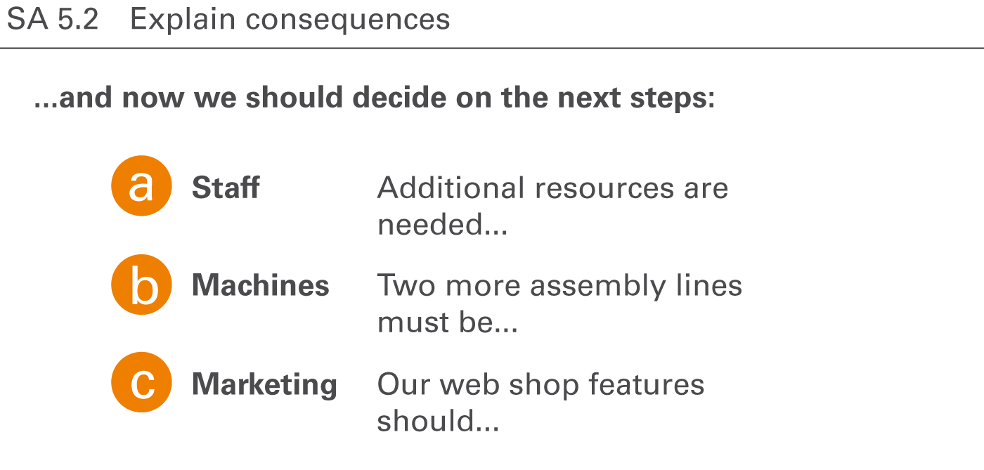
Conclude reports and presentations with proposals for decisions to be taken and an explanation of their consequences. This is the real objective of a presentation: Convince the audience of both the message and the suggested steps to be taken next.
STRUCTURE covers all aspects of organizing the content of reports and presentations.
Organizing the content means that reports and presentations follow a logical structure forming a convincing storyline.
This chapter covers using consistent elements, building non-overlapping elements, building collectively exhaustive elements, building hierarchical structures, and visualizing their structure properly.
Listings and groupings of any kind of elements (items, terms, pictures, symbols, etc.) used to organize content in charts, tables, and texts should contain consistent elements only. This pertains for example to items, statements, wordings, and the appearance of symbols and pictures.
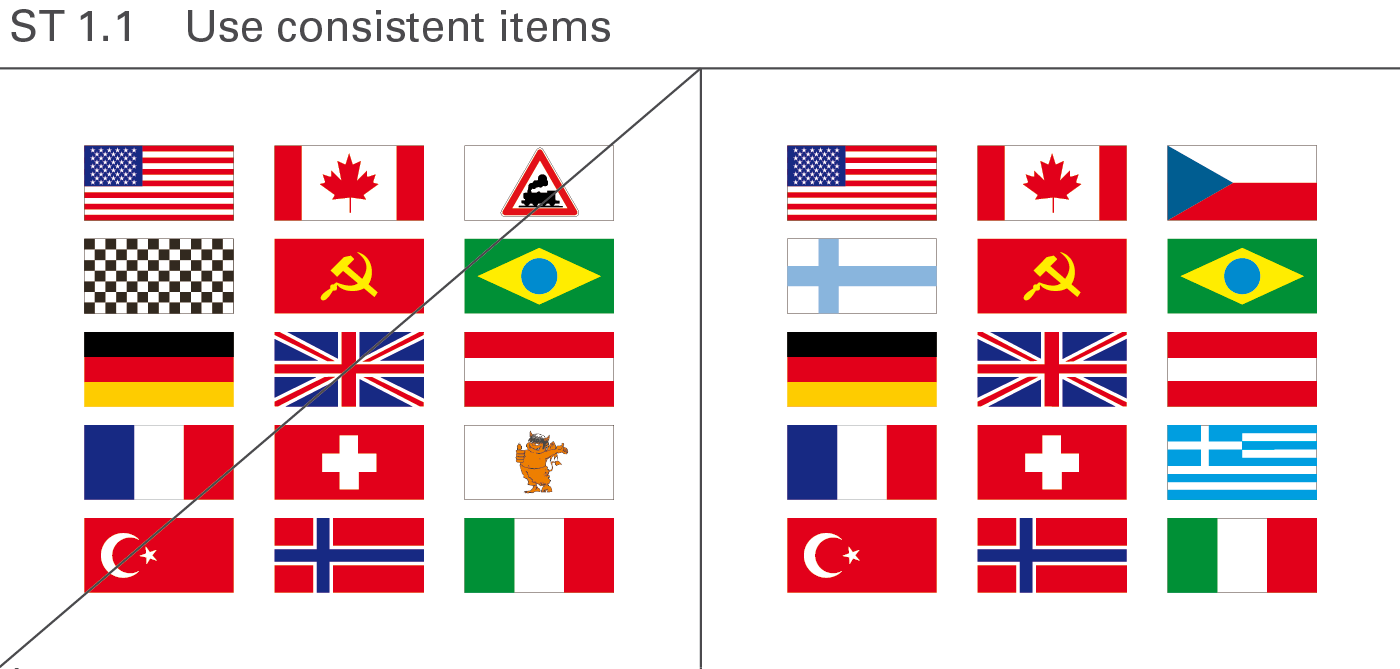
Items in a group should be of the same type, i.e. consistent. Consistent items can be different types of cars, houses, traffic signs, or – as shown in Figure ST 1.1, on the right hand side – different national flags representing the corresponding nations. The left hand side of this figure includes other types of items besides national flags, destroying the consistency.
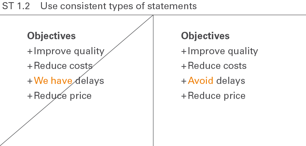
A list of statements will be easier to understand if all statements are of the same type. The right hand side of Figure ST 1.2 shows four suggestions. By contrast, on the left-hand side of this figure the third statement is a detection, not a suggestion.
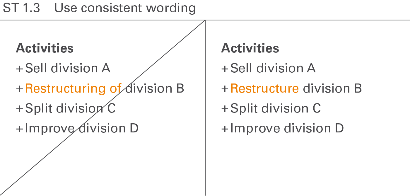
Structure all phrases – especially in listed arrangements – in a grammatically consistent manner to facilitate quicker understanding. The right hand side of Figure ST 1.3 shows a group of four consistent suggestions, an imperative verb paired with a noun. By contrast, on the left hand side of this figure the second suggestion uses verbal substantive instead of an imperative.
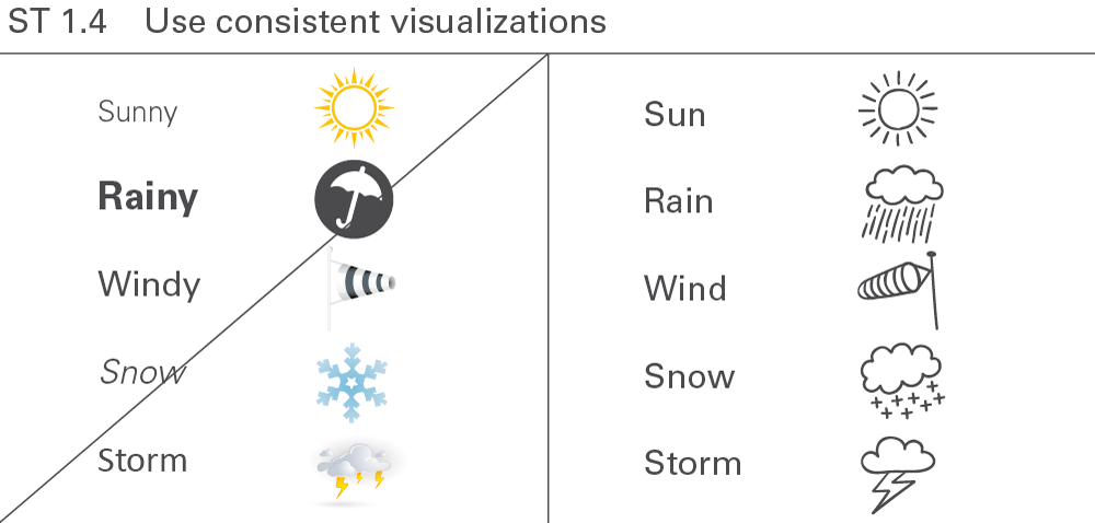
Visualizations such as symbols and pictures that are uniform in respect to their layouts, colors, forms, fonts, etc. – especially in listed arrangements – facilitate faster and easier comprehension.
Elements belonging to a group should not overlap, i.e. they should be disjoint or mutually exclusive. This concerns practical applications such as report structures, business measures, or structure dimensions.
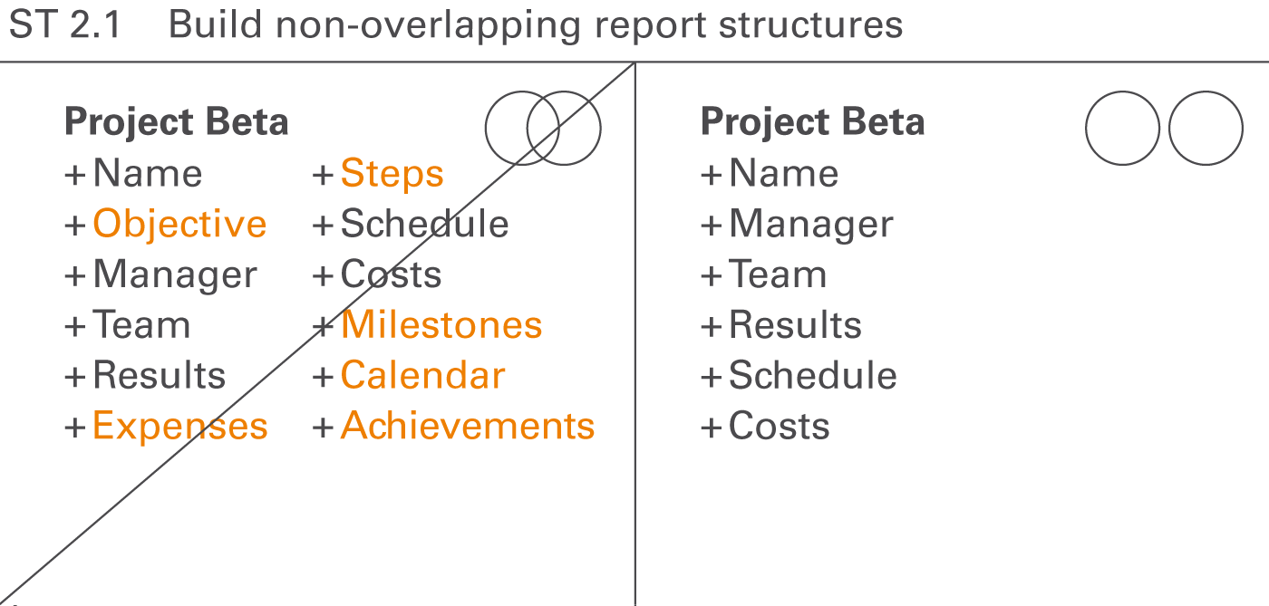
Structure reports and presentations in such a way that the parts, chapters, sections, and paragraphs do not overlap. They should not cover the same aspects.
In Figure ST 2.1, on the left hand side, the following chapters of a project description overlap:
At first glance, the six terms on the right hand side of this figure have no overlap in their logical structure. Of course, a relationship exists between the cost, the results, and the schedule of a project, but in regards to the content of the chapters this is not an overlap.
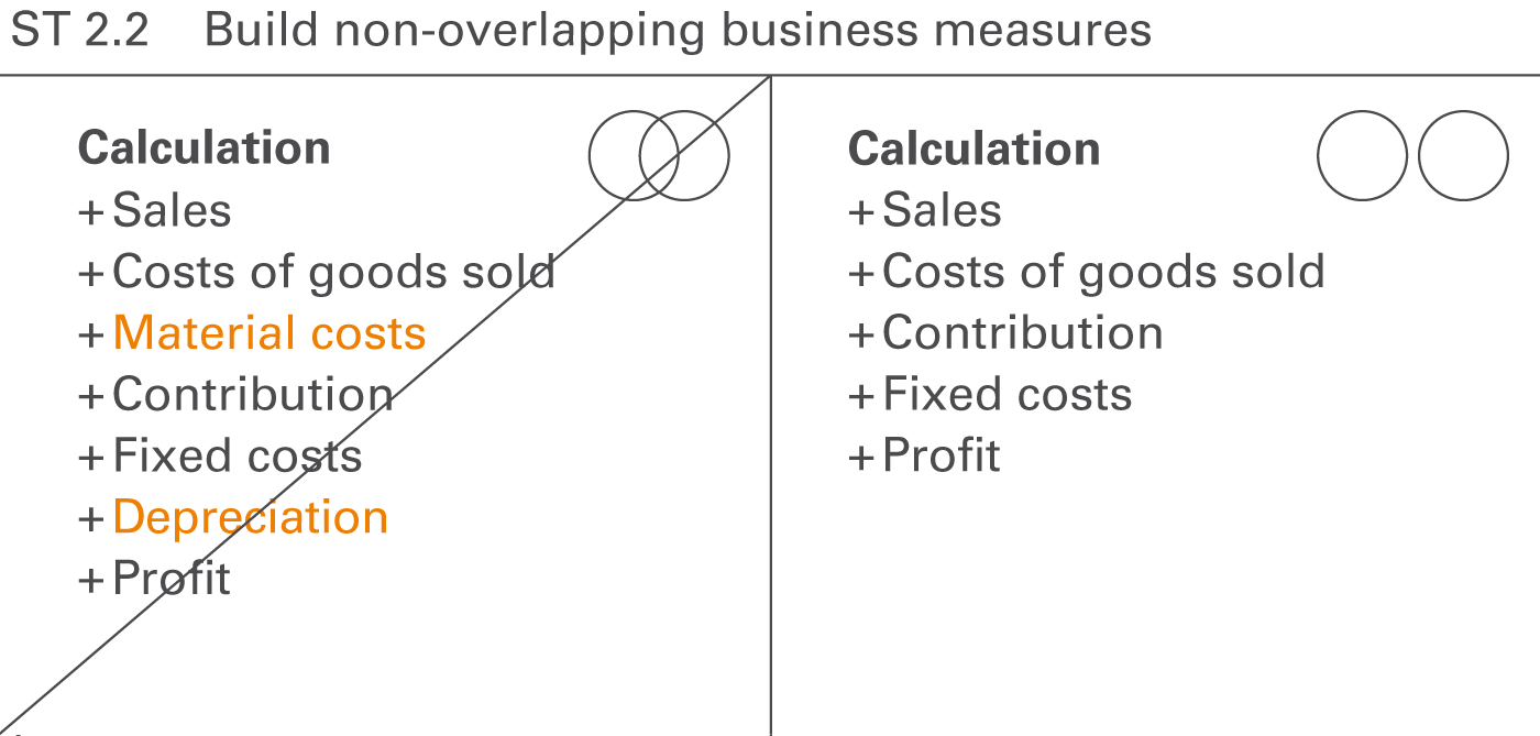
Structure a group of business measures in lists or calculations in a way they do not overlap, i.e. business measures on one hierarchical level should be disjoint or mutually exclusive.
Looking at Figure ST 2.2, on the left hand side, the following business measures overlap
The calculation scheme on the right hand side has been cleaned up.
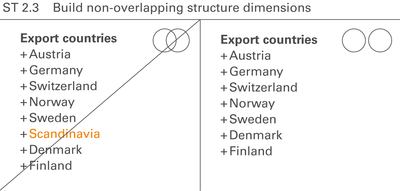
The elements of the structure dimensions used in reports and presentations should not overlap, i.e. the elements of a structure dimension should be disjoint or mutually exclusive.
Looking at Figure ST 2.3 on the left hand side, the regions Norway, Sweden, Denmark, and Finland overlap with Scandinavia.
A list of elements is considered to be exhaustive when they cover all aspects of a superordinate topic. For example, dividing Europe into Germany, Austria, Switzerland, and Belgium is not exhaustive because other countries also belong to Europe.
Structures with mutually exclusive (ME) and collectively exhaustive (CE) elements are known as MECE structures.
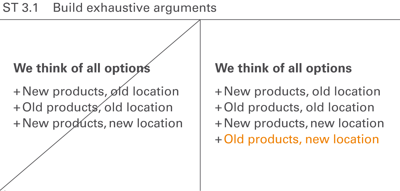
If some important arguments relating to a specific question are left out, the given answer will not be convincing.
Looking at Figure ST 3.1 on the left hand side the option “old products, new location” is missing.
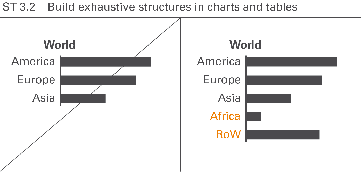
The elements of structures presented in charts and tables should also be exhaustive, in other words, adding up to one hundred percent.
In many practical applications of this kind, adding a remainder element (“rest of...”) helps to conform to this rule.
Give reports and presentations a hierarchical structure whenever possible, resulting in faster comprehension and simplified searching. These rules help to write and present a good storyline.
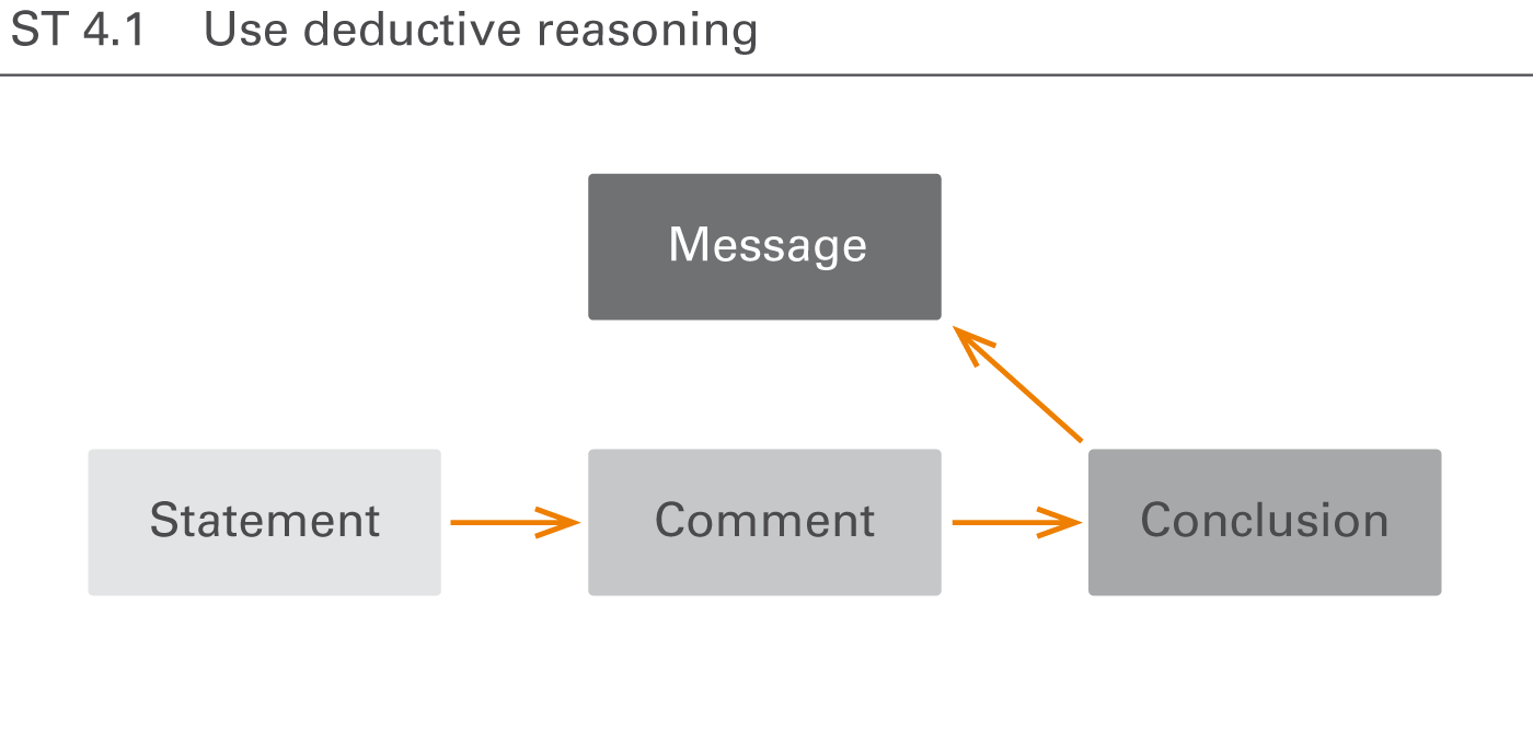
Exhibiting deductive reasoning (logical flow) for a given message aids in building hierarchical structures. Logical flows always answer the question “why” following the key message. They begin with a statement (all men are mortal), continue with a comment (Socrates is a man), and resolve with a conclusion (Socrates is mortal) culminating in the message (Socrates will die).
Deductive reasoning can be best applied in controversial discussions for arguing and demonstrating need for action. However, it forces the readers or the audience to reproduce the deduction and the whole argumentation can collapse if any statements are questionable.
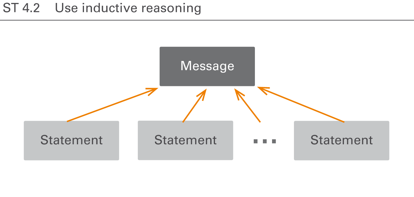
Exhibiting inductive reasoning (logical group) for a given message aids in understanding hierarchical structures. Logical groups are homogenous, non-overlapping, and collectively exhaustive arguments culminating in a message. This results in a powerful argumentation that satisfies the addressees need for an easily comprehensible logical structure.
Having organized the arguments hierarchically, visualize this structure in order to make the storyline transparent.
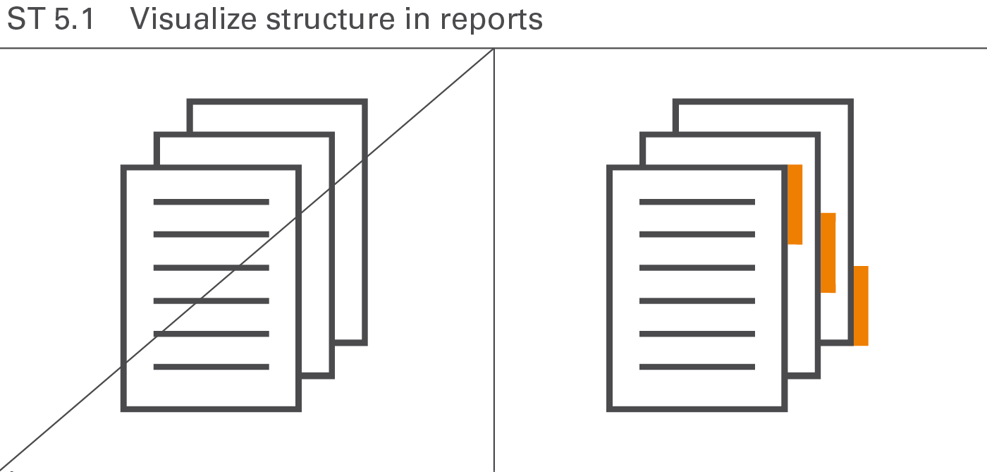
For easier understanding, underscore the logical structure of reports and presentations with visual aids (e.g. outlines, dashboards, summaries). Figure ST 5.1 illustrates this rule showing binder tabs on the right hand side.
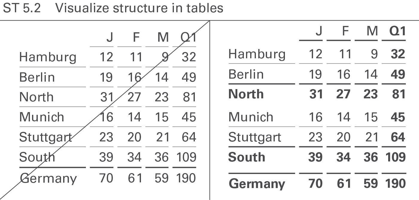
Design tables in such a manner that their hierarchical structure can be recognized in both the columns as well as the rows.
The right hand side of Figure ST 5.2 shows three hierarchical levels of rows in a table. The base level shows cities, the first summary shows regions, and the second summary shows the country.
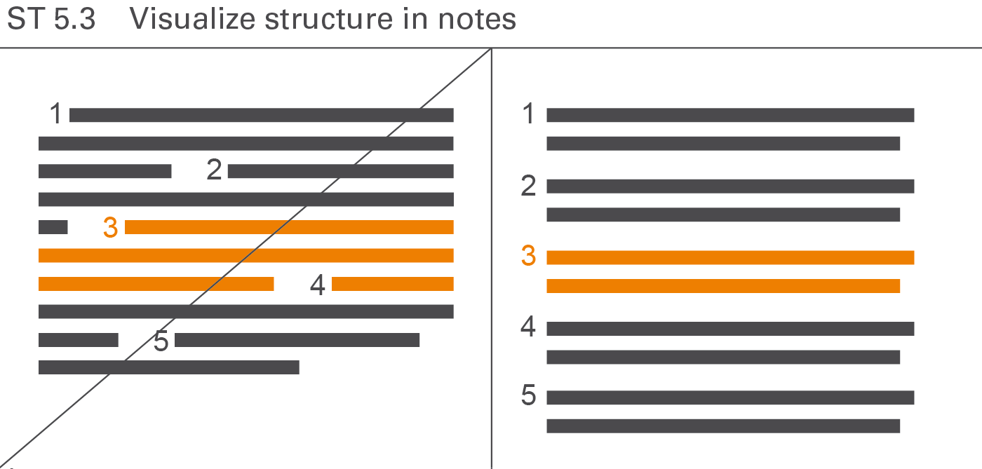
Notes are also easier to understand when their structure is shown clearly (see Figure ST 5.3).
EXPRESS covers all aspects of choosing the proper visualization in reports and presentations.
Proper visualization means that reports and presentations contain charts and tables, which convey the desired message along with the underlying facts as quickly as possible.
This chapter covers utilizing the correct types of charts and tables, replacing inappropriate visualizations and representations, adding comparisons, and explaining causes.
Choosing the appropriate object type is of prime importance for the comprehension of reports and presentations.
We use tables when looking up data. Tables have a high information density. They are clear, they are honest, they do not want to highlight, and they typically do not want to visually convey a certain message. So they do not compete with charts.
Charts on the opposite are always biased. It is the selection of data, the selection of the chart type, and the usage of highlighting which makes the difference. We evaluate charts by asking whether they transfer the intended message effectively and in a proper way. So charts cannot be replaced by tables.
The following section is about choosing the appropriate types of charts and tables. It presents in detail different types, layouts, and examples as well as their proper application.
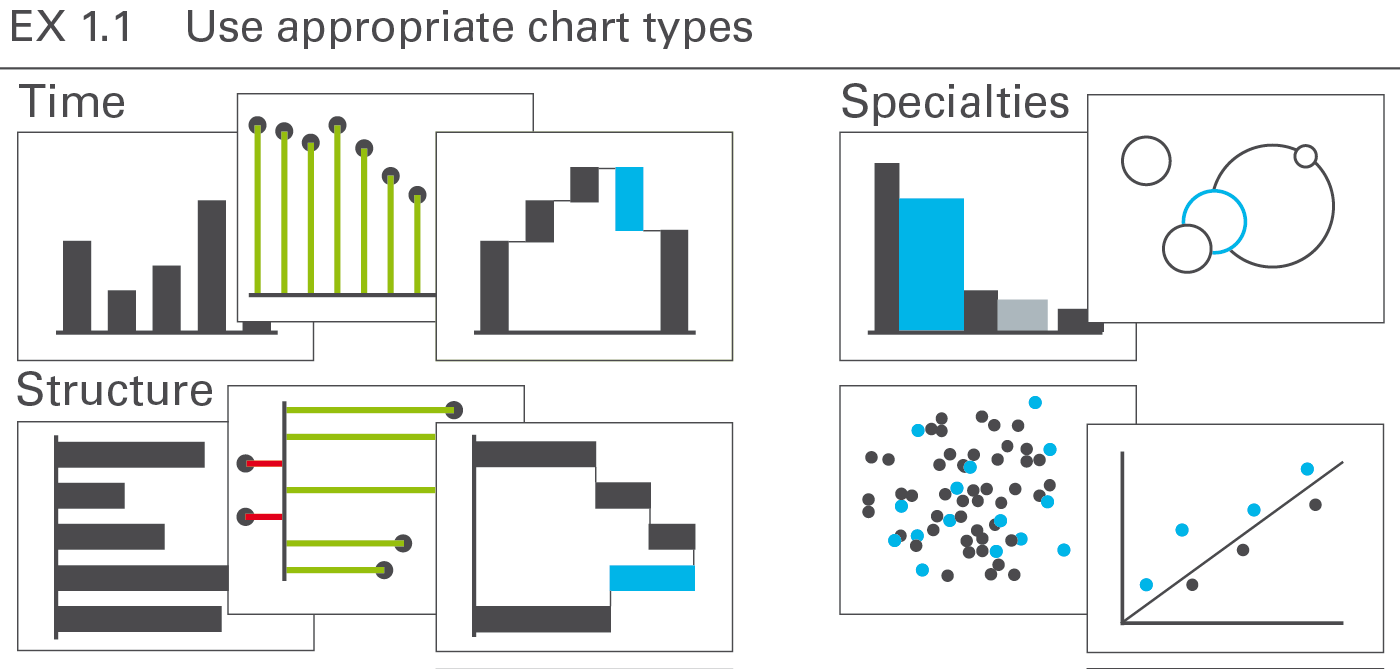
A chart is a graphical object, in which visualization elements such as columns, bars, and lines represent data.
This section discusses the types, layout, and examples of single charts. Overlay chartsand multiple charts are discussed in the CO 4 “Add elements” and CO 5 “Add objects”.
The most important groups of business charts are those showing development over time (charts with horizontal category axes), those showing structural relationships (charts with vertical category axes), and those showing x‑y charts, scatter plots, and bubble charts (charts with two value axes), see Figure EX 1.1.
Other chart types are of lesser interest in business communication and will be treated in a later version of the standards.
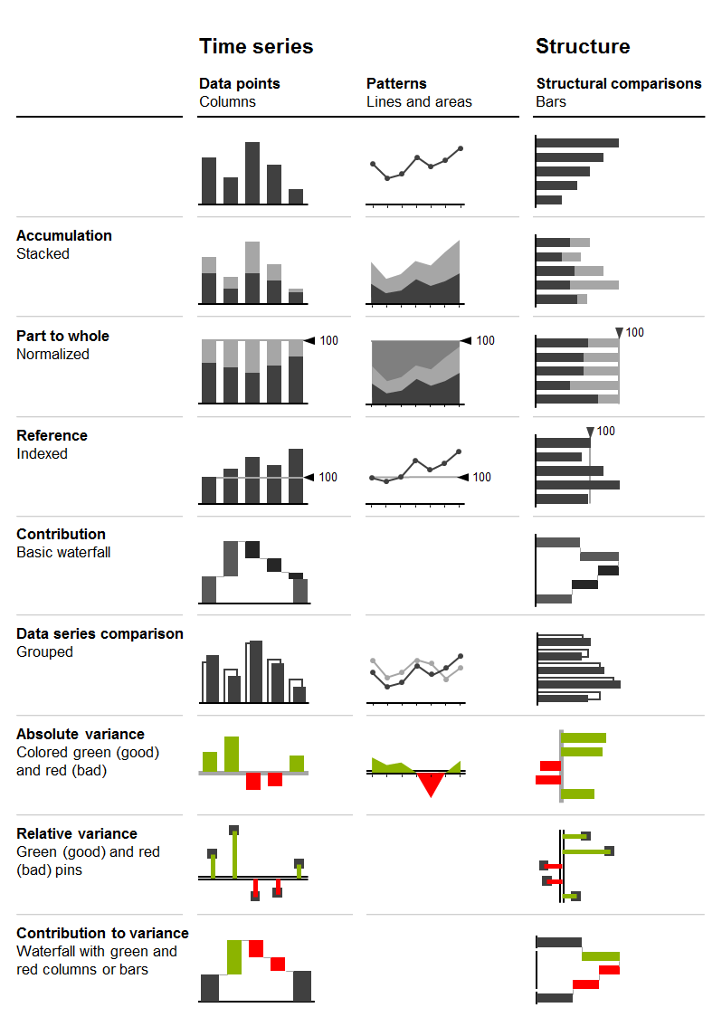
Looking at charts with horizontal and vertical category axes, the chart selection matrix displayed in the figure aids in selecting the right chart type for time series and structure analyses.
In the following sections, the correct usage of charts with horizontal category axes, charts with vertical category axes, and charts with two value axes is discussed in greater detail.
Charts with horizontal category axes
Charts with horizontal category axes (short:horizontal charts) typically display time series. Use the horizontal category axis as a time axis. Vertically, the visualization elements represent the data per time period or point of time (there is no need to show a vertical value axis as the visualization elements carry their own values). Time category axes run from left to right and show characteristics of period types (e.g. months or years) or points of time (dates).
In general, the data series of a horizontal chart is represented by columns (single, stacked, grouped), vertical pins, horizontal waterfalls, or lines. Vertical pins can be considered very thin columns. Because of their importance, they are dealt with in a separate section.
Here follows the grouping of horizontal chart types:
Single column charts
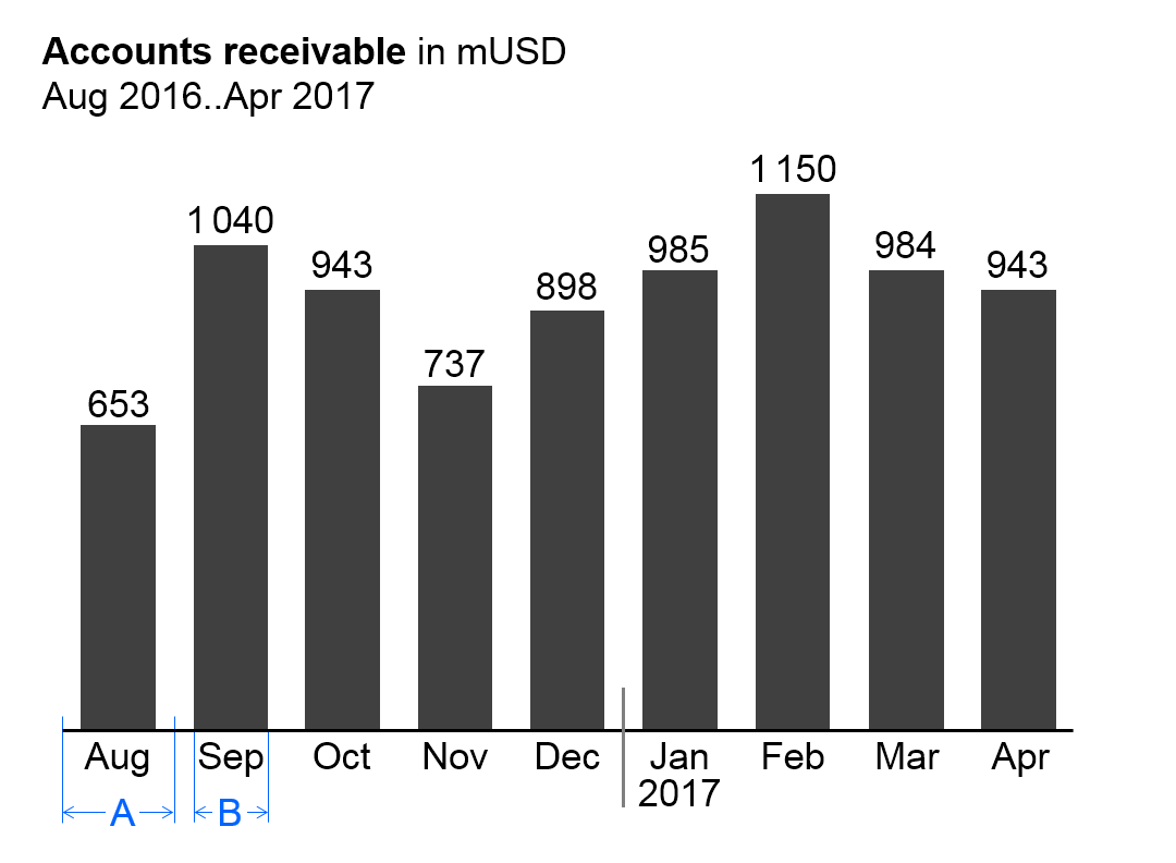
In general, single column charts (short: single columns) are used to display the temporal evolvement of one data series.
Single columns consist of:
Horizontal category axis: The horizontal category axis represents with its labels the respective time periods or points of time. The part on “Semantic rules” suggests to use the category width (see width A in the figure) for identifying the period type (see UN 3.3 “Unify time periods”).
Columns: One column per time period or point of time extends from the category axis in accordance with the respective value. Columns are displayed in the foreground of the category axis, so that the length of the column is not hidden. The part on “Semantic rules” suggests that the ratio of column width to category width (see ratio B/A in the figure) represents information about the measure type (see UN 3.1 “Unify measures”).
Legends: As there is only one data series, the legend (name of the data series) is part of the chart title.
Data labels:Data labels name the values of the data series corresponding to the length of the respective columns. Position the labels of positive values above their respective columns, the labels of negative values below.
Stacked column charts
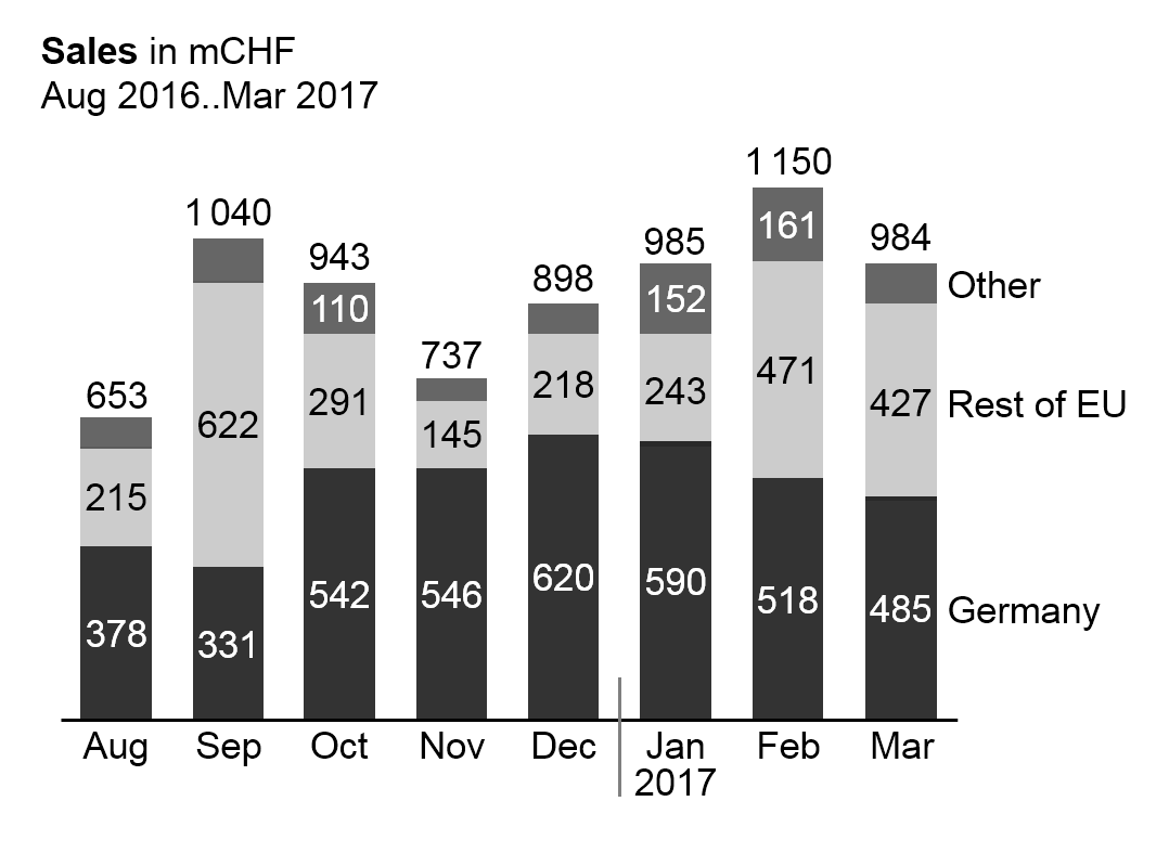
Stacked column charts (short: stacked columns) represent more than one data series (e.g. multiple products, countries, or divisions), see the figure on the left.
Stacked columns consist of:
Horizontal category axis: See single column charts.
Columns: The columns (see single column charts) are divided into segments (Excel names them “data points”) representing the data series (stacked columns).
Legends: Legends (names of the data series) are positioned either on the far left side with right-aligned text or on the far right side with left-aligned text. The column segments define their vertical position, centered vertically with the data labels of the respective column segment. If a segment at the far left or far right is missing or has a very small size, its legends might need assisting lines.
Data labels:Data labels name the values of the data series corresponding to the length of the respective column segments. If the sum of the column segments of a category is positive (column pointing upward), the label of the sum is positioned above the respective column, if negative (column pointing downward), it is positioned below.
It must be pointed out that stacked columns should only be used if all chart values are either positive or negative.
This chart type might also not be a good choice if the values of each data series vary too much. The maximum number of data series (segments of a stacked column) to be shown depends on the range of how much the values of each data series vary: More than 5 data series will only work well in the case of little variations.
Position the data series of central importance or interest directly on the axis in order to best see its development over time.
Grouped column charts
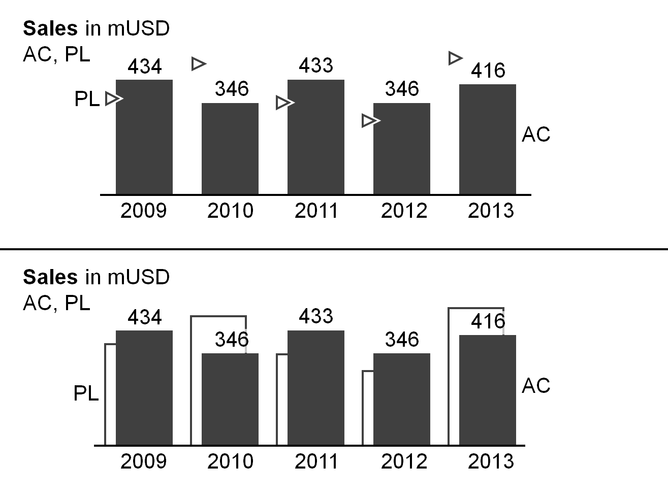
Grouped column charts (short: grouped columns) show, in general, time series for a primary scenario (e.g. AC or FC) in comparison with a reference scenario (e.g. PY or PL). Two columns per category (grouped columns) represent these two scenarios.
The columns of the primary scenario and the reference scenario overlap, the reference scenario placed behind the primary scenario – either to the left or right of the primary scenario (see bottom chart of the figure as well as the paragraph on ”Scenario comparisons” in UN 4.1 “Unify scenario analyses”). A third scenario could be displayed using a reference scenario triangle. All other elements of a grouped column chart are identical to single column charts.
Instead of using grouped columns, the primary scenario can be represented with a single column with the reference scenario represented by reference scenario triangles (see top chart of the figure).
Horizontal pin charts
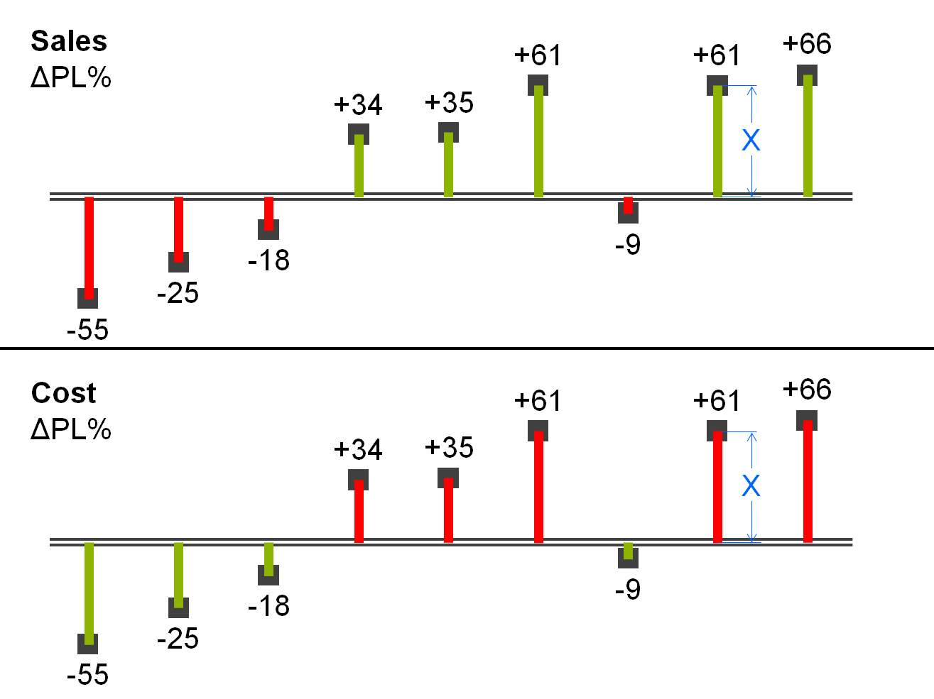
Horizontal pin charts (short: horizontal pins) are used for the visualization of relative variances in a time series analysis.
Horizontal pins consist of:
Horizontal category axis: see single column chart.
Pins: One pin per time period or point of time extends from the category axis to the respective length. The pin has the size of a very thin column. Color the pin green or red corresponding with positive or negative relative variances respectively. The fill of the pinhead represents the primary scenario (see the paragraph on “Scenario comparisons” in UN 4.1 “Unify scenario analyses”). Display the pin in the foreground, so that the length of the pin (see length X in the figure) is not hidden.
Legends: As there is only one data series, the legend (name of the data series) is part of the chart title.
Data labels:Data labels name the values of the data series consistent with the length of the respective pins. Position the labels of positive values above the respective pins, labels of negative values below.
Horizontal waterfall charts
Horizontal waterfall charts (short:horizontal waterfalls or column waterfalls) analyze root causes, over time, for the change or variance between two or more statuses. Accordingly, horizontal waterfalls consist of two or more base columns and totals columns. In between a base column and a totals column there are contribution columns demonstrating what led to the difference between these two columns. The contribution columns start at the end value, i.e. the height, of the preceding column, and show the positive or negative contribution as well as the accumulated contribution of all columns up to the respective point of time.
There are two types of horizontal waterfalls:
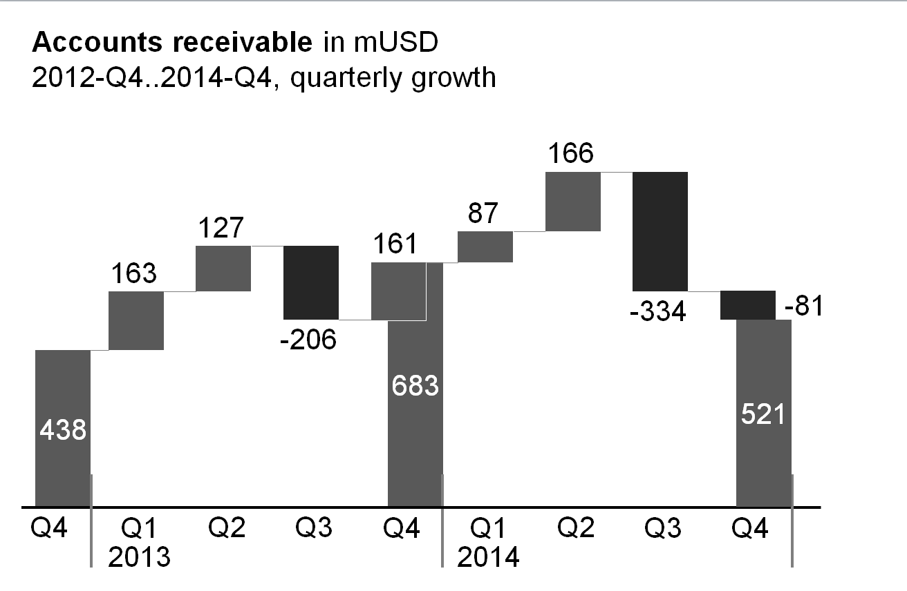
Growth waterfalls: In growth waterfalls, base columns and totals columns represent a stock measure (e.g. headcount, accounts receivable) at different points in time (e.g. end of Q4 2012, 2013 and 2014). The contribution columns in between represent the changes (increases and decreases) over time of this stock measure.
(There is no vertical equivalent to the horizontal growth waterfall.)
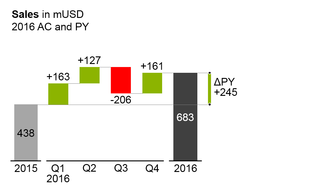
Horizontal variance waterfalls: In horizontal variance waterfalls, base columns and totals columns represent a flow measure (e.g. sales) at different periods in time (e.g. 2015 and 2016) and/or regarding different scenarios (e.g. PL and AC). The contribution columns in between represent the periodical variances between the different time periods and/or scenarios.
The elements of a horizontal waterfall chart are the same as the elements of single column charts. In addition, assisting lines connect the end of a column to the beginning of the succeeding column.
Line charts
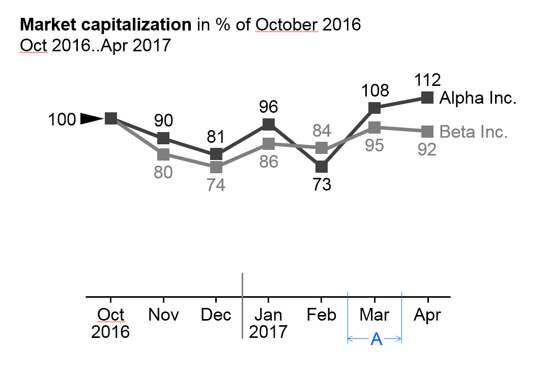
In general, line charts are used for the display of the temporal evolvement of data series with many data points.
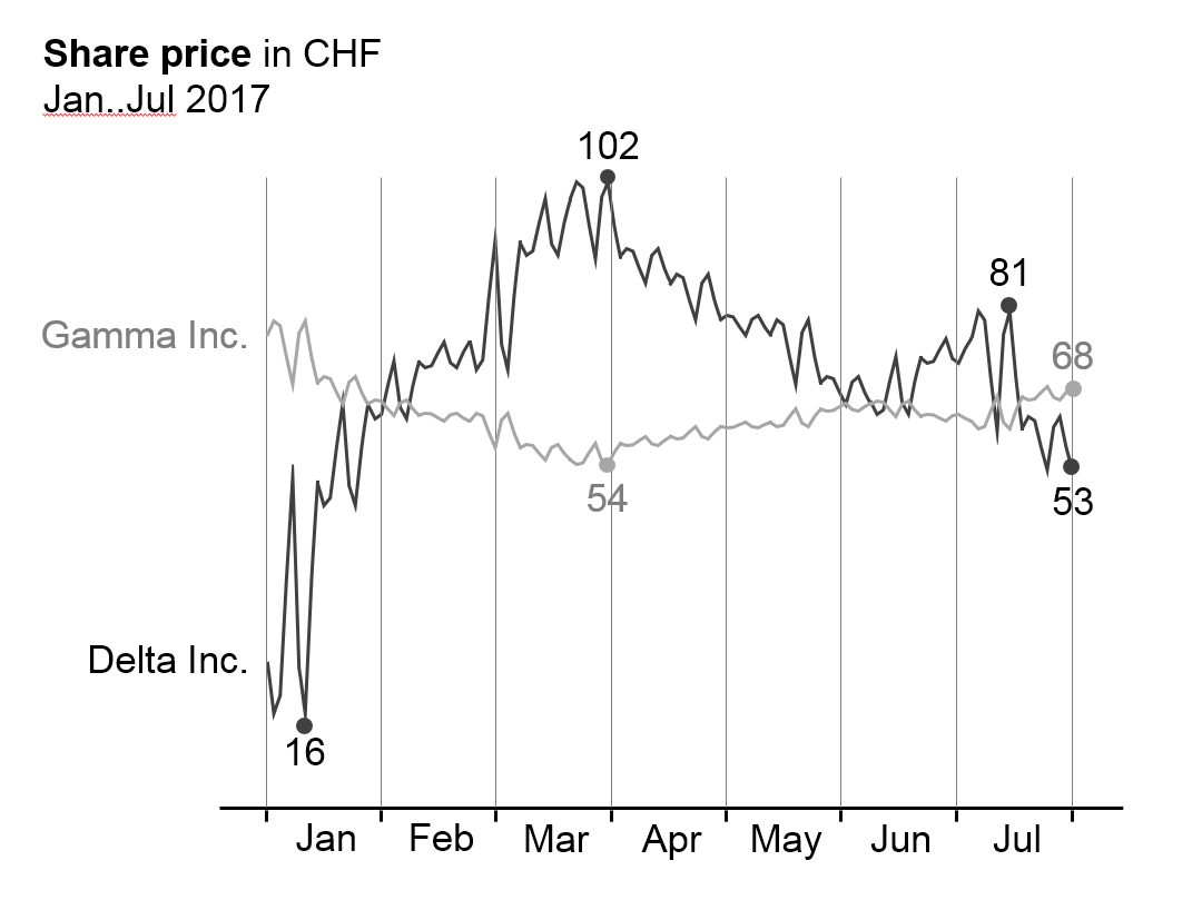
Many data points lead to small category widths. The advantage of line charts over column charts is the simplified display of data (better data-ink-ratio). In addition, they can better represent positive and negative values of more than one data series than columns. On the other hand, lines tend to imply a continuous timeline – practically non-existent in business communication. Therefore lines should not be used for the presentation of data series with only a few values.
Line charts cannot be “stacked” in order to show structure like in stacked column charts. In the place of line charts for “stacked data”, area charts offer a good solution (there is no layout concept for area charts in this version of the guide yet).
Line charts with more than three intersecting lines tend to be confusing. Instead, several smaller charts with one line each could be placed next to one another (small multiples), particularly when the general trends of the lines are to be analyzed – not the direct comparison of two data series (e.g. in comparing seasonal developments of several years), see also EX 2.4 “Replace spaghetti charts”.
Line charts consist of:
Horizontal category axis: See single column chart. The semantic rules in part 3 suggest to use the category width (see width A in the first figure) for identifying the period type (see UN 3.3 “Unify time periods”).
Lines: One or more lines with line markers represent the values of the respective data series. Use line thickness, line color, and line markers for meaning, see part “Semantic rules”.
Legends:Legends label the data series. If the line chart shows only one data series, include the legend in the chart title. If the line chart shows two or more data series, the legend should be positioned to the right of the far right data point (left-aligned text, see first figure) or the left of the far left data point (right-aligned text, see second figure). Alternatively position legends close to the lines at any other place in the chart.
Data labels:Data labels name the values of the respective data points. If possible, label maximum values (peaks) above the line markers and minimum values (valleys) below the line markers. In many practical applications it is not necessary to clutter the line chart by labeling every data point, see second figure on the left and SI 5.3 “Avoid unnecessary labels”.
Other horizontal charts
Other chart types with horizontal category axes are boxplot charts (range charts) and area charts. There is no specific notation concept for these chart types yet however it can be easily derived from the notation concept of column and line charts.
Charts with vertical category axes
Charts with vertical category axes (vertical charts) typically show structural data. In general, present structural data of one period or one point of time in the form of bars.
Use the vertical category as a structure axis. Horizontally, the visualization elements represent the data per structure element (there is no need for a horizontal value axis as the visualization elements carry their own values). Structure axes run from top to bottom and show characteristics of structures (e.g. products or countries). The sequence of these elements depends on the intended analysis; see the UNIFY section about “Structure analyses”.
In general, the data series of a vertical chart is represented by (horizontal)bars (single, stacked, grouped), by horizontal pins, or by waterfall bars. Do not use lines in vertical charts as they could be interpreted as trends or developments, which do not exist in structure analyses.
Horizontal pins can be considered very thin bars, but because of their importance are dealt with in a separate section. A chart with horizontal pins is called a vertical pin chart.
Here follows the grouping of vertical chart types:
Single bar charts
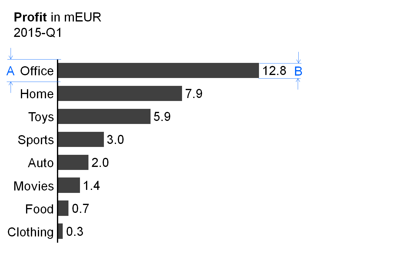
In general, single bar charts (short: single bars) are used for the structural analysis of one data series (e.g., products, countries, or divisions) for one period or one point in time.
Single bar charts consist of:
Vertical category axis: The vertical category axis with its labels represents the respective structure elements such as countries, products, etc. The category width (see width A in figure) should be the same for corresponding analyses.
Bars: One bar per structure element extends from the category axis to the length representing the respective value. Display the bars in the foreground of the category axis, so that the length of the bar is not hidden. The part on “Semantic rules” suggests that the ratio of bar width to category width (see ratio B/A in figure) represents information about the measure type (see UN 3.1 “Unify measures”).
Legends: As there is only one data series, the legend (name of the data series) is part of the chart title.
Data labels:Data labels name the values of the data series consistent with the length of the respective bars. Position the labels of positive values at the right hand side of the respective bars, the labels of negative values at the left hand side.
Stacked bar charts
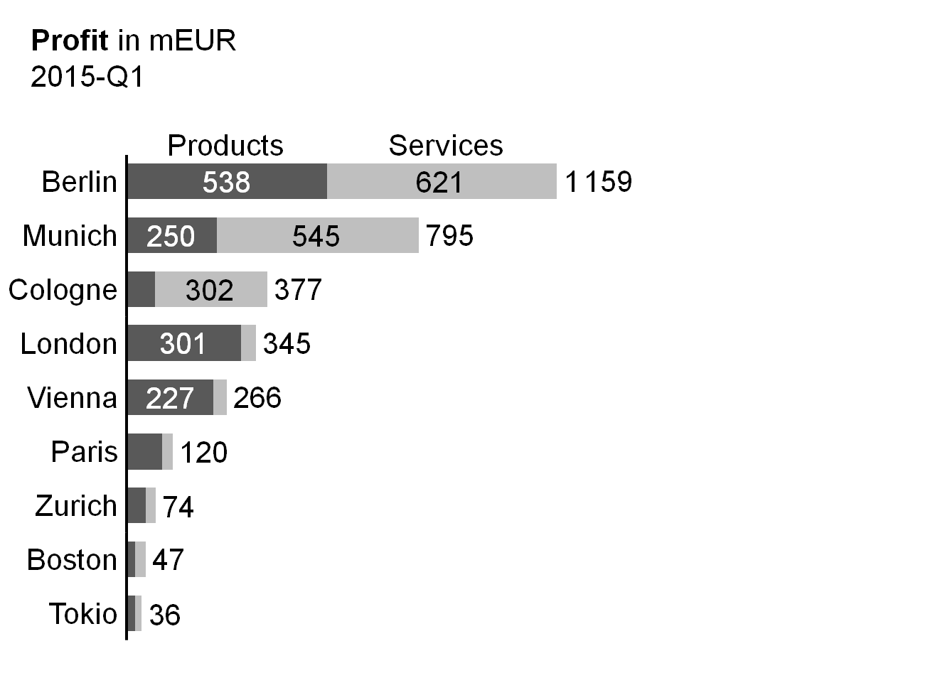
Stacked bar charts (short: stacked bars) represent more than one data series (e.g., products, countries, or divisions) for one period or one point in time.
Stacked bar charts consist of:
Vertical category axis: See single bar charts.
Bars: The bars (see single bar charts) are divided into segments (Excel names them“data points”) representing the data series (stacked bars).
Legends: Legends (names of the data series) are positioned either above the top stacked bar or below the bottom stacked bar, with the bar segments defining their horizontal position: they are horizontally centered with the data labels of the respective bar segment. If a segment at the top or bottom is missing or has a very small size, its legend might need assisting lines.
Data labels:Data labels name the values of the data series corresponding to the length of the respective bar segment. If the sum of the bar segments of a category is positive (bar pointing to the right), the label of the sum is positioned to the right hand side of the respective bar. If the sum is negative (bar pointing to the left), the label of the sum is positioned to the left hand side of the respective bar.
It must be pointed out that stacked bars should only be used if all chart values are either positive or negative.
This chart type might also not be a good choice if the values of each data series vary too much. The maximum number of data series (segments of a stacked bars) to be shown depends on the range of how much the values of each data series vary: More than 5 data series will only work well in the case of little variations.
Position the data series of central interest directly at the axis in order to best see its structure.
Grouped bar charts
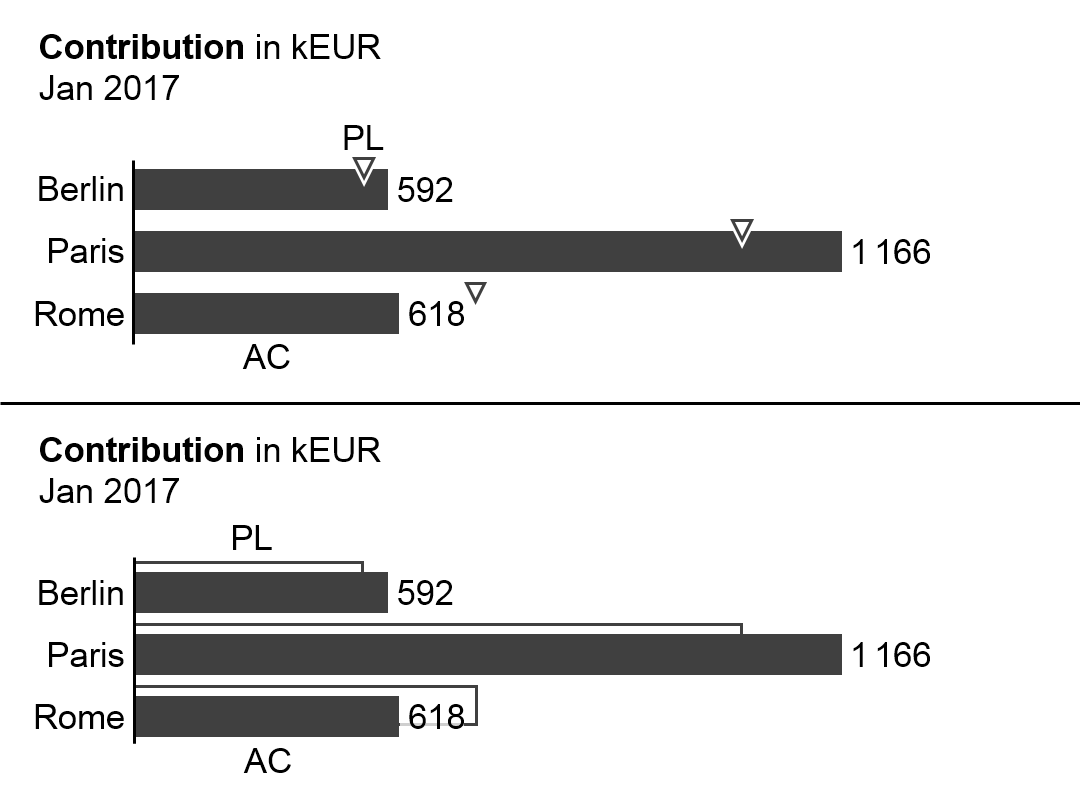
In general, grouped bar charts (short: grouped bars) show structure analyses for a primary scenario (e.g. AC or FC) in comparison to a reference scenario (e.g. PY or PL). Two bars per category (grouped bars) represent these two scenarios.
The bars of the primary scenario and the reference scenario overlap, the reference scenario placed behind the primary scenario – either above or below (see the bottom chart of the figure as well as the paragraph on “Scenario comparisons” in UN 4.1 “Unify scenario analyses”).
A third scenario could be displayed using a reference scenario triangle. All other elements of a grouped bar chart are identical to a single bar chart.
Alternatively, instead of grouped bars, the primary scenario can be represented with a single bar and the reference scenario by reference scenario triangles (see top chart of figure).
Vertical pin charts
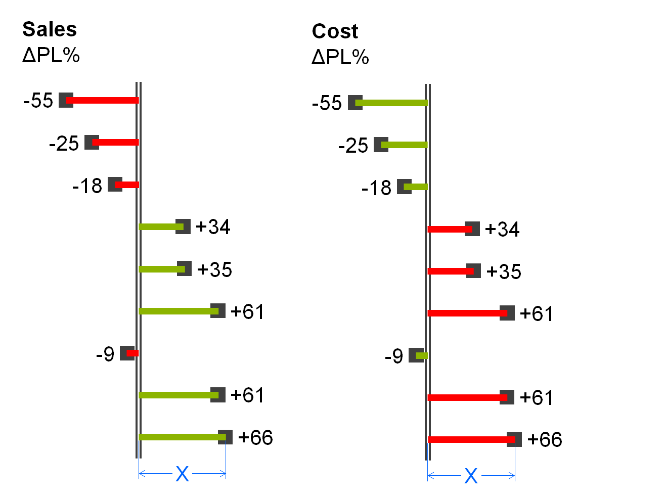
Vertical pin charts (short: vertical pins) are used for the visualization of relative variances in a structure analysis.
Vertical pins consist of:
Vertical category axis: see single bar chart.
Pins: One pin per structure element extends from the category axis to the respective length. The pin has the size of a very thin bar. It is colored green or red when representing positive or negative relative variances respectively. The fill of the pinhead represents the primary scenario (see the paragraph on “Scenario comparisons” in UN 4.1 “Unify scenario analyses”). Display pins in the foreground, so that the length of the pin (see length X in the figure) is not hidden.
Legends: As there is only one data series, the legend (name of the data series) is part of the chart title.
Data labels:Data labels name the values of the data series corresponding to the length of the respective pins. Position the labels of positive values at the right hand side of the respective pins, the labels of negative values at the left hand side.
Vertical waterfall charts
Vertical waterfalls charts (in short:vertical waterfalls or bar waterfalls) analyze structural root causes for the difference between two or more statuses. Accordingly, vertical waterfalls consist of two or more base bars and totals bars. In between a base bar and a totals bar there are contribution bars representing the contribution to the difference between these two bars. Starting from the top base bar, contribution bars always start at the end of the preceding bar, showing positive or negative individual contributions of the respective structure element as well as the accumulated contribution resulting in the next totals bar.
There are two types of vertical waterfalls:
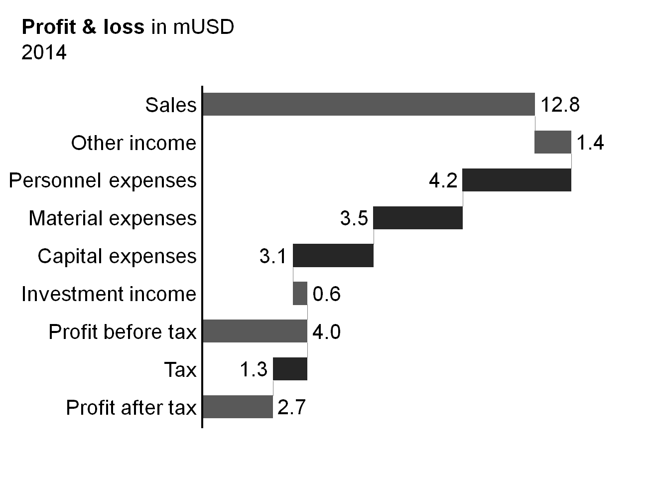
Calculation waterfalls: In calculation waterfalls, base bars and totals bars represent base and result measures (e.g. sales and EBIT) whereas the contribution bars in between represent the additions and subtractions of other measures (e.g. financial income and direct cost) in a calculation scheme. More complex calculation schemes (e.g. profit and loss calculation) can have intermediate subtotals bars.
(There is no horizontal correspondence to the vertical calculation waterfall.)
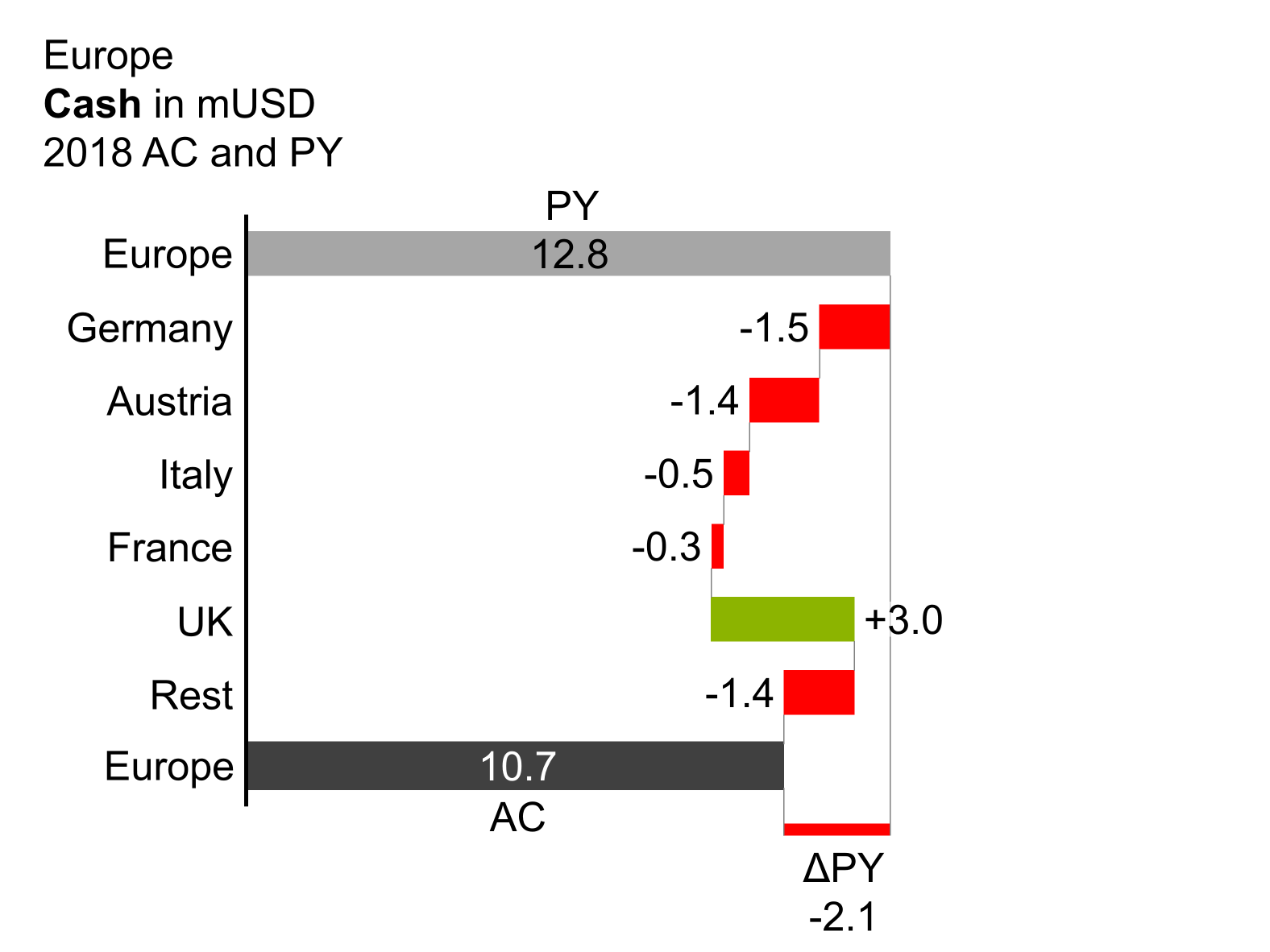
Vertical variance waterfalls: In vertical variance waterfalls, base bars and totals bars represent values at different periods or points in time (e.g. January 1, 2013 and January 1, 2014) and/or different scenarios (e.g. PY and AC). The contribution bars in between represent the variances in structure between the different times and/or scenarios.
The elements of vertical waterfalls are the same as the elements of single bar charts. In addition, assisting lines connect the end of a bar with the beginning of the succeeding bar.
Remainder bar
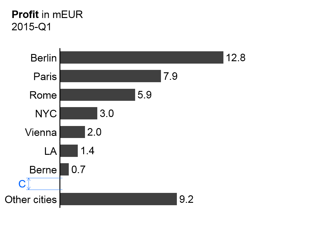
If a large number of elements need to be presented, then only the most important elements can be displayed in one chart or on one page. In order to make the analyses exhaustive, sort the elements by descending size, accumulating the smallest elements, which cannot be depicted, in a remainder bar (“rest of...”). Separate the remainder bar from the other bars by a wider gap (see gap C in the figure on the left).
Note: This remainder bar has to be excluded from some Structure analyses such as averaging, ranking, and selecting.
Other vertical charts
Other chart types with vertical category axes are vertical boxplot charts (range charts). There is no specific notation concept for this chart type yet however it can be derived from the notation of the standard bar charts.
In general, do not use lines and areas in vertical charts as they might underline a continuum of data non-existent in business communication.
Charts with two values axes
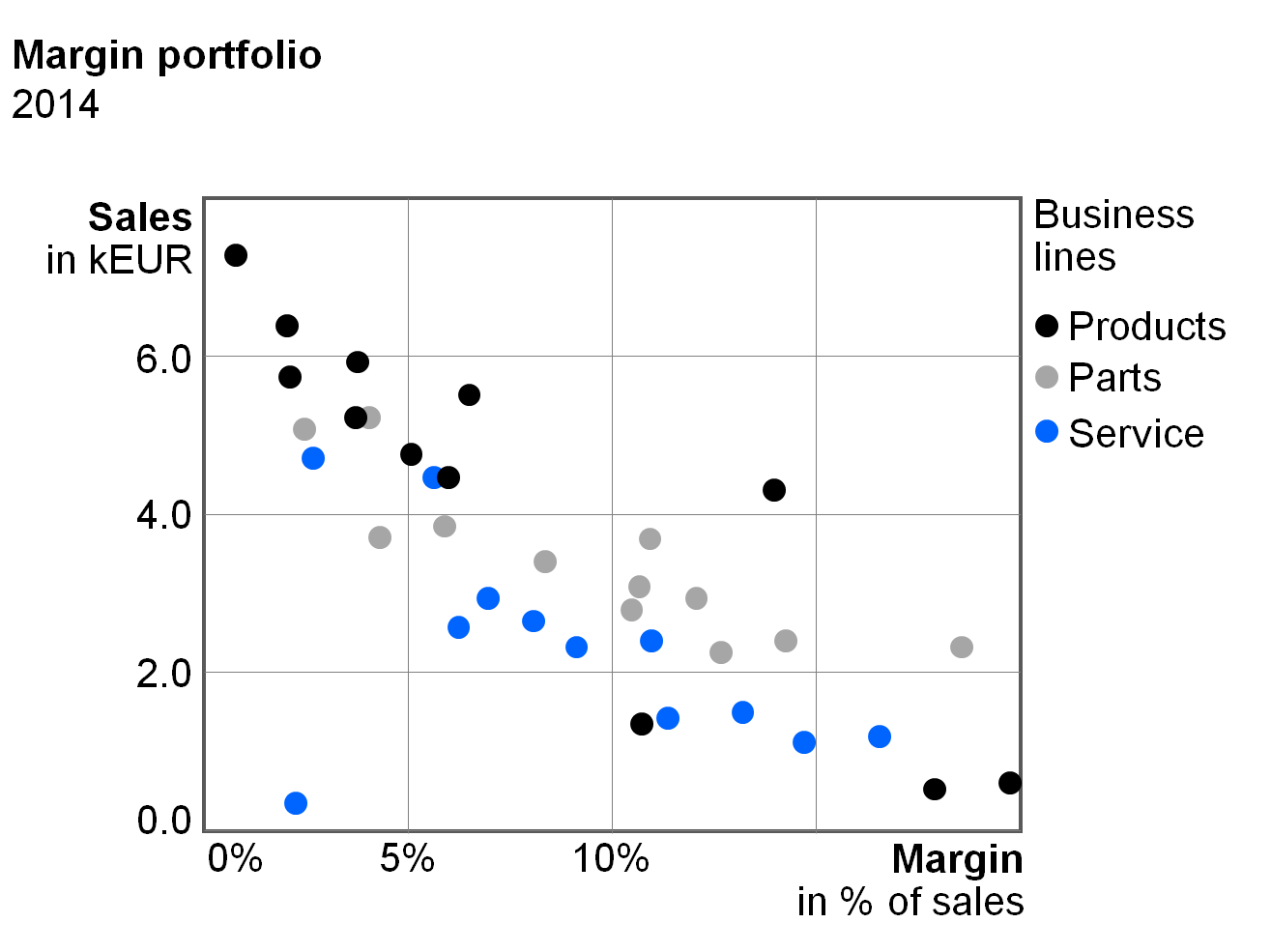
Charts with two value axes show two-dimensional positioning of visualization elements, which can provide new and interesting insights. Scattergrams arrange points in a two-dimensional coordinate system.
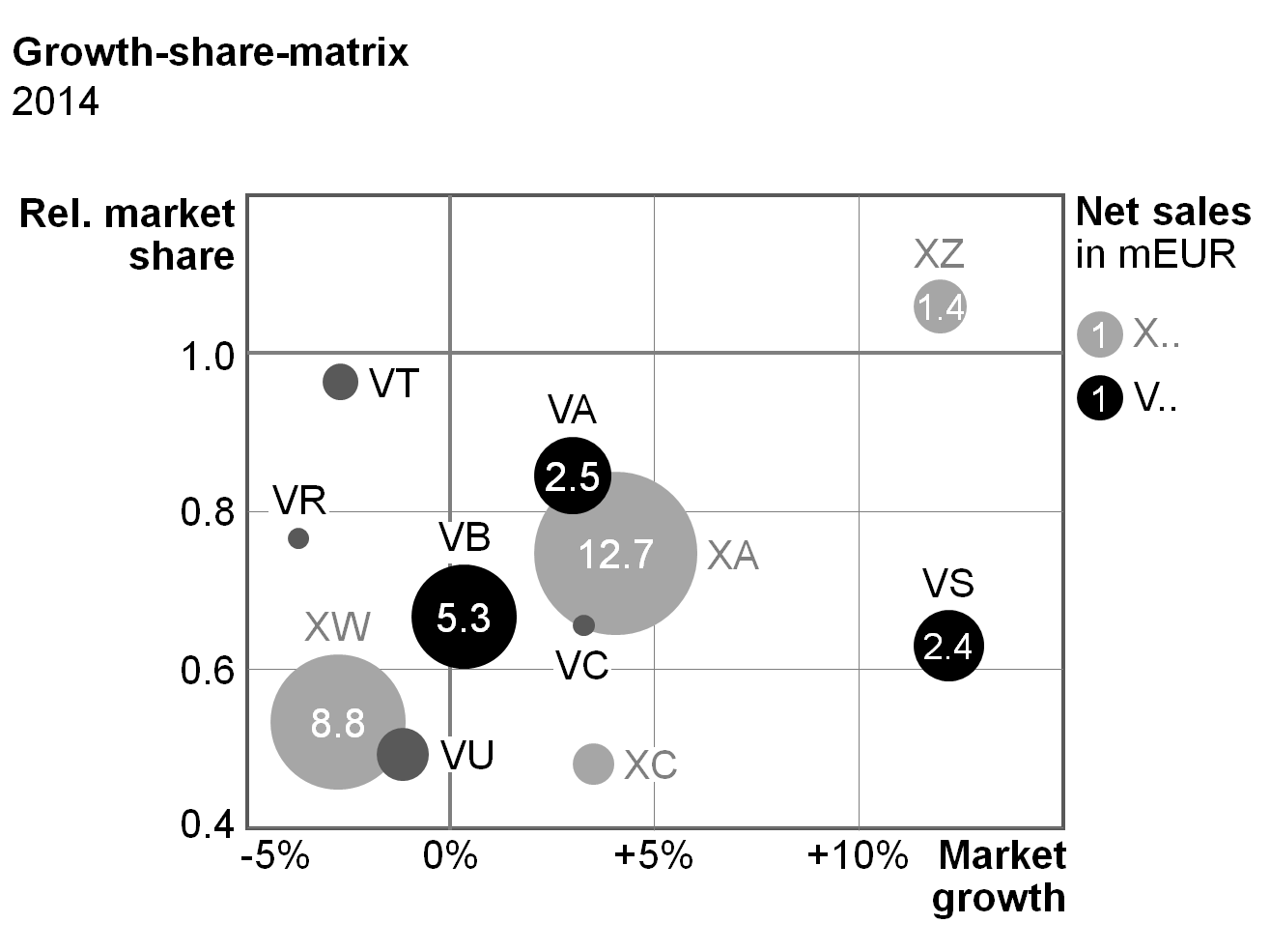
Bubble charts (portfolio charts) have bubbles instead of points and use the bubble area to show a third dimension. A fourth dimension could be presented via pie segments within the bubbles (bubble pie charts).
Besides scattergrams and bubble charts there are other chart types with two value axes, e.g. charts with horizontal axes representing a continuous timeline (instead of fixed time categories) and charts with columns or bars of variable width.
There are no specific notation rules for charts with two value axes yet. An appropriate notation concept for these chart types can be derived from the notation of column charts, bar charts and line charts with their data visualization elements, legends, data labels, and axes.
A table is a communication object in which data is arranged in two dimensions, i.e. (vertical)columns and (horizontal)rows. The row header (row name) describes the content of a row, the column header (column name) the content of a column. The data are positioned at the intersections of rows and columns called table cells.
“One-dimensional tables” (tables with one or more columns but without row headers) are called lists and are not covered here.
Table types are defined by a set of columns and a set of rows in order to fulfill specific analytic and/or reporting purposes.
Column types
Column types are columns with similar content falling under similar column headers. Typical column types are time columns (with monthly or yearly data), scenario columns (with actual or plan data) and variance columns (ΔPL or ΔPY).
The following layout principles apply to all column types:
Width: Columns belonging to a certain column type should have an identical width. This column width should not depend on the text length of the respective column header.
Orientation: Right-align columns with numerical data. Left-align columns with non-numerical data (e.g. texts or product names). Column headers have the same orientation as the rest of the column. Headers for combined columns can be centered or even left-aligned to increase legibility.
Vertical lines and gaps: Vertical lines separating different columns should be very light or even omitted. Use white vertical lines or white vertical gaps to mark the columns. In the following figures, different widths of these white lines resp. gaps are being used to separate and group columns. Separate columns of the same type by a narrow gap (see gap B1 in the figure in section “Scenario columns” et seq.). Use a wider gap to separate a group of similar columns from the next group (see gap B2 in the figure in section “Row header columns” et seq.).
Additional layout principals depend on the column types described below.
Row header columns
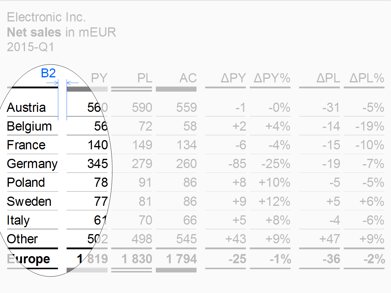
Row header columns contain the header texts of the rows. Often, these columns are positioned at the very left of a table. In most cases, row header columns are much wider than other column types.
Keep the texts of the row headers short by using abbreviations or footnotes in order to omit too wide tables.
Use a wider gap (see width B2 in the figure) to separate the row header column from columns with numbers.
Scenario columns
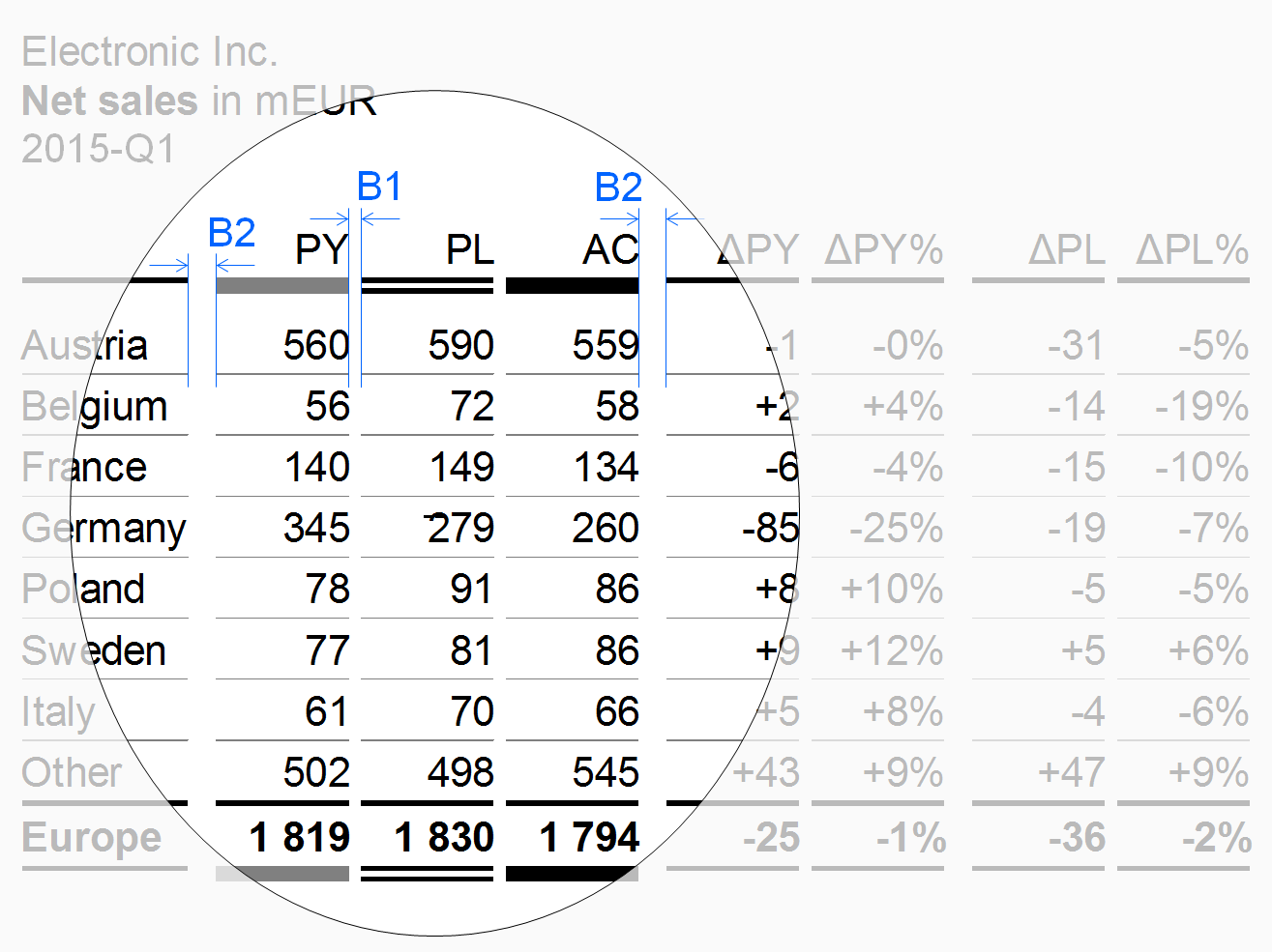
Scenario columns show data for scenarios (e.g. previous year, plan, actual). Use the same width for all scenario columns (depending on the number of digits).
For the sequence of scenario columns see UN 4.1 “Unify scenario analyses”.
Variance columns
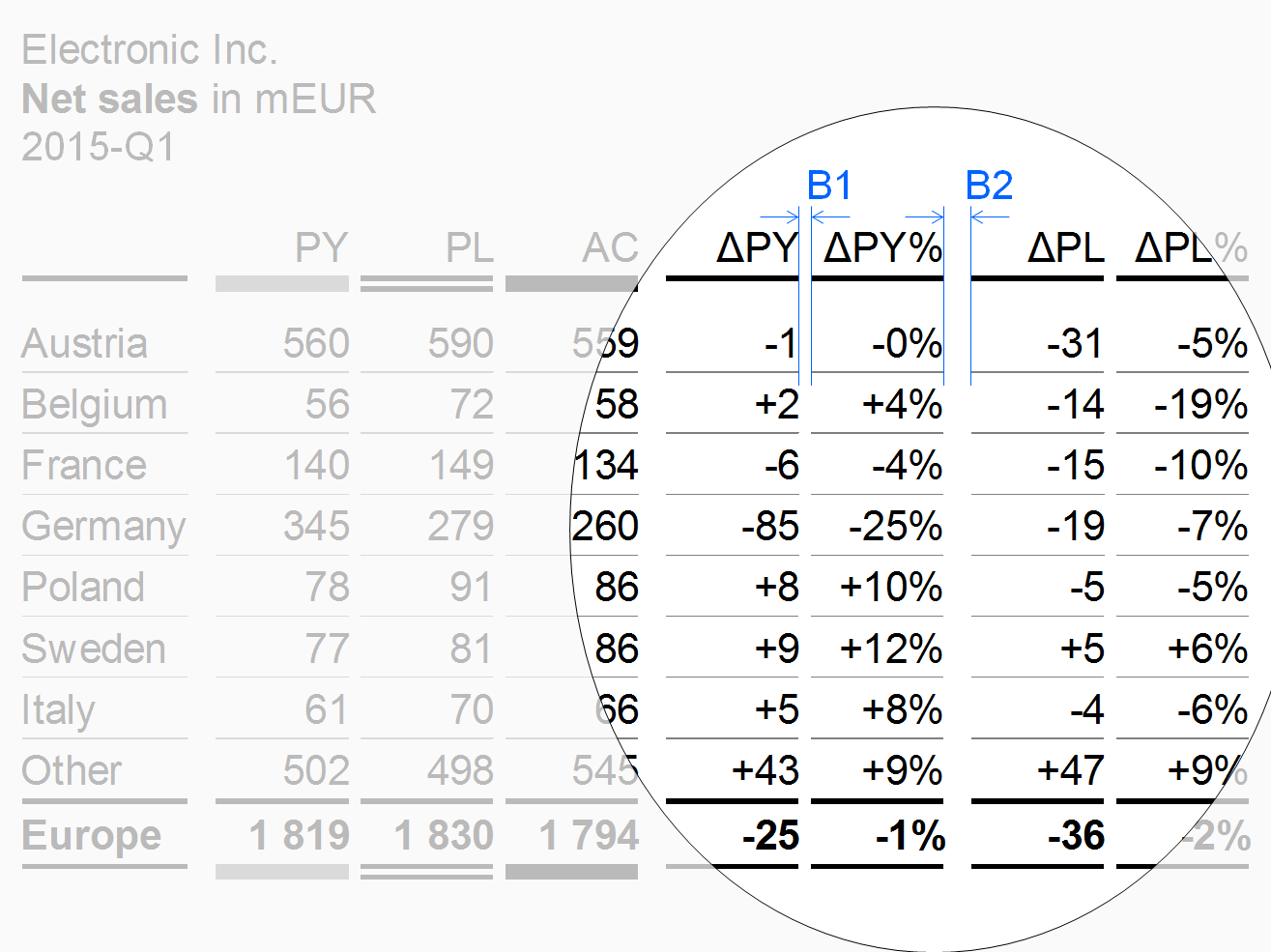
Variance columns show data of absolute variances (e.g. ΔPL, ΔPY) or relative variances (e.g. ΔPL%, ΔPY%).
Time columns
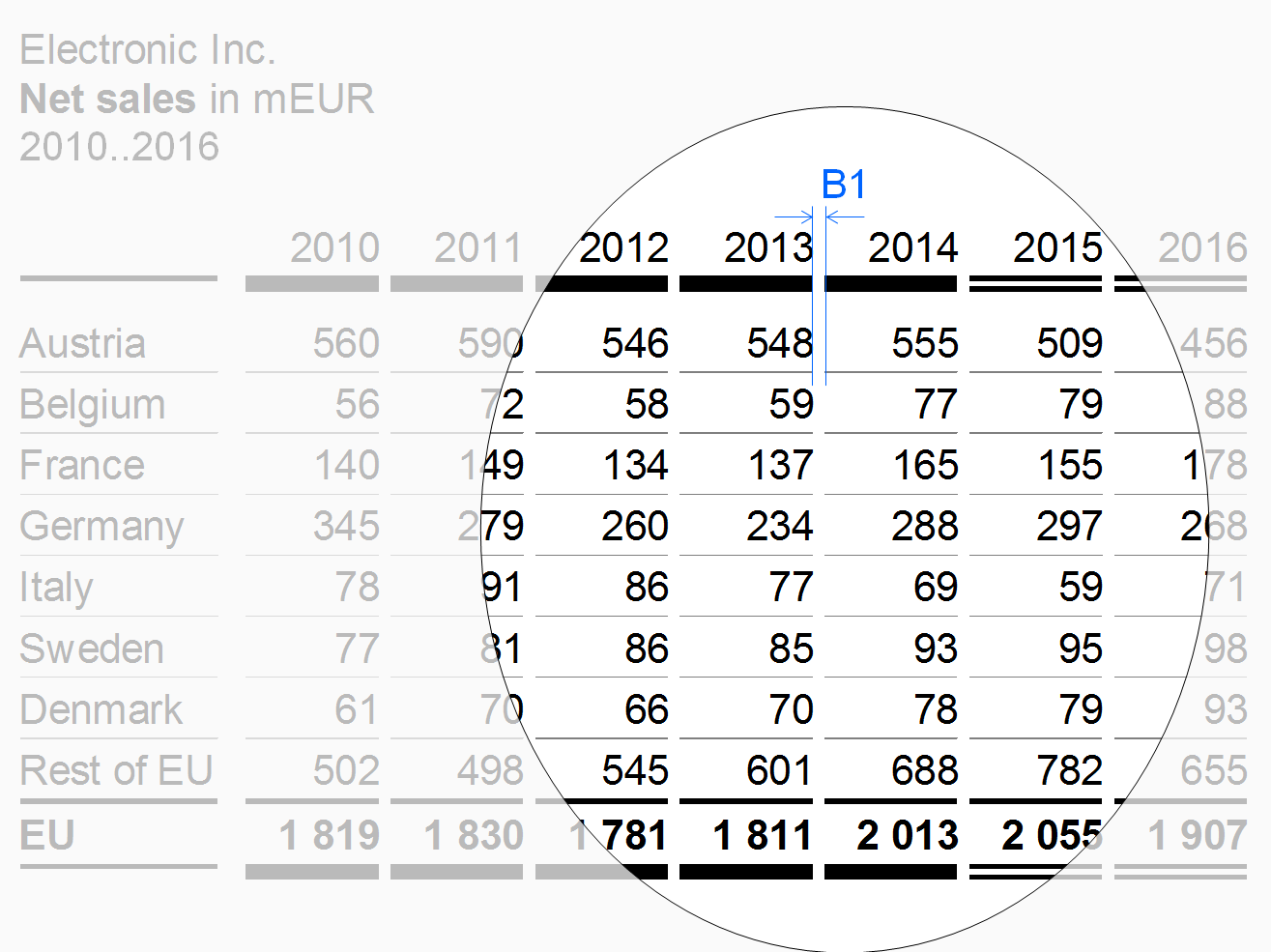
Time columns show time periods (for flow measures) or points of time (for stock measures).
Use a temporal order – from left to right – for the sequence of the time columns (e.g. Jan, Feb, Mar, or 2013, 2014, 2015).
Measure columns
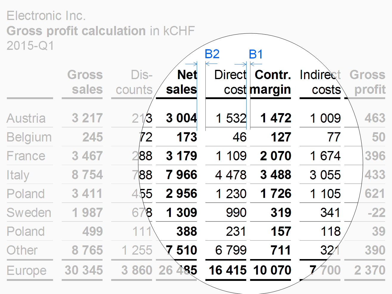
Measure columns show measures such as sales, headcount, or equity.
Displaying long measure names in column headers can be challenging. As the column width should not depend on the length of the measure name, use the abbreviations defined in the glossary instead.
Use a wider gap after intermediate results to expose the calculation scheme (see width B2 in the figure on the left).
Structure columns
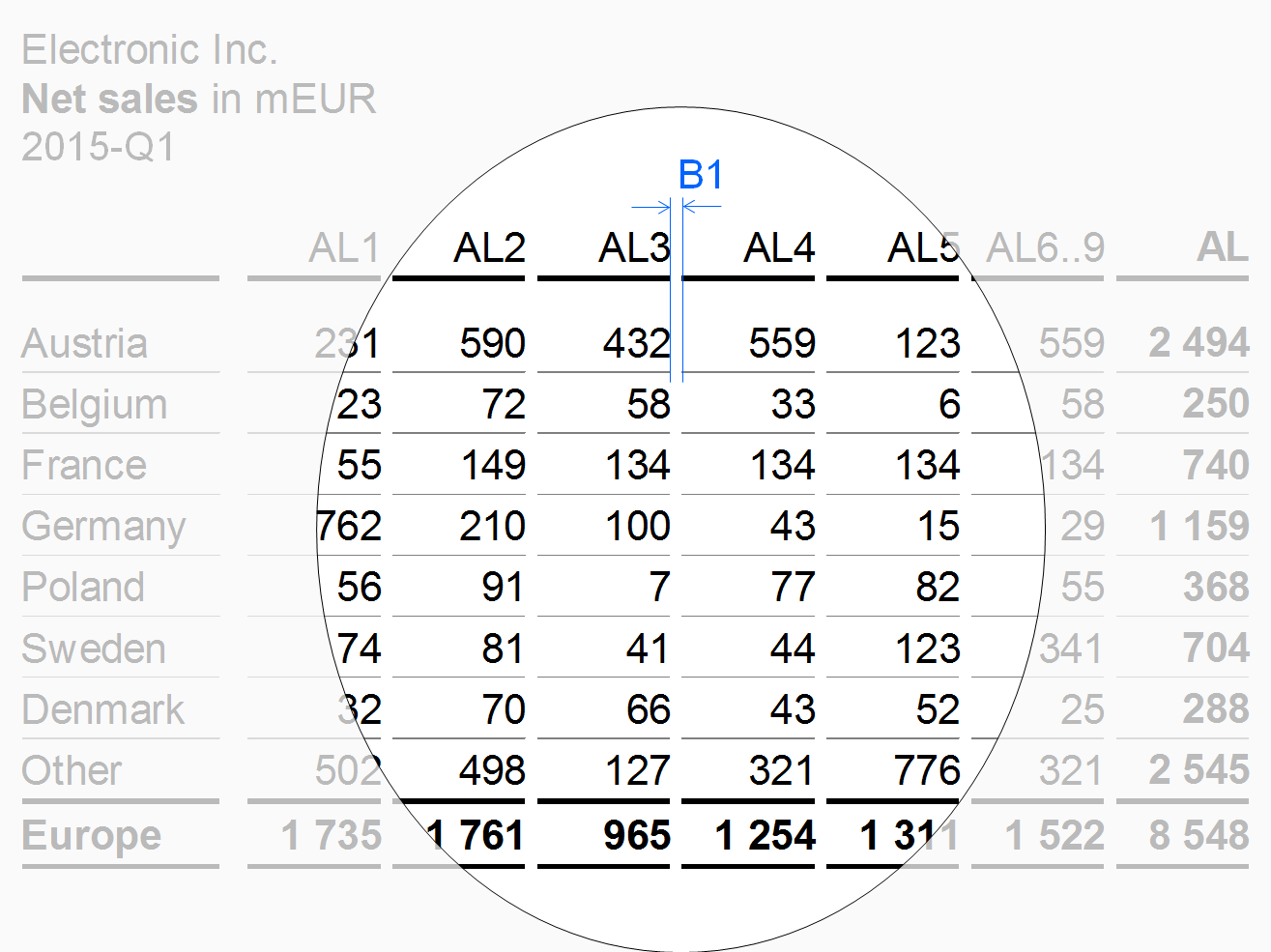
Structure columns show the elements of a structure dimension (e.g. countries or products).
“Thereof” columns
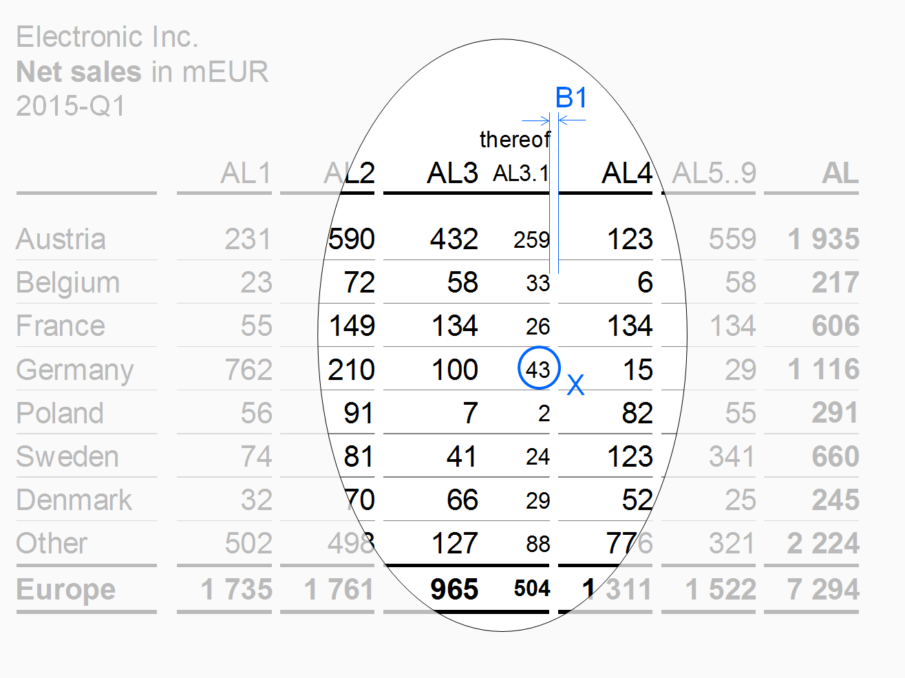
If details of an aggregated column are shown in one or more column not totaling to the aggregated column, these columns are called “thereof” columns.
The design of the thereof columns should differ from other columns. E.g. use a smaller font (see X in the figure) to expose a thereof column and do not separate it from the mother column (see columns AL3 and AL3.1 in the figure) in order to show that it is part of it. A thereof column is positioned at the right hand side of the mother column.
Remainder columns
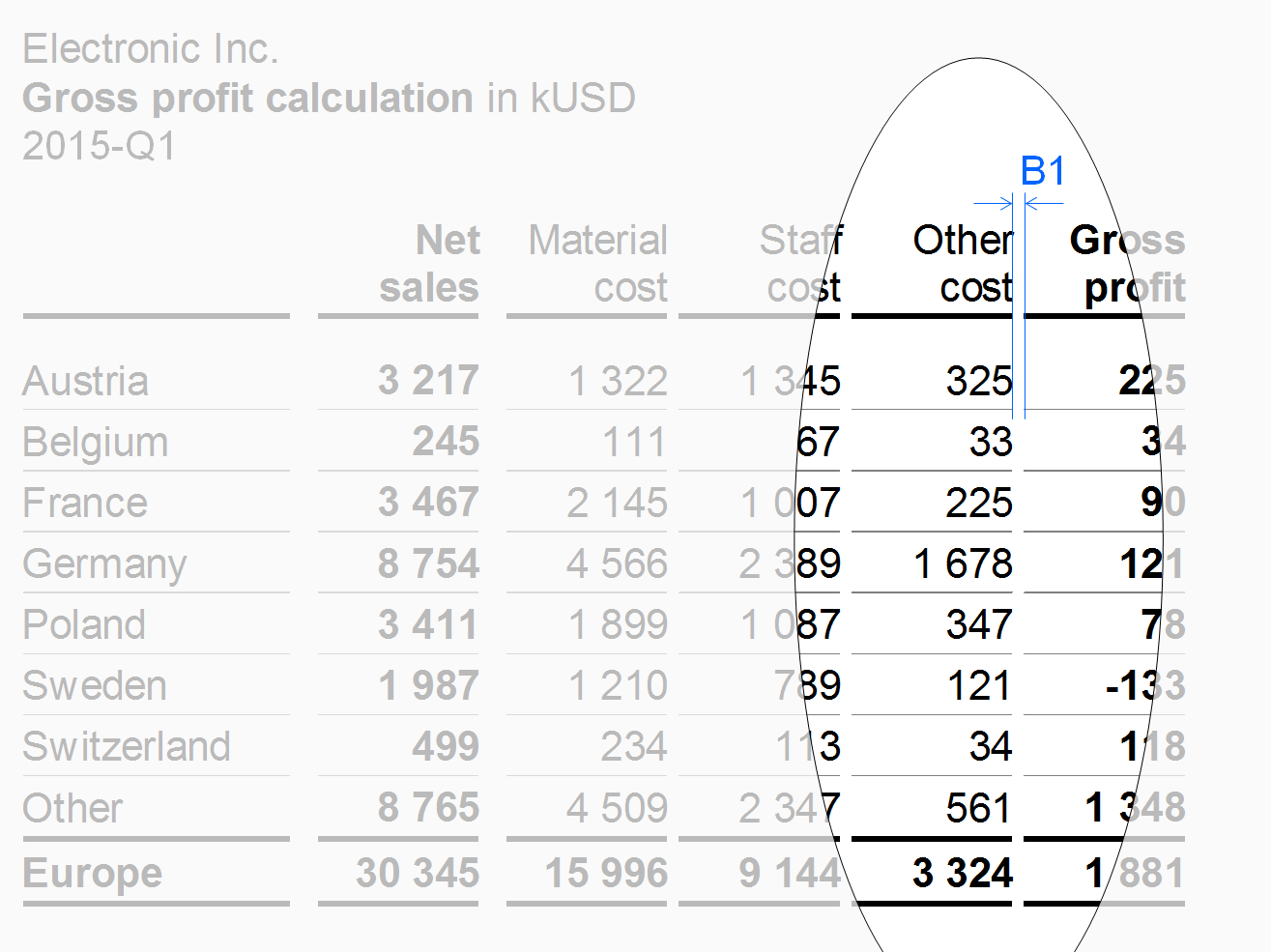
If the set to be presented in the columns has too many elements, accumulate the less important or smaller elements in a remainder column (e.g. 10 columns for the top 10 countries and a remainder column titled“Rest of world” or “RoW”).
In the figure, the remainder column “Other cost” has the same vertical gaps B1 as the other measure columns.
“Percent of” columns
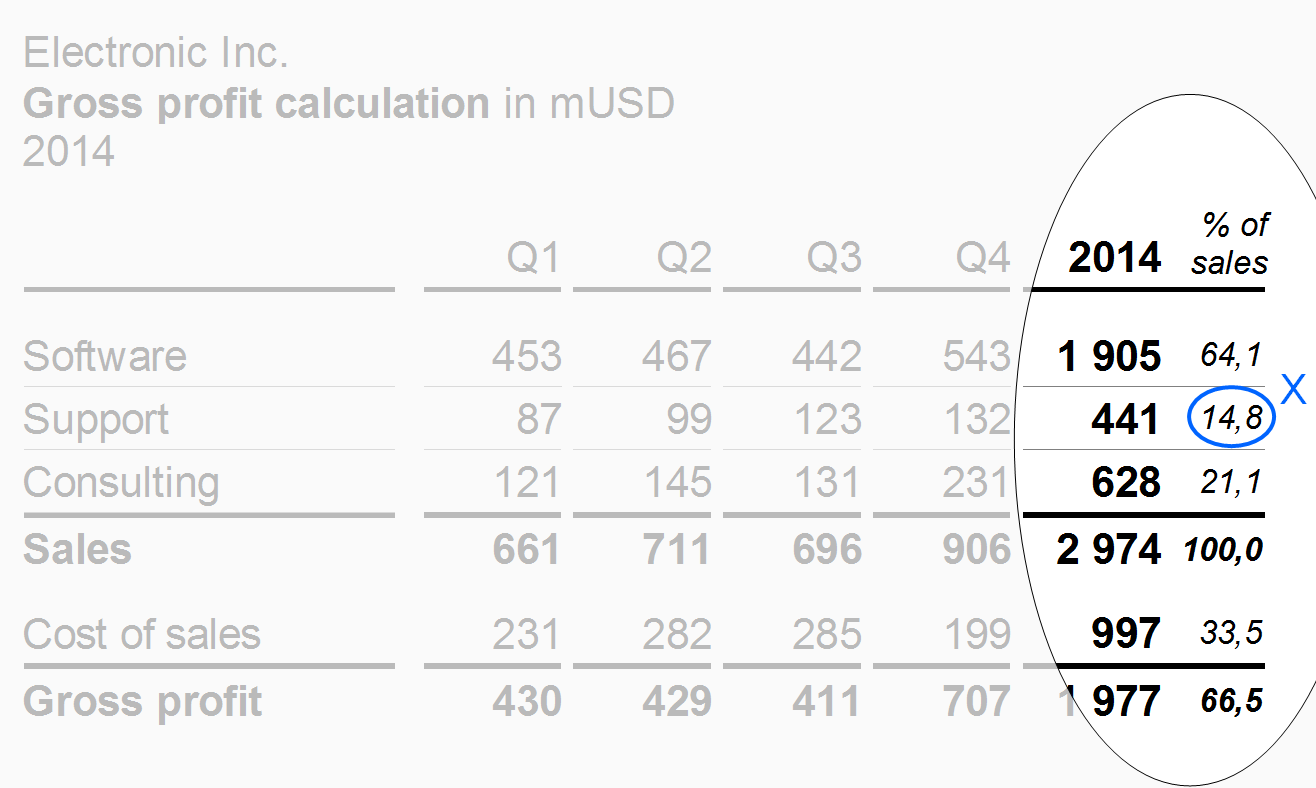
Use “Percent of” columns to present important data of another column as shares of a given total. A typical example for a “percent of” column is data of a profit and loss statement as a percentage of sales.
“Percent of” columns have a smaller font size (see X) than the other columns.
Totals columns
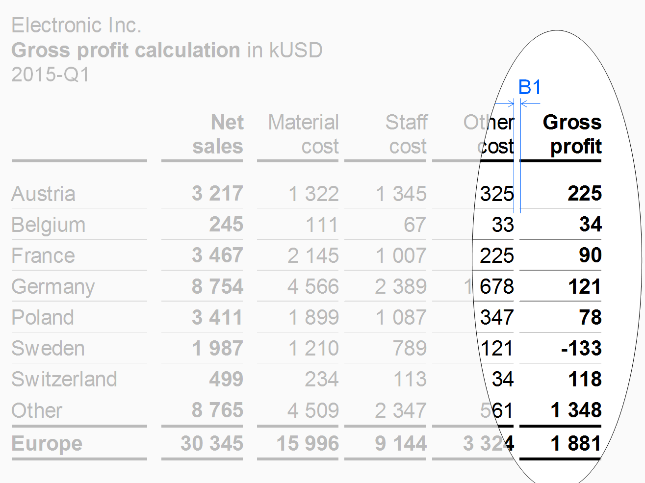
Position columns displaying totals of a group of columns (e.g. quarters totaling in years or products totaling in product groups) at the right hand side of the columns belonging to this group. The design of the totals columns should differ from other columns, e.g. highlighted by bold fonts or by light gray background.
The column types described before refer to single columns. The following paragraphs present combined columns i.e. hierarchical and nested columns.
Hierarchical columns
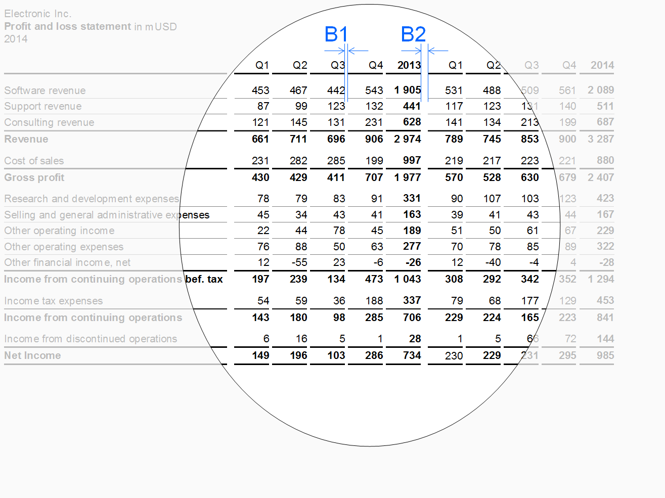
Hierarchies in dimensions may call for columns showing multiple levels. If possible, the sibling elements belonging to the same parent element of a dimension should be homogenous, mutually exclusive, and collectively exhaustive.
Separate parents by appropriate means, e.g. wider gaps. Display the parent columns at the right hand side of their child columns (like totals columns).
In the figure, a wider gap B2 separates the two years (with four quarters each) from each other.
Nested columns
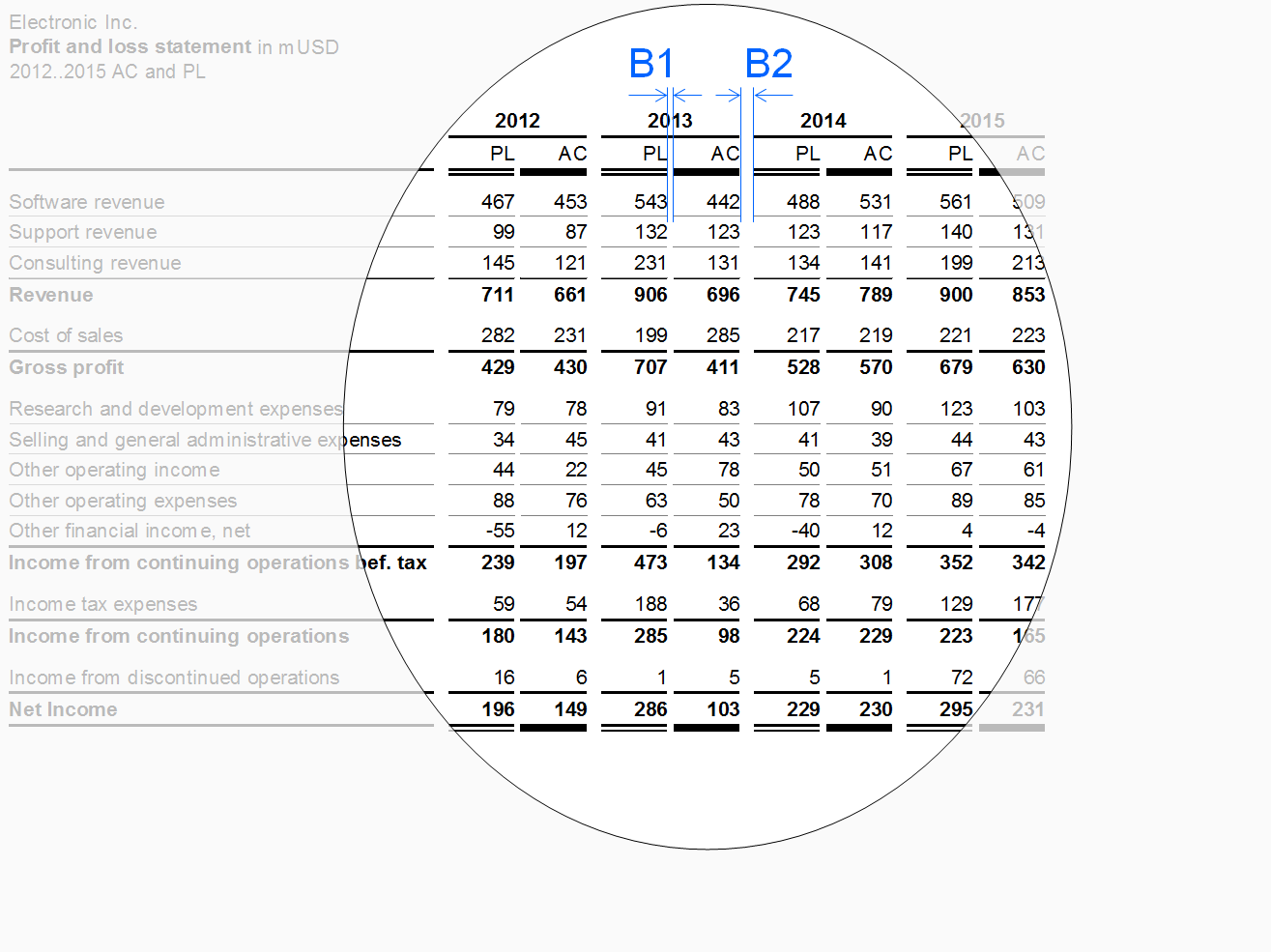
In nested columns, two column types are combined in such a way that the columns of one type repeat iteratively within every column of the other type. Separate the resulting groups of columns by appropriate means, e.g. wider gaps.
In the figure, wider gaps B2 separate the four years (with AC and PL data each) from each other.
Row types
Row types are rows with similar content falling under similar row headers. Typical row types are measure rows (e.g. sales, cost, profit) or structure rows (e.g. Italy, France, UK).
The following layout principles apply to all row types:
Height: Rows belonging to a row type should have an identical height (see height A in the figure in section “measure rows” et seq.).
Horizontal lines: Separating rows by light horizontal lines will increase the legibility.
Additional layout principals depend on the row types described below.
Time periods and points of time, scenarios, and variances should be displayed in columns rather than in rows.
Column header rows
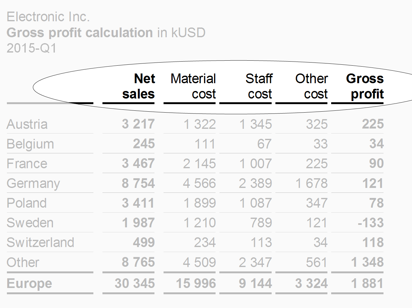
Column header rows contain the header texts of the columns. In most cases, these rows are positioned at the very top of a table. In order to group columns two and more column header rows might be necessary. If necessary, abbreviate column header texts in order to fit in the preferred column width. Alternatively keep column headers short by using footnotes.
In the figure the column header row uses two lines in order to fit the column header texts in the narrow columns.
Measure rows
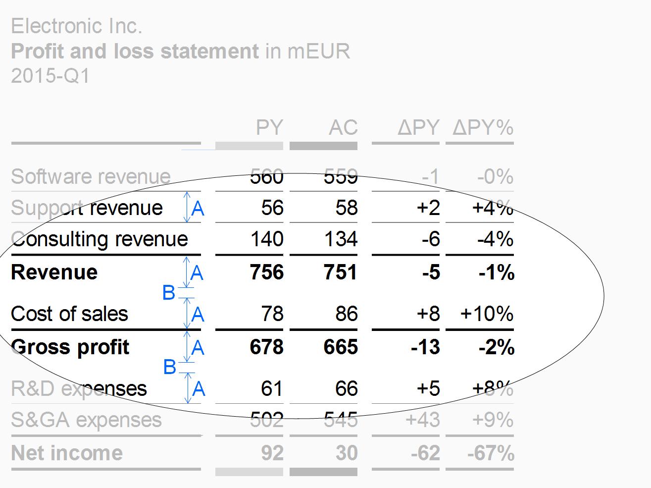
Measure rows show measures such as sales, headcount, or equity.
Separate rows showing final or intermediate results of a calculation scheme (results rowsor totals rows) by solid lines. Display results rows in bold font or highlight them with light gray background. An additional gap B below a results row will increase legibility.
Structure rows
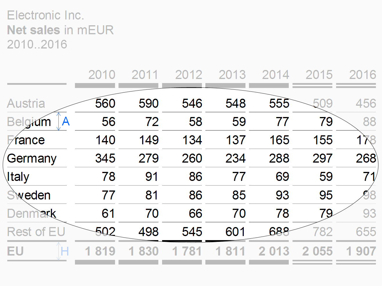
Structure rows show elements of a structure dimension (e.g. countries or products).
“Thereof” rows
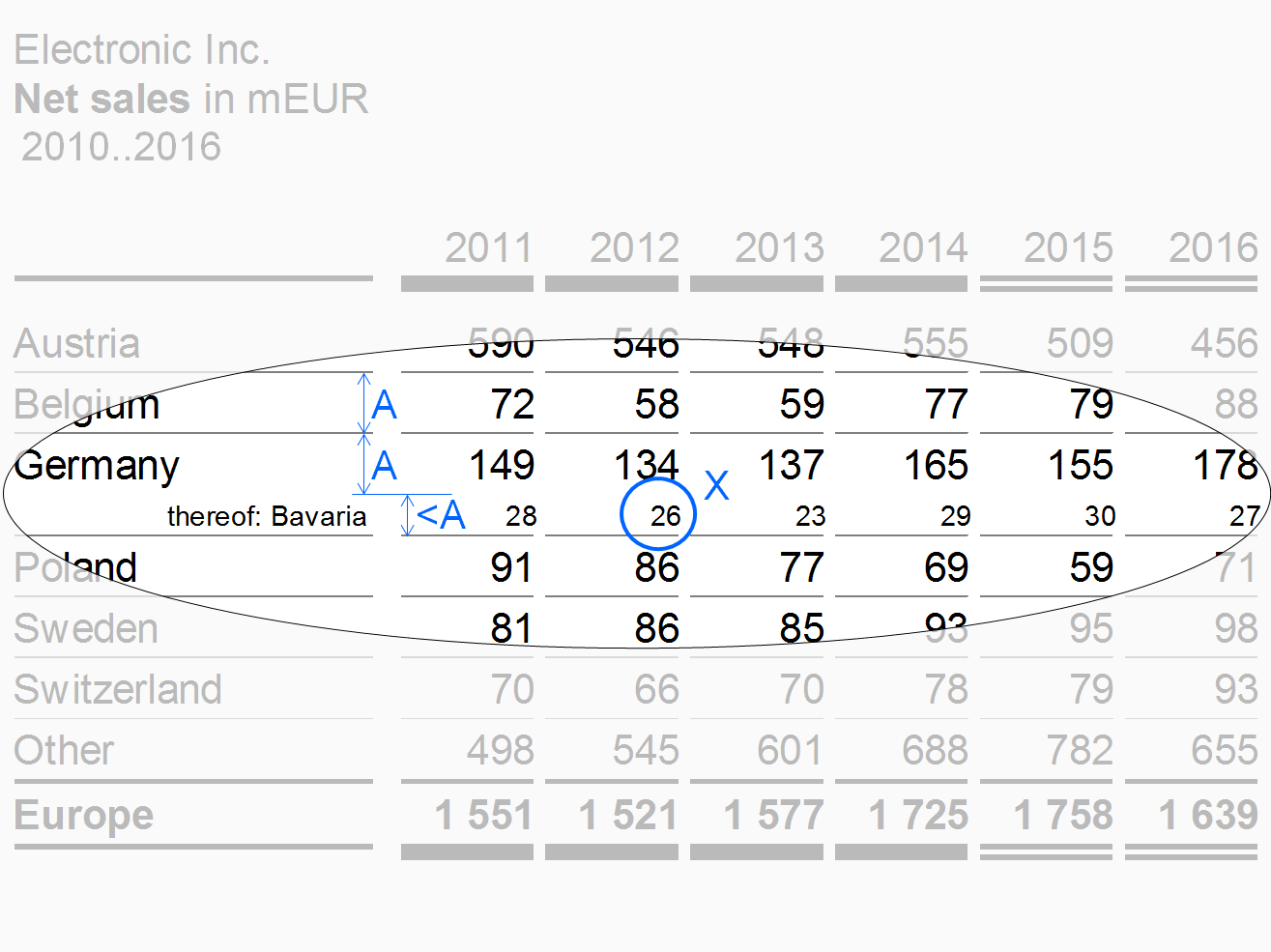
If details of an aggregated row are shown in one or more rows not totaling to the aggregated row, these rows are called “thereof” rows. Place the aggregated above the “thereof” rows (in contrast to the totals row positioned below the rows of its group).
The design of the thereof rows should differ from other rows. E.g. in the figure, the thereof row is of smaller height, written in a smaller font (see X), not separated by a horizontal line, and has a right-aligned row header.
Remainder rows
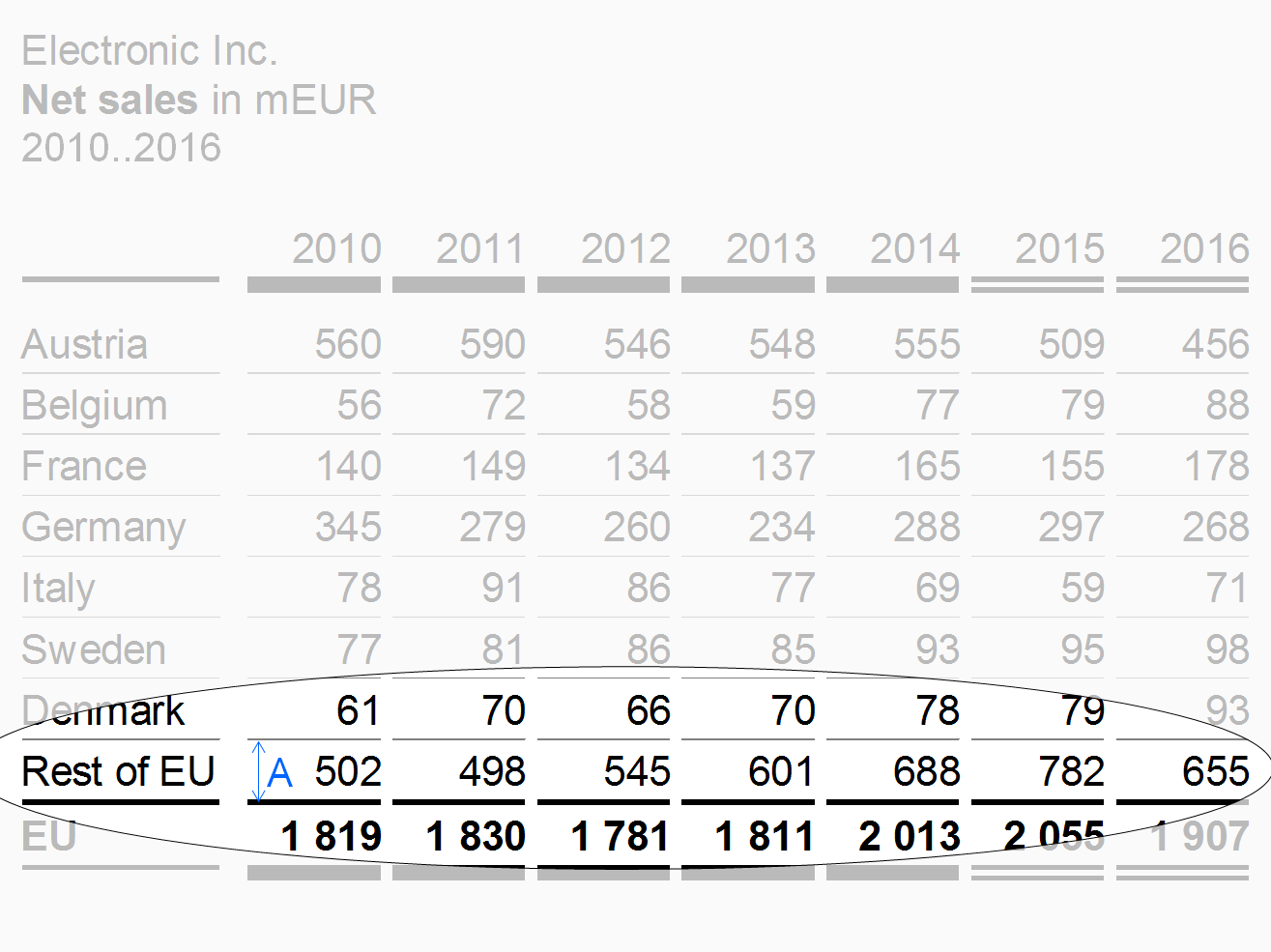
If the structure dimension to be presented in the rows outline has too many elements, accumulate the less important or smaller elements in a remainder row (e.g. 7 rows for the top 7 countries and a remainder titled “Rest of world”).
Exclude remainder rows from some of the Structure analyses such as averaging, ranking, and selecting.
In the figure, the remainder row has the same row height A as the other structure rows of this table example.
“Percent of” rows
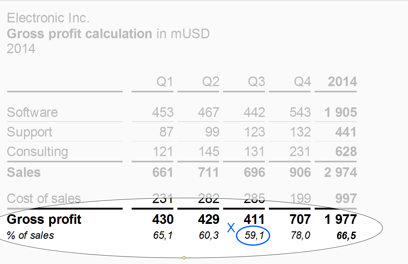
Use “Percent of” rows to present important data of another row as shares of a given total. A typical example for a “percent of” row is gross profit as a percentage of sales.
“Percent of” rows have a smaller font size (see X) than the other rows.
Totals rows
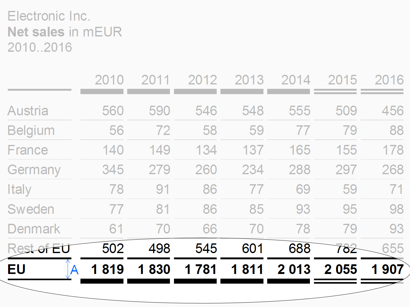
Place rows displaying totals of a group of rows (e.g. countries totaling in regions or products totaling in product groups) below the rows of this group and separated them by solid lines.
The design of the totals rows should differ from other rows, e.g. highlighted by bold fonts or by light gray background.
The row types described before refer to single rows. The following paragraphs present combined rows i.e. hierarchical and nested rows.
Hierarchical rows
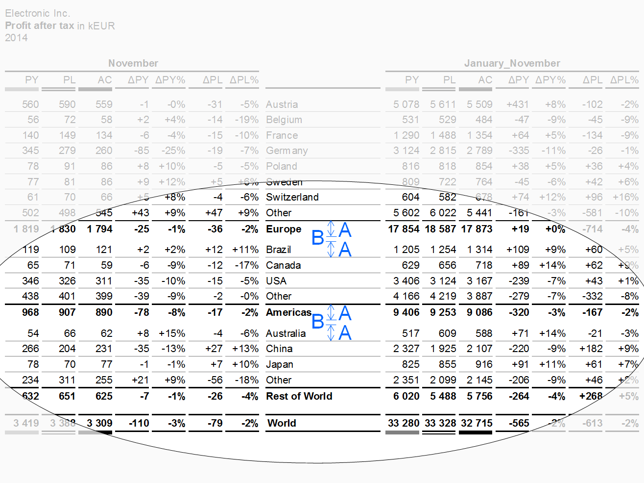
Hierarchies in dimensions may call for rows showing multiple levels. If possible, the sibling elements belonging to the same parent element of a dimension should be homogenous, mutually exclusive, and collectively exhaustive.
Separate parents by appropriate means, e.g. wider gaps (see additional gap B in the figure). Display the parent rows below their child rows (like totals rows).
Nested rows
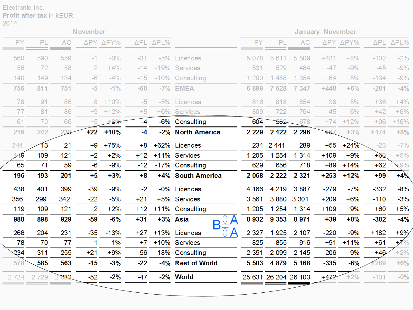
In nested rows, two types of rows are combined in such a way that the rows of one type repeat iteratively within every row of the other row type.
Separate the resulting groups of rows by appropriate means, e.g. wider gaps (see additional gap B in the figure).
Table types
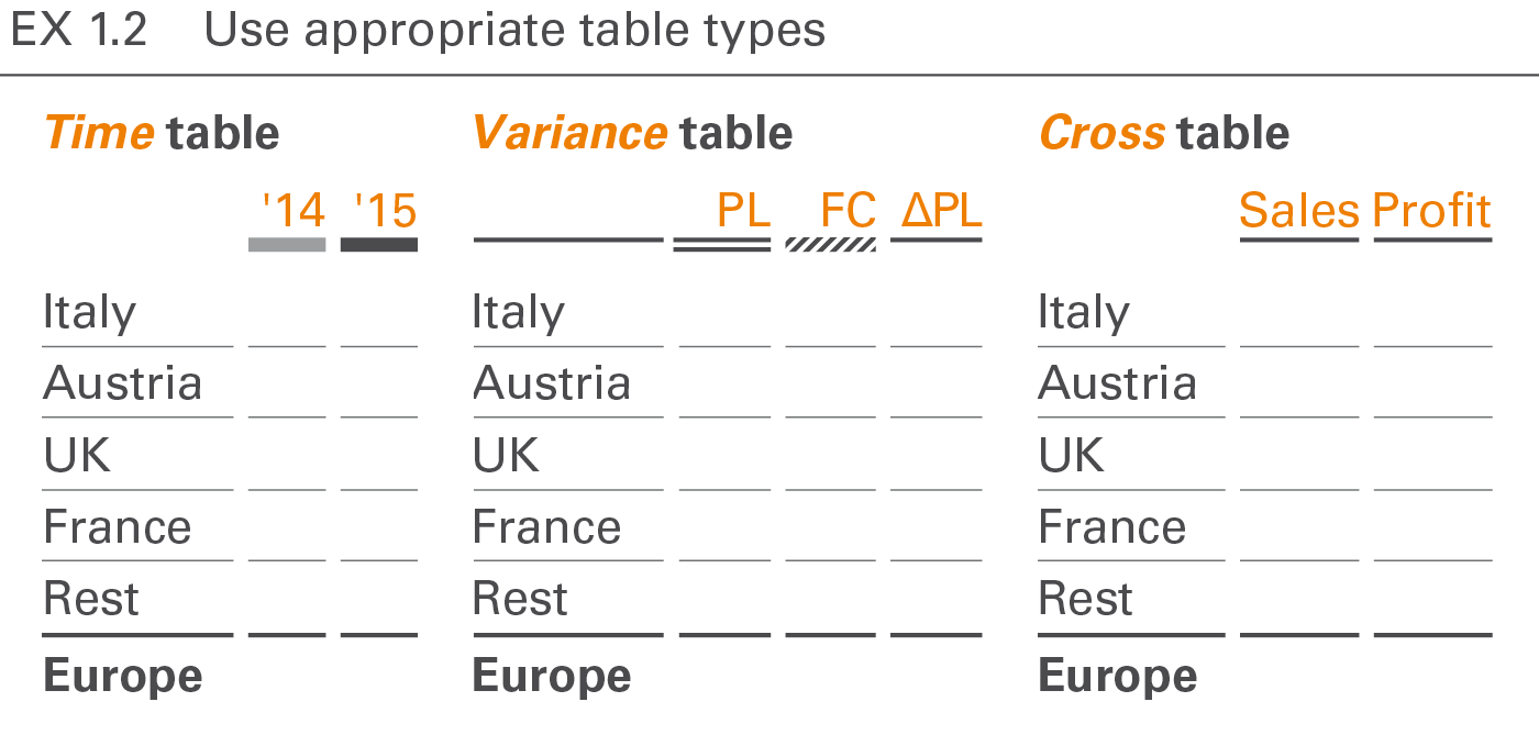
Table types are distinguished by their analytic purpose in time series tables, variance tables and cross tables. Tables serving more than one analytic purpose are called combined tables.
Time series tables
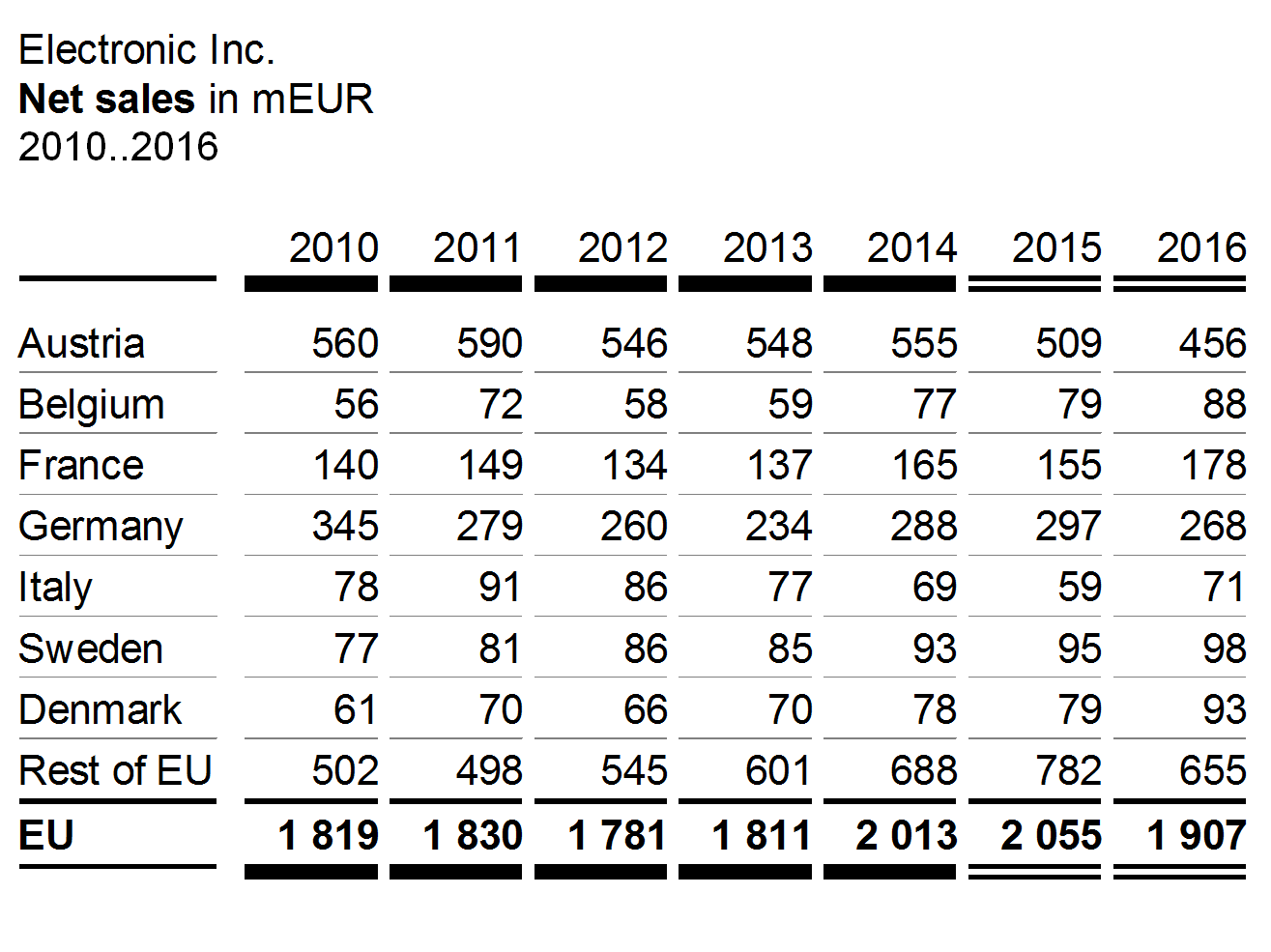
Time series tables are used for time series analyses, combining time columns with measure rows or structure rows.
A typical example for a time series table is a sales analysis by countries (rows) and years (columns).
Variance tables
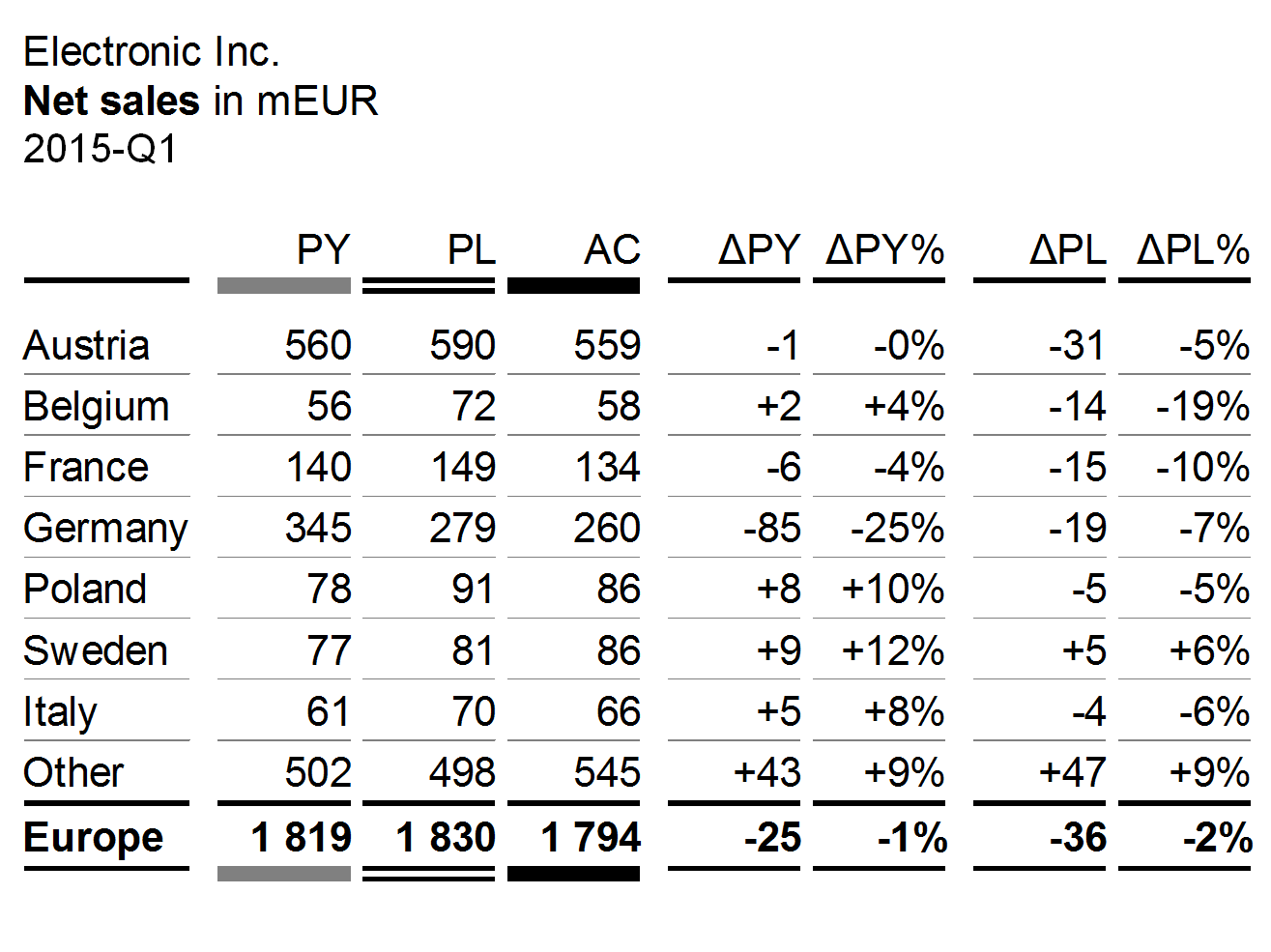
Variance tables are used for scenario analyses, combining scenario columns and variance columns with measure rows or structure rows.
A typical example for a variance table is a sales analysis by countries (rows) showing different scenarios and different variances (columns).
Cross tables
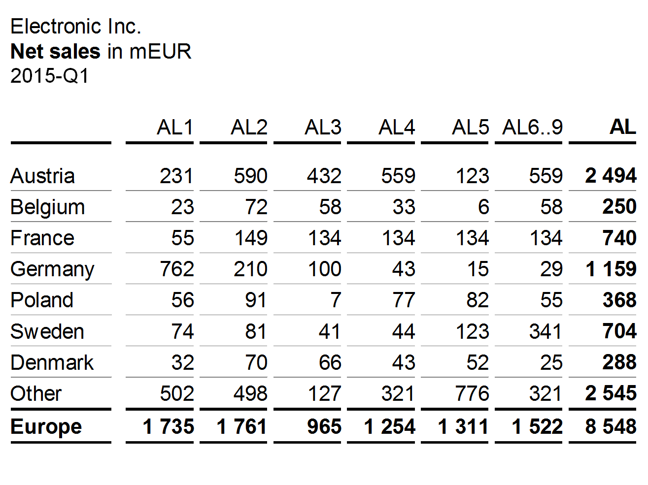
Cross tables are used for Structure analyses, combining structure columns with structure rows.
A typical example of a cross table is a sales table with countries in rows and products in columns.
Combined tables
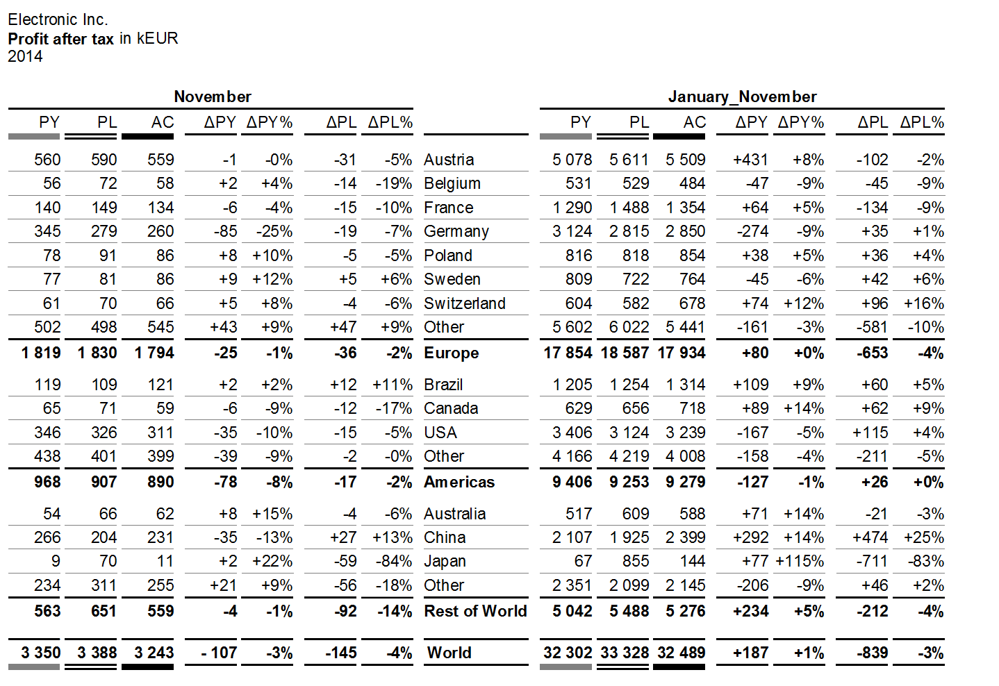
Combined tables are used for multiple analyses. A combined table uses more than one column type and/or more than one row type presented either side by side or nested.
The first figure shows a hierarchical structure of countries on three levels in the rows. The columns are nested: scenarios and variances are the same for both time periods November and January_November.
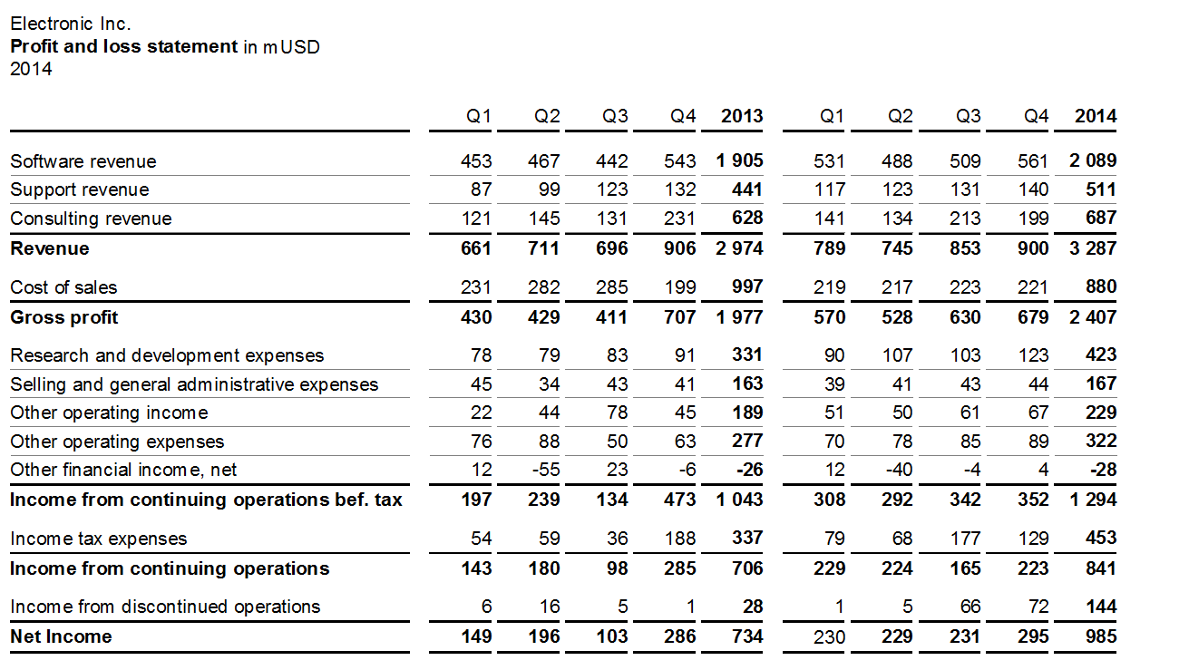
The second figure shows the measures of a calculation scheme in the rows. The columns are nested: The four quarters and the annual total are the same for both years.
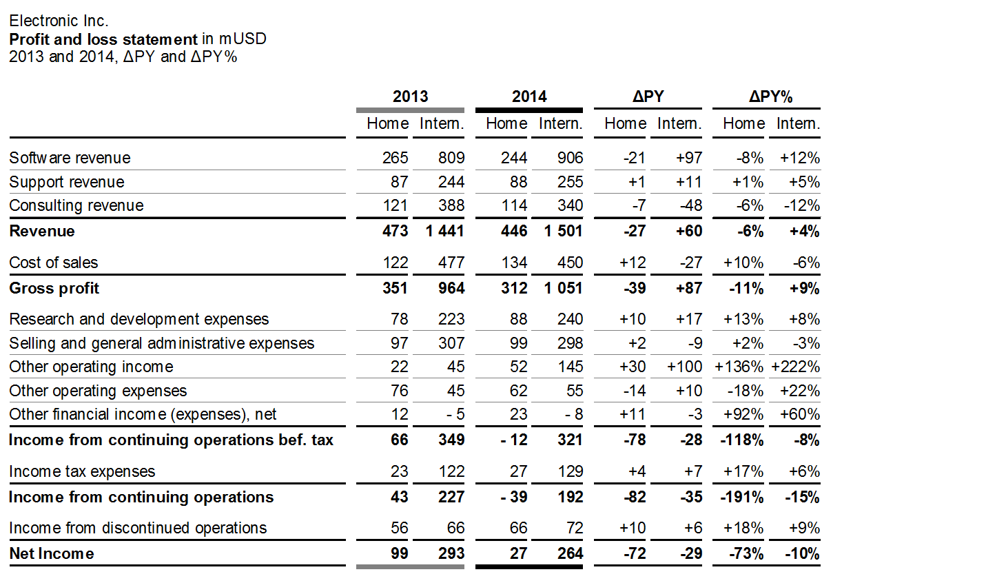
The third figure shows the same rows as the second one (measures of a calculation scheme). The nested columns now show PY and AC data as well as absolute and relative variances for two markets.
Inappropriate charts make it hard to perceive the message. Knowing the correct usage of chart types helps in replacing inappropriate visualizations, such as pie charts, speedometer visualizations, radar charts, and spaghetti charts, with those chart types better suited.
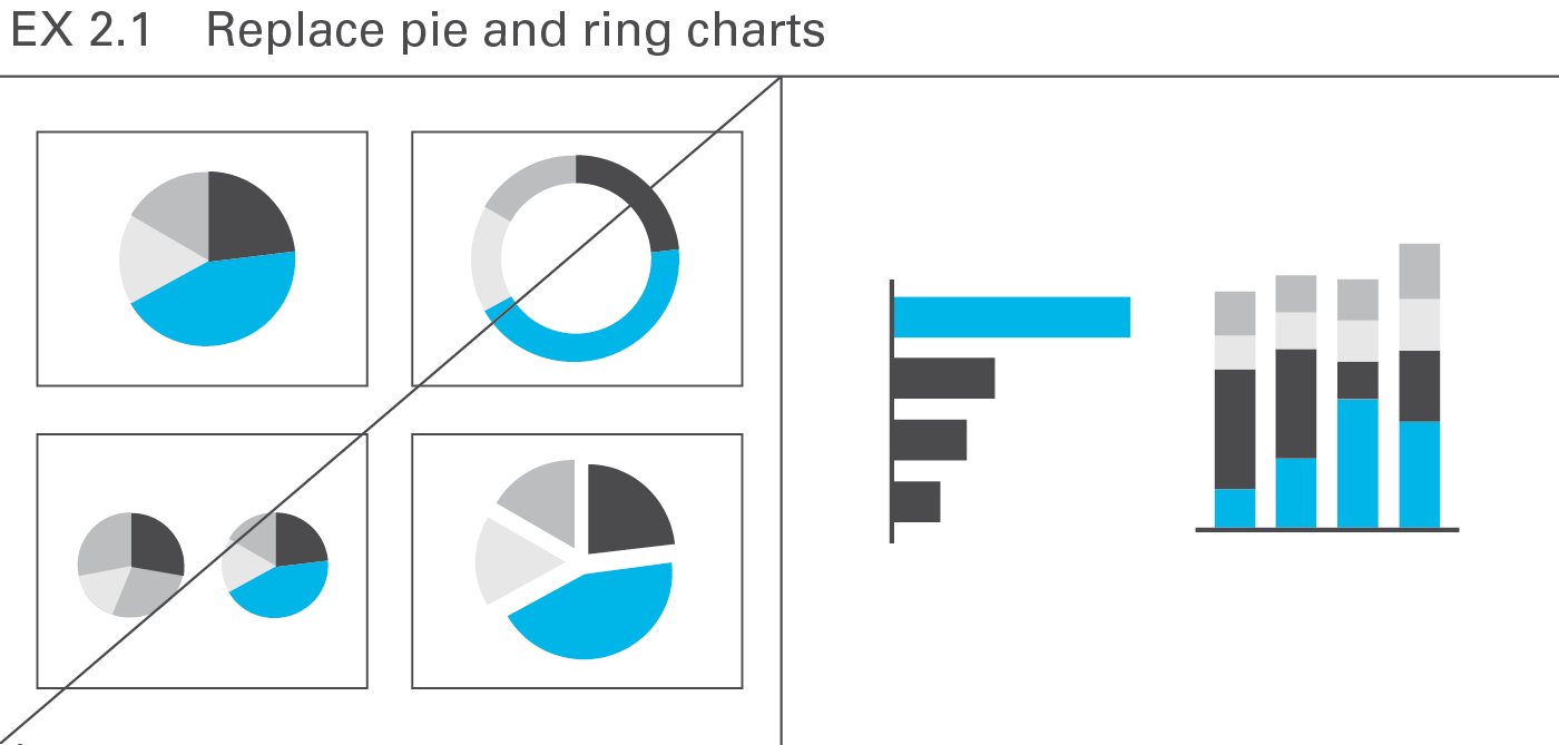
Pie and ring charts arecircular charts dividing some total intosectors of relative proportion, but there are better ways to illustrate the numericalproportions of segments, e.g. bar charts or charts with stacked columns, see Figure EX 2.1.
Pie charts allow for one-dimensional analyses only, and therefore seldom convey revealing insights. However, some useful applications for pie charts exist, for example when market sizes and/or market shares for one period need to be allocated to certain regions on a map (see CH 3.3 “Avoid misleading colored areas in maps”). As opposed to column or bar charts, pie charts can be positioned on a specific point on a map.
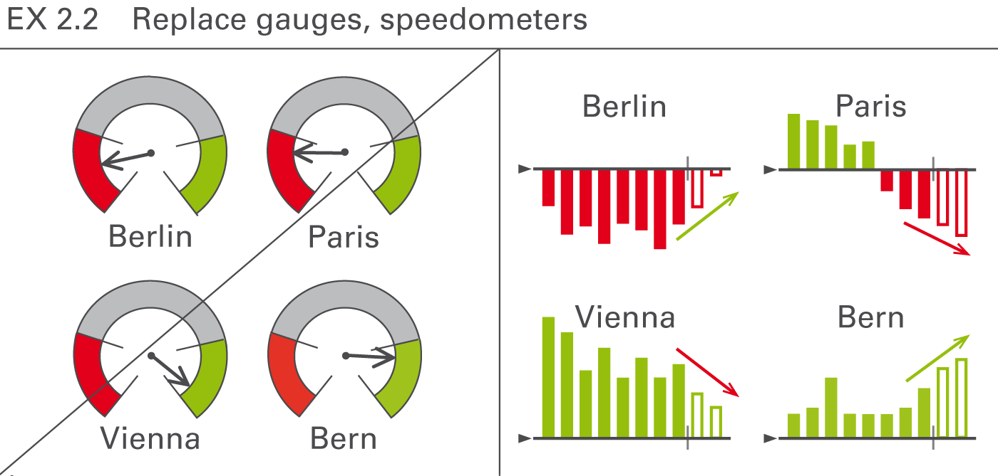
Often found as part of a so-called dashboard, speedometers are probably one of the most useless visualizations out there. They take up way too much space and have often confusing color coding and scaling. In general, bar charts showing the respective structures or columns charts showing the respective development over time are better choices, see Figure EX 2.2.
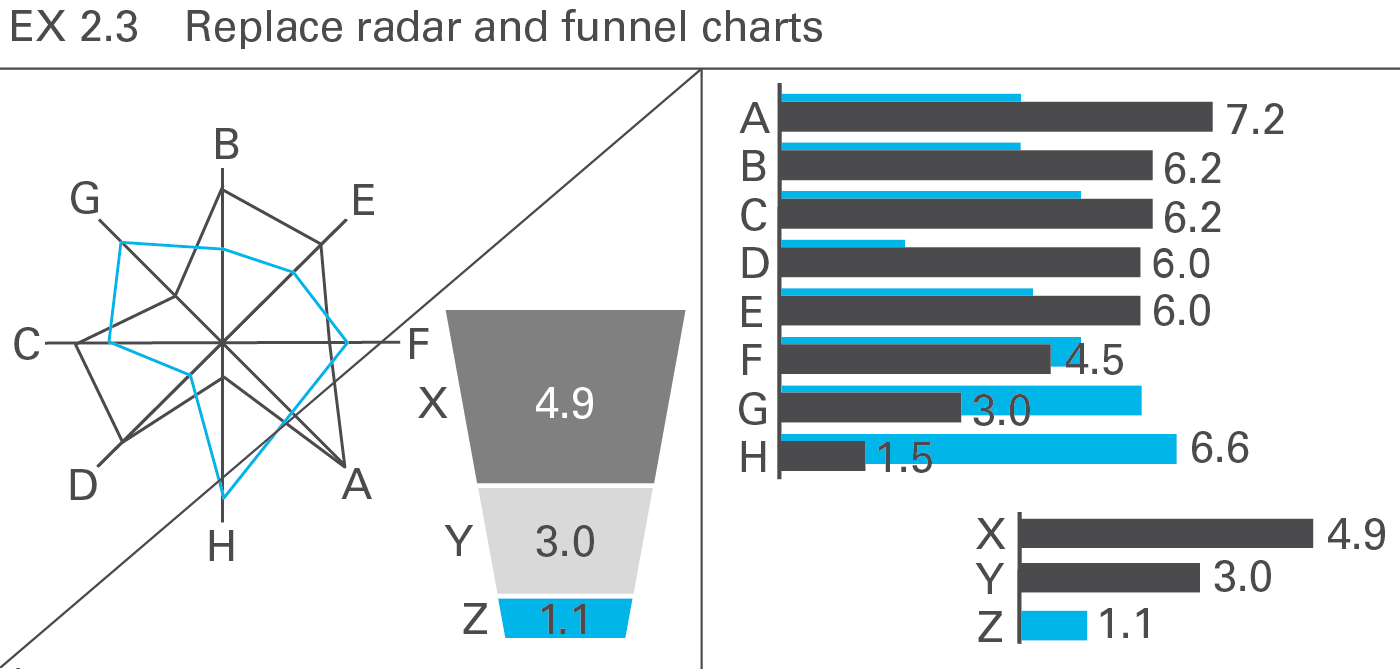
So-called radar charts (also called net charts or spider charts) are frequently used for evaluating purposes. Having no advantage over bar charts and having, actually, many weaknesses, use them only for two-dimensional analyses (e.g. comparing young-old with rich-poor). Willard C. Brinton wrote almost 100 years ago: “This type of chart should be banished to the scrap heap. Charts on rectangular ruling are easier to draw and easier to understand.”
Of course, if the circular arrangement has meaning (such as the compass direction), this kind of chart can be very valuable, but these types of analysis are not typical in business reporting.
Funnel charts are misleading when the size of the area displayed does not correspond to the respective numerical values – an issue applying also to other artificial chart forms (e.g. spheres) in which the length, area, or volume do not correspond to the numerical values.
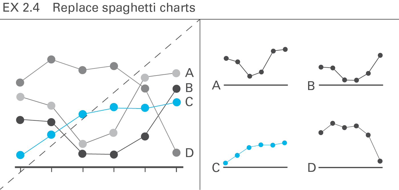
A chart with more than three or four intersecting lines (“spaghetti chart”) can be more confusing than several smaller charts with one line each placed next to one another (small multiples), particularly when evaluating the shape or the trend of the lines, see Figure EX 2.4.
However, when needing to compare exactly the height of data points of several lines, spaghetti charts cannot be avoided.
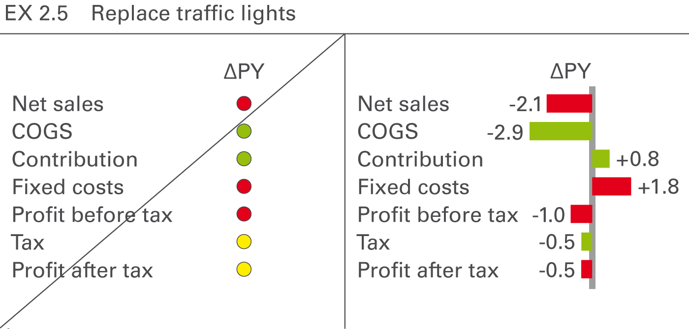
“Traffic lights” with green, red, and yellow areas are a popular form of visualization but contain little information per area used. However, they can be used for analyses showing “yes or no” decisions or situations similar to real traffic lights. In all other cases replace them with more suitable means of (analog) representation such as bar charts, see Figure EX 2.5.
From a perceptual perspective, avoid all visual representations requiring time consuming analyses or additional explanations, particularly the popular use of merely conceptual representations and all forms of texts, including bullet lists.
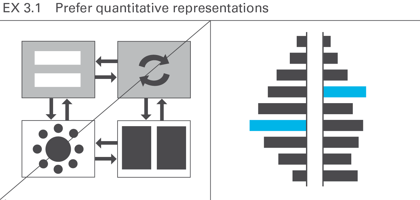
Due to the time constraints usually involved with presentations, conceptual graphs prove less suitable than charts, photos, maps, etc. For a one-hour presentation, do not use more than three or four conceptual representations. Do this only if they are absolutely essential for comprehension. The audience will understand charts and pictures (photos, drawings, etc.) better and faster, see Figure EX 3.1.
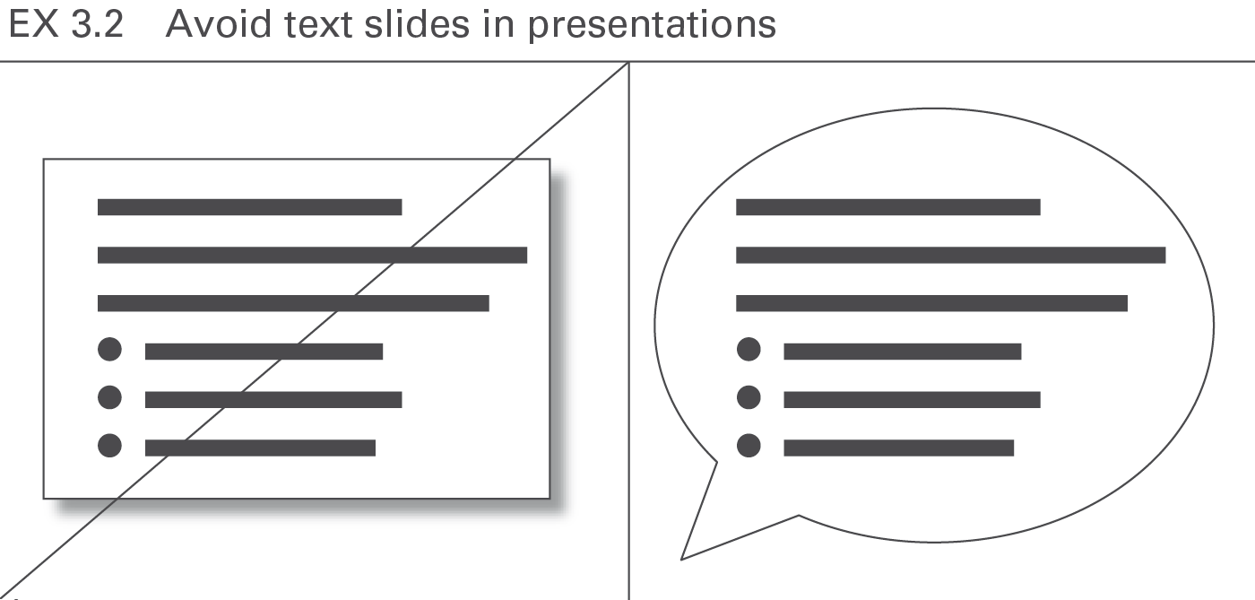
Avoid all forms of text slides in presentations. Texts should either be recited or written in a handout. A few exceptions to this rule are specific texts being discussed such as definitions, quotes, etc. In general, all forms of lists (bullet points) should appear only in the written handout, not projected on the screen. True, if someone sees and hears something simultaneously, he remembers it better than when he just hears it, but bear in mind texts are not considered something merely to be seen – they must be read and understood, see Figure EX 3.2.
Visual perception is strongly based on setting one perceived object in relation to another. Adding meaningful comparisons helps the eye evaluate faster, the main purpose of charts.
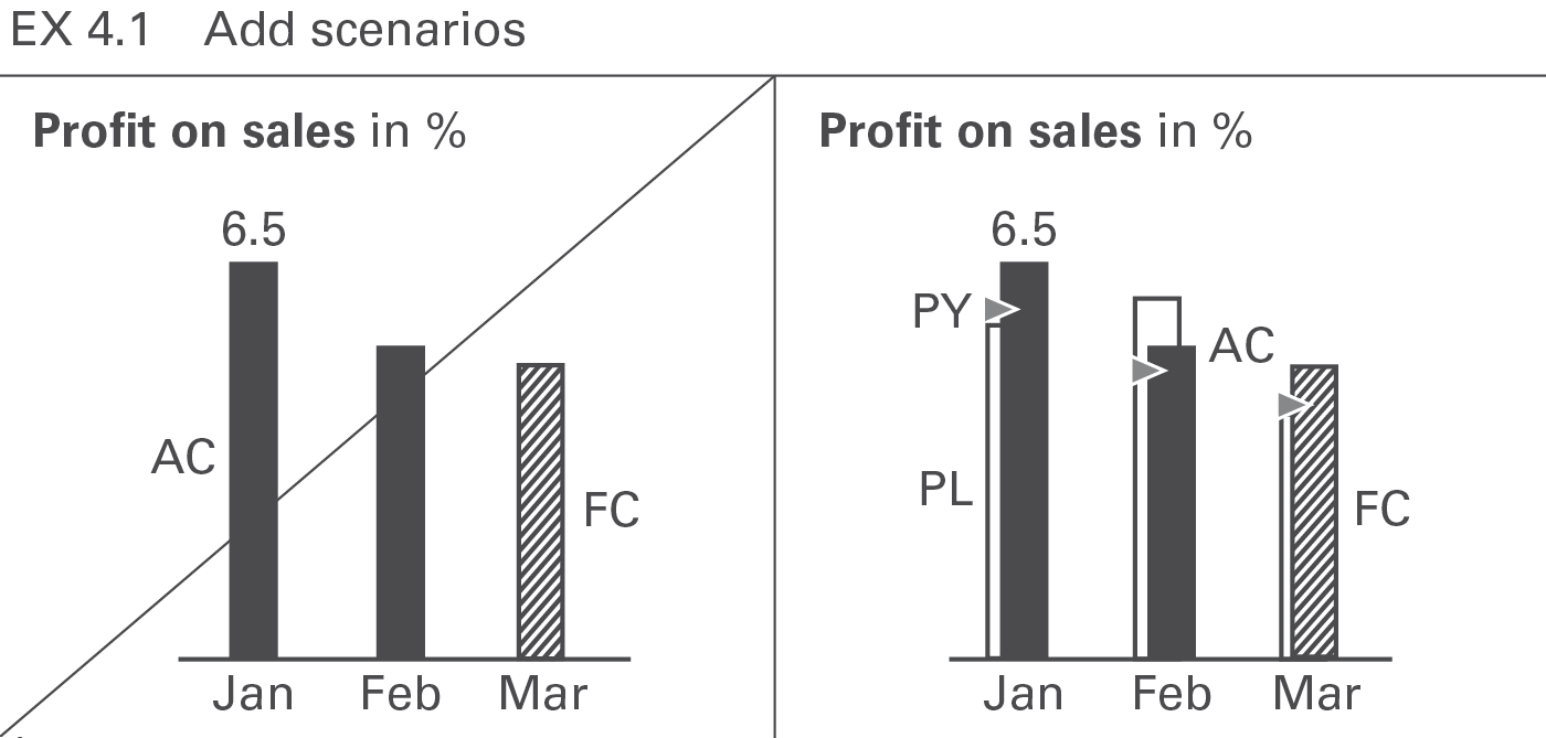
Scenarios such as “plan” and “previous year” are the most common references for comparison purposes. Add them whenever available. Use a standardized scenario notation for faster comprehension, see Figure EX 4.1.
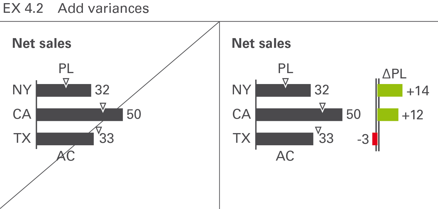
Having added scenarios for comparison purposes, the visualization of variances makes it easier to evaluate the situation. Use a standardized notation of variances for faster comprehension, see Figure EX 4.2.
Present data more understandable by showing interrelations, i.e. causes and dependencies. Seeing the entire context, especially extreme values and deviant values, helps to explain causes. Details increase not only the level of credibility but also comprehension. Use charts to prove, explain, and render something plausible, not to serve merely as decoration. This section focuses on the explanation of causes by using tree structures, clusters, and correlations. A more structured approach to increasing information density is discussed in the chapter “CONDENSE – Increase information density”.
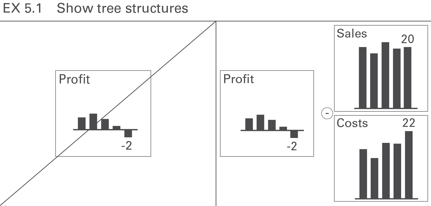
The presentation of the assumptions or basic data upon which a business analysis is based, results not only in better understanding, but also makes it more convincing. A good choice is the display of calculated measures in a tree structure, see Figure EX 5.1 (see also CO 5.2 “Show related charts on one page”).
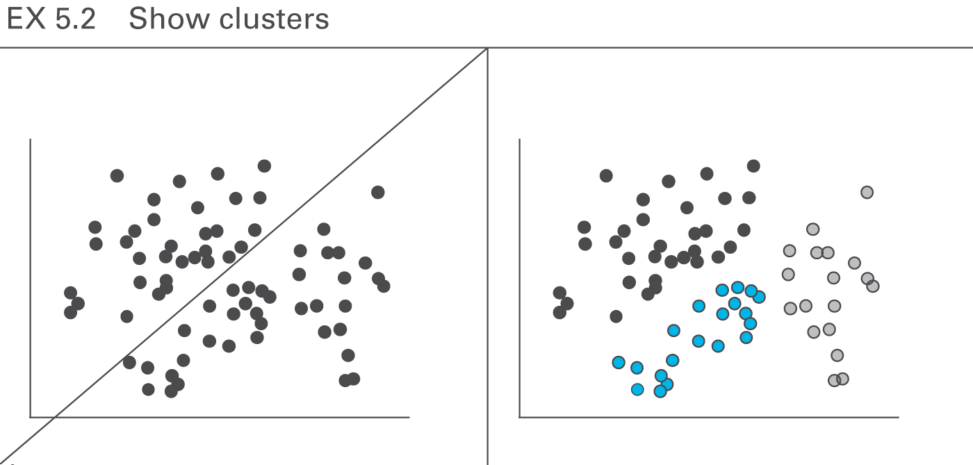
With the help of clusters in two-dimensional and three-dimensional forms, large amounts of data very often can provide interesting and new insights, see Figure EX 5.2.
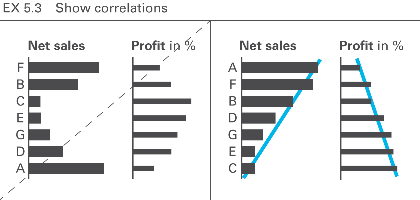
When comparing several data series, correlations are often sought in order to better understand the interrelations. Suitable rankings and comparisons can facilitate the understanding of patterns, see Figure EX 5.3.
SIMPLIFY covers all aspects of avoiding clutter in reports and presentations.
Avoiding clutter means that reports and presentations avoid all components and characteristics, which are too complicated, redundant, distracting or merely decorative.
This chapter covers avoiding unnecessary and decorative components and replacing them with cleaner layouts, avoiding redundancies and distracting details.
Completely avoid components, such as pictures, backgrounds, and logos, not contributing to the comprehension of a report or presentation.
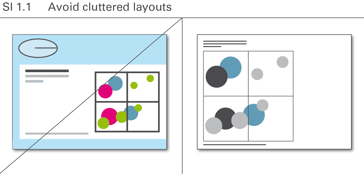
Layout concepts often contain elements that lack meaning but merely conform to corporate design or personal taste. Avoid all these elements, see Figure SI 1.1.
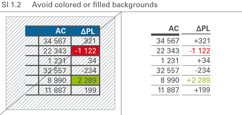
Numbers and labels are easiest to read when depicted in black on a white background. Any type of background color or pattern makes something harder to read, see Figure SI 1.2.
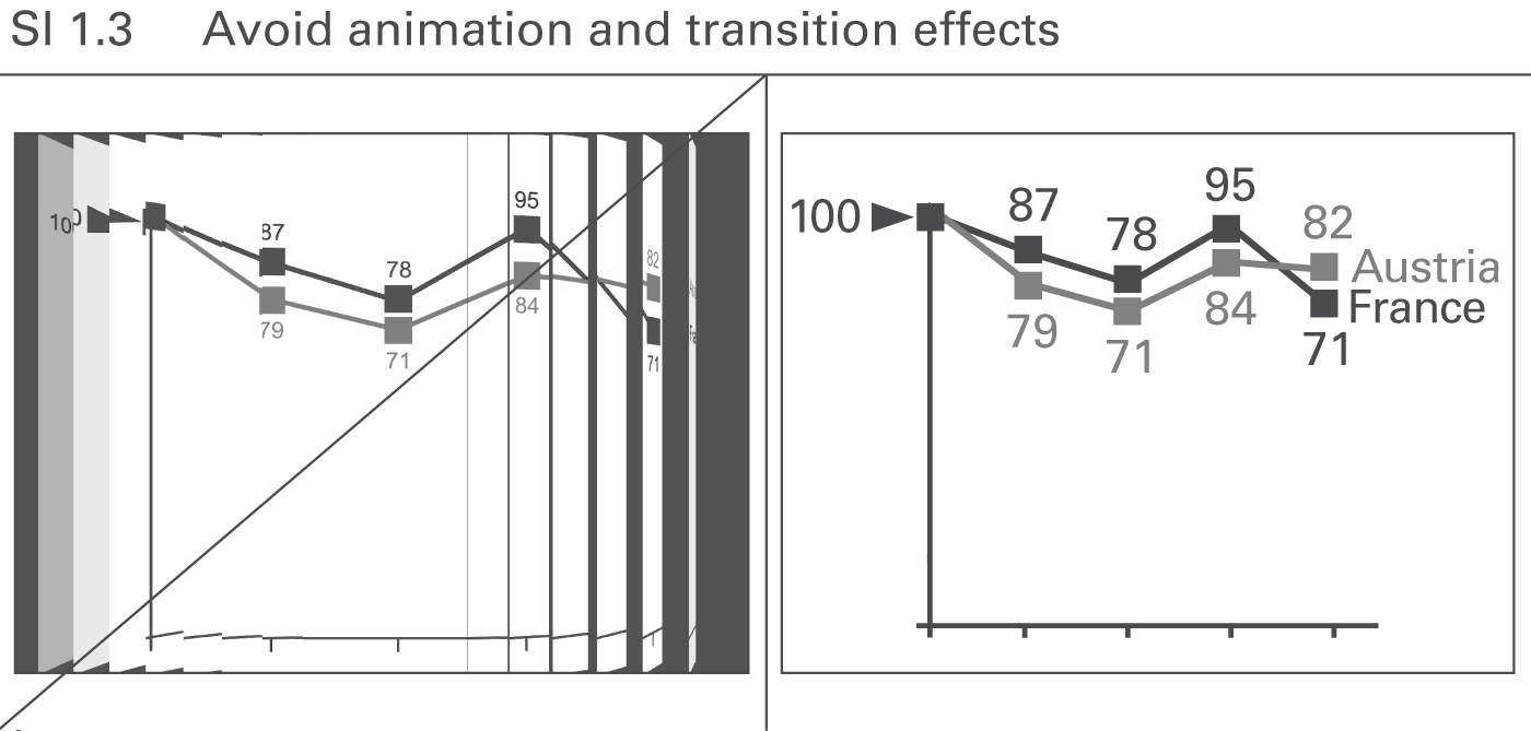
Animated PowerPoint slides are not useful if the animation has no meaning and does not support the message, see Figure SI 1.3. They merely distract and confuse. Only the “appear” function is recommended to be used for the gradual development of a slide.
Simplify complicated visualizations in order to facilitate and accelerate their comprehension. Whereas the section “Avoid unnecessary components” involves omitting entire layout elements, the aim here is to find the most suitable and simplest possible style of visualization elements.
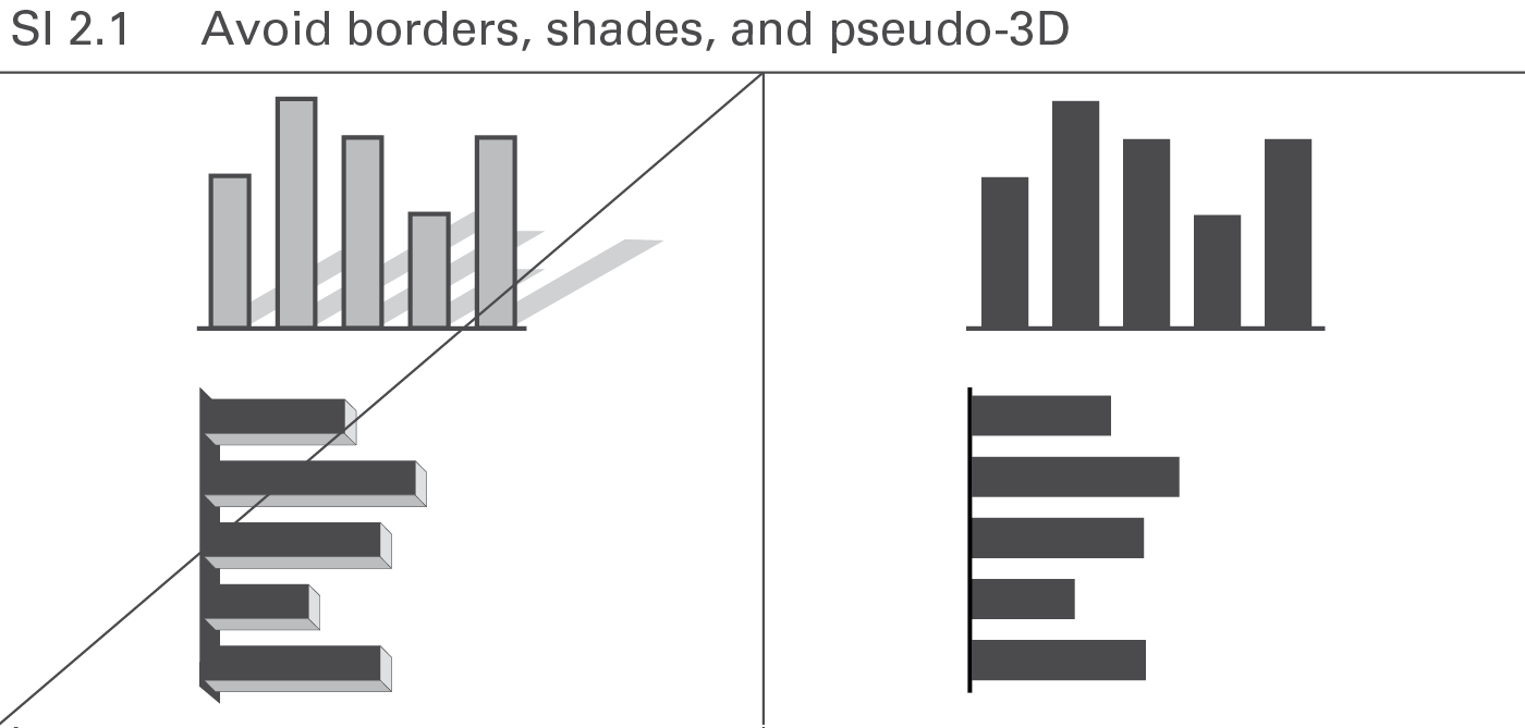
In general, borders, shades, and pseudo-3D convey no meaning and make comprehension more difficult. Shades and pseudo-3D might even give a false visual impression. Avoid them because they do not add value, see Figure SI 2.1.
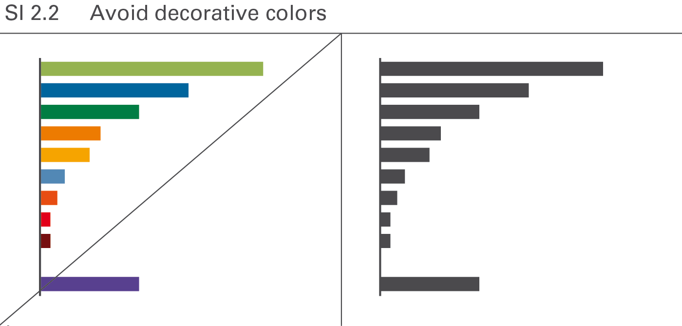
If colors serve merely decorative purpose in one instance, using them for meaning in another instance (e.g. for highlighting) becomes difficult. Therefore use colors only if they convey meaning, see Figure SI 2.2.
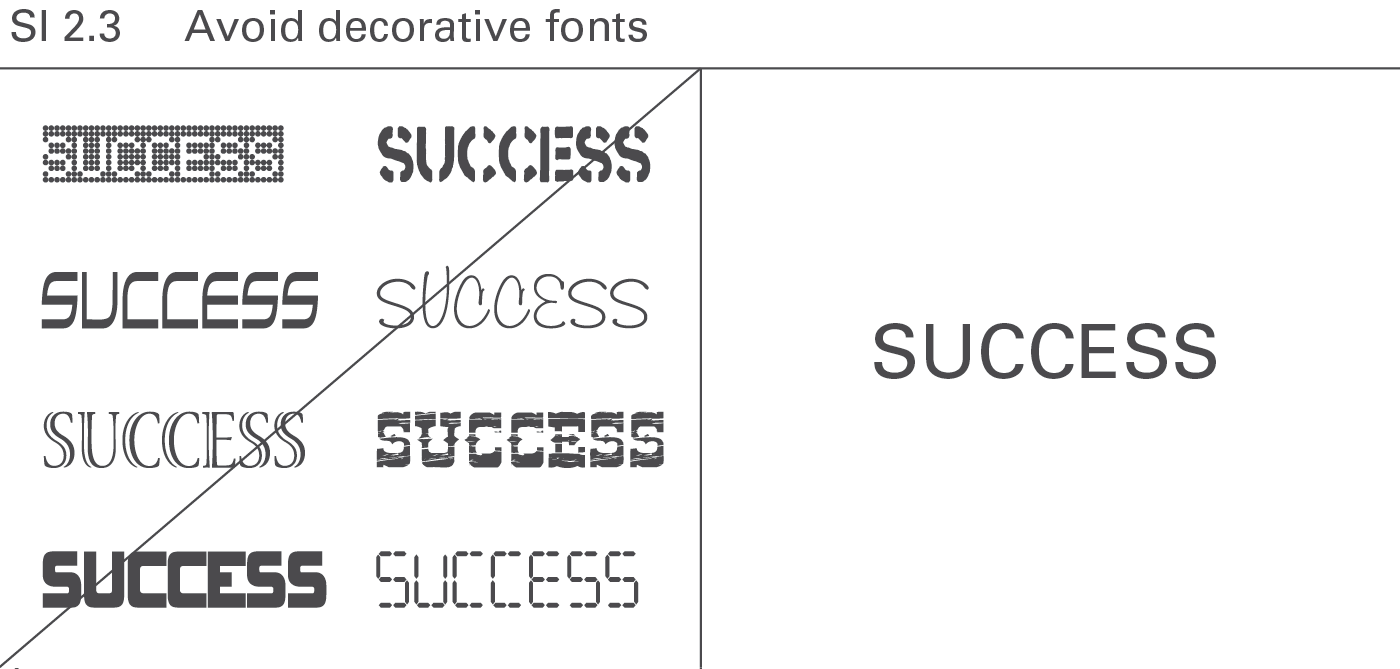
A normal typeface and clear fonts increase legibility. Save bold and cursive fonts for making distinctions, see Figure SI 2.3.
Using a cleaner method of visualization decreases the amount of ink necessary to convey a message.
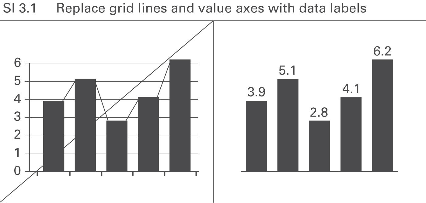
Using integrated data labels can make value axes, tick marks, and gridlines superfluous, see Figure SI 3.1. Gridlines, however, can be useful in charts with missing reference points as might be the case in charts with many data series and data points, or in small charts (e.g. small multiples).
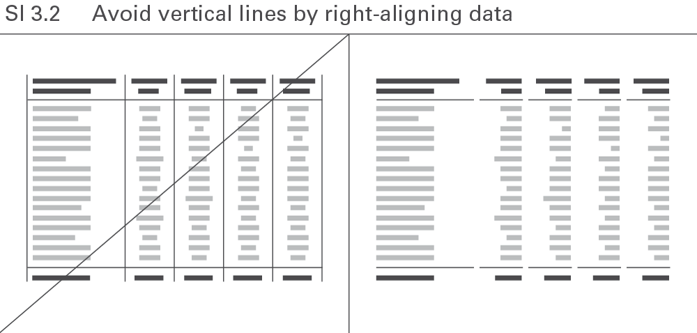
Omit all avoidable elements to make tables more straightforward. Avoid vertical lines by right-aligning numerical values and the corresponding column headers, see Figure SI 3.2.
Avoiding redundant terms usually increases the legibility of charts and tables. In some cases, a certain amount of redundancy can be helpful like when the time period named in the chart title also appears in said chart. But unnecessary redundancy impedes comprehension like when naming the year twelve times in a chart with twelve monthly category labels.
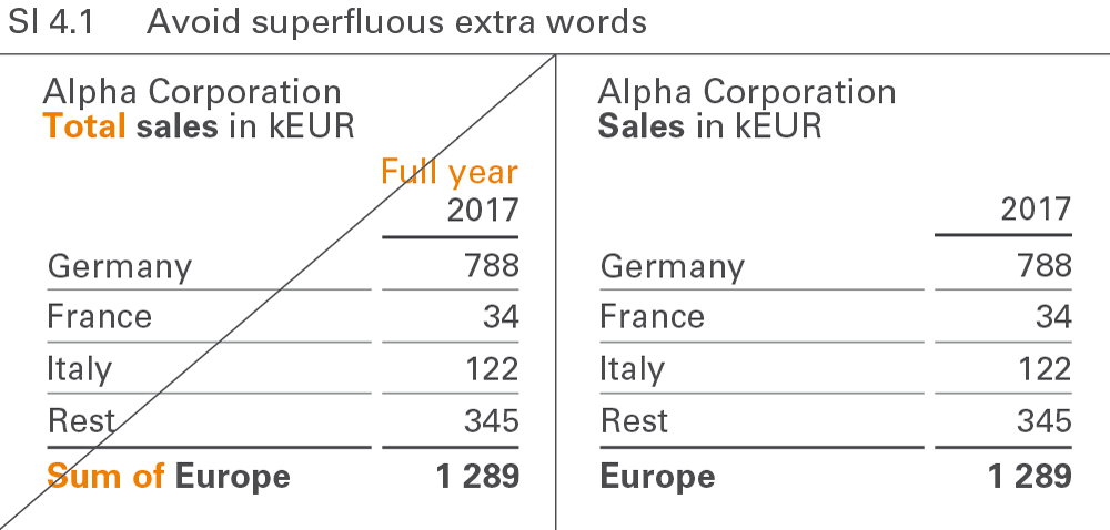
Extra words such as “sum” and “total” are redundant because they add no value to the meaning of the term they accompany. No difference exists between “Europe” and “Sum of Europe”. Extra words make it harder to read text elements, see Figure SI 4.1.
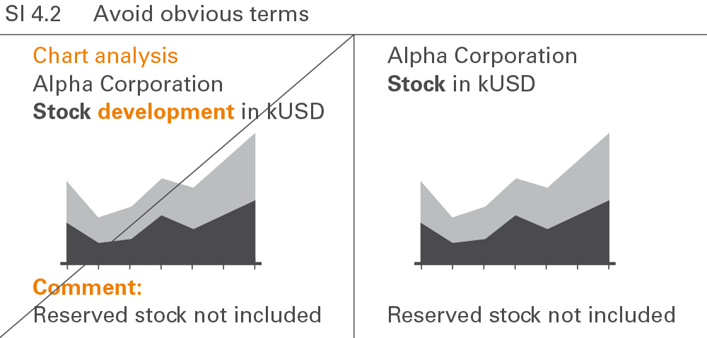
Terms such as “chart analysis”, “development”, or “comment” are redundant because they name something already shown, see Figure SI 4.2. Other obvious terms in charts and tables are “table”, “statistics”, “report”,“visualization”, “structure”, or “trend”.
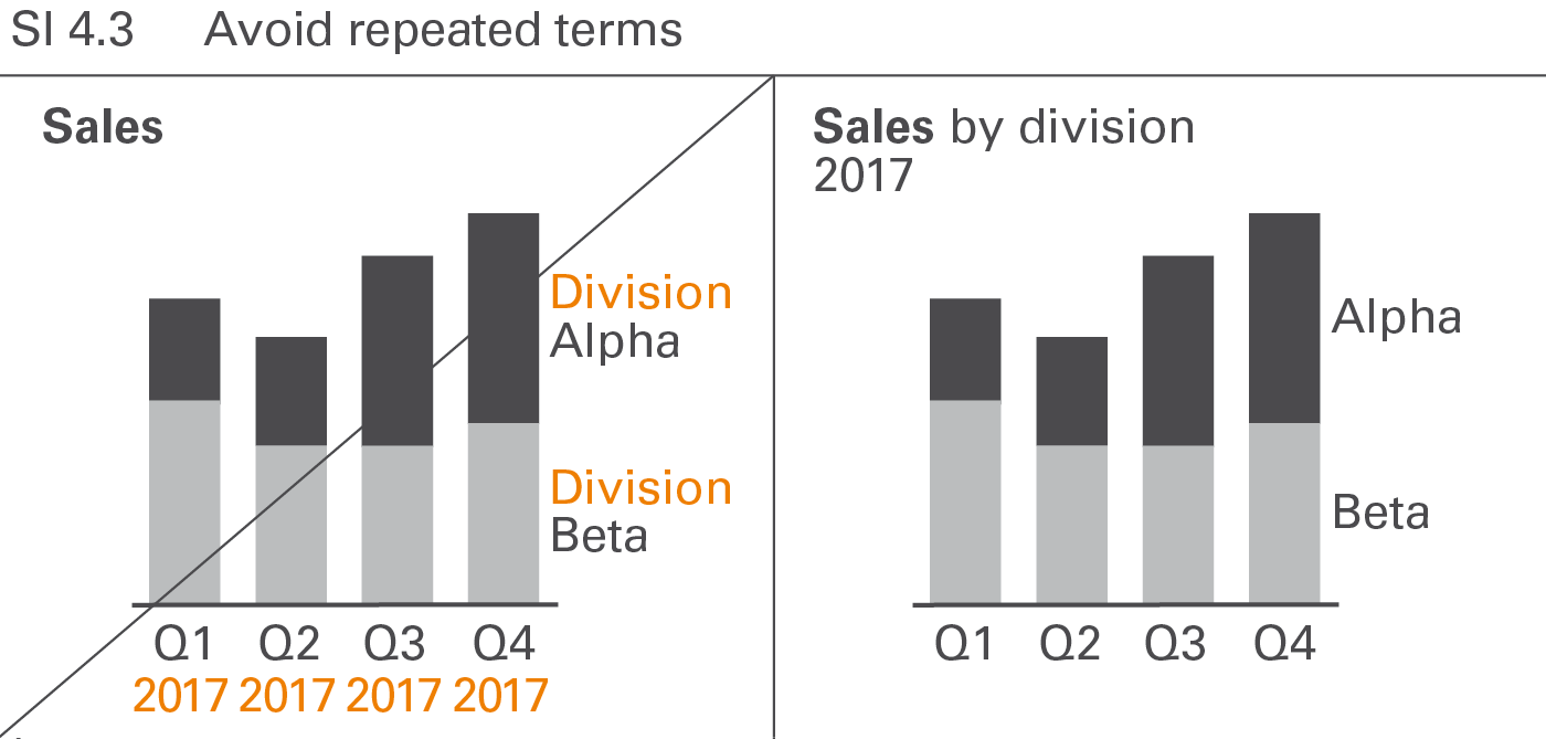
Repeated words in legends, axis labels, row headers, etc. such as“division” in “division A”, “division B”, etc. or “2017” in “Q1 2017”,“Q2 2017”, etc. should be avoided, see Figure SI 4.3. Omitting repeated words usually increases the degree of legibility.
In addition to avoiding noise and redundancy, omitting nonessential, distracting information details facilitates comprehension. Examples include unnecessarily large numbers and disproportionately detailed information in project or product overviews.
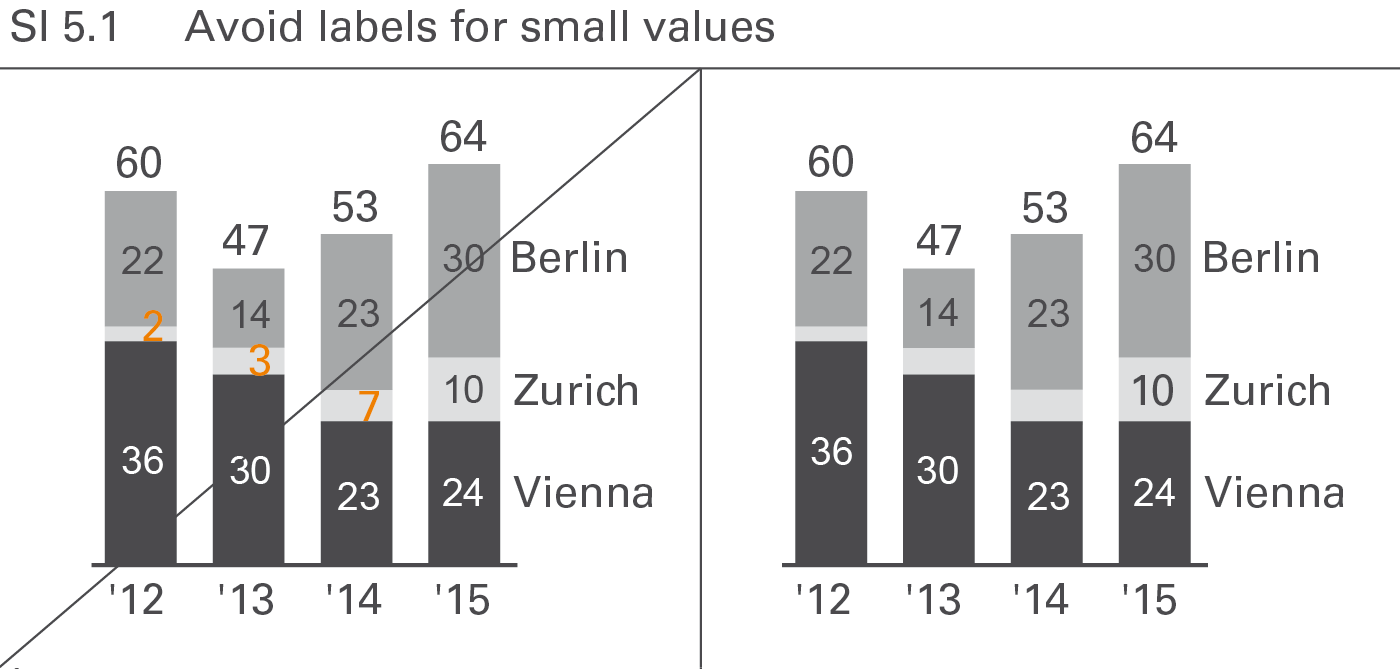
Labels of small values are often hard to position and rarely contribute to the comprehension of the message. Therefore they can be avoided in most cases, see Figure SI 5.1. However, add them when special reference is made to them. If it is necessary to label these small values or small visualization elements, assisting lines might be necessary.
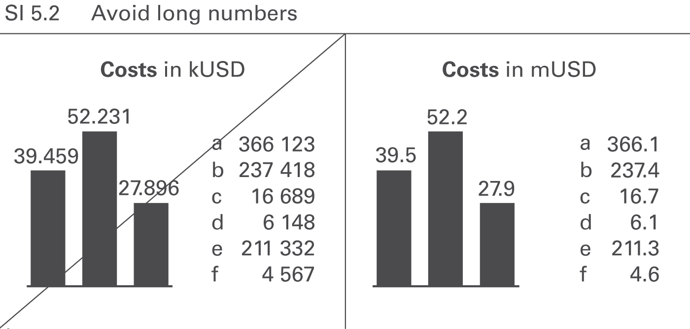
Numbers with more than three digits in charts and four digits in tables are hard to read; moreover, such precision is seldom necessary to understand the message, see Figure SI 5.2.
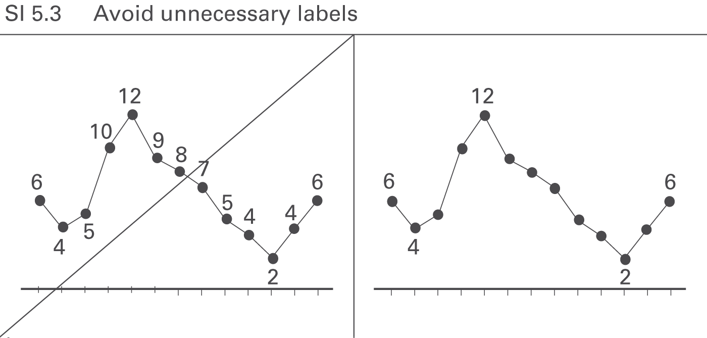
Omit labels for data points that do not represent extreme values or values of special importance, see Figure SI 5.3.
→]()
CONDENSE covers all aspects of increasing information density in reports and presentations.
Increasing information density means that all reports and presentations include all information that is necessary to understand the respective message on one page.
This chapter covers using small components, utilizing space, as well as adding data, elements, and objects.
The need for a higher level of information density requires to display all objects, elements, and signs as small as possible, while still being legible. Different technical parameters apply to printed material, screen displays, and projected slides.
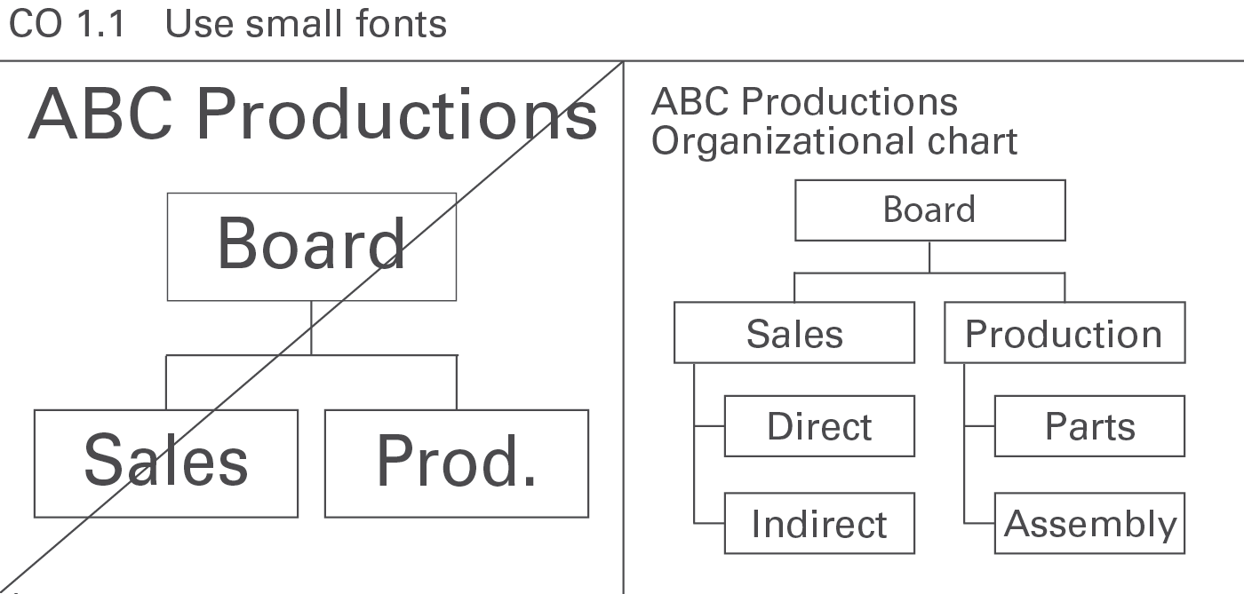
In general, avoid oversize fonts. They needlessly waste space, see Figure CO 1.1.
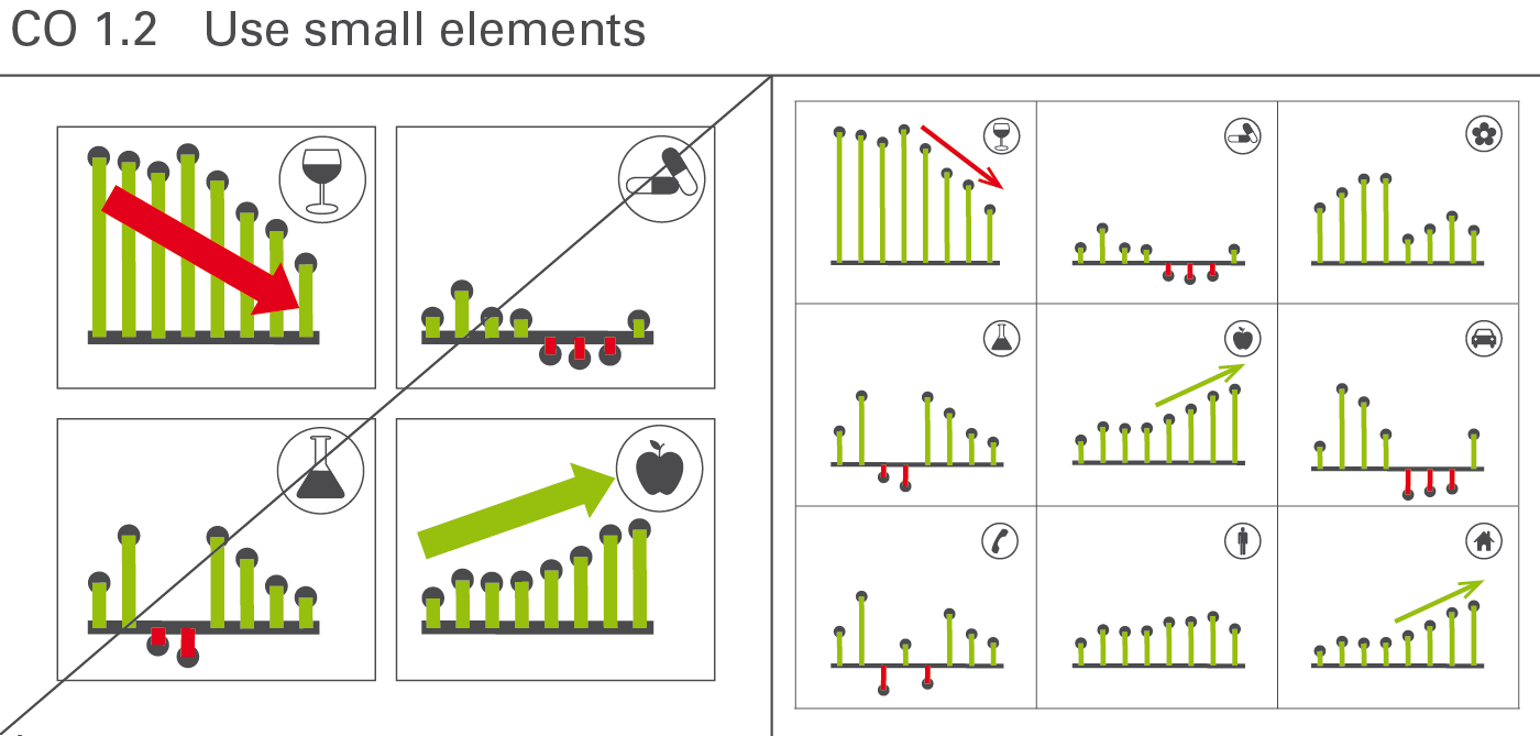
Small elements increase clarity. Large-scale symbols and highlights are not more suitable than smaller symbols and highlights, see Figure CO 1.2.
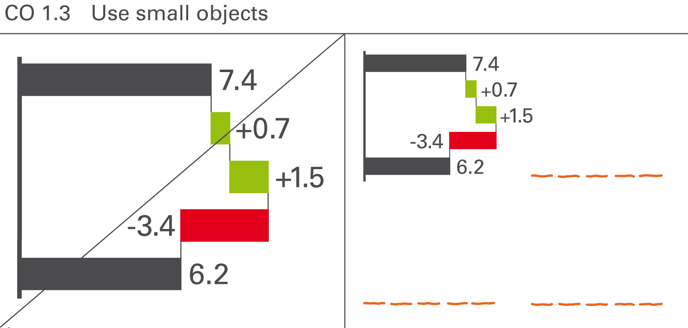
The size of charts and tables in reports and presentations should not be as large as possible, rather as small as possible – yet only so small so that the objects and all its details and labels can be read easily. This provides room for more information and therefore better understanding of the context, see Figure CO 1.3.
Utilizing free space is the fastest and easiest way to increase information density. Make better use of needlessly wide margins and frames, or blank or little used pages by filling them with helpful data pertaining to the context.
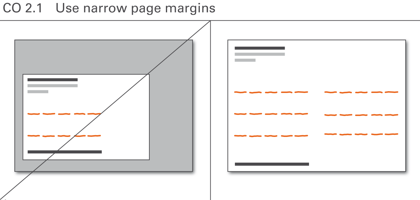
The page layout is often dominated by corporate design standards not made for high information density but for attractive design, sacrificing valuable space to layout elements such as extra wide page margins, see Figure CO 2.1.
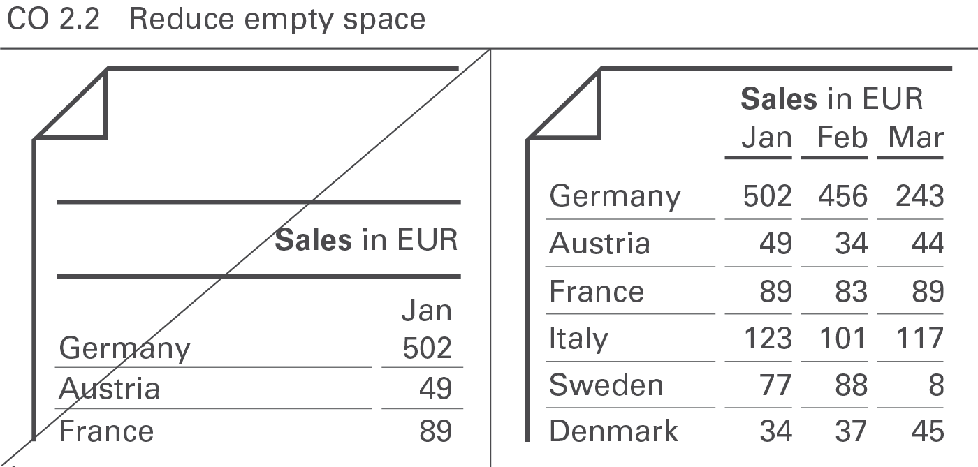
Reduce empty space to increase information density. This applies not only to the page layout (see Figure CO 2.1) but also to the layout of report objects such as charts and tables (see Figure CO 2.2).
Adding more data to an existing visualization increases information density and helps better understand the context.
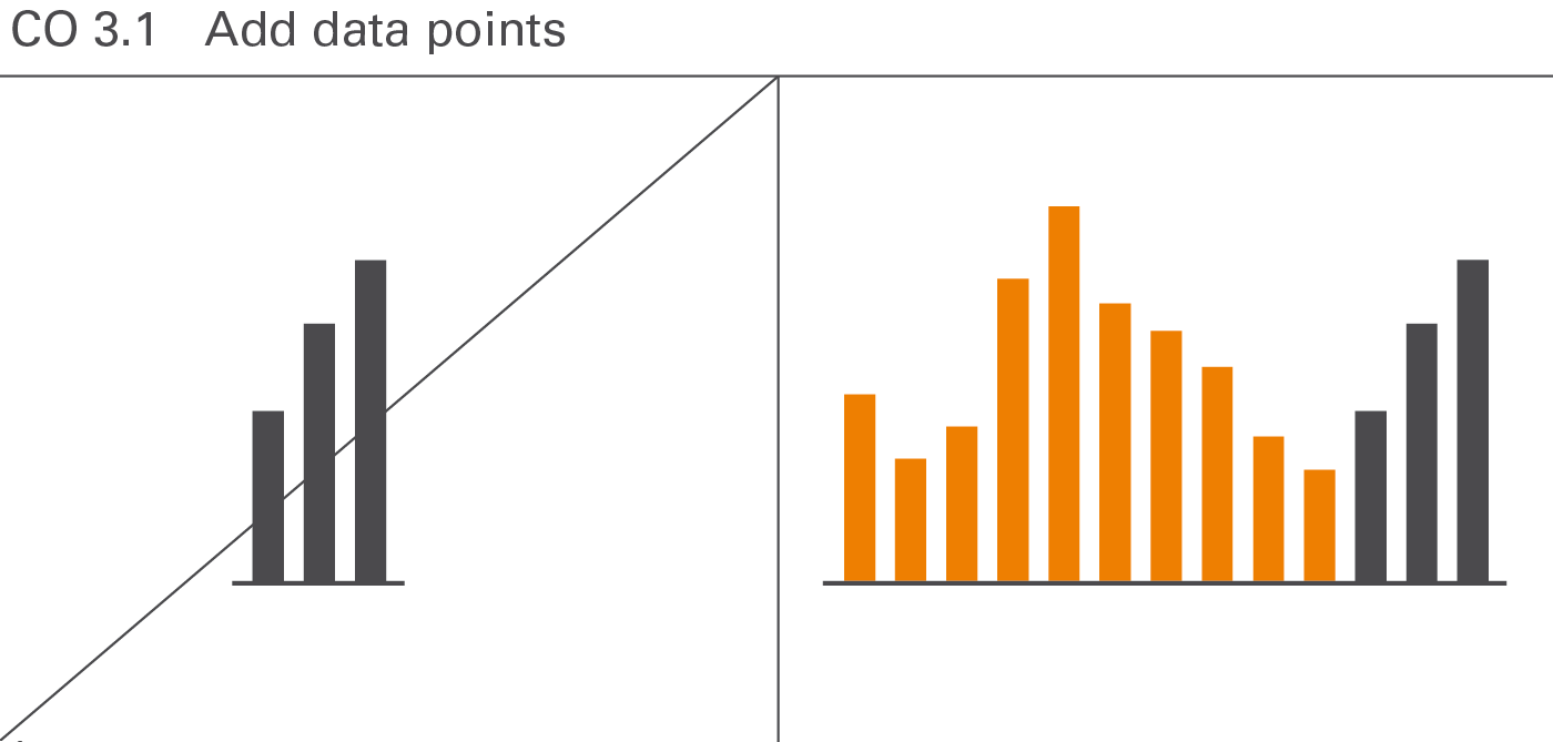
Displaying more data points does not jeopardize the comprehension of numerical data. For example, a monthly statistic of staff numbers over twelve months in a year would be understood just as quickly as for the same data series with twelve months for each of the last three years – in other words, a total of 36 data points instead of twelve. Usually, interesting relationships are only detected with an increased number of elements in a data series (see Figure CO 3.1).
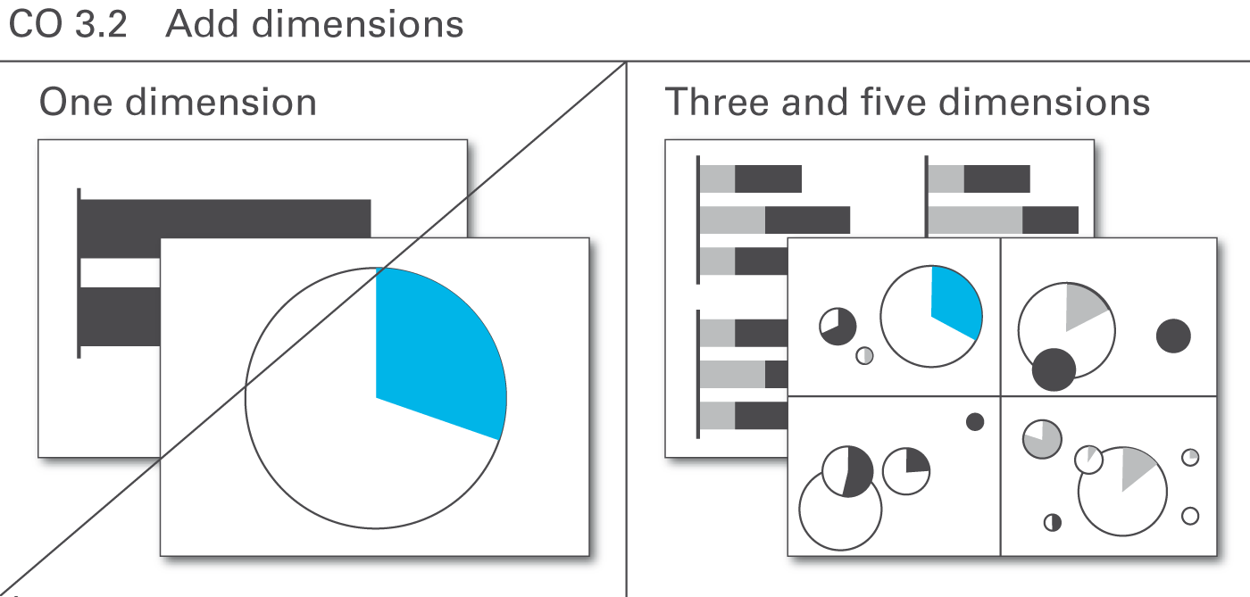
A very useful way to increase information density is to show more than two dimensions of a business situation. A chart with only one dimension (such as in a pie chart), visualizes only mundane things easily stated in a simple sentence. Already charts with two dimensions can yield very interesting relationships – yet those charts with three and more dimensions yield structures leading to completely new insights (see Figure CO 3.2).
It is often appropriate to use two or more basic chart types (either horizontal or vertical) to build combined charts with a higher information density. Combined charts are treated as one entity as opposed to multiple charts. Combined charts can be built both out from horizontal or vertical charts.
There are three types of combined charts depending on their type of combination:Overlay charts, multi-tier charts, and extended charts. Additionally, chart elements can be embedded in tables and explanations can be integrated.
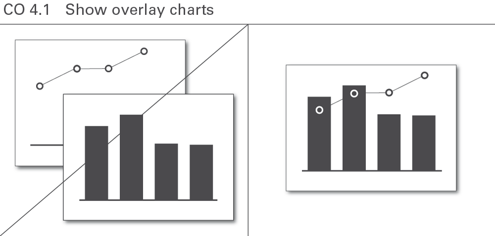
In an overlay chart, two or more basic charts overlap. These overlapping charts always use the same category axis.
Overlay charts can facilitate comprehension such as in the combination of the development of sales (a series of columns) and the return on sales in percent (a line). However, this approach can only be used for a few chart combinations, see Figure CO 4.1.
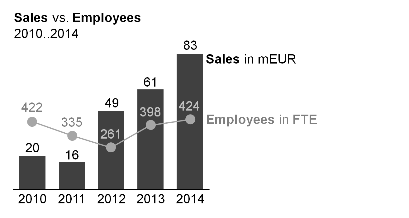
Overlay charts frequently use different value axes. A column chart representing a measure (e.g. sales) combined with a line chart representing another measure (e.g. employees) is a typical example.
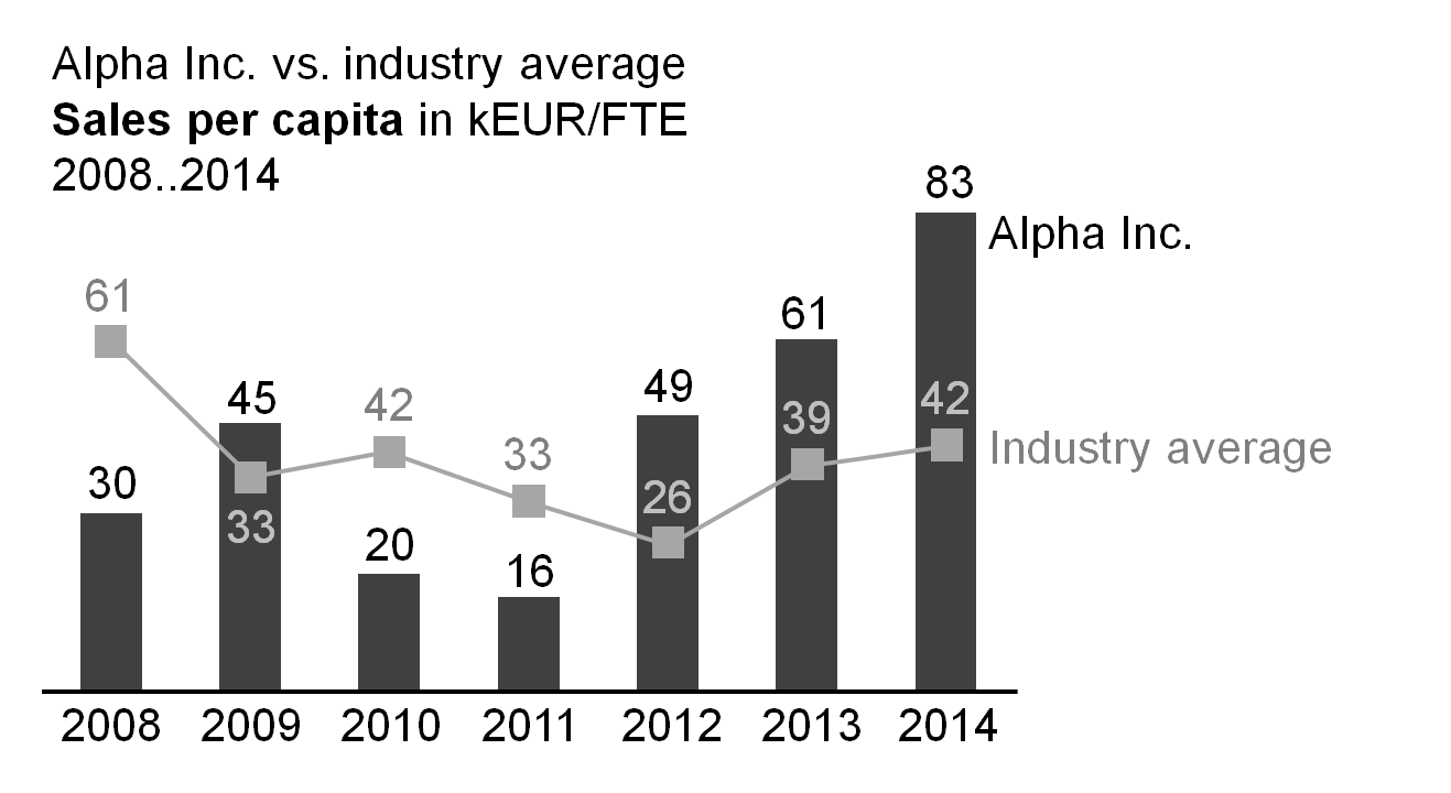
Sometimes, the same value axis is used as well. A column chart representing a measure (e.g. sales) combined with a line chart representing the same measure (e.g. industry average) is a typical example for such an overlay chart.
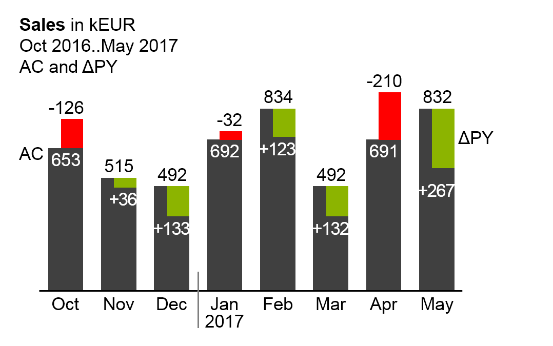
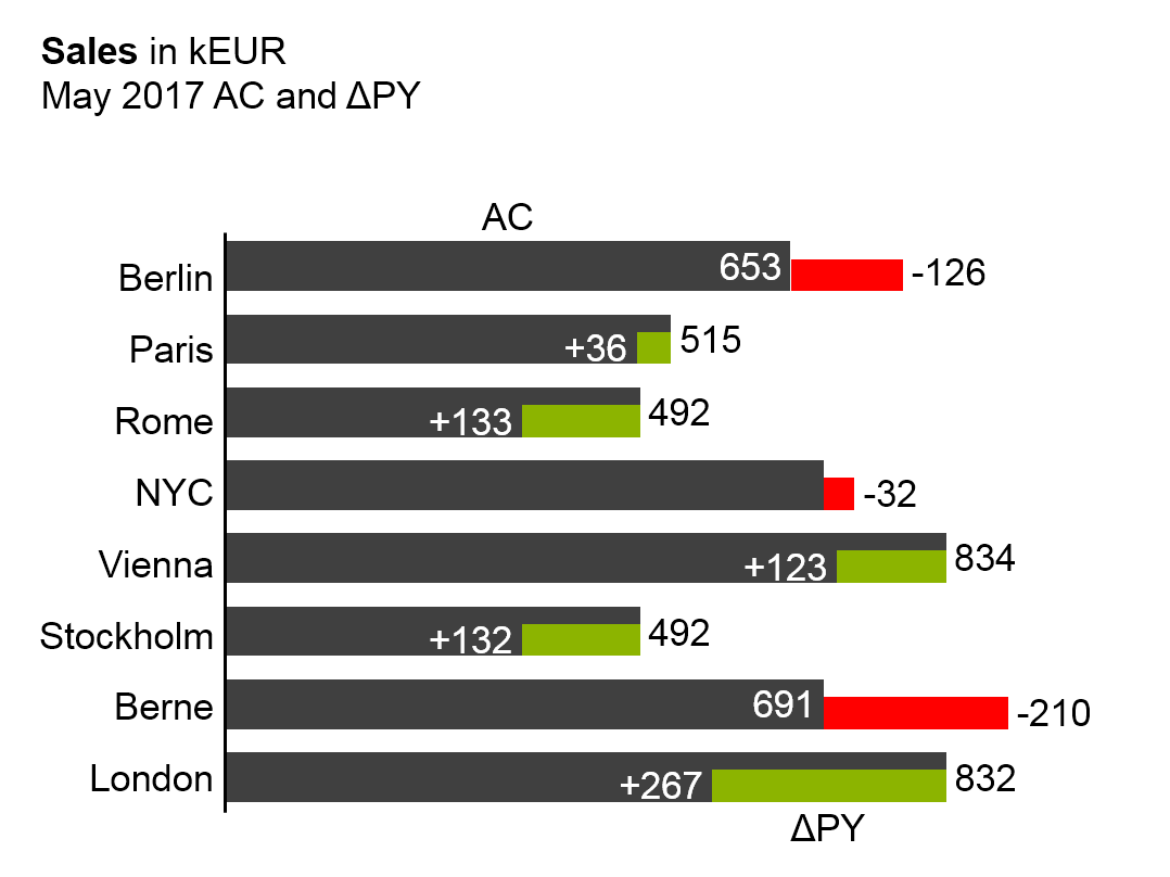
Column or bar charts with integrated variances (variances displayed within the columns or bars) are other typical example for overlay charts using the same value axis (see the last two figures).
Compared to two-tier charts, this presentation of two data series uses much less space. The disadvantages, though, are twofold: First, it is difficult to label the data of both the primary and secondary chart. Second, the development over time (horizontal axis) respectively the structure (vertical axis) of the primary chart is difficult to see.
Suggestion: If there is enough space, use multi-tier charts instead.
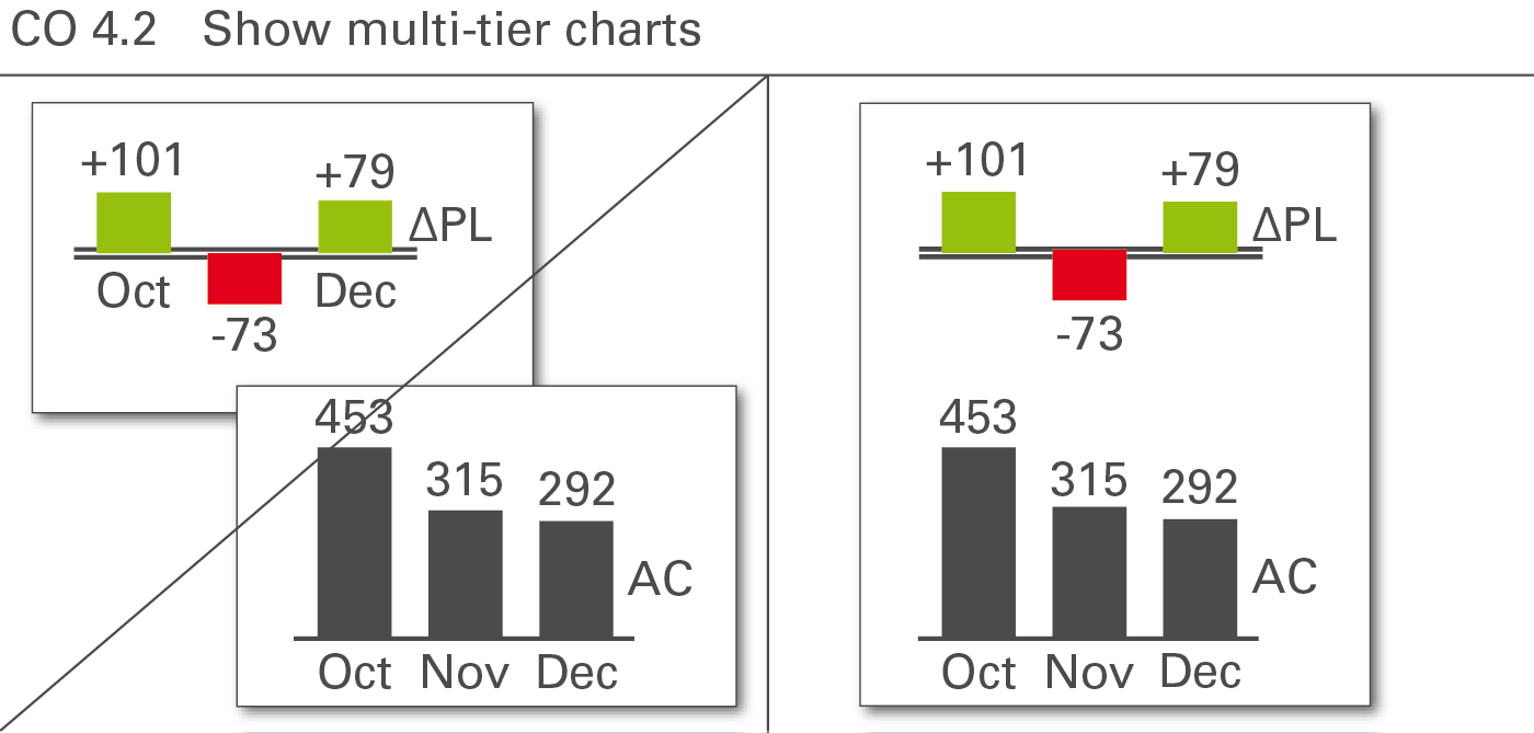
Use multi-tier charts to increase information density by adding additional tiers to the same category axis for analyses on the same basic data. Multi-tier charts are most frequently used for displaying variances along with the basic values, see Figure CO 4.2.
In a two-tier chart, a secondary chart is shifted in parallel to the category axis of the primary chart. For horizontal charts the secondary chart appears above the primary chart, for vertical charts the secondary chart appears to the right of the primary chart.
In both cases, the category axes of the primary charts are reduplicated in the secondary charts, usually having a different semantic scenario design.
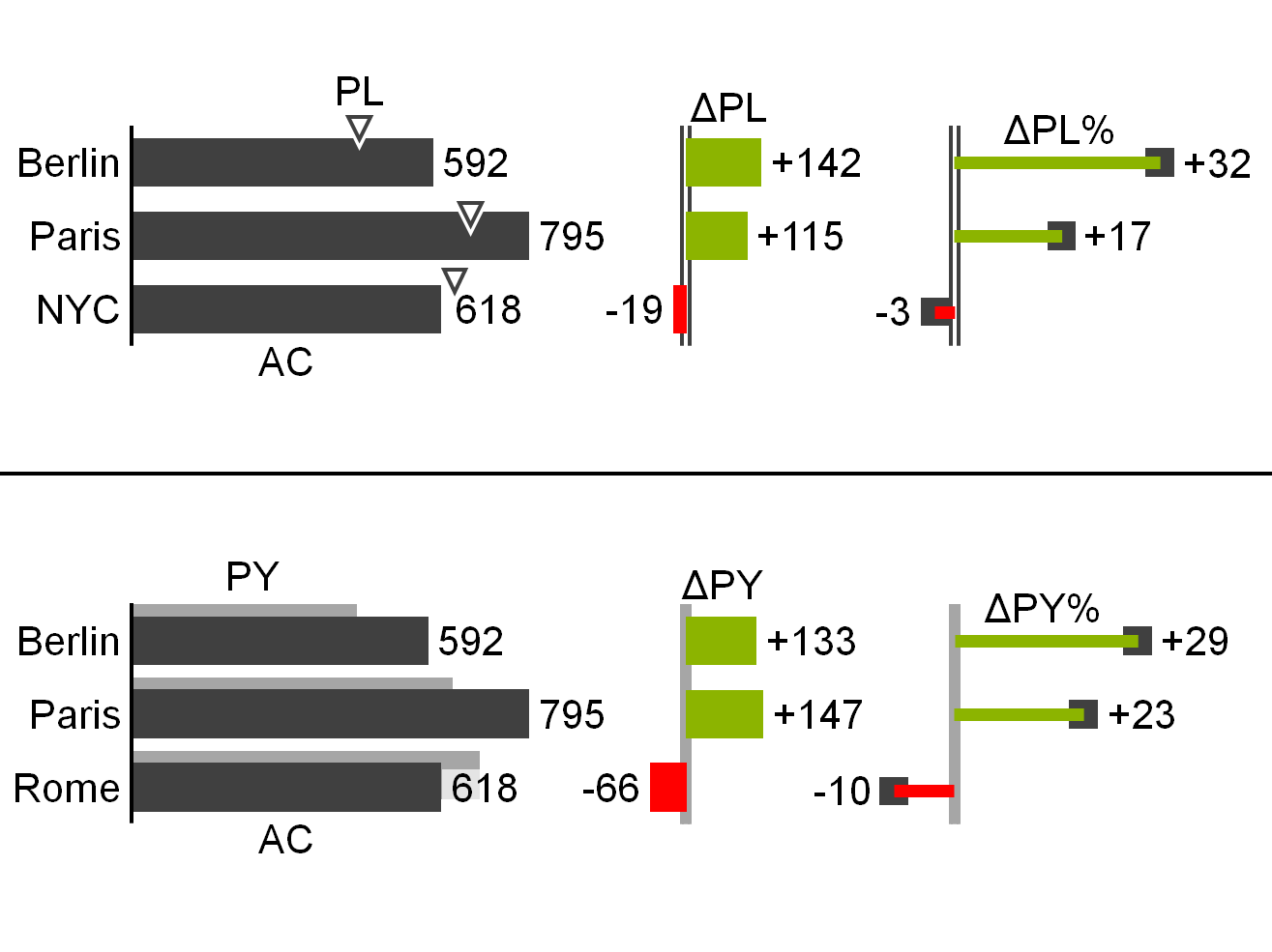
Both the primary and the secondary charts have their own value axes. Value axes showing the same currency or the same physical unit should be scaled identically.
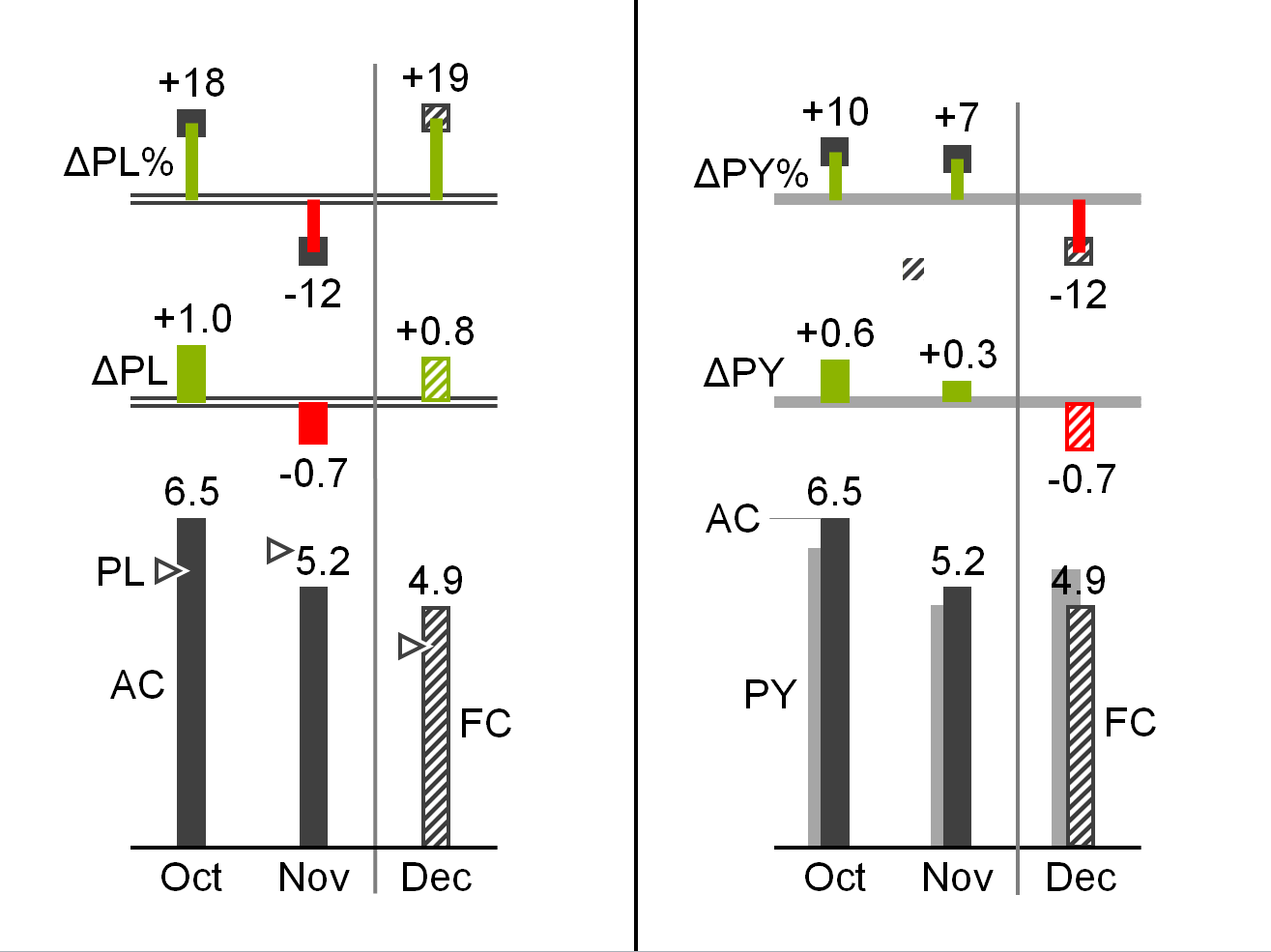
In a three-tier chart a third chart appears above a horizontal or to the right of a vertical two-tier chart. In special cases, more than three tiers can be combined.
Improve the interpretation of a primary chart showing grouped bars for actual and plan data by adding variances. In the second and third figure a secondary chart with absolute variances and a tertiary pin chart with relative variances are combined.
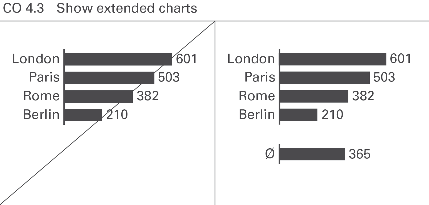
An extended chart, arranges additional charts next to the primary chart by virtually extending the category axis. This way of increasing information density often is used when displaying context information such as market averages or competitor figures, see Figure CO 4.3.
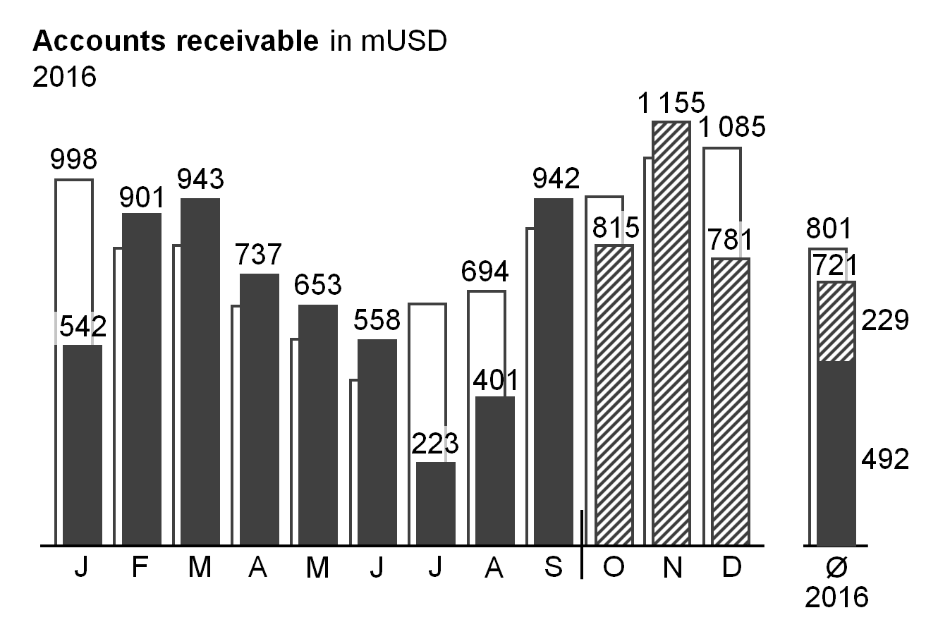
For horizontal charts, additional charts appear to the left or right of the primary chart, for vertical charts, above or below. In both cases, position the category axes of the additional charts on a virtual extension of the category axes of the primary chart.
In an extended chart, use the same value axis for both the primary and the additional charts.
Improve the interpretation of a primary chart by adding extended charts showing the same values from a different perspective. In the figure on the left, a secondary grouped column chart at the right hand side shows the monthly average.
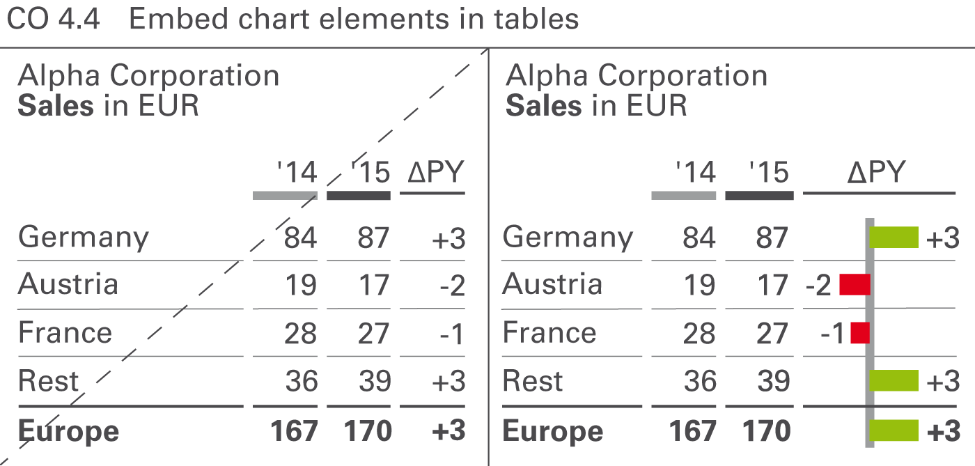
Increase the information density of tables by using chart elements, see Figure CO 4.4. Bars, warning dots, sparklines, and traffic lights are the predominant chart element types in tables.
Table bars
Table bars are bar charts integrated into tables. The categories of these bar charts must correspond to the rows of a table. Both single bar charts with single bars or pins and waterfall bar charts are powerful means to visualize the absolute figures and variances in tables. Most recommendations concerning vertical chart types can be applied to table bars.
Warning dots
Not to be confused with traffic lights, warning dots can be a good solution in highlighting important negative, positive, or questionable parts of a table. It is important to use only very few warning dots in one table.
Sparklines
Omit sparklines if not scaled properly. Individually scaled sparklines can be misleading because small fluctuations in a series of other small fluctuations look the same as big fluctuations in a series of big fluctuations. However, sparklines with proper scaling (e.g. indexed) can be helpful.
Traffic lights
Traffic lights contain little information, as they represent no more than three (red, green, yellow) states. Use them only if there is no more information to be conveyed than those two or three states (e.g. “yes” or “no”). In all other cases, replace traffic lights with more suitable means of representation, such as table bars.
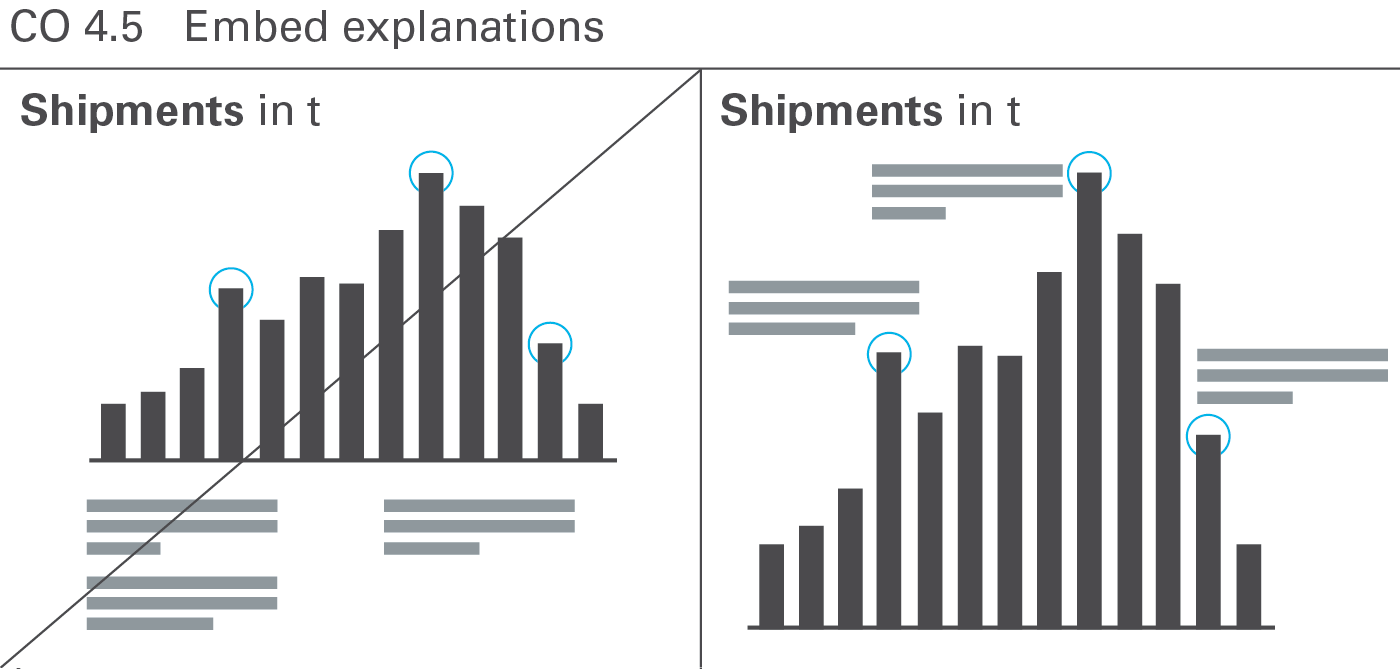
Both the density of information and the level of comprehension increase when explanations are embedded into charts and tables (this applies to written reports and handouts only). When the explanation refers directly to the visual presentation in question, it helps to establish a connection and speeds up comprehension, see Figure CO 4.5.
Reports and presentation material consist of one or more pages. The content of one page can be viewed together without referring to other content, e.g. flipping to other pages.
Reports and presentation material often arrange more than one chart on one page. While this increases information density and fosters a higher level of comparability, it presents a design challenge: A uniform notation concept and consistent scaling are even more important than on pages with single charts.
The most important types of pages with multiple objects are small multiples and multi-charts (including ratio trees).
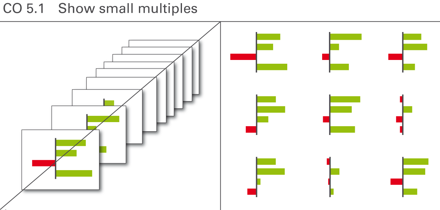
Substantially improve the comprehension of complex relationships by displaying charts of the same type and the same scale on the same page. These charts are called small multiples, see Figure CO 5.1.
Typical applications are charts with different countries, products, or projects placed next to each other. Of course, there is an upper limit to the number of charts on one page, depending mainly on the page- and font-size used.
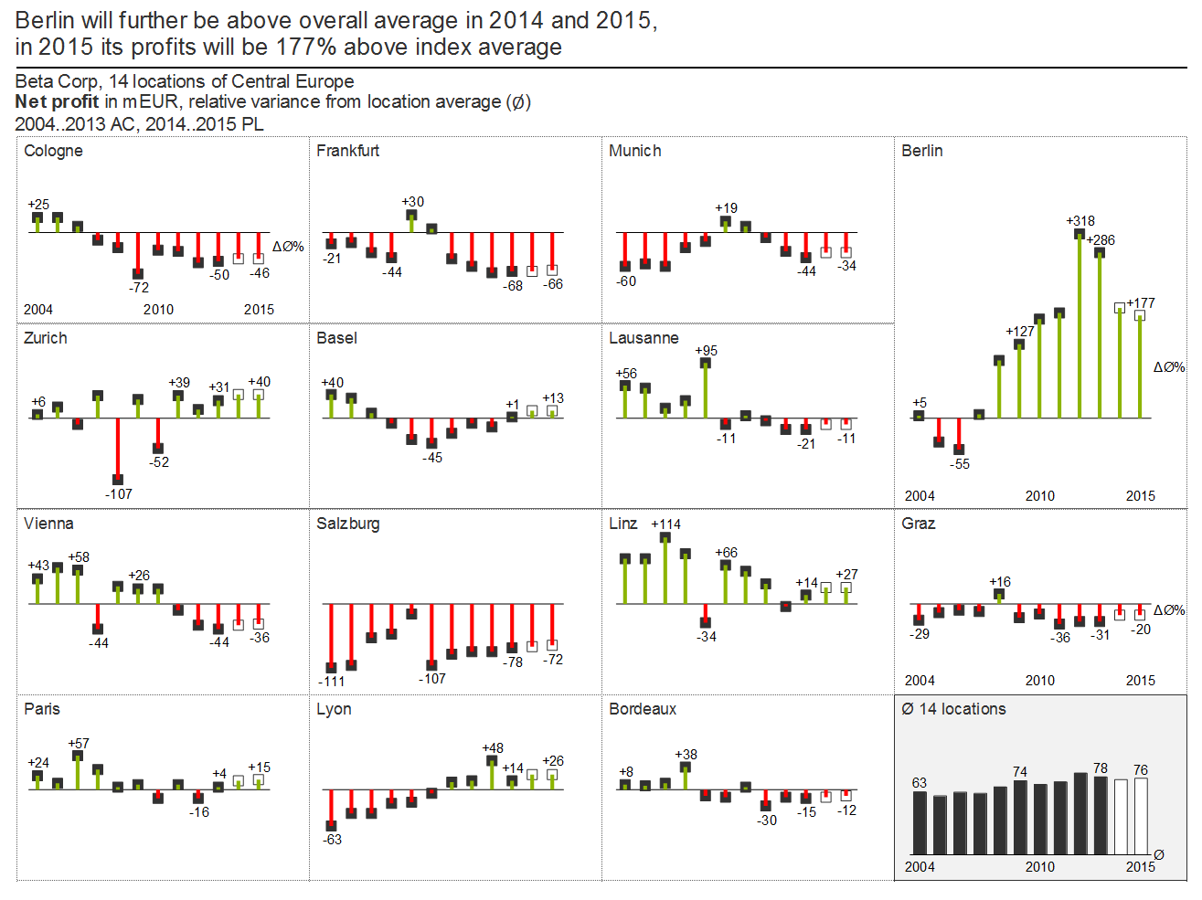
Showing small multiples is a good way to compare a set of up to around 25 charts. Instead of exceeding this number on one page, a new chart called “Others” containing the accumulation of all other elements could be a solution.
As mentioned in the chapter “CHECK – Ensure visual integrity”, all small multiples must use the identical scale.
Working with small multiples can be difficult if certain charts show significantly bigger values than others. Using a different scale for a chart with bigger values is not a feasible option, increase the size of this chart instead.
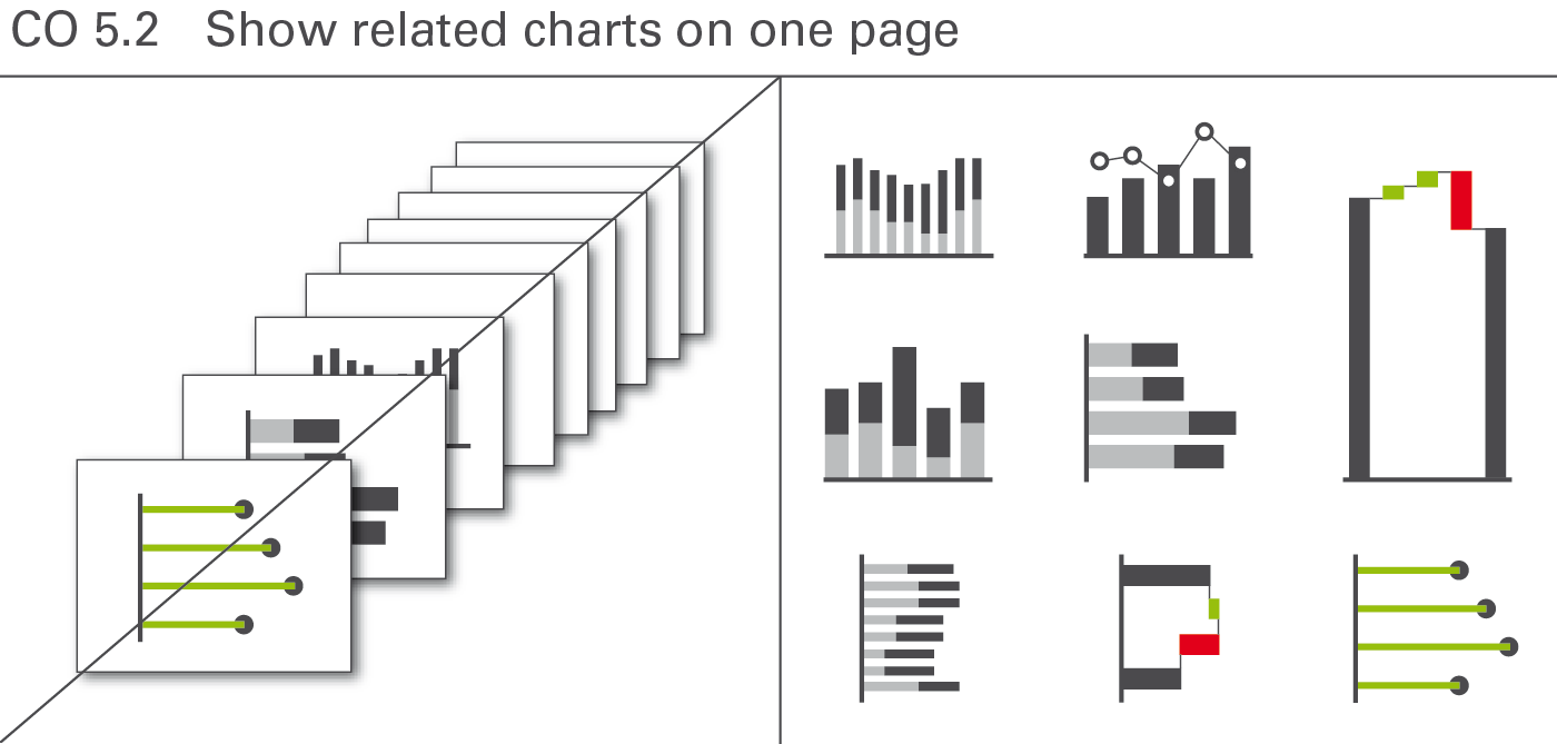
Different from small multiples, related charts cover different topics (different measures) on one page. They mostly use different scales, too. This arrangement of charts on one page is sometimes called multi-charts. But the term multi-charts fails to underline the fact that these charts must have a useful relationship. It does not make sense to arrange several, completely unrelated charts on one page.
This approach offers high data density and a higher level of comparability – but it can be a demanding visual and technical challenge as a uniform notation concept, clear terms, and an understandable scaling prove even more important (see Figure CO 5.2).
Consistent scaling of multi-charts can be difficult. Sometimes different scales for the same unit or measure are inevitable. In this case, clearly indicate the use of a different scale by an appropriate mean, e.g. scaling indicators.
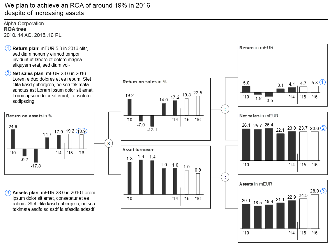
Ratio trees are multi-charts showing root causes. Use ratio trees to prove or explain a specific issue. Pointing out the assumptions and root causes of variances or temporal evolvements improves understanding and is more convincing, too. In general, the ratio is broken down into its components (mostly from left to right). Thus individual charts, preferably identical size, are arranged in a tree shape structure.
Consistent scaling of ratio trees can be difficult. Sometimes different scales for the same unit or measure are inevitable. In this case, clearly indicate the use of a different scale by an appropriate mean, e.g. scaling indicators.
A typical example of a page showing a ratio tree is the “Return on asset” tree.
Combining charts and tables on a page is not to be confused with the integration of chart elements in tables.
Chart-table combinations cover situations where a separate chart is added to a page with a table or vice versa. In general, such a combination is very useful if both objects display supplementary data. Tables simply listing the numbers of a chart are superfluous in most cases (see also UN 2.3 “Unify the position of legends and labels.
Embedding illuminating charts and tables in the text of a written report helps the reader understanding the message.
Always position charts and tables in close proximity to the phrase carrying the message, which the chart or table supports.
Text pages should contain a title element like other pages. Also use a title – and, if possible, a message – for every chart and table embedded in a text page.
CHECK covers all aspects of ensuring visual integrity in reports and presentations.
Ensuring visual integrity means that reports and presentations present information in the most truthful and the most easily understood way by avoiding misleading visuals.
This chapter covers avoiding manipulated axes and visualization elements, using the same scales, and showing data adjustments.
Charts serve as a means to visually compare numerical values. Manipulated axes defeat this purpose of explaining actual interrelations.
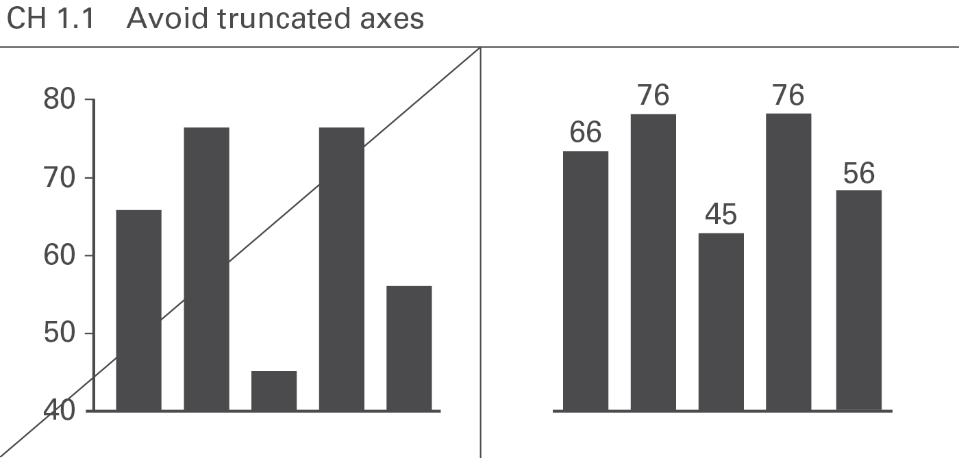
Charts with value axes not starting at zero (“cut” axes) are not “wrong”in and of themselves, but the message to be visually conveyed then does not correspond to the numerical values upon which the chart is based. Therefore, value axes should generally start at zero, see Figure CH 1.1.
One exception to this rule exists: charts with indexed data (e.g. if the value for the index period is set to 100%) with only small variances from 100%. Here “zooming in” on the variances could be of greater value than indicating the absolute values (starting at zero). In this case, position the category labels at the 100% line in order to avoid misinterpretations.
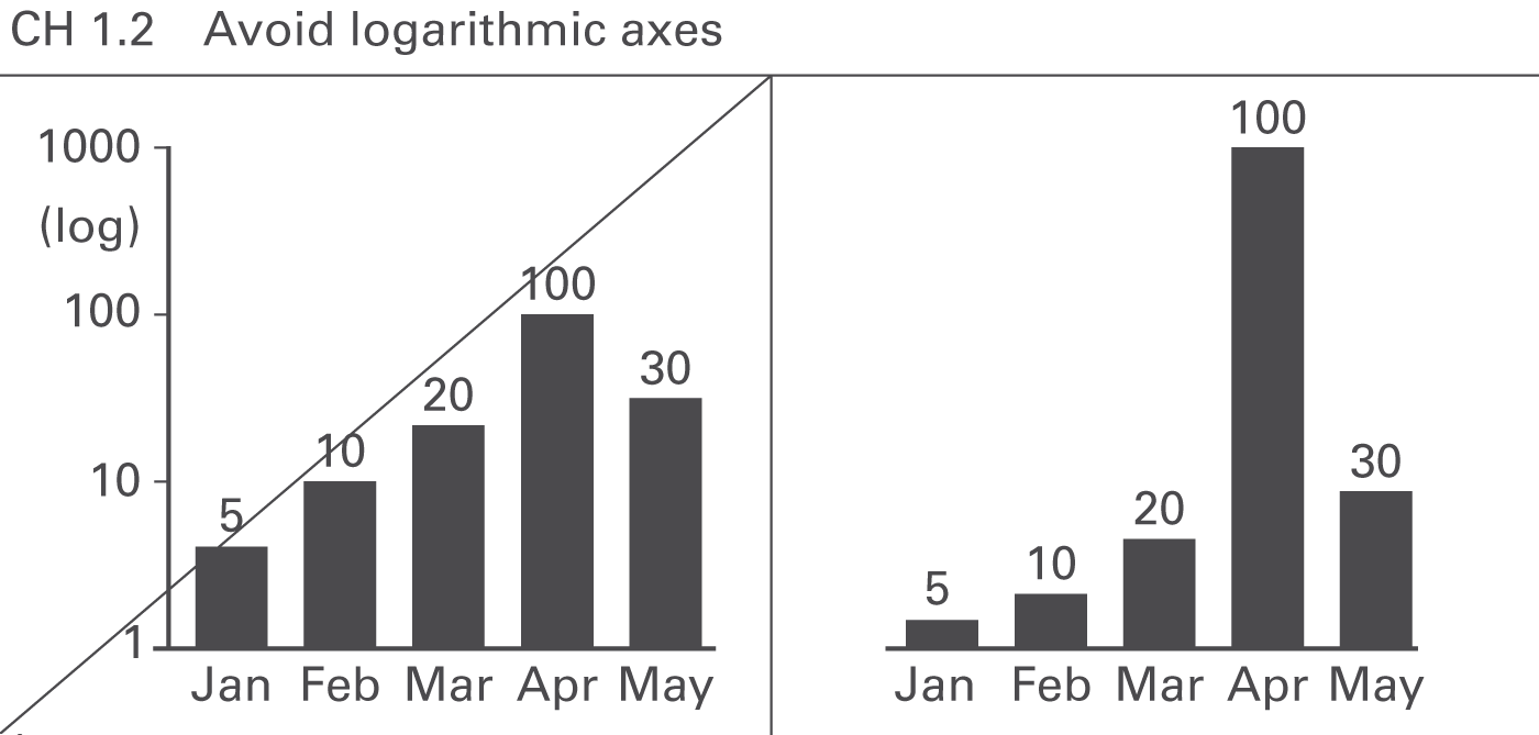
Avoid logarithmic scales because they do not allow the visual comparison of values, see Figure CH 1.2. In business, very few applications for logarithmic axes exist (e.g. comparing growth rates of different stocks in percent).
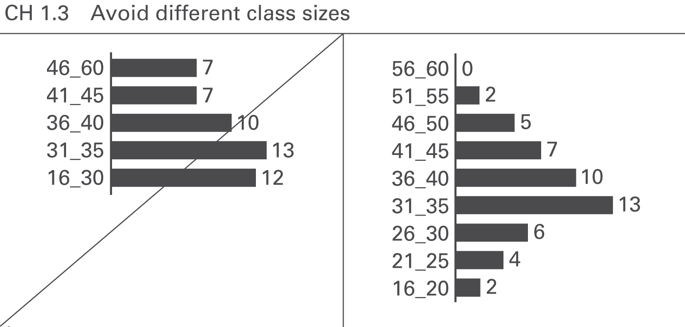
If the categories represent ordered classes of elements (e.g. age classes) as used for the visualization of distributions in histograms, use class sizes of identical width (e.g. ten years). Otherwise, true visual comparability is impossible, see Figure CH 1.3.
Displaying values differing by orders of magnitude can be challenging. Use creative solutions instead of clipping visualization elements or cutting value axes.
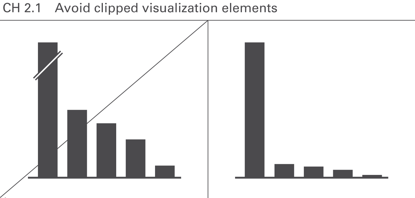
Similar to “cut” axes, clipped visualization elements such as broken columns make visual comparisons impossible, see Figure CH 2.1.
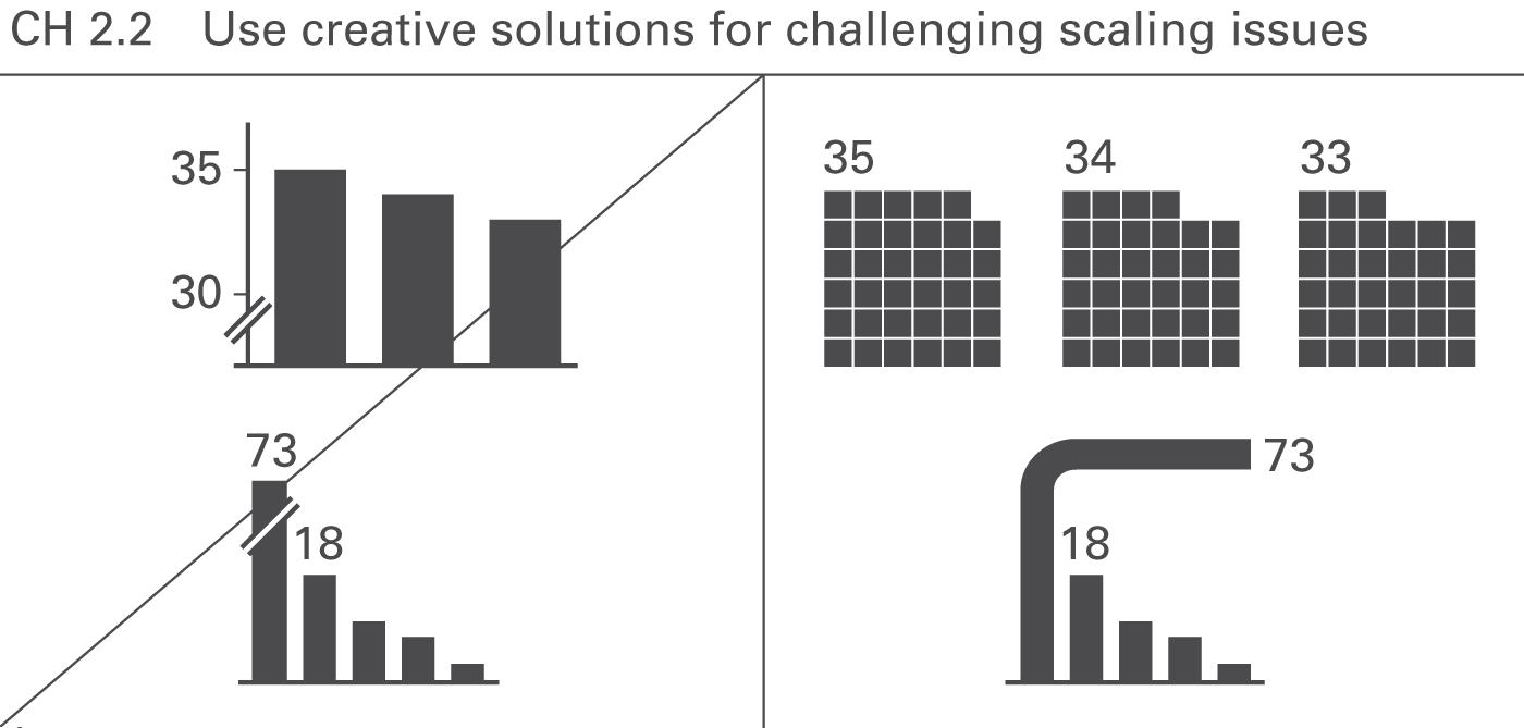
Creative visualization elements can be used to compare extreme values, e.g., displaying data in two-dimensional or even three-dimensional visualization elements allows the comparison of values differing by orders of magnitude, see Figure CH 2.2.
This rule must be clearly separated from the rules of section CH 3 “Avoid misleading representations” where area and volume visualizations are used improperly.
Graphical representations are misleading if the visual impression for the observer differs from the underlying values.
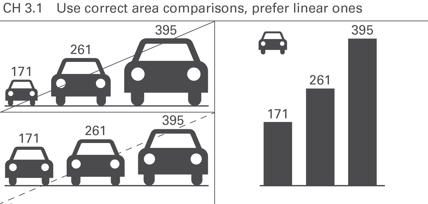
Using two-dimensional representations (areas of circles, icons, or emblems) for the visualization of data is only valid, if the size of these areas corresponds to the underlying values. The visual perception will be misleading if the diameters of circles or the heights of icons represent the values, see Figure CH 3.1.
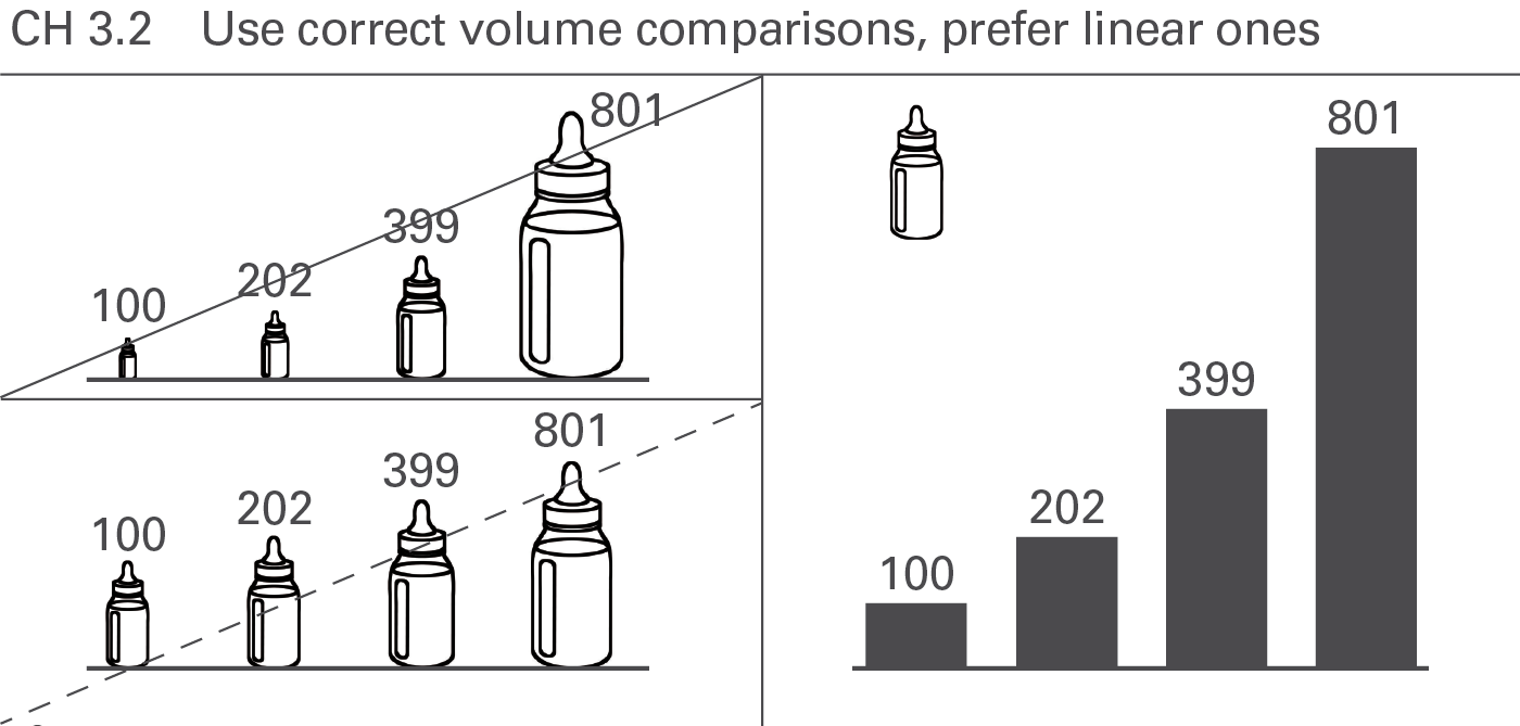
Similar to areas, the visual perception will be misleading, if the (one-dimensional) diameters or the (two-dimensional) areas of three-dimensional visualization elements (spheres, cubes, etc.) represent the values, see Figure CH 3.2. Even if their volumes represent the values, it is hard to perceive them properly. Prefer linear comparisons instead.
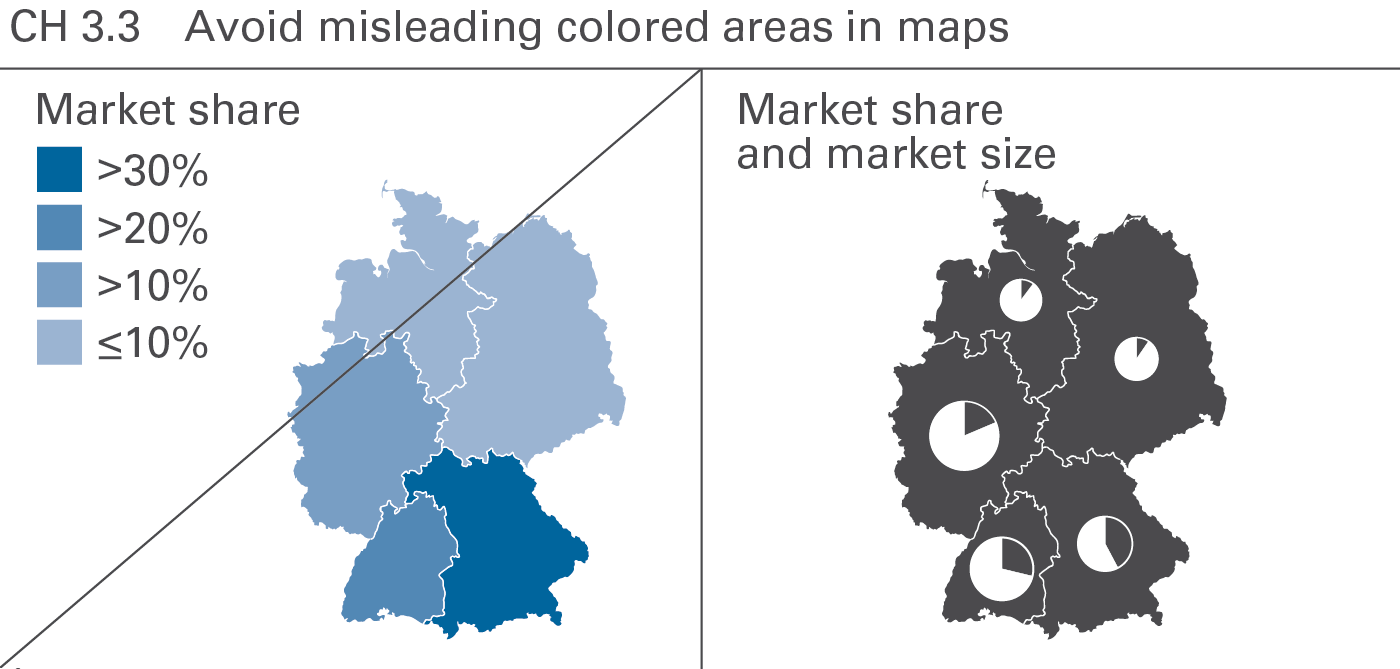
Different colored areas can be helpful to visualize the precipitation per square meter or the population density. However, do not use colored areas for the visualization of non-area-related figures such as market shares or return on sales. Position columns or bars of identical scale in maps instead. By the way, pie charts also work well here (an exception to the EX 2.1 “Replace pie...” because they can be placed precisely at one point, like a city (see Figure CH 3.3).
Proper visual comparison requires the usage of identical scales for identical measure units, or – if this is not possible – a clear indication of the difference. If possible, use a consistent scaling concept for the complete report or presentation material.
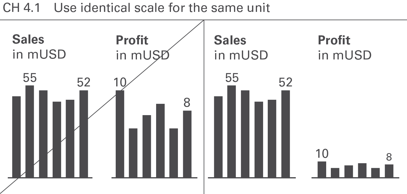
If presenting more than one chart of the same unit on one page, use the identical scale for these charts, see Figure CH 4.1. In extreme situations identical scales might not be desirable. In these exceptional cases the use of scaling indicators (seeCH 4.3 andUN 5.2) can be helpful.
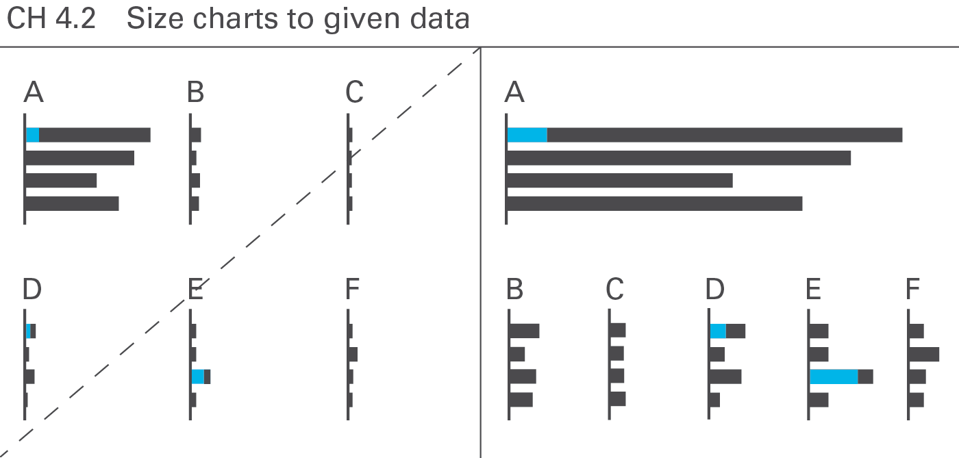
Using identical scales in multiple charts can be demanding if the values in the charts differ by orders of magnitude. A good solution is adapting the chart size to the given data, see Figure CH 4.2.
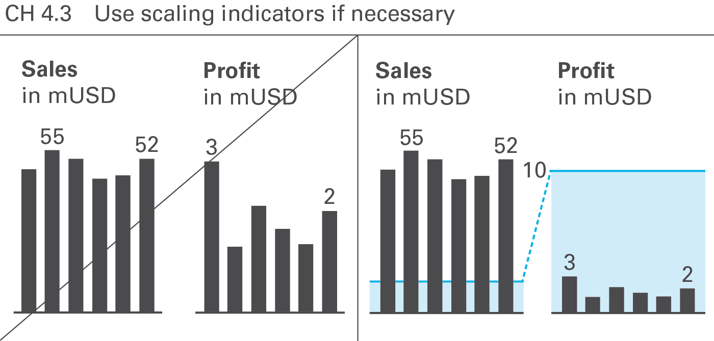
There are several ways to overcome challenging scaling problems. Scaling indicators, such as scaling lines and scaling areas indicating the same numerical height (typically a power of 10) in all charts are helpful to assist in comparing multiple charts (of the same unit) with different scales, see Figure CH 4.3.
This guide suggests a semantic design for scaling lines and scaling areas, see UN 5.2 “Unify scaling indicators”.
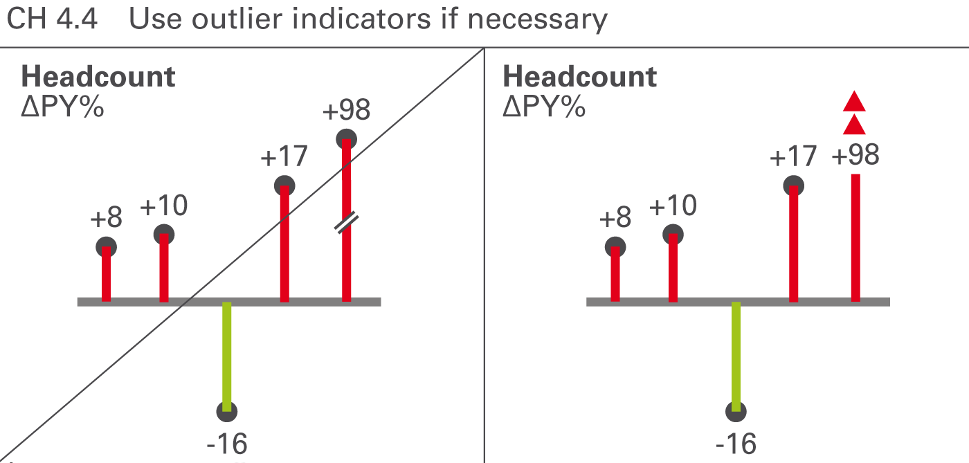
Certain values that are very big in comparison to other values are called outliers. If an outlier is not important for business, e.g. a big relative variance of a small value, then it is not appropriate to scale the whole chart to this outlier. Therefore, use outlier indicators for unimportant outliers, see Figure CH 4.4.
This guide suggests a semantic design for outlier indicators, see UN 5.3 “Unify outlier indicators”.
Another way to assist in scaling problems is to use “magnifying glasses” for zooming in on a part of a chart with a bigger scale. Use an appropriate visualization element to mark the part of a chart to be zoomed in and to link it to a second chart displaying the zoomed part on a bigger scale.
For longer time series, currency and inflationary effects can bias the visual impression, hiding the real development of business.
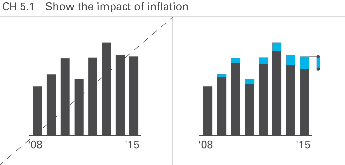
Making inflation effects transparent helps avoid misinterpretations of time series visualizations, see Figure CH 5.1.
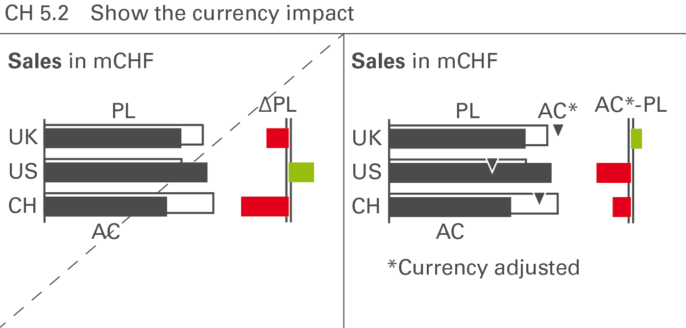
Similar to inflation effects, the adjustment of currency effects can help to avoid misinterpretations, see Figure CH 5.2.
→]()
UNIFY covers all aspects of applying semantic notation in reports and presentations.
Applying semantic notation means that reports and presentations follow this governing principle:Similar content should be visualized in a similar manner; what looks the same should also mean the same. On the flip side: If the content is not the same, it should not look the same.
In many specialized disciplines such as engineering, music, and architecture, semantic notation standards are a matter of course. The world of business communication lacks such notation standards, one of the main reasons management reports are sometimes hard to understand. For example, no common agreement on the meaning of various style elements such as titles, line markers, axes, highlighting indicators, etc. used in business charts exists yet.
This chapter covers semantic rules for all important and frequently recurring aspects of meaning in the context of business communication, such as terminology (e.g. words, abbreviations, number formats), descriptions (e.g. messages, titles, legends), dimensions (e.g. measures, scenarios, time periods), analyses (e.g. comparisons and variances), and indicators for highlighting, scaling and other purposes.
Terms are the non-visual part of business communication. Unified terms and abbreviations as well as unified formats for numbers, units and dates accelerate understanding.
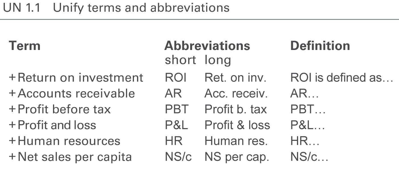
The standardization of terms and abbreviations in reports and presentations is achieved by using an unambiguous language (see SA 4.2 “Speak with precise words“) and by unifying the usage of terms (glossary).
Unify, compile and explain all terms and abbreviations used in reports and presentations in a clearly arranged glossary including abbreviations and definitions, see Figure UN 1.1.
A glossary with terms and abbreviations in more than one language might be necessary in order to avoid different translations.
Often the names of business measures are too long for charts and tables. Use abbreviations instead. It might be a good solution to define short abbreviations (e.g. to A/R for Accounts Receivable be used in table column headers) and long abbreviations (e.g. Acc. Receiv. to be used in table row headers).
Unified terms and abbreviations for the notation of scenarios and time periods are covered in the respective sections.
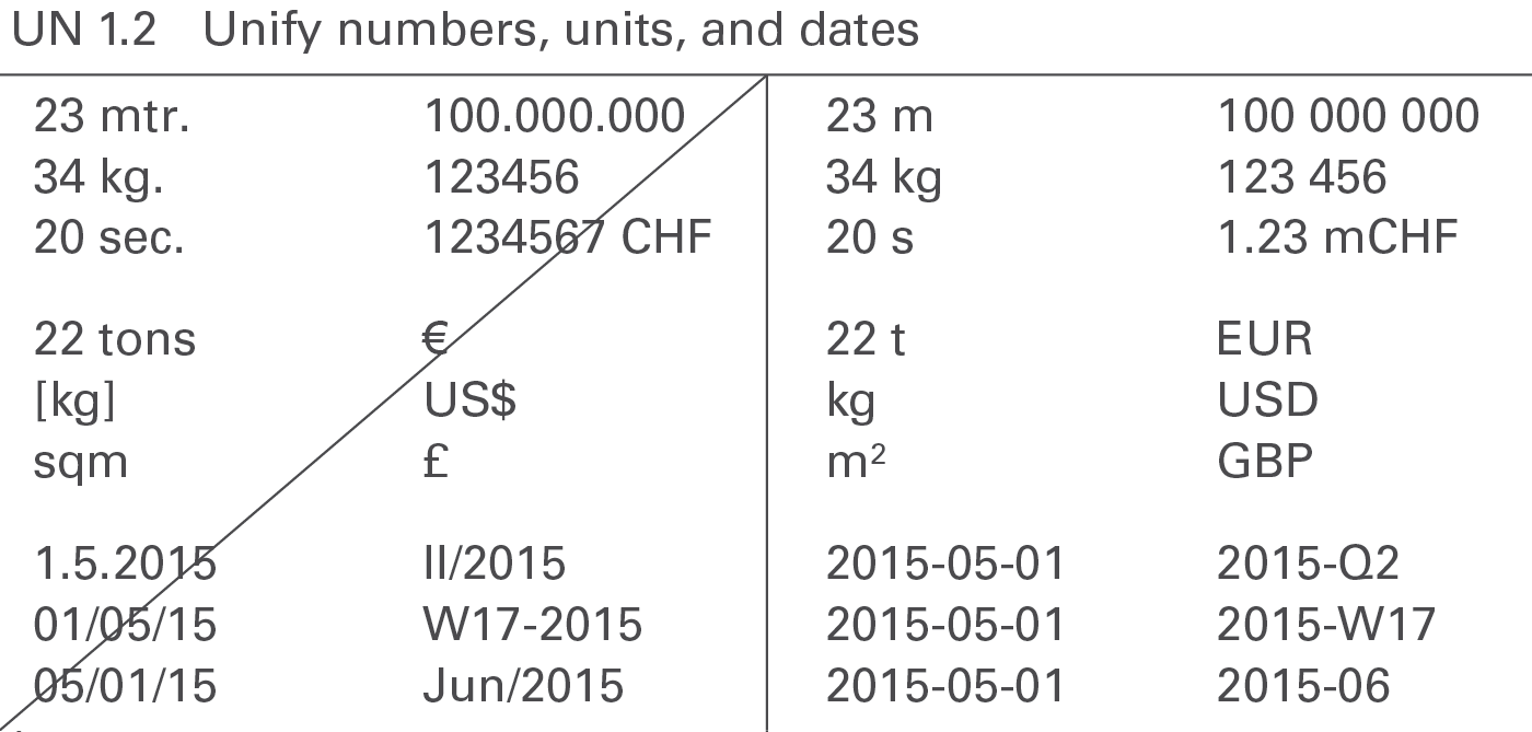
The uniform use of formats for numbers, units and dates will enhance legibility, see Figure UN 1.2.
Numbers
Different languages and countries use different number formats, e.g. 1.234.567,00 (D); 1,234,567.00 (USA); 1’234’567,00 or 1’234’567.00 (CH).
It is important to unify the number formats in all reports and presentations. The International System of Units (SI) as described in “ISO 80000-1” recommends the following notation:
Do not use long numbers in order to avoid distraction and to concentrate on the essentials, see also SI 5.2 “Avoid long numbers”. Use currency prefixes and metric prefixes to limit the number of digits to a maximum of three in charts and four in tables.
The most common formats for negative values are “-123” and “(123)”. Use the same format for all negative values.
Positive values do not have a plus sign, unless they represent variances.
Currencies
Use the standard currency abbreviations based onISO 4217. ISO 4217 provides a set of currency abbreviations using three-letter acronyms such as EUR, CHF, USD, and GBP. The use of special currency symbols such as €, $, and ₤ is not recommended if a report includes many different currencies.
Use “metric prefixes” in combination with the currency units for monetary values expressed in thousands or millions. Use lower case characters to differentiate the prefixes from the currency abbreviations and use single digit metric prefixes to save space, such as “k” for thousand, “m” for million and “b” for billion. The following shows the correct use of currency metric prefixes with EUR:
1 bEUR = 1 000 mEUR = 1 000 000 kEUR = 1 000 000 000 EUR
(The metric prefixes for physical units are “M” for “millions”and “G” for “billions”. Nevertheless, this guide suggests using “m” and“b” for currency metric prefixes, as “mEUR” and “bEUR” which is easier to understand than MEUR and GEUR.)
Physical units
For physical units use theInternational System of Units (SI) such as kg, t, m, km, etc.
In the case of non-monetary values expressed in thousands or millions, usemetric prefixes suggested by the International System of Units such as “G” for billion, “M” for million, and “k” for thousand.
Dates
Dates are best displayed usingISO 8601, an international standard covering the exchange of date and time-related data: YYYY-MM-DD, e.g. “2015-12-31”.
Other significant notation principles regarding time-related aspects will be dealt in UN 3.3 “Unify time periods”.
Descriptions are textual elements that describe the visual elements in reports and presentations facilitating comprehension. The following suggests unified layouts for every kind of descriptions.
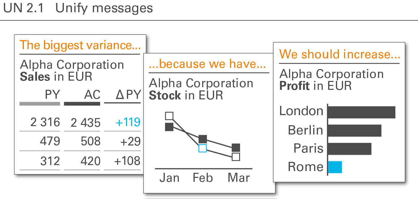
The message the author intends to convey to the reader or audience is best recognized, if the position and the layout of the message is always the same, see Figure UN 2.1.
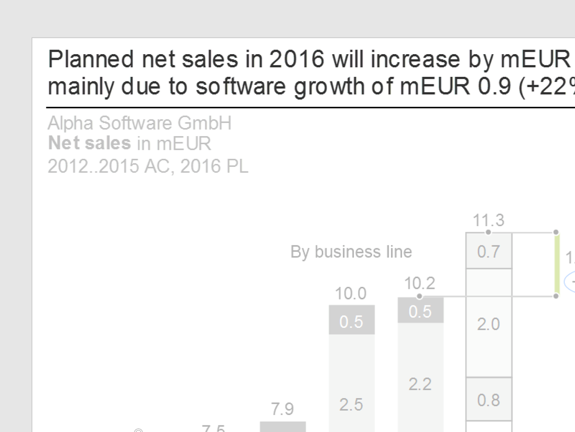
The notation of messages should be two text lines at the top of a report or presentation page, either a) above the title (see figure on the left) or b) right of the title. Position b) is not structured as clearly as position a) but it helps saving valuable vertical space especially on pages in landscape format.
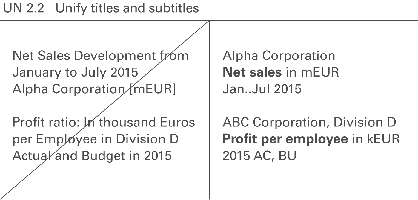
Titles identify the content of pages and their objects in its entirety, omitting nothing necessary to understand the content, see Figure UN 2.2. In contrast to messages, titles do not contain any evaluating aspects, such as interpretations, conclusions, or propositions.
If there is more than one object on a page, use page titles for entire pages, slides, or screens and sub titles for different objects on a page.
Page titles
Page titles identify the content of a page. In general, three lines suffice to completely describe the content of a page:
Title line 1: Reporting unit
Element(s) of a structure dimension representing the object of the report, typically a legal entity, an organization unit, a line of business, a project, etc. or combinations thereof, e.g.
Add filter information if the elements are not exhaustive, e.g.
If title line 1 becomes too long its content can be split into two lines, e.g.
International Chocolate Corporation, European division
Top ten clients
Title line 2: Business measure(s)
Element(s) of the measure dimension such as sales, profit, and shipment. Business measures are measured either in currency units (e.g. EUR, USD) or in physical units (e.g. #, kg, t). Use metric prefixes (e.g. k, m, b) where appropriate. Measures are written in bold font, their units are written in regular font. Examples are:
Use a suiting name for a set of measures, if more than two measures have to be presented on one page. Examples are:
Use footnotes if parts of the measures are redundant or if parts of the measures are of minor importance for understanding. Examples are:
Additional information about the way presenting the content can help to understand better the respective page. They might concern structure dimensions, e.g.
or they might be analytical annotations, e.g.
or even combinations of structure dimensions and analytical annotations, e.g.
If title line 2 becomes too long its content can be split into two lines, e.g.:
Full time equivalents in #, by offices
Indexed (2012 = 100%)
Net sales in mEUR, by countries
Sorted by net sales (↓)
Title line 3: Time period(s) scenario(s), and variance(s)
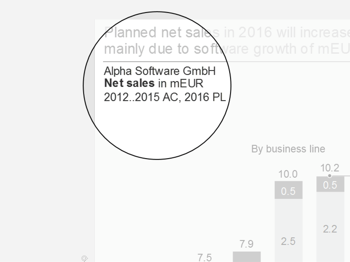
Element(s) of the time dimension (e.g. years, months), of the scenario dimension (e.g. actual, plan), and variances (e.g. ΔPL, ΔPL%) if necessary.
In general, elements of the time dimension (e.g. 2016, 2016-Q1) are necessary for understanding. Elements of the scenario dimension (e.g. AC, PL, FC) and variances are added if they help to understand the page content faster. If only actual values are presented, the attribute AC can be omitted.
Display the time element first if both time and scenario elements are shown in title line 3.
Use “&” (ampersand sign) when title elements together make up a time series, e.g. “AC&PL” (without blanks) if the first 8 months of a year present AC values and the last 4 months present PL values.
Use “and” when different elements are presented for all time periods, e.g. “AC and PY” if all 12 months of a year present both AC and PY values.
Examples of alternative arrangements in title line 3 are:
Keep it clear and easy to understand – too many elements tend to be confusing. In many cases the information depicted in column headers of tables and legends of data series in charts are sufficient and give better and quicker insight than long texts in title line 3. In any case, rules for abbreviating time periods and dates as well as the rules for abbreviating scenarios and variances must be followed.
In general, position page titles at the very upper left corner of a page, directly underneath the message (if a message exists). Alternatively, position them at the same height as the message if there is not enough space – preferably on the left hand side of the message.
Here are some typical examples of page titles:
Chocolate Corp.
Gross profit in mUSD
2016
Construction Inc., Division EMEA
Net sales in mEUR, profit margin in %
_2016-Q3 (AC, PL)
Beverage Corporation
Product market portfolio
2015 and 2016
Milk & Cheese Corp.
Shipments in t, by product, by country
2016-W01..10
Subtitles
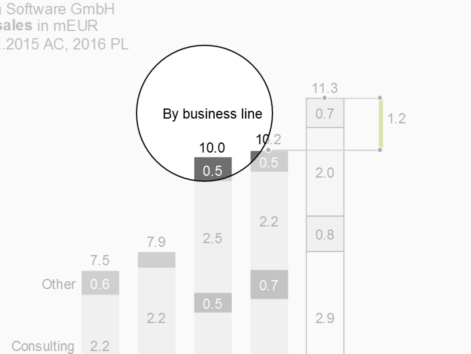
Subtitles identify either page segments or objects (e.g. charts and tables) within a page with multiple objects. They complement the identification information already given in the page title. Subtitles display identifiers that differ from object to object on a page. Put identifiers that are identical for all objects of a page in the page title and not in the subtitles.
In most cases, one line is sufficient for subtitles because different elements of only one dimension have to be identified. Typical examples are:
Revenue in mEUR
Apples
2014..2016
Sales in SKU
Pears
2016-Q1..Q4
Avg. price in EUR/SKU
Oranges
2016-10..12
Subtitles are positioned above the respective objects (charts, tables, etc.) which they identify – either centered or left-aligned.
Titles on screen pages
Unlike titles on printed pages, the layout of titles on screen pages can depend on the device (responsive design). For small devices in landscape format e.g. writing the three title lines in one line separated by a “|” (pipe sign) is a valid solution.
Titles on screen pages can also mutually interfere with interactive navigation objects such as drop-down boxes for selection and check boxes for filtering. These navigation objects can contain redundant title information, but they cannot replace the title or parts of it. Hide these navigation objects when they are not in use or when the screen page is being printed.
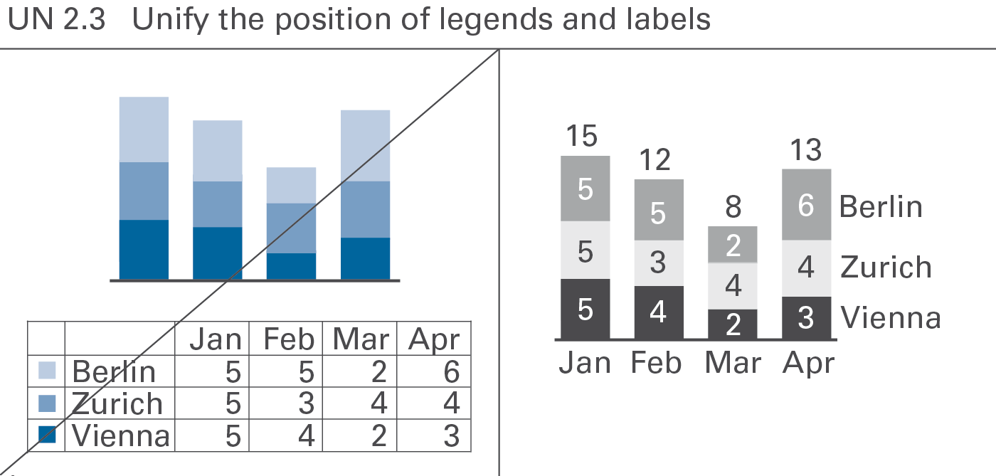
A standardized notation of legends and labels will improve legibility and speed up comprehension of charts, see Figure UN 2.3.
Legends
Legends (also called “data series labels”) identify data series.
If possible, integrate legends into charts, not positioned externally. Write legends horizontally for better legibility.
Legends for single column charts and single bar charts are best integrated into the title.
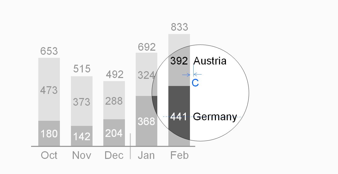
In stacked column charts, position legends either to the left of the leftmost column or to the right of the rightmost column.
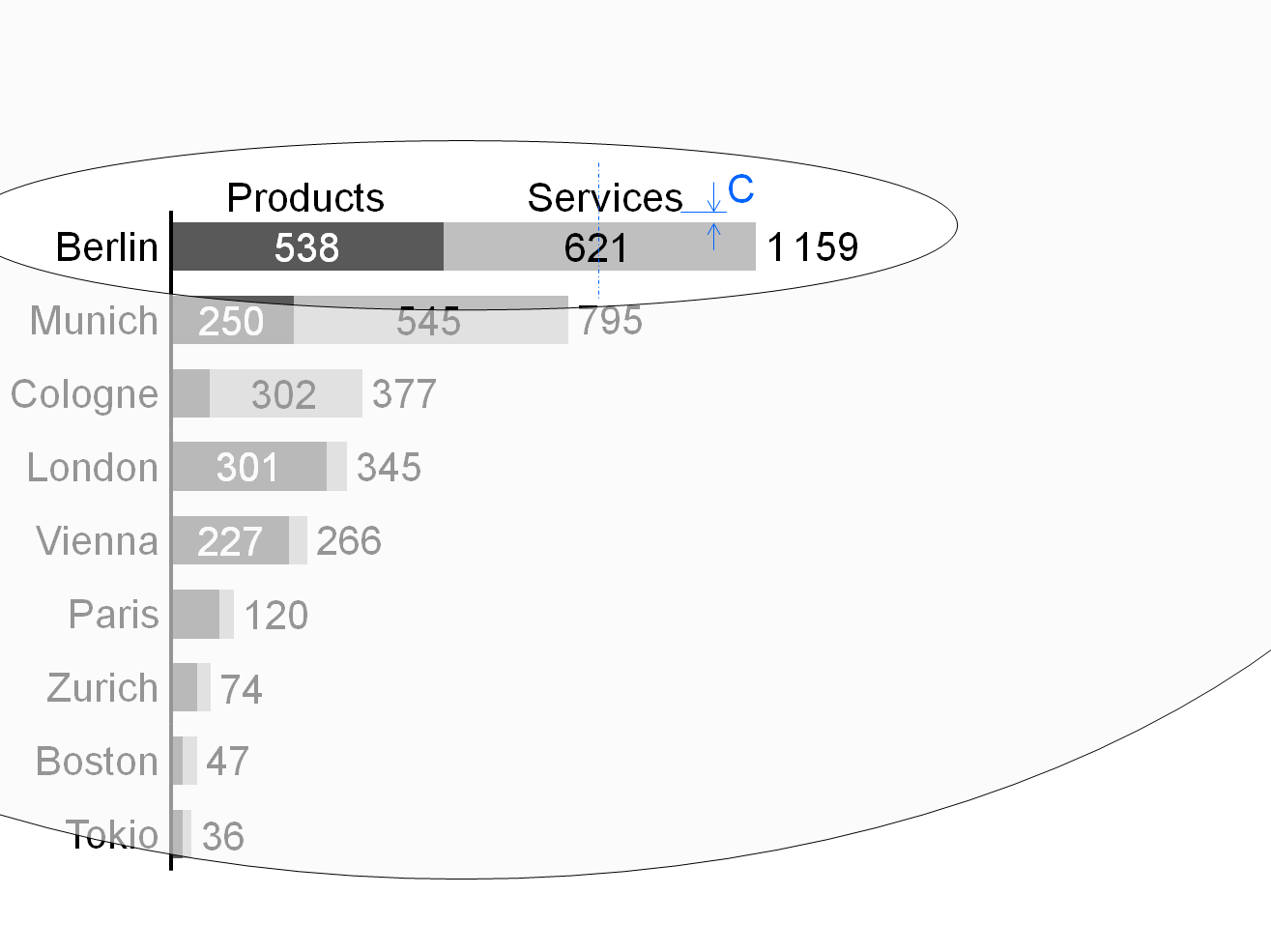
Center legends of stacked bar charts above the top bar.
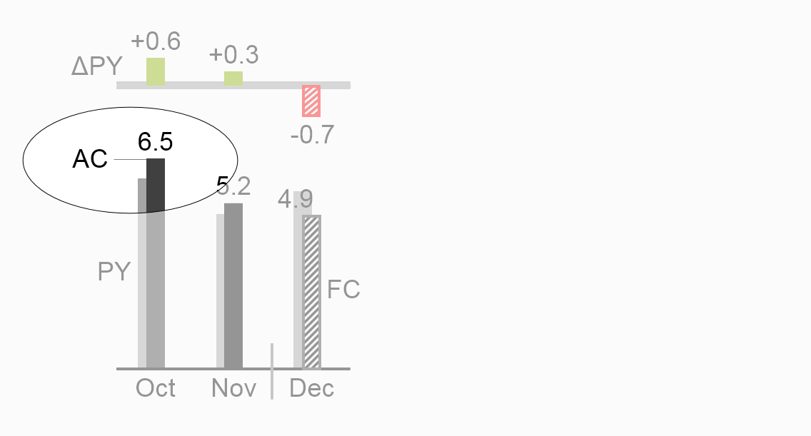
Assisting lines can help to assign the legends to the correct visualization elements. In grouped column charts and grouped bar charts, assisting lines can also help to assign the legends to the correct visualization elements.
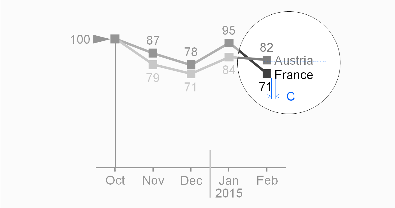
In line charts, position legends either to the right of the line end or close to the course of the line.
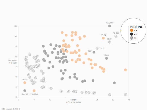
For charts with two value axes, externally positioned legends next to symbols can be a good choice. When helpful, integrate these legends into the chart by positioning them next to typical points or bubbles.
Labels
Labels (more precise:data labels) assign the data values to the respective visualization elements.
Omit labels of small visualization elements, use labels with not more than three digits, and avoid unnecessary and distracting labels (see also the SIMPLIFY rules SI 5 “Avoid distracting details”).
Write labels horizontally for better legibility.
Position labels next to their visualization elements. If this is not possible, use lines connecting the labels to the correct visualization elements.
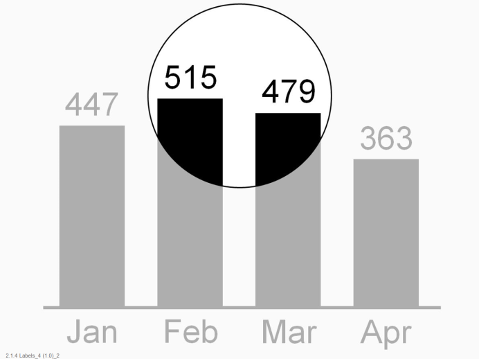
In charts with horizontal category axes, position labels above or below the visualization elements, see the first and second figure. In stacked columns, either center labels in the data points (if the data points are large enough) or position them outside of the data points.
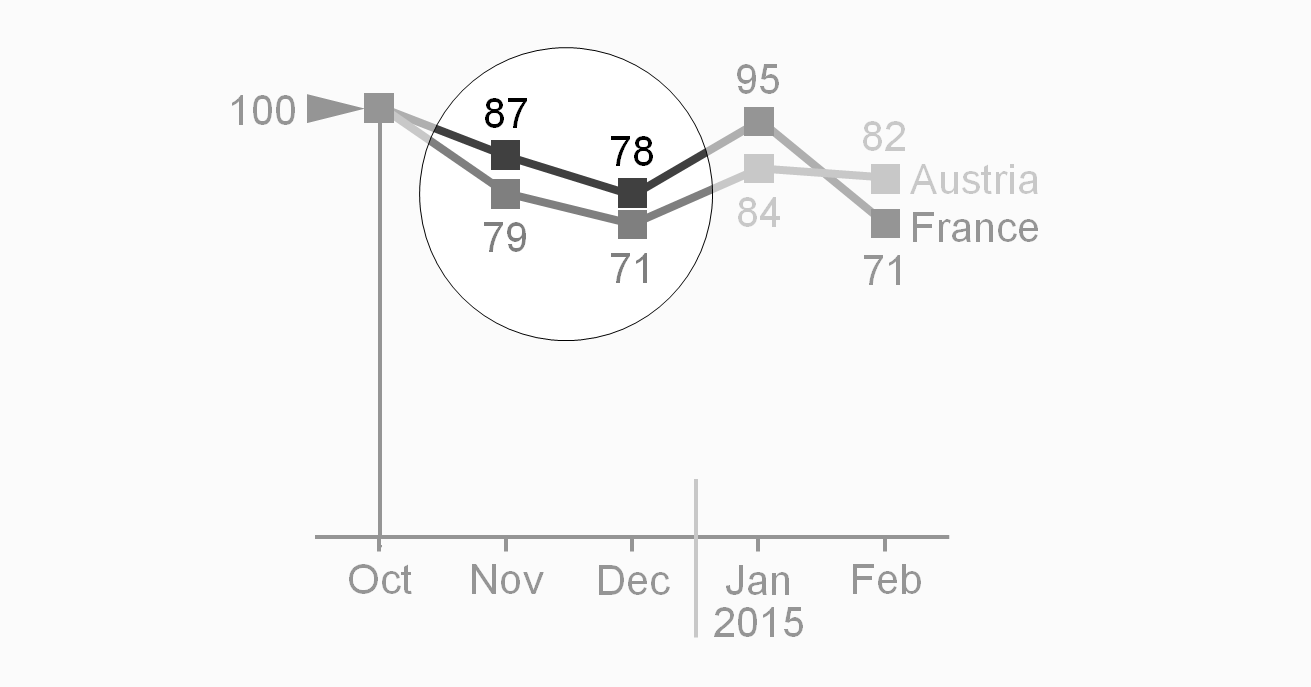
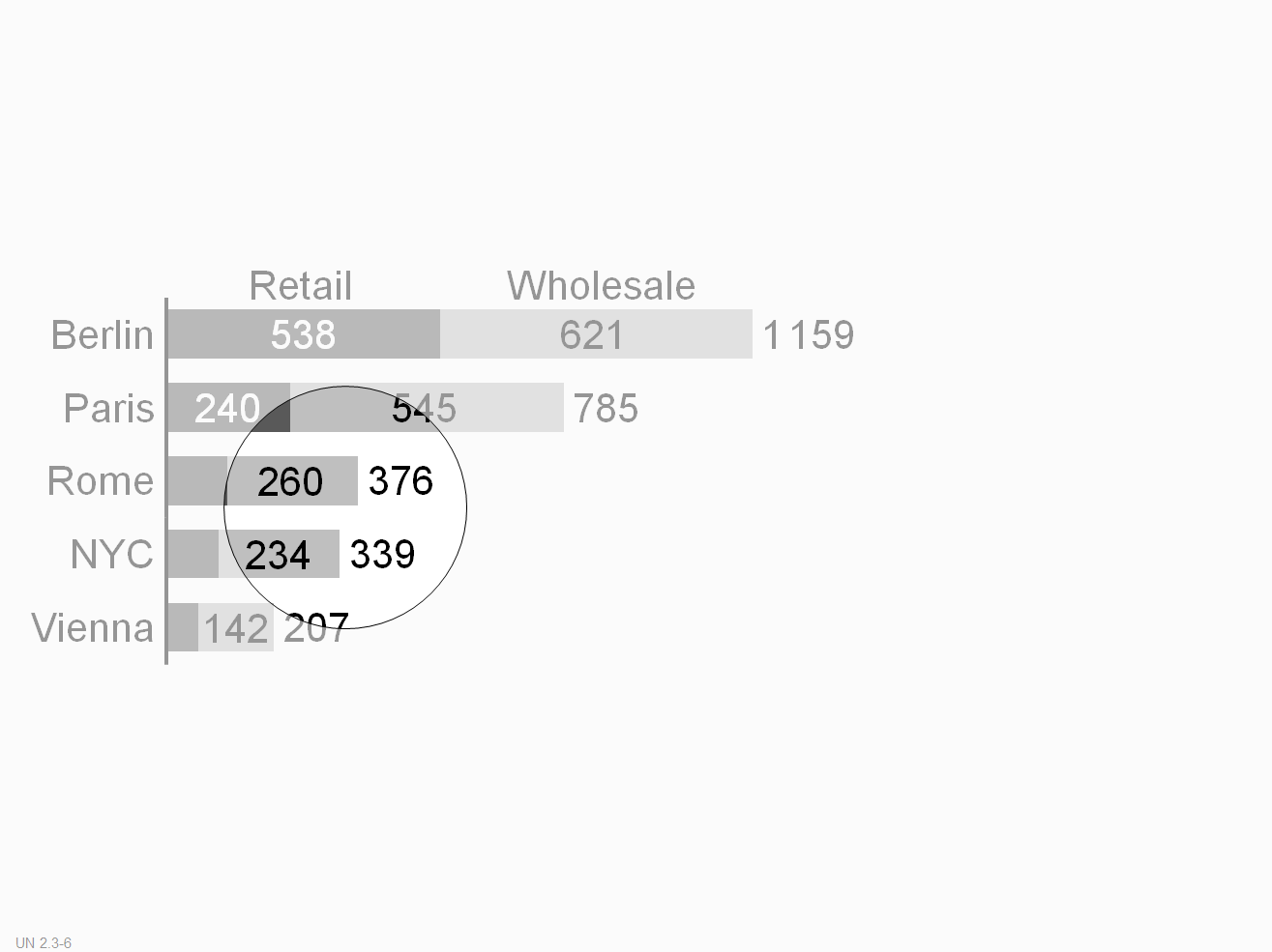
In charts with vertical category axes, position labels right or left of the visualization elements. In stacked bars, either center labels in the data points (if the data points are large enough) or position them outside of the data points.
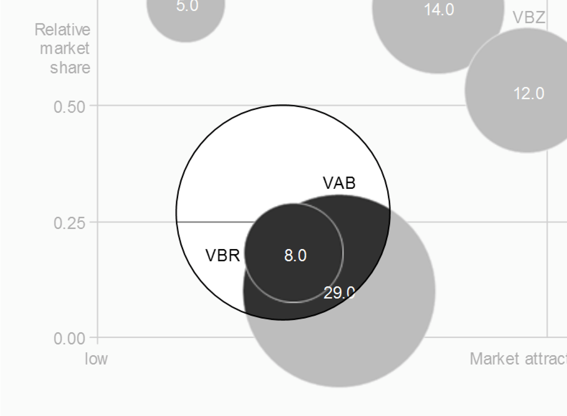
In charts with two value axes, position labels next to the visualization elements (above or below, right or left). Large bubble visualization elements labels can also have centered labels.
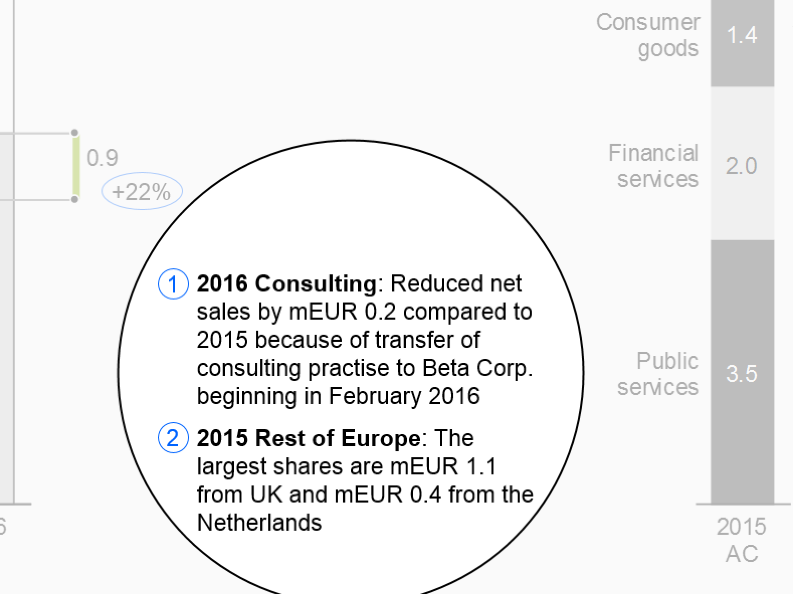
Mainly in static reports, comments detail other elements (e.g. definitions of data series) and objects such as charts and tables. Sometimes comments also refer to complete pages.
The level of comprehension increases when comments refer directly to the visual representation. Therefore, comments on an object (e.g. chart) are integrated into that object when possible. Comment elements should be linked to the content of tables, charts, etc. through comment references.
Footnotes, a special type of comments, provide general explanations, explanations of abbreviations, and information that increases the credibility of the content such as the sources or the dates of retrieval and printing. They can be omitted from slides projected on the wall, but must be included in written material.
Position footnotes at the bottom of a page.
Data in reports and presentations can be viewed from various perspectives called dimensions. For example, all business measures, such as sales, profit, margin, etc., constitute a measure dimension, all months, quarters, years, etc., a time dimension.
Identifying dimensions via uniform visualization will help to understand reports and presentations.
This section suggests visualization standards for measures, scenarios, time periods, and structure dimensions.
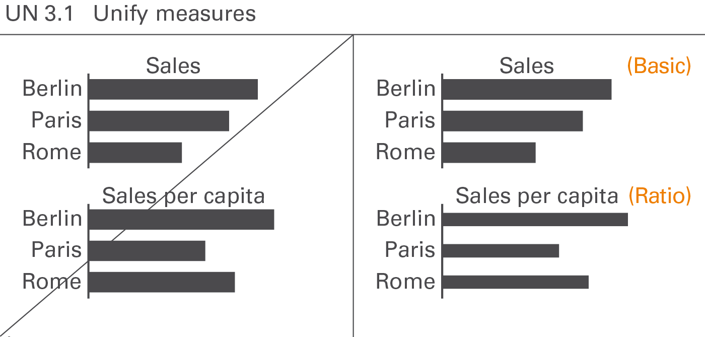
Business measures such as sales, profit, margin, etc. describe, report, and calculate business situations. A standardized notation will help to comprehend the specific characteristics of measures, e.g. whether they are basic measures or calculated ratios of measures, whether they represent value or volume figures, flow or stock figures, or whether they have a positive or negative impact, see Figure UN 3.1.
The visualization of business measures is presented here. Their definition, generally given in accounting manuals or similar documentation, is not discussed here.
Basic measures and ratios
Basic measures such as “export sales” are directly derived from business processes. Ratios such as “return on sales” are quotients of two basic measures.
Basic measures
Basic measures have either currency units (e.g. EUR) or physical units (e.g. kg). They are neither shares of something (percentages) nor quotients of two measures.
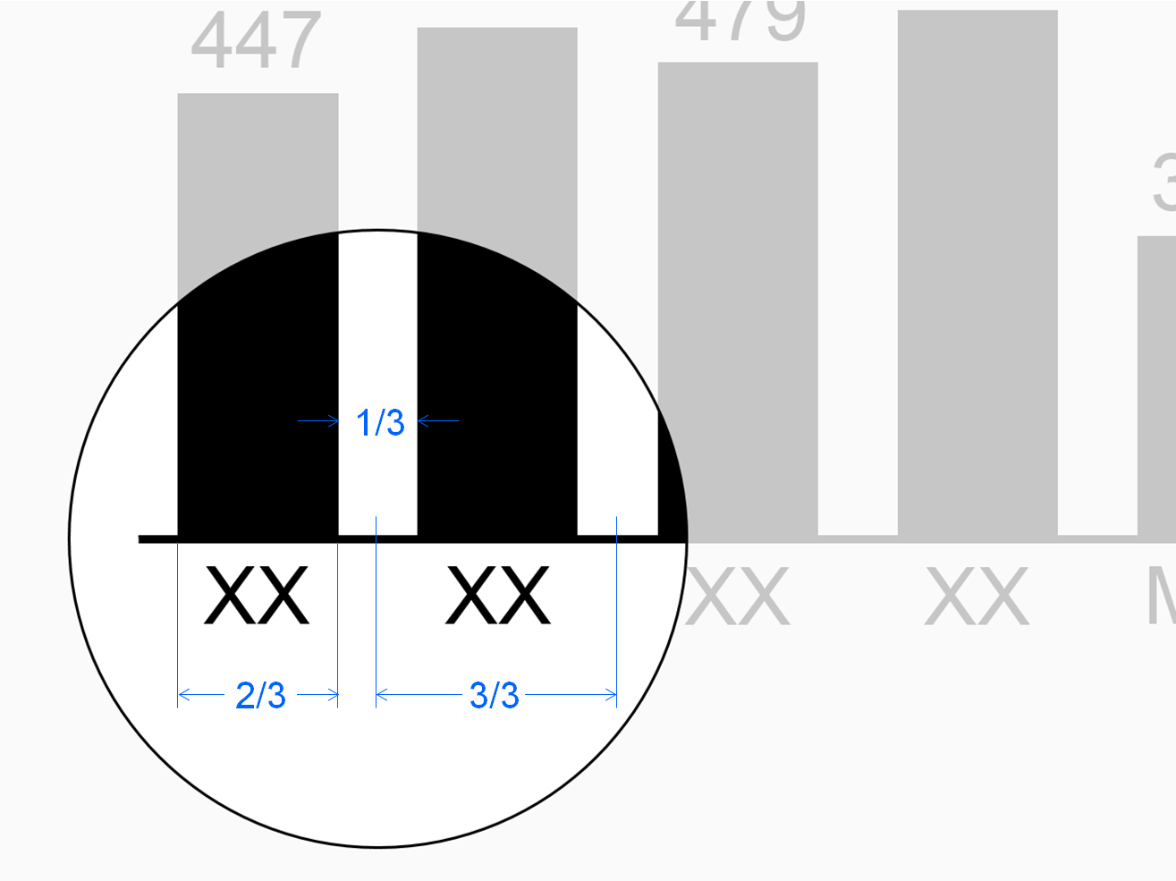
Use 2/3 of the category width for the column width in column charts and the bar width in bar charts to visualize basic measures.
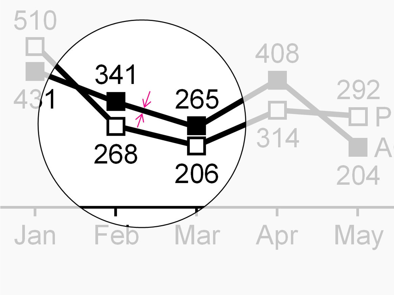
Use thick lines for representing basic measures in line charts.
Ratios
Ratios are quotients of two basic measures such as “return on sales”. In practice, few denominators exist: “Sales”, “units sold”, “headcount”, and “capital”constitute the majority of all business ratios.
If both the enumerator and denominator have the same unit the resulting ratio has no unit. It is expressed in percent (e.g. “profit in % of sales”).
In addition, if both enumerator and denominator have the same basic measure (e.g. “headcount”), it is called a share(e.g. “gender share”).
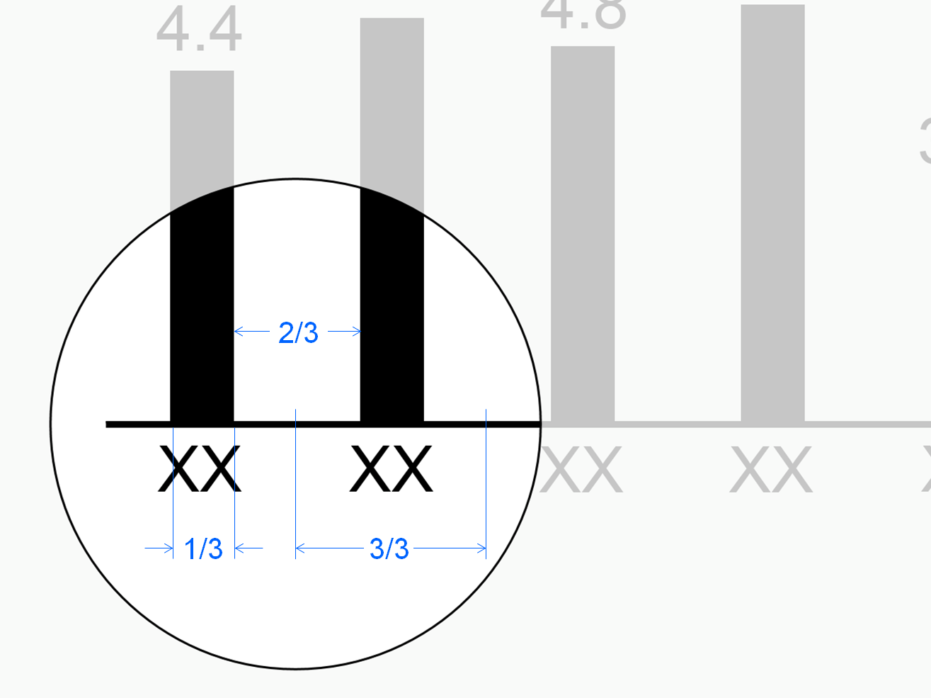
The width of both bars and columns representing ratios is 1/3 of the category width, i.e. 50% of the width of bars and columns representing basic measures.
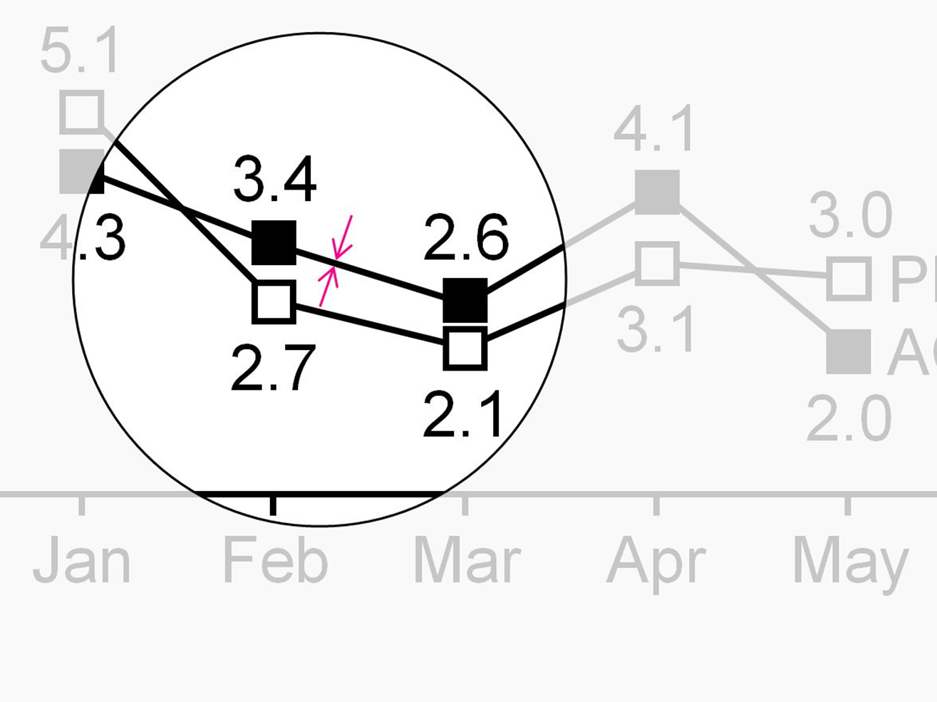
Represent ratios in line charts with thin lines (50% of thick lines).
Value and volume
Value measures such as “profit” and “capital” have currency units. Volume measures such as “shipment” and “headcount” have physical units.
Flow and stock
Flow measures like “net sales” relate to a certain time period such as months or years. Stock measures like “inventory” relate to a certain fixed date, such as December 31st of 2015 (at midnight).
Positive, negative, and neutral impact
An increase of a positive measure such as “profit” or “sales” positively impacts the organization’s result.
An increase of a negative measure such as “cost” or “waste” negatively impacts the organization’s result.
An increase of neutral measures such as “market size” or “investment” has no direct impact to the organization’s result.
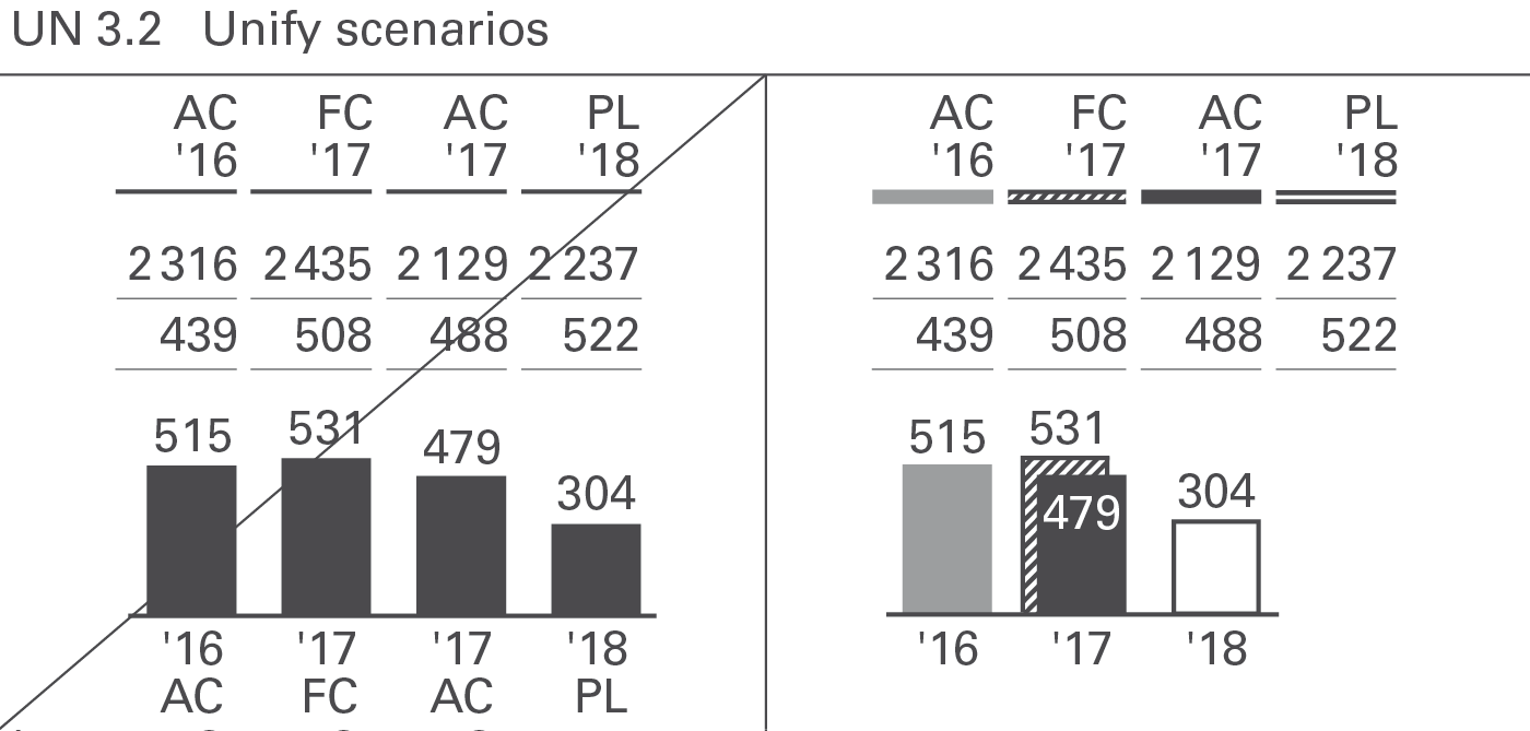
Scenarios(also called data categories, data types, or versions) represent different layers of a business model. Typical scenarios are “Actual”, “Previous year”, “Plan”, “Budget”, and“Forecast”. In special cases benchmarks such as competitor data or market averages are also called scenarios.
Often comparisons and variances between different scenarios are presented to provide business insights.
There are two basic types of scenarios:
Actual scenarios refer to measured data about things that already happened in present or past time periods. These data might not be perfectly correct because of difficulties with systems, unclear definitions, and false data acquisition – but they are as correct as possible. The terms we use most often for scenarios of this type are ‘Actual’ and ‘Previous year’.
Planned scenarios refer to fictitious (not materialized) data. The terms we use most often for scenarios of this type are ‘Plan’ and ‘Budget’.
In-between those two basic scenario types there is a third one:
When analyzing charts and tables, it is very important to quickly recognize whether you look at measured, expected, or fictitious data. Readers can visually recognize these scenario types by looking at the area fill of a visualization element without having to read the labels. Typical chart visualization elements such as bars, columns, line chart markers, scenario triangles, etc. carry the semantic scenario notation.
In charts presenting variances, their axes carry the semantic scenario notation in order to show the respective reference scenario (seeUN 4.1).
In charts with stacked columns, stacked areas, and charts with multiple lines or areas, the application of this semantic scenario notation can become a challenge. In these cases, applying the semantic notation to the axis instead of the columns etc. is a valid option.
Actual scenarios: measured data
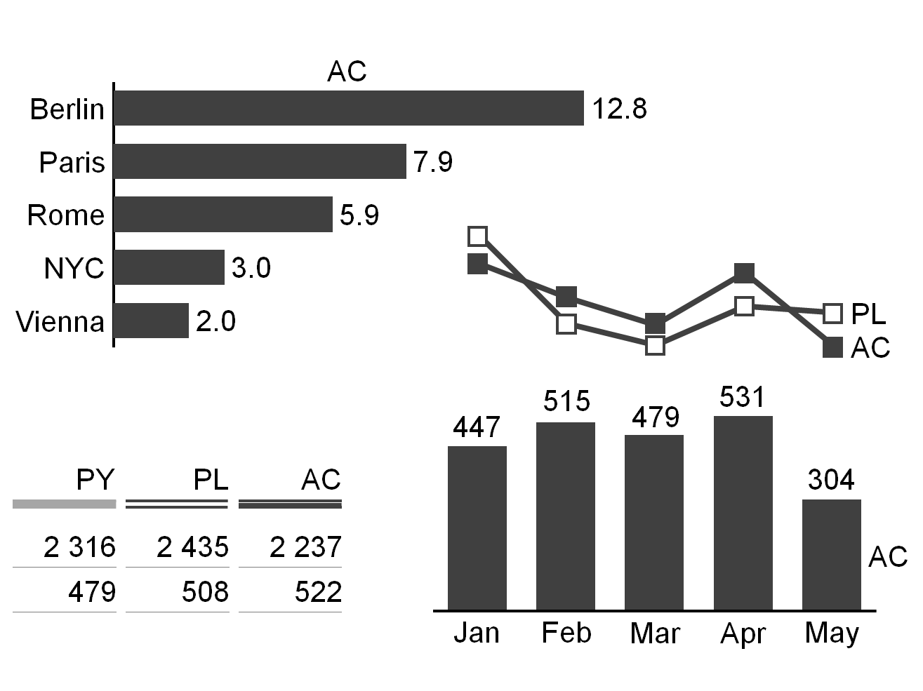
Scenarios with measured data are identified by a solid dark (e.g. black or dark gray) fill for the areas of the respective visualization elements.
If measured data of recent periods (“Actual”) are compared with measured data from earlier periods (e.g. “Previous year”,“Previous month’”, “Month YoY”) the areas representing the earlier periods are identified by a lighter solid fill (e.g. light gray).
The suggested two-letter codes for the most important measured data scenarios are “AC” for “Actual” and “PY” for “Previous Year”.
Planned scenarios: fictitious data
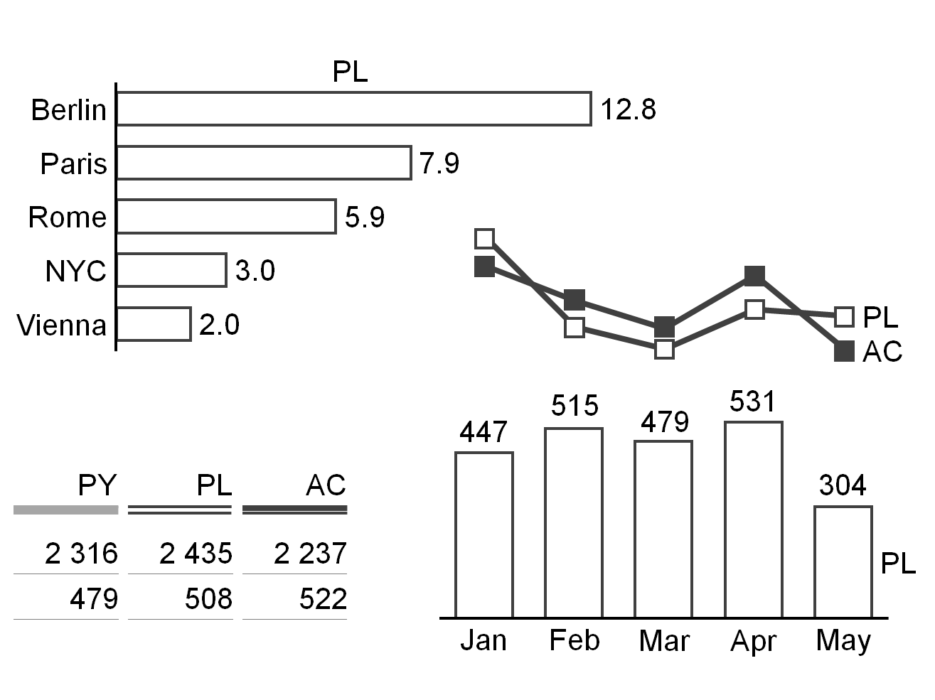
Scenarios with fictitious data are identified by bordered (outlined, framed) areas of the respective visualization elements. The areas within these borders literally “fill up when materializing”, e.g. when changing from fictitious data to measured data.
The suggested two-letter codes for the two most important fictitious data scenarios are “PL” for “Plan” and “BU” for“Budget”.
Forecasted scenarios: expected data
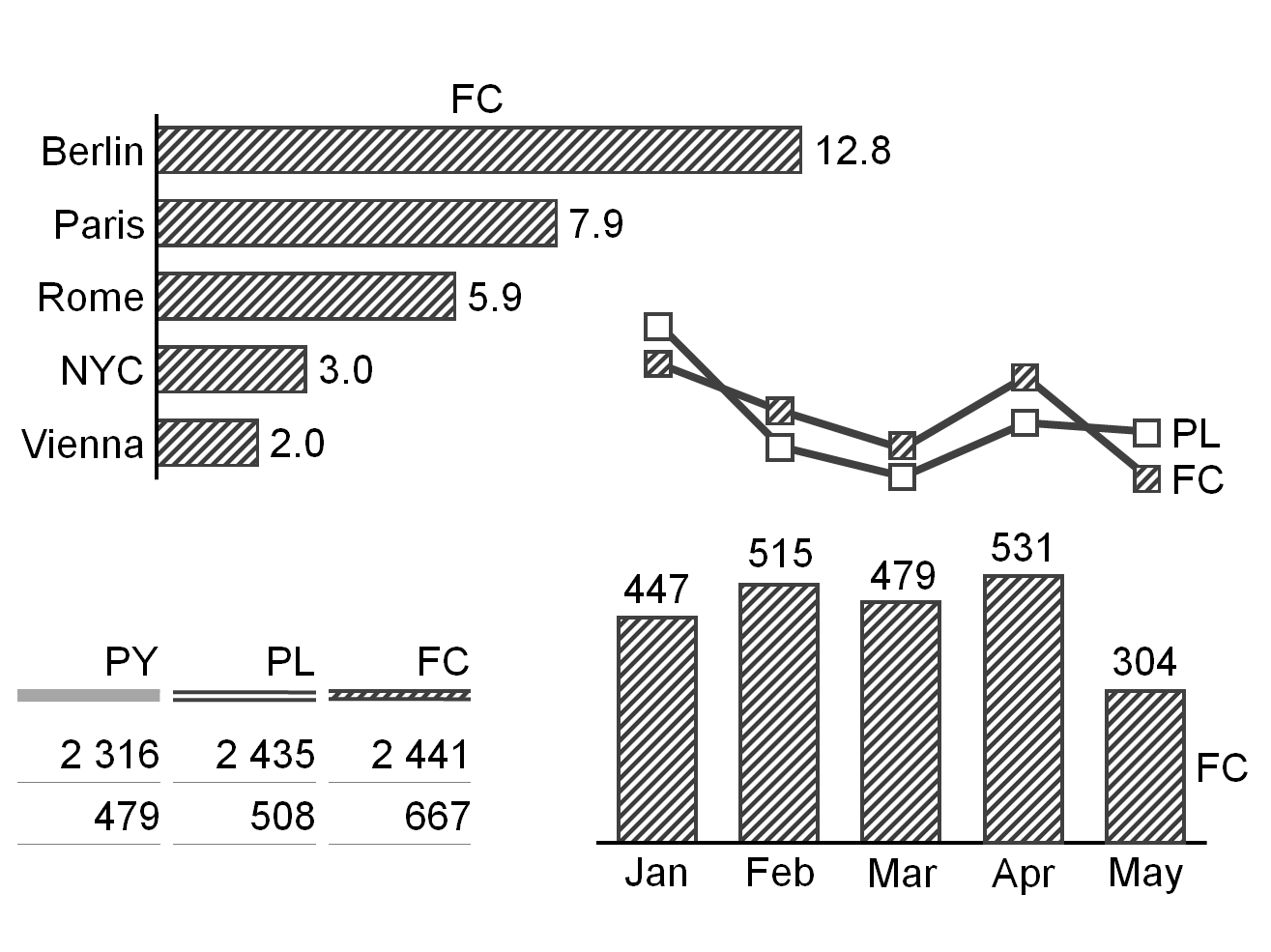
Expected data is strictly speaking fictitious, so they are also identified by bordered (outlined, framed) areas. However, as it is based on measured data, the area fill of the respective visualization elements becomes hatched. The color of the dark stripes correspond to the color of measured data (e.g. dark gray).
The suggested two-letter code for the most important expected data scenario is “FC” for “Forecast”.
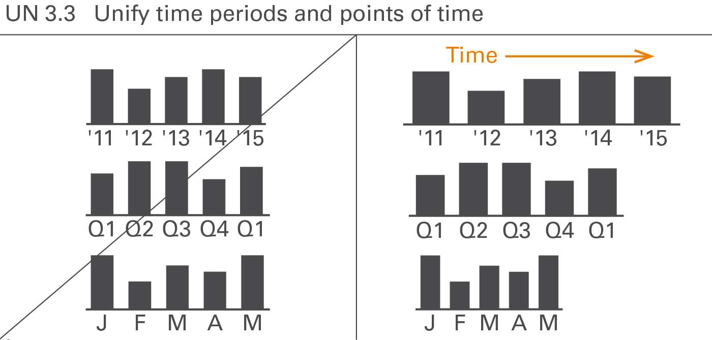
Using standard notations for time periods (for flow measures) and points of time (for stock measures) is important as they are frequently applied to all forms of business communication. This requires standard notations for the visual direction of time, time period and points of time abbreviations and – in charts with horizontal time axes – category widths, see Figure UN 3.3.
Visual direction of time periods
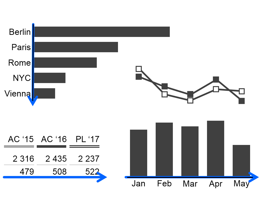
As opposed to structural comparisons, horizontal axes visualize data series over time. In tables, present data series over time in columns. In both cases time moves from left to right.
Time period and points of time abbreviations
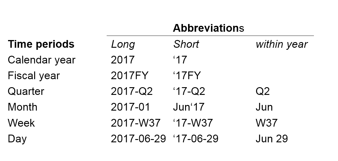
For a better understanding, use unified abbreviations for time periods and points in time. ISO 8601 recommends the following pattern for time periods: YYYY-MM-DD (e.g. 2017-05-13) for its unambiguousness and easy sorting. The abbreviations in the figure.
In some countries or organizations other abbreviations such as Oct 2017, Q2 2017, W07 2017 are common. They can also be used as long as they are used consistently.
A “.” (full-stop) before the period name indicates the first day of a time period, e.g. “.2017” for the first day of 2017 or “.Jun” for the first day of June.
Likewise, append “.” (full-stop) to the period name to visualize the last day of a time period, e.g. “2017.” for the last day of 2017 or “Jun.” for the last day of June.
The sign “..” (two full-stops) indicates a time span, e.g. “Jan..Mar” (without blanks) for “from January to March.”N.B.: Use two dots instead of three dots (“ellipsis”).
Category widths
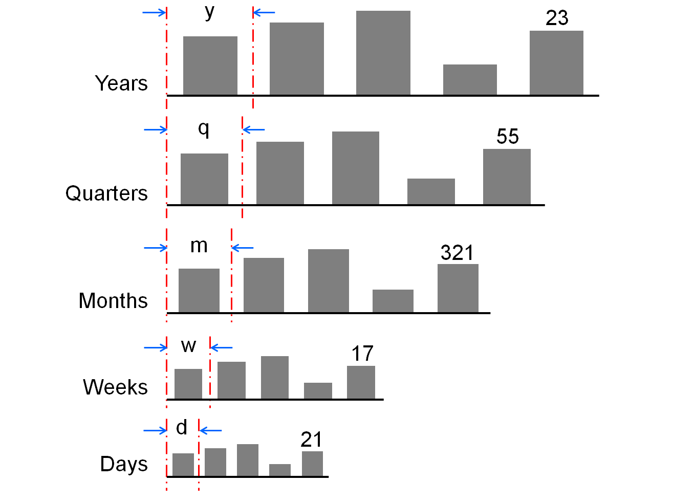
When helpful, differentiate different types of time periods with different category widths according to this rule: the longer the period the wider the category segments on the category axis.
It might be necessary to use rather wide category segments to label stacked columns or rather narrow category segments due to restricted dashboard space. In any case, if certain period types have been allocated certain category widths, this allocation should be the same for the entire report or presentation.
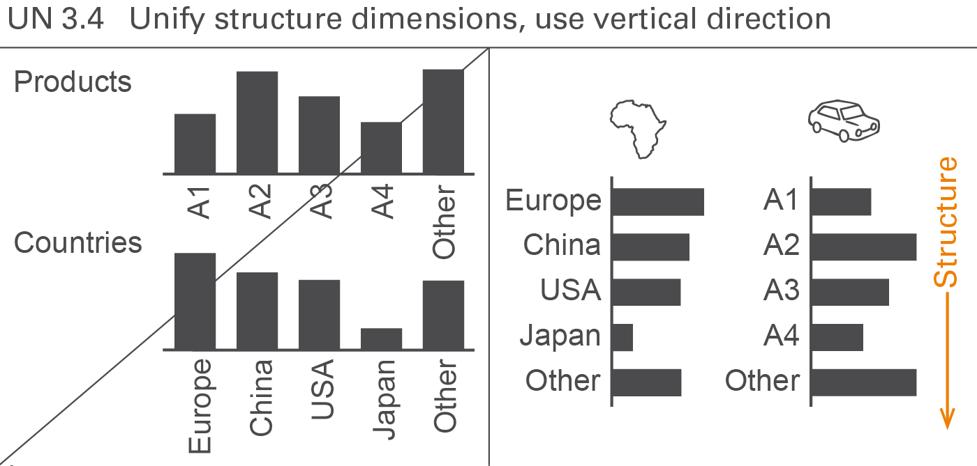
Structure dimensions are all dimensions that are not measures, scenarios, or time periods. In many cases, the following structure dimensions are used: regions, organization units, products, customers, channels, and accounts.
Display structures always in vertical direction. Use custom symbols if it is helpful to differentiate structure dimensions, see Figure UN 3.4.
Analyses are carried out in order to understand certain business situations, e.g. finding the greatest variances from a plan or calculating the monthly average.
This section comprises analyses regarding different dimensions such as scenario analyses, time series analyses, and structure analyses. A section covering different adjustment analyses is added.
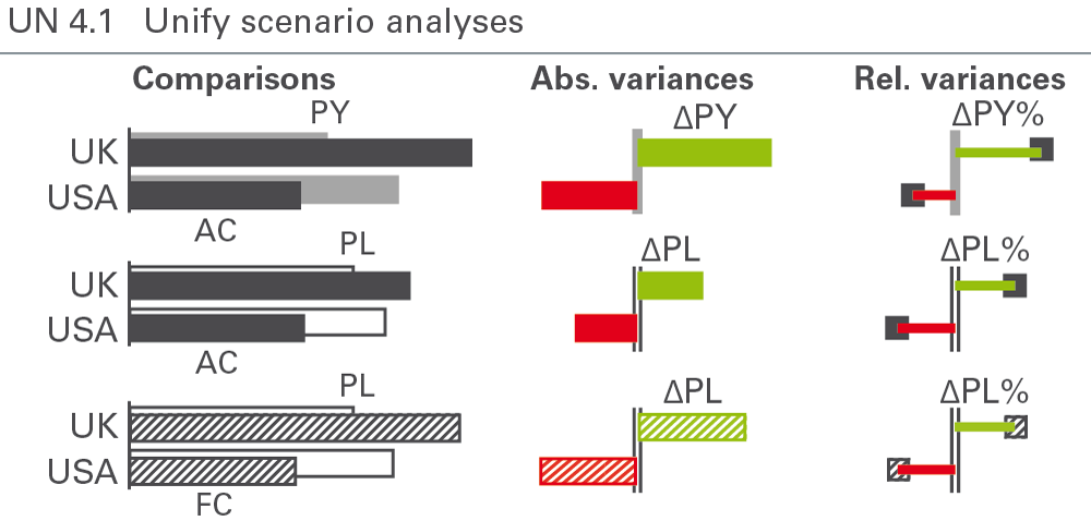
Analyze scenarios by comparing them and by calculating their absolute and relative variances. Notation standards for scenario analyses cover the labelling of variances and the semantic design of chart elements such as columns, bars, and axes, see Figure UN 4.1.
Scenario comparisons
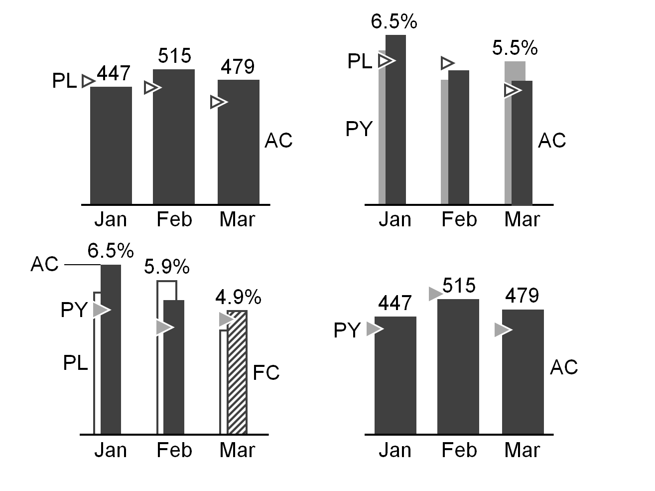
Scenario comparisons place the data of different scenarios next to each other, for example actual data next to previous year or budget data. This is relevant for both charts and tables. In tables, scenarios usually are shown in columns.
Scenarios can be compared in an absolute or relative way:
Absolute variance = primary scenario – reference scenario
Relative variance = absolute variance / reference scenario
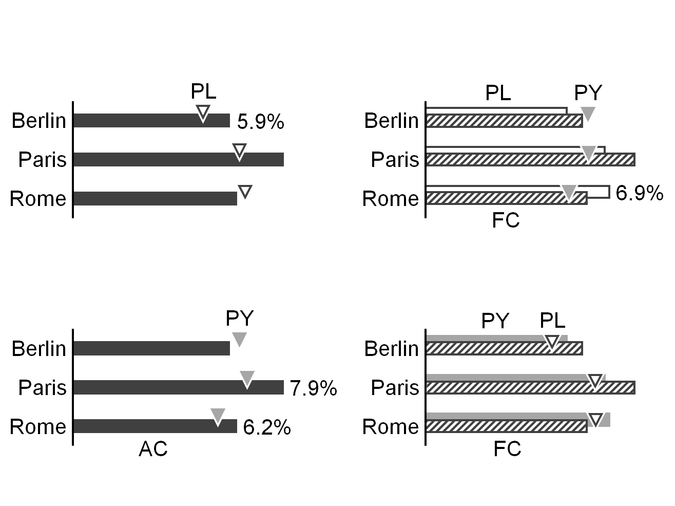
Arrange scenarios of different time periods (mainly years) in temporal ascending order either from left to right (horizontal axes) or from above to below (vertical axes), e.g. PY (= AC 2014), FC 2015, PL 2016.
No rule governs the sequence of scenarios referring to the identical time period – e.g. PL 2015, FC 2015, AC 2015, but the selected sequence should be kept the same in all charts and tables.
Scenario comparisons are visualized either by grouping columns or bars (e.g. overlapping columns of PY and AC or overlapping bars of PL and AC), or with scenario triangles using the respective area coding (e.g. solid light color for PY) to represent the reference scenario. Scenario triangles can also be added to overlapped bars or columns in order to show a third scenario.
The scenarios AC and FC stand in the foreground of other scenarios in grouped columns or bars.
Absolute variances
An absolute variance is the difference between two values of one measure from different scenarios.
The sign “Δ” represents the absolute variance as a prefix to the subtrahend of the respective difference, i.e. “ΔPL” for the absolute difference “AC minus PL” (AC-PL) or – if FC is compared to PL – “FC minus PL” (FC-PL).
The most common absolute variances are the following:
Plan variance: “ΔPL” for AC-PL or FC-PL (when comparing FC to PL)
Previous year variance: “ΔPY” for AC-PY or FC-PY (when comparing FC to PY)
If it is not clear whether AC or FC is compared to plan in ΔPL or ΔPY, use the following notation:
Positive absolute variances (as well as positive percent variances) have a “+” to emphasis this aspect: “+13” always means a variance of 13, “13” means any absolute value of 13.
If absolute variances are displayed in columns or bars (“variance columns” or “variance bars”), these variance columns or bars have the same width and the same scale as the corresponding base value columns or bars.
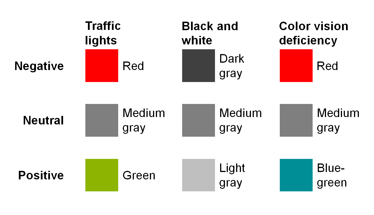
Variance bars and columns representing a positive impact on business issues (mainly result) are colored green, those representing a negative impact red, see figure on the left. Variance bars and columns representing a neutral impact are colored medium gray. If no color is available, replace red with dark gray, green with light gray. For readers with color deficiency, replace green with blue-green.
If it is helpful, numbers in tables representing variances are colored in the same way.
Note: These colors for positive, negative, or neutral variances must not be confused with red and green “traffic lights” (see also EX 2.5 “Replace traffic lights”).
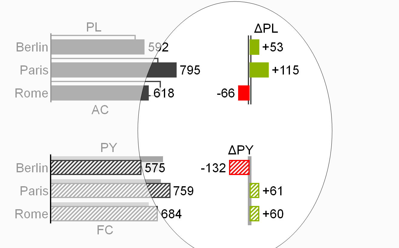
In order to visualize the scenario to be analyzed (minuend), apply scenario notation to the fill of the variance columns or bars, e.g. solid green or red fill for AC and hatched green or red fill for FC. If in special cases the minuend is PL (e.g. variance of plan versus average) the variance columns and bars are outlined green or red.
Position data labels for variance columns and bars always outside of these visualization elements. These labels’ position aligns with the direction of positive or negative increase, i.e. the label of a positive variance (green) in a variance column is positioned above the column; the label of a negative variance (red) on the left hand side outside of the bar.
In order to visualize the reference scenario (subtrahend) of an absolute variance (in general PY, PL, or BU), apply scenario notation to the axis: For absolute variances to PY the axis is colored solid light, for absolute variances to PL or BU the axis takes an outline shape (two parallel lines).
Treat variances of ratios, e.g. percent values (profit on sales) in a special way: Absolute variances of percent values are called percent points, e.g. AC 50% – PL 40% = +10pp.
Relative variances
A relative variance is an absolute variance as a percentage of the subtrahend of the absolute variance.
For the textual notation of relative variances, use the sign “Δ”as a prefix to the subtrahend and the sign “%” as appendix, e.g. ΔPL% for the relative variance (AC-PL)/PL*100.
The most common relative variances are the following:
Plan variance: “ΔPL%” for (AC-PL)/PL*100 or (FC-PL)/PL*100 (when comparing FC to PL)
Previous year variance: “ΔPY%” for (AC-PY)/PY*100 or (FC-PY)/PY*100 (when comparing FC to PY)
Display “n.a.” (not available) if the calculated relative variance cannot be interpreted, as is often the case when a positive value is compared to a negative reference value (denominator):
Profit AC = 30
Profit PL = -30
ΔPL = +60
ΔPL% = 60 /
-30 = -200% => n.a.
Use the following notation, if it is not clear whether AC or FC is compared to Plan:
Positive relative variances (as well as positive absolute variances) have a “+”-to emphasize this aspect: “+13%”always means a variance of 13%, “13%” means any kind of percentage such as ratio or a share.
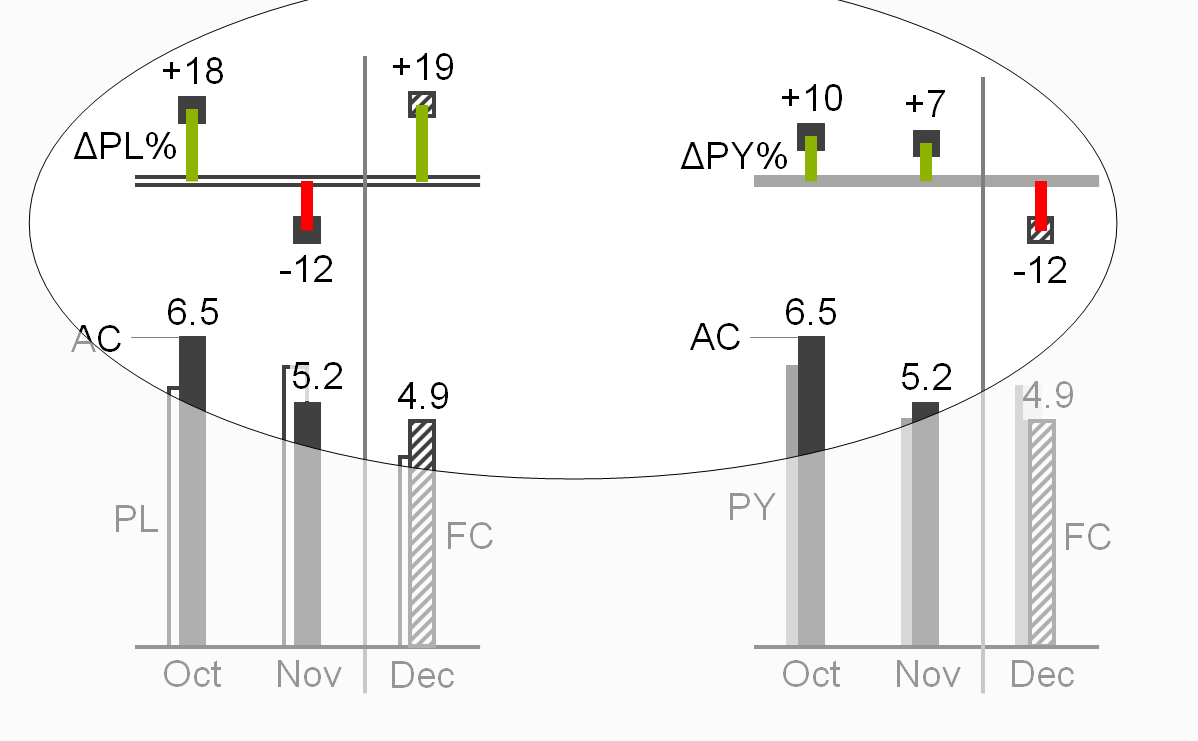
Relative variances are displayed in thin columns (vertical pins) or thin bars (horizontal pins), see the two figures on the left.
Pins representing a positive impact on business issues (mainly result) are colored green, those representing a negative impact red. Pins representing a neutral impact on business issues are colored medium gray. If no color is available, replace red with dark gray, green with light gray. For readers with color deficiency, replace green with blue-green.
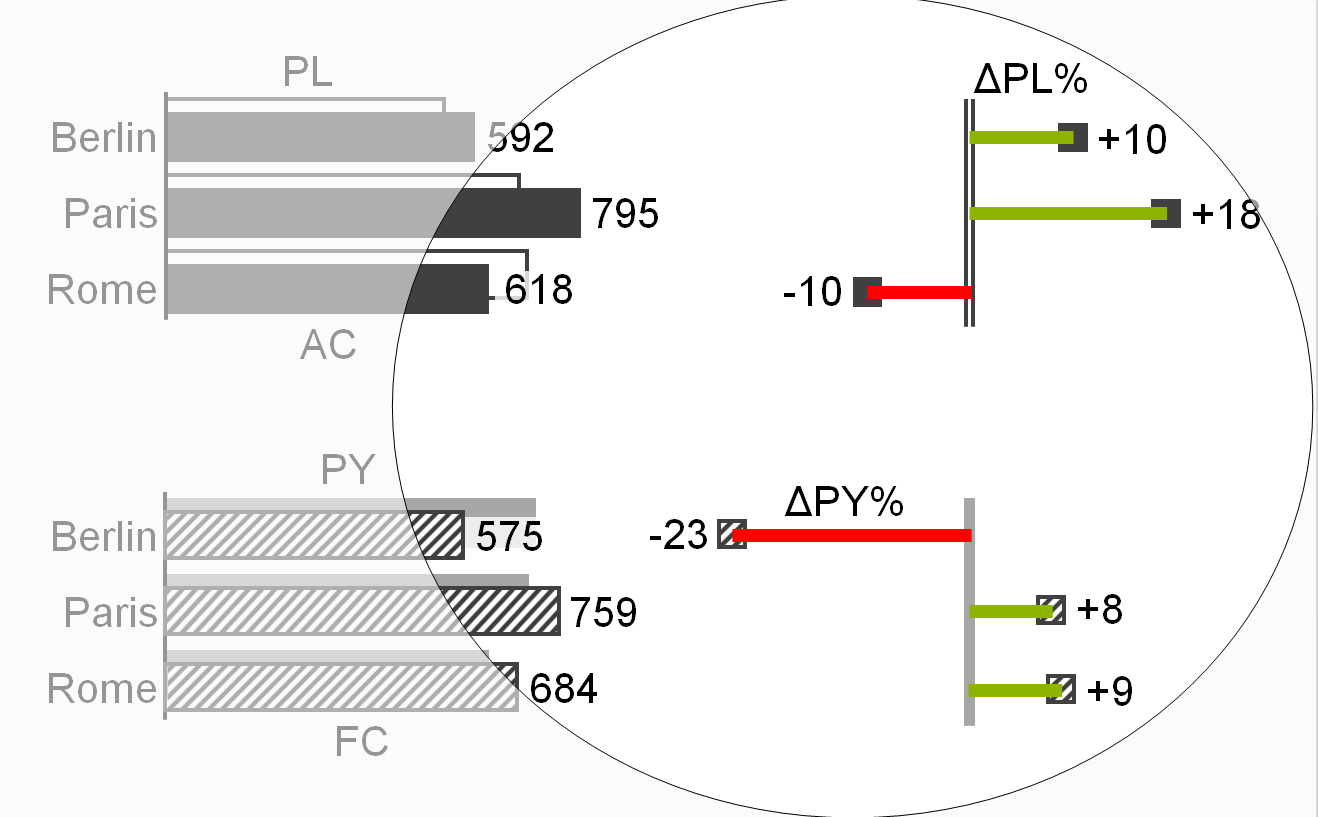
The labels of pins and the numbers representing variances in tables can be colored in the same way.
Note: These colors for positive, negative, or neutral variances must not be confused with red and green “traffic lights” (see also EX 2.5 “Replace traffic lights”).
Position data labels of pins outside the pin in the direction of the positive or negative increase, e.g. position the label of a horizontal pin depicting “sales growth in %” (green) on the right hand side of the pin, position the label of a vertical pin depicting “cost decrease in %” (green) below the pin.
Add head markers to the pins to visualize the scenario to be analyzed (minuend). Apply the scenario notation to the fill of the heads, e.g. solid dark fill for AC and hatched fill for FC.
Apply the scenario notation to the axis in order to visualize the reference scenario for a relative variance (in general PY, PL, or BU): For relative variances to PY fill the axis solid light, for relative variances to PL or BU the axis takes an outline shape (two parallel lines).
Treat relative variances of percent values the same way as relative variances of absolute values, e.g. (AC 50% – PL 40%) / PL 40% * 100 = +25%.
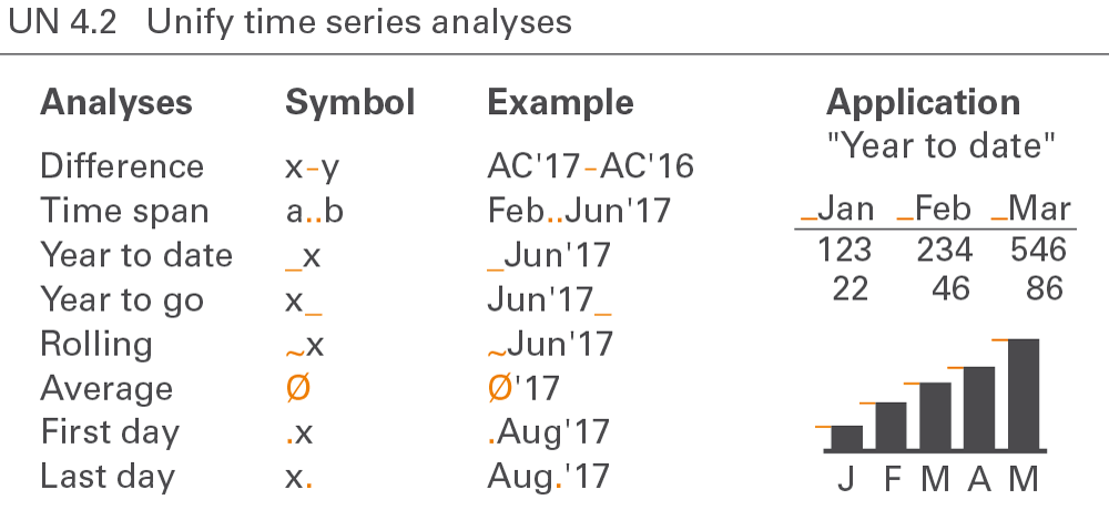
Notation for time series analyses covers year-to-date analyses, moving analyses, and temporal indexing, see Figure UN 4.2.
Year-to-date analyses
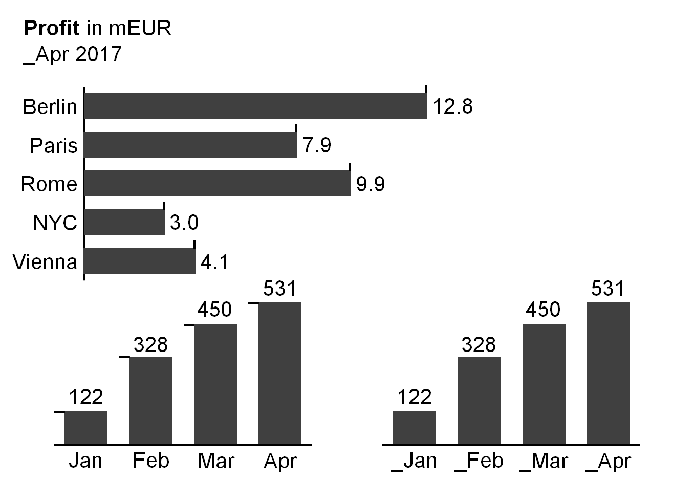
Year-to-date analyses (YTD) refer to the period from the beginning of the year to the present (YTD time span). The beginning of the year is not necessarily January 1. Some companies have fiscal years beginning at other dates.
Where helpful, visualize analyses showing YTD values by prefixing an underscore to the time period name, e.g. “_Jun 2015”or “_Jun∅” respectively. Optionally, add the first period of the YTD time span, e.g. “January_June 2015”. In charts, add the underscores as a prefix at the left hand side of the end of the columns or at the upper side of the end of bars.
Year-to-date operations cover accumulation of values, calculation of averages, and picking of last date values.
YTD accumulation
In this context, accumulation means totaling successive time period values from the beginning of a calendar year or fiscal year to the present. In this stricter sense, accumulation applies only to flow measures, such as sales or costs.
If it is helpful, visualize analyses showing YTD accumulation with the underscore prefix (without additional notation) e.g. “_Jun 2015”.
YTD average
In this context, the average is calculated by dividing the YTD accumulation by the number of periods in the YTD time span. YTD average applies to both flow and stock measures.
If it is helpful, visualize analyses showing YTD averages with the underscore prefix and an appended “∅”sign, e.g. “_Jun 2015∅”.
Last date value
A special YTD analyses for stock measures is picking the value of the last date in the YTD time span.
If it is helpful, visualize analyses showing last date values with the underscore prefix and an appended full-stop, e.g. “_Jun 2015.”.
Year-to-go analyses
By analogy to year-to-date analyses, year-to-go analyses (YTG) refer to the period from the presence (now) to the end of the (fiscal) year.
Where helpful, visualize analyses showing YTG values by appending an underscore to the time period name, e.g.“Jun-2015_”.
Moving analyses
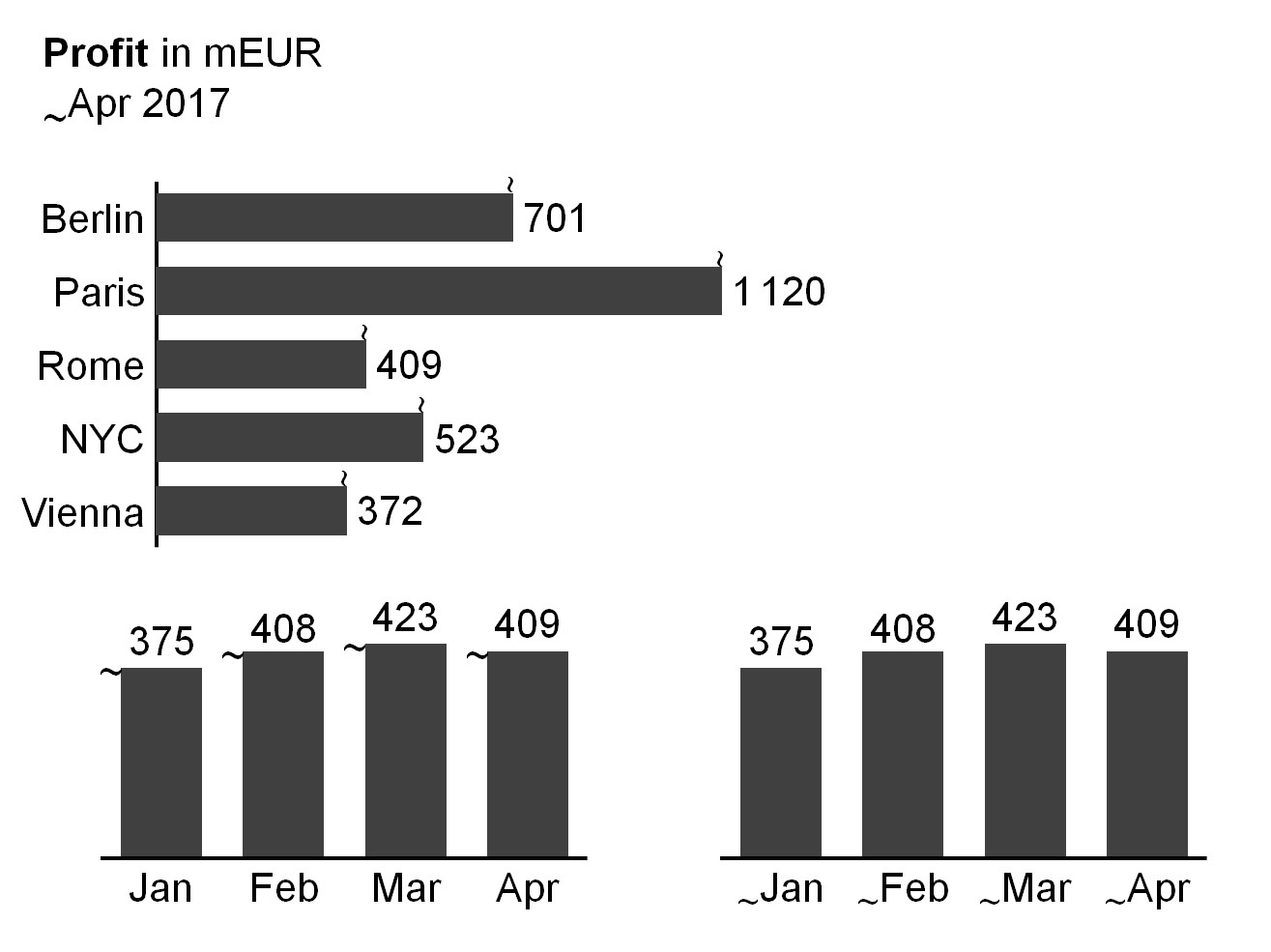
In general, moving analyses refer to the period of the previous twelve months.
If it is helpful, visualize moving analyses by prefixing the time period name with a tilde, e.g. “~Jun 2015” or “~Jun∅” respectively. In charts, add the tilde as a prefix at the left hand side of the end of columns or the upper side of the end of bars.
Similar to year-to-date operations, moving analyses cover accumulation of values (moving annual total MAT), calculation of averages (moving annual average MAA), and picking of last date values.
The visualization concept for accumulation of values, calculation of averages, and picking of last date values is identical to the visualization concept of year-to-date analyses – the tilde simply replaces the underscore.
Temporal indexing
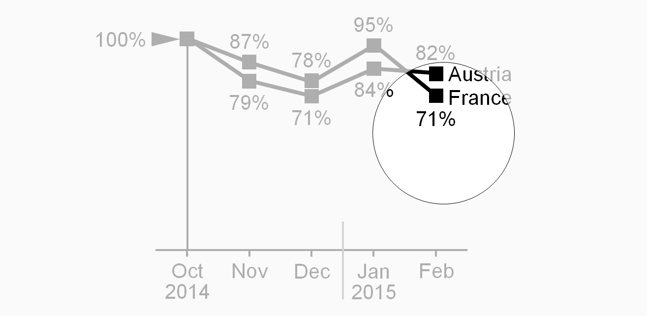
Using temporal indexing (indexing a time series), all period values are depicted in relation to the value of a chosen reference period (1 or 100%).
To visualize temporal indexing, position a black arrowhead pointing right at the left of the index point. “100%” or “100”is written left of the arrowhead. If helpful, add an assisting horizontal line.
Notation for structure analyses covers averaging, ranking, selecting, indexing, and normalizing.
Structural average
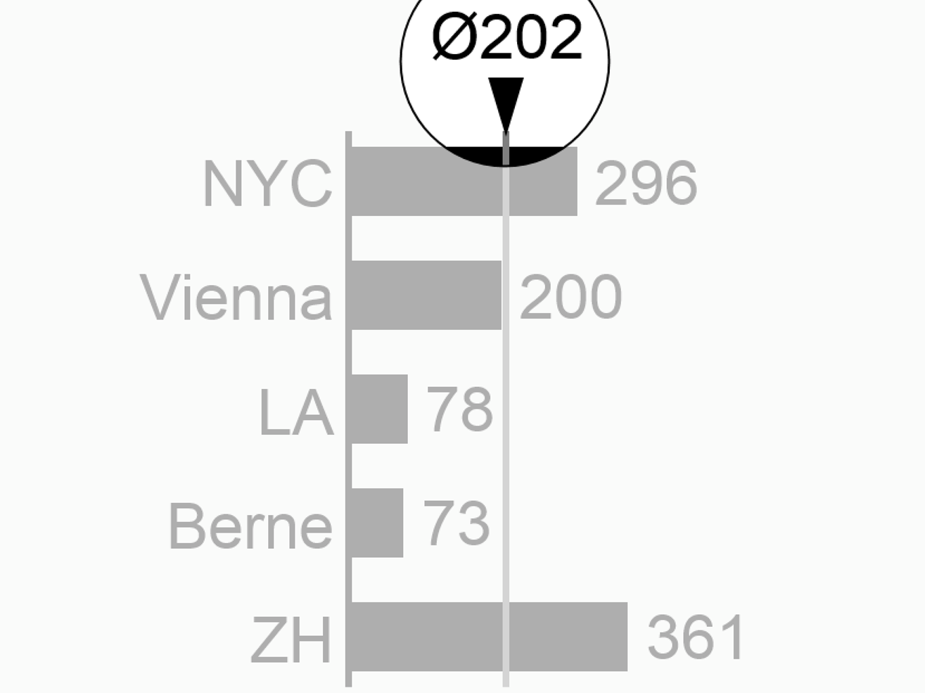
The term “average” usually refers to the mean of different values. The section time series analyses described temporal averages (e.g. monthly average of a year). Structural averages (e.g. average sales of several subsidiaries) are covered here. Typical structural averages are average by product, average by country, and average by customer.
Visualize analyses showing structural averages with a “Ø” sign either appended or as a prefix, e.g. “EuropeØ” or “Ø464”. If needed, add an assisting line.
Ranking
Ranking analyses refer to descending or ascending rankings of structure elements. Words can be ranked in alphabetical order, numbers in numerical order.
If helpful, append an arrow sign to rankings, e.g. “country names↓” or “product sales↑”.
Selecting
The structure analysis selecting is related to the structure analysis ranking, used, in general, to determine either maximal (fastest, most expensive) elements or the minimal (slowest, cheapest) elements. Top ten, last ten, first quartile, last percentile, etc., are common forms of selecting.
Structural indexing
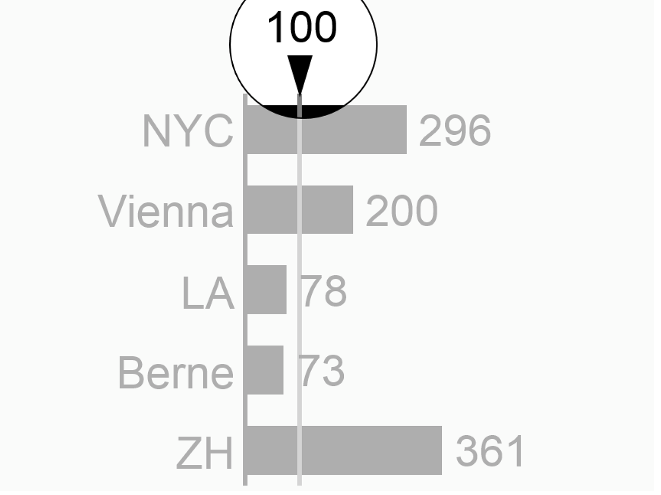
Structural indexing depicts all element values in relation to the value of a chosen reference element (=1 or 100%). Typical reference elements are the mean, the maximum, or a specific element in a given structure, e.g. “Germany = 100%”.
To visualize structural indexing, position a black arrowhead close to the index point. “100%” or “100”, is written next to the arrowhead. If helpful, add an assisting line.
Structural normalizing
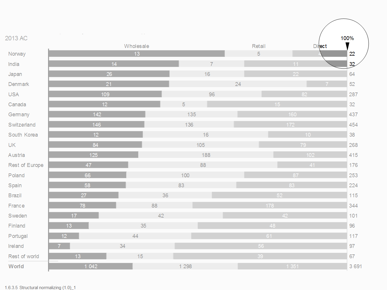
Structural normalizing refers to the comparison of several shares of some whole, e.g. shares of export to different countries. Indexing and normalizing are similar analyses, indexing refers to one element (e.g. a selected country), normalizing to the whole of several parts (e.g. country sales in % of Europe sales).
To visualize structural normalizing, add an assisting line representing 100%. Position a black arrowhead at one end of the assisting line. “100%” or “100”, is written next to the arrowhead.
Adjustment analyses can offer insight into root causes as they adjust values by neutralizing special effects. In general, adjustment analyses are used in conjunction with scenario analyses. Here the values of one scenario are recalculated with correction factors from another scenario: e.g., adjust AC sales for currency effects by re-measuring them with the PY exchange rates.
Typical adjustment analyses deal with currency, inflation, and seasonal effects.
Indicators in reports and presentations serve different purposes, e.g. highlighting and scaling. Using the indicator with the same design for the same purpose will help to identify the situation much faster.
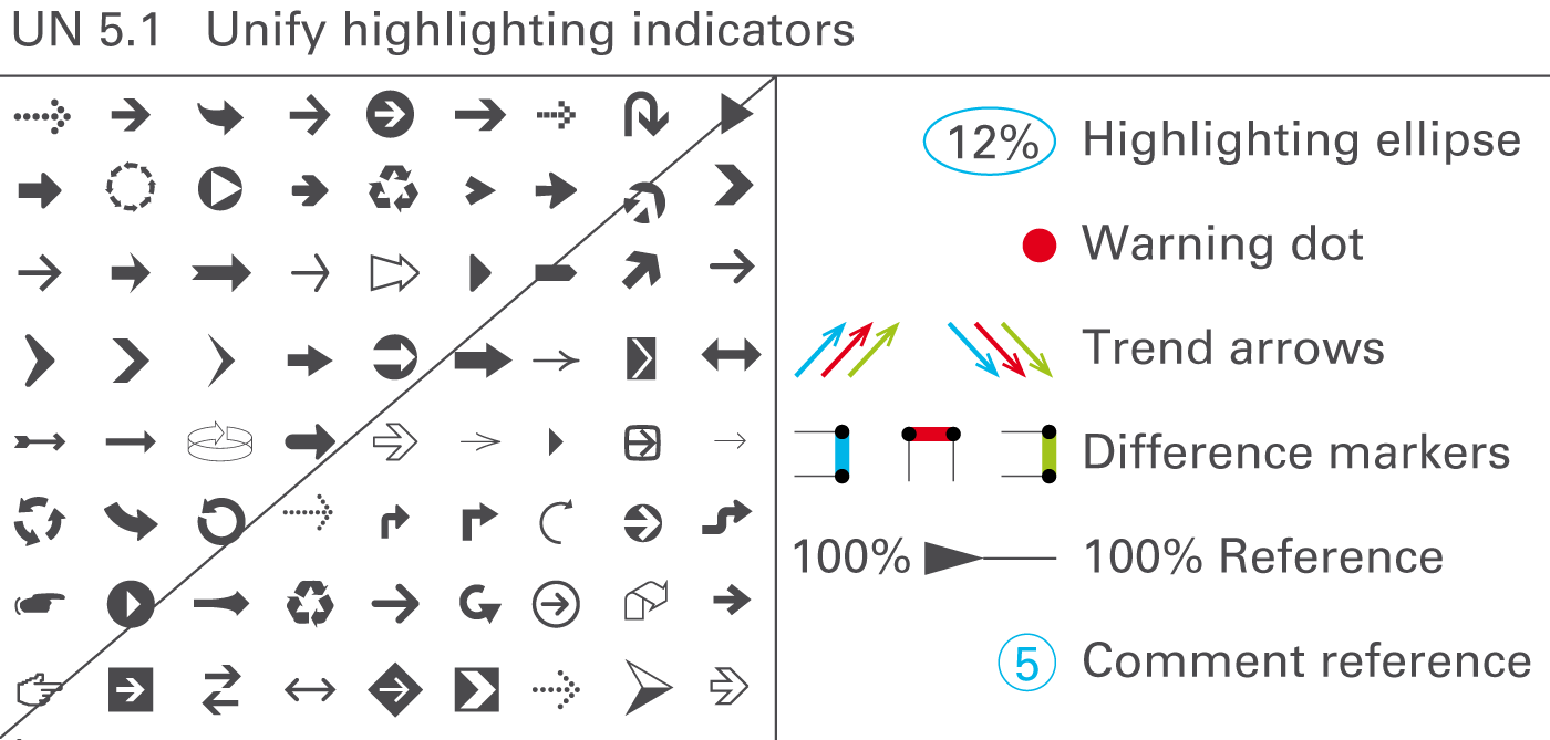
The message to be conveyed should be highlighted on the respective page by appropriate visual means. Highlighting elements enhance the meaning and importance of other elements. Use highlighting elements for assisting purposes, for visualizing differences and trends, for underlining values, for indicating a reference, or for linking comments, see Figure UN 5.1.
Assisting lines and areas
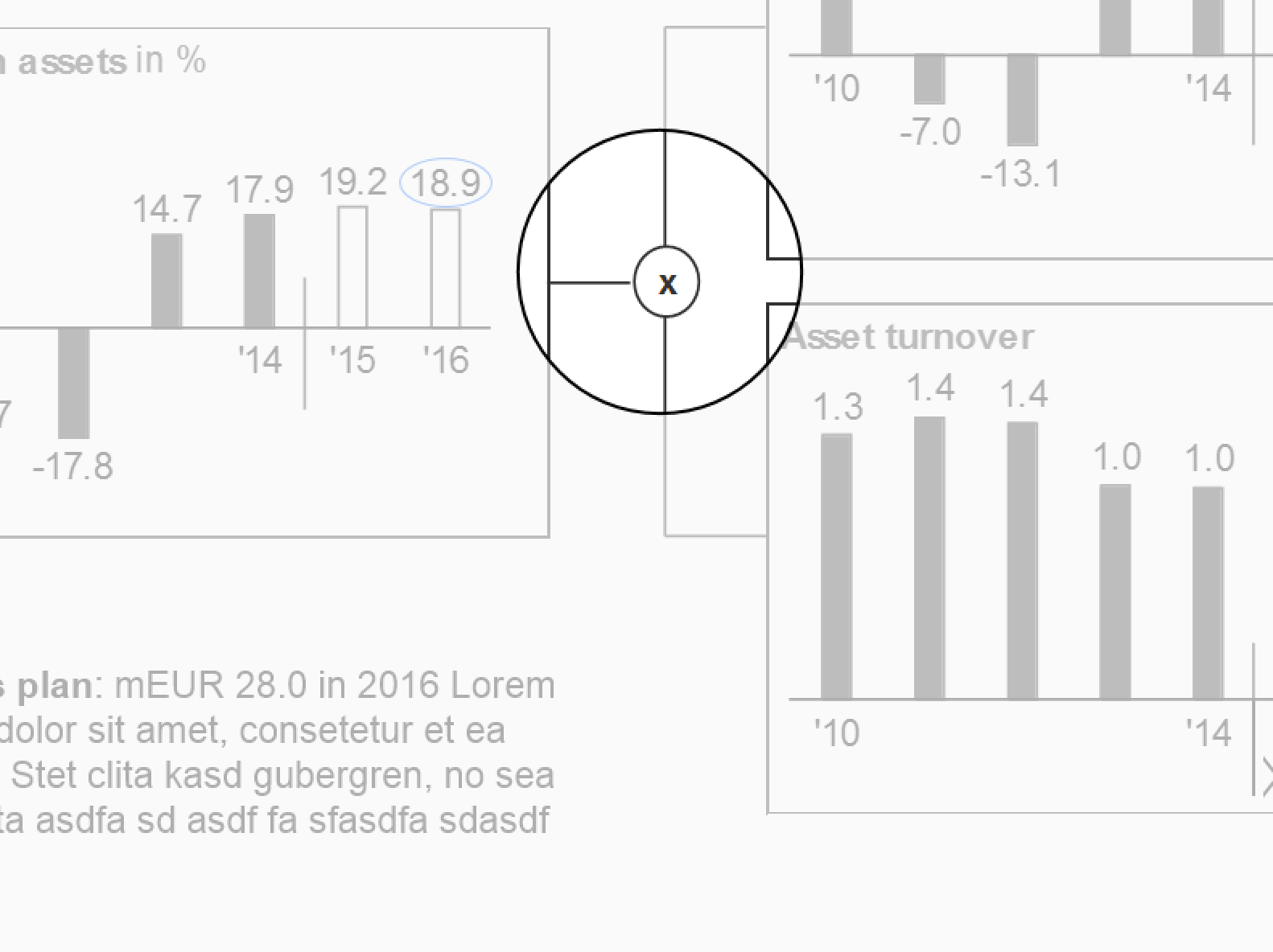
Use assisting lines for different highlighting purposes, e.g. for showing differences, for separating, arranging, or grouping data in charts or tables, or for coordinating visualization elements of different charts, see figure on the left.
Use assisting areas for different highlighting purposes, e.g. for highlighting words in a longer text, or for highlighting certain parts of charts or tables.
Difference markers
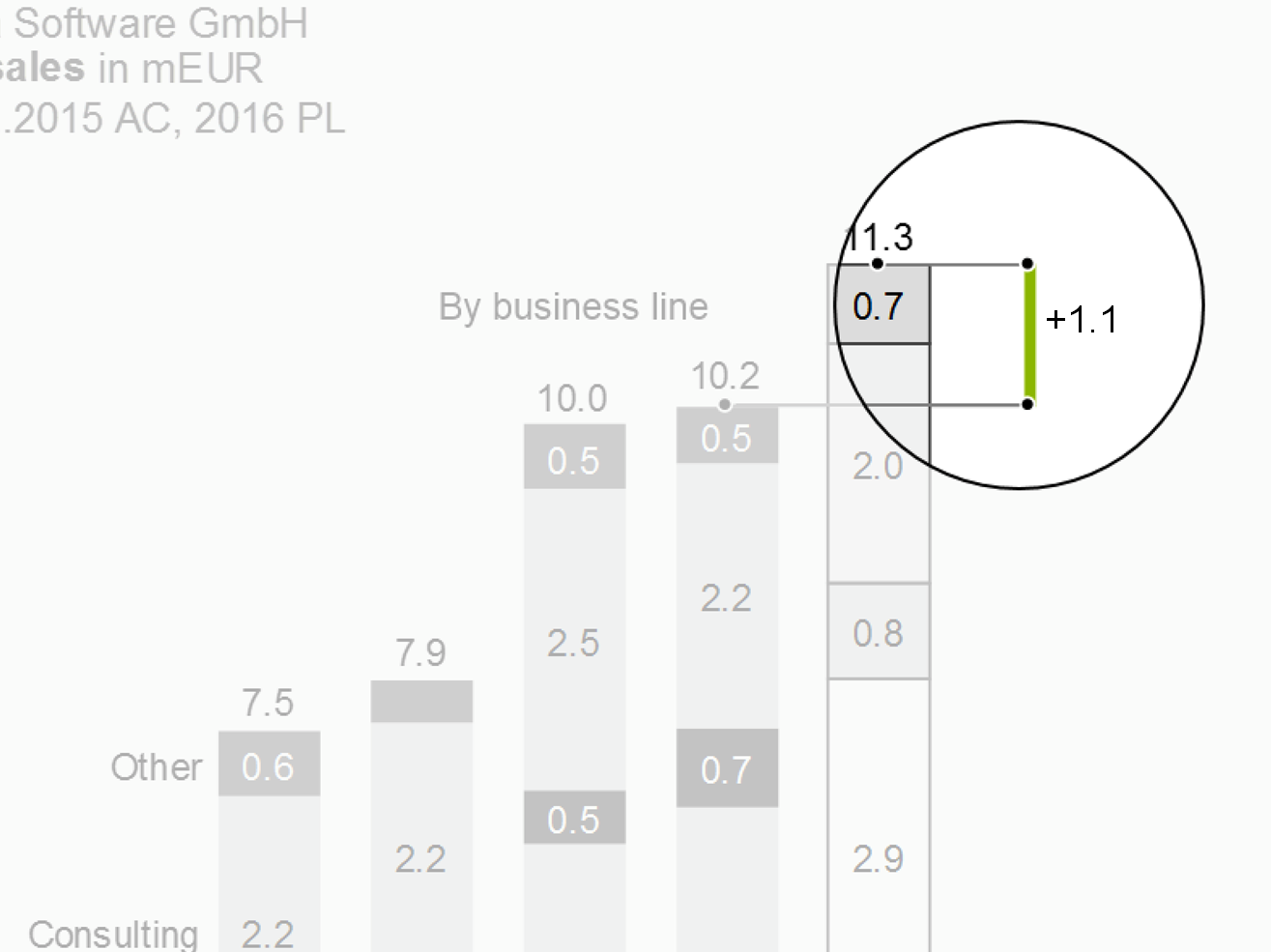
Highlight differences in charts by using two parallel assisting lines to project the respective lengths of two columns or bars to a difference marker highlighting the distance between the two assisting lines.
Position difference markers in a way that they can clearly highlight the respective difference.
Difference markers representing a positive impact on business issues (e.g. profit) are colored green; difference markers representing a negative impact on business issues (e.g. loss) are colored red. Difference markers representing neutral impacts on business issues are colored gray.
Trend arrows
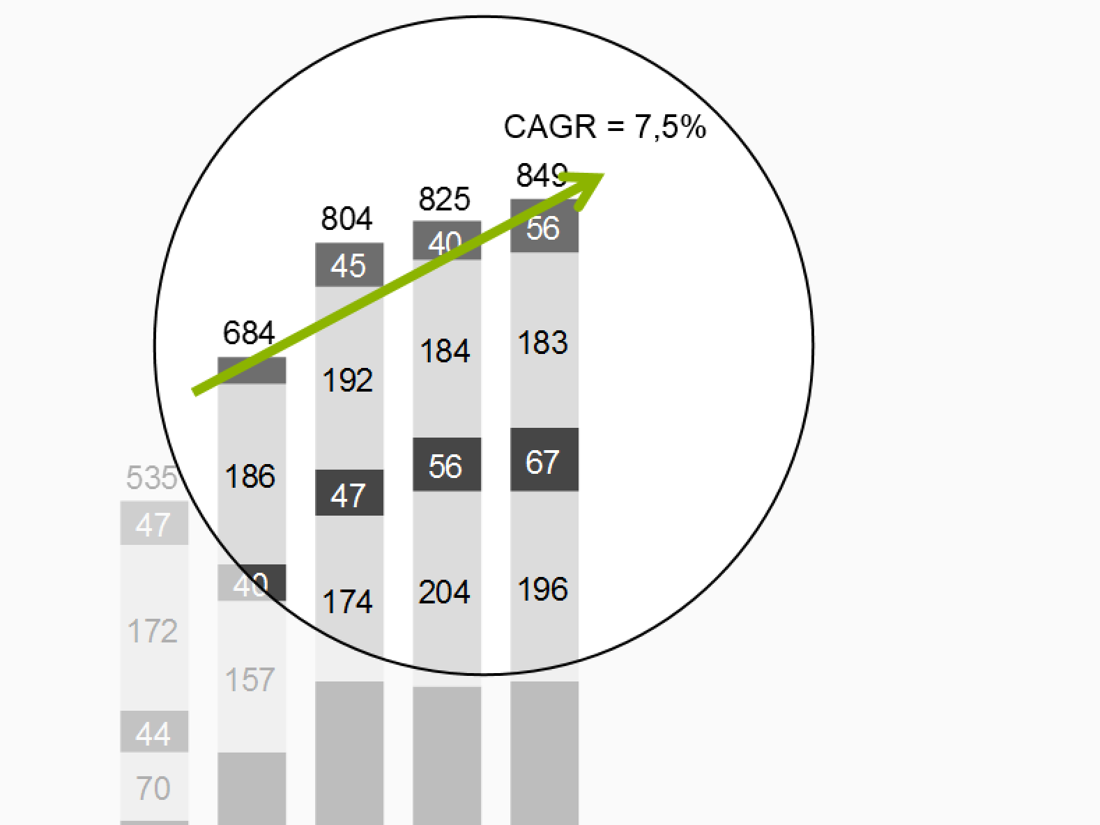
Arrows can highlight trends in charts and (seldom) tables, too.
Position trend arrows in a way that they can clearly highlight the direction of the trend with the respective slope. The arrow starts at the first period and ends at the last period included in the calculation of the respective trend. The arrowhead is pointing in time direction. Adding a number and a designation for the calculation method (e.g. CAGR: 10.8%) will give additional insight.
Trend arrows representing a positive trend are colored green; trend arrows representing a negative impact on business issues (e.g. loss) are colored red. Trend arrows representing neutral impacts on business issues are colored gray.
Highlighting ellipses
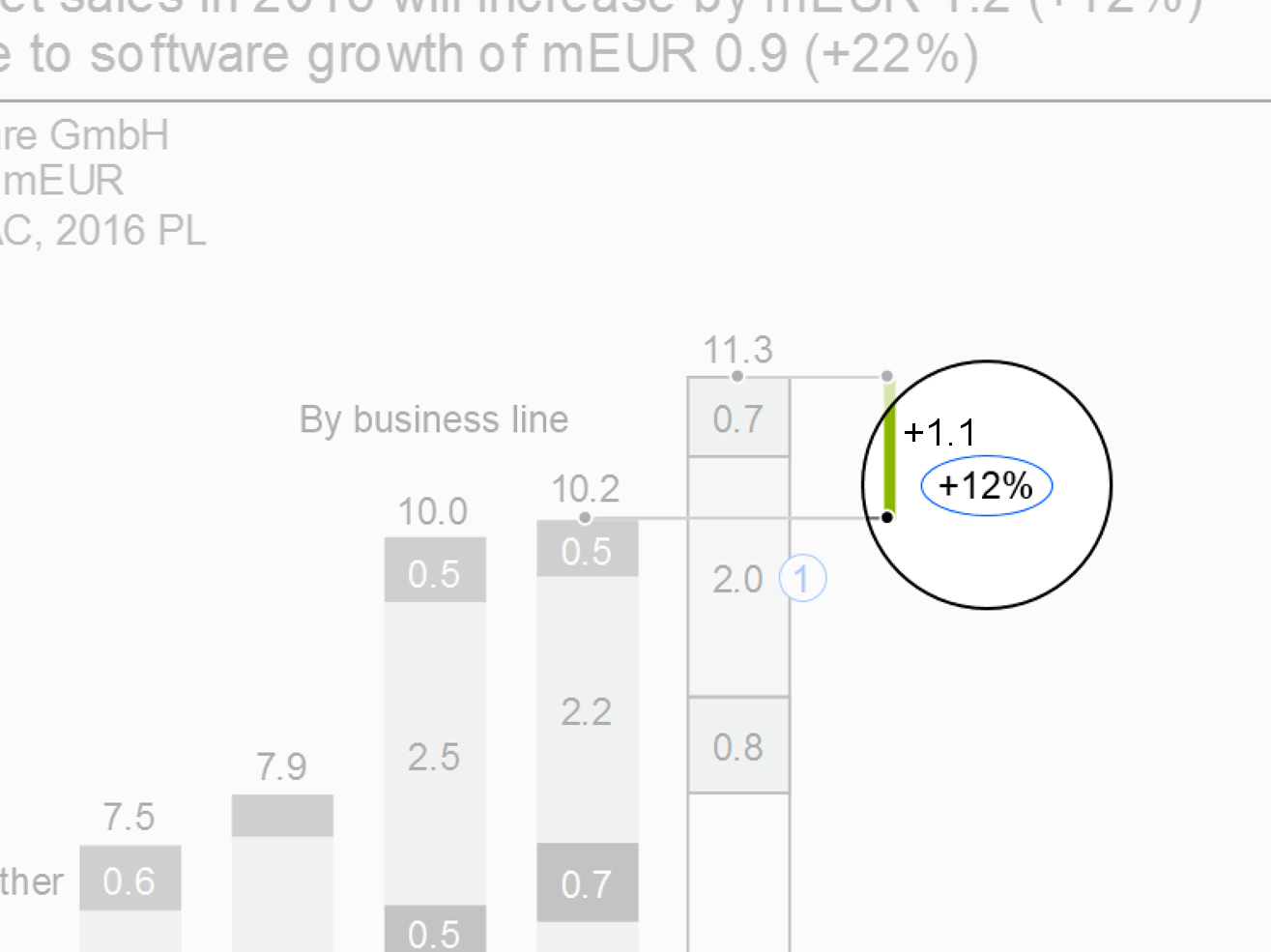
Use highlighting ellipses to highlight single values. Good reasons for highlighting single values are e.g.
Highlighting messages: If the message refers to a specific value in a chart, table or graph, highlight this value with a blue ellipse.
Highlighting additional values: Sometimes it is helpful to add additional values (e.g. percent value) in charts or tables. In this case, use a black ellipse.
Reference arrowheads
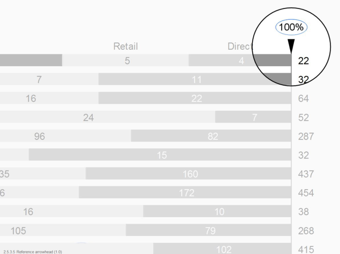
Use reference arrowheads for highlighting a reference standard. Examples of reference standards are:
Indices: Either one value (e.g. the value of the year 2010) is set to 100%, or the total is set to 100% (see sections about time series analyses and Structure analyses).
Benchmarks: Popular benchmarks are market averages, competitors, or best practices.
Position the arrowhead close to the point representing the index or the benchmark. Write the label for the index (e.g. “100%” or “100”) or for the benchmark (e.g.“Market avg.”) next to the arrowhead. The arrowhead points in the direction of an imaginary index or benchmark line. If helpful, add an assisting line.
Comment references
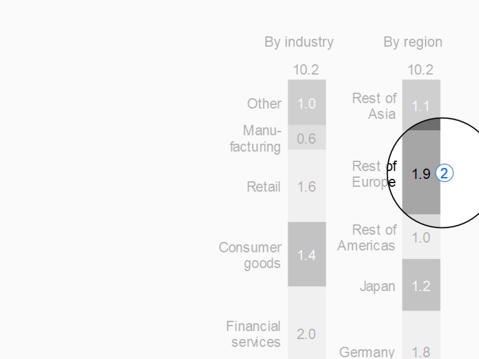
Use comment references in pairs to link comments to the corresponding values or positions in a chart or a table.
Variance highlighting indicators
Highlight variances in tables by using visualization elements representing the magnitude of the variance, such as bars and pins (see also EX 2.5 “Replace traffic lights”). “Traffic lights” might be useful for highlighting single variances related to the message or to comments in tables without chart elements, though. Another means for highlighting single variances are “warning dots” positioned next to the value or text element needing attention.
Indicators highlighting variances representing a positive impact on business issues are colored light green, those representing a negative impact light red. If no color is available, replace red with dark gray, green with light gray. For readers with color deficiency, replace green with blue-green.
Use only few variance highlighting indicators per page.
Other highlighting
Add visualization elements for not-valid values, limits, or other relevant phenomena. Standardize and document these “signals” so that they become an effective means of communication.
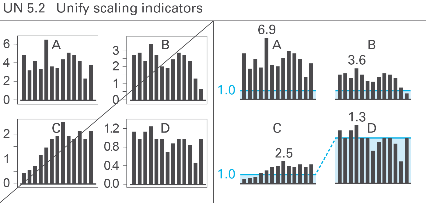
Proper scaling is very important for the creation of meaningful charts. Several semantic scaling indicators exist to deal with in challenging scaling problems. Use scaling lines and scaling areas (scaling bars) if necessary, see Figure UN 5.2.
Scaling lines
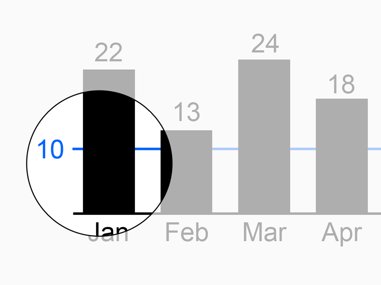
Use scaling lines when comparing multiple charts (with the same unit) having different scales. Position a scaling line parallel to the category axis at the same numerical height in all charts. If one chart among several other charts uses a different scale, this fact can easily be identified (in general, the differing scale uses a multiplier of ten).
Scaling areas
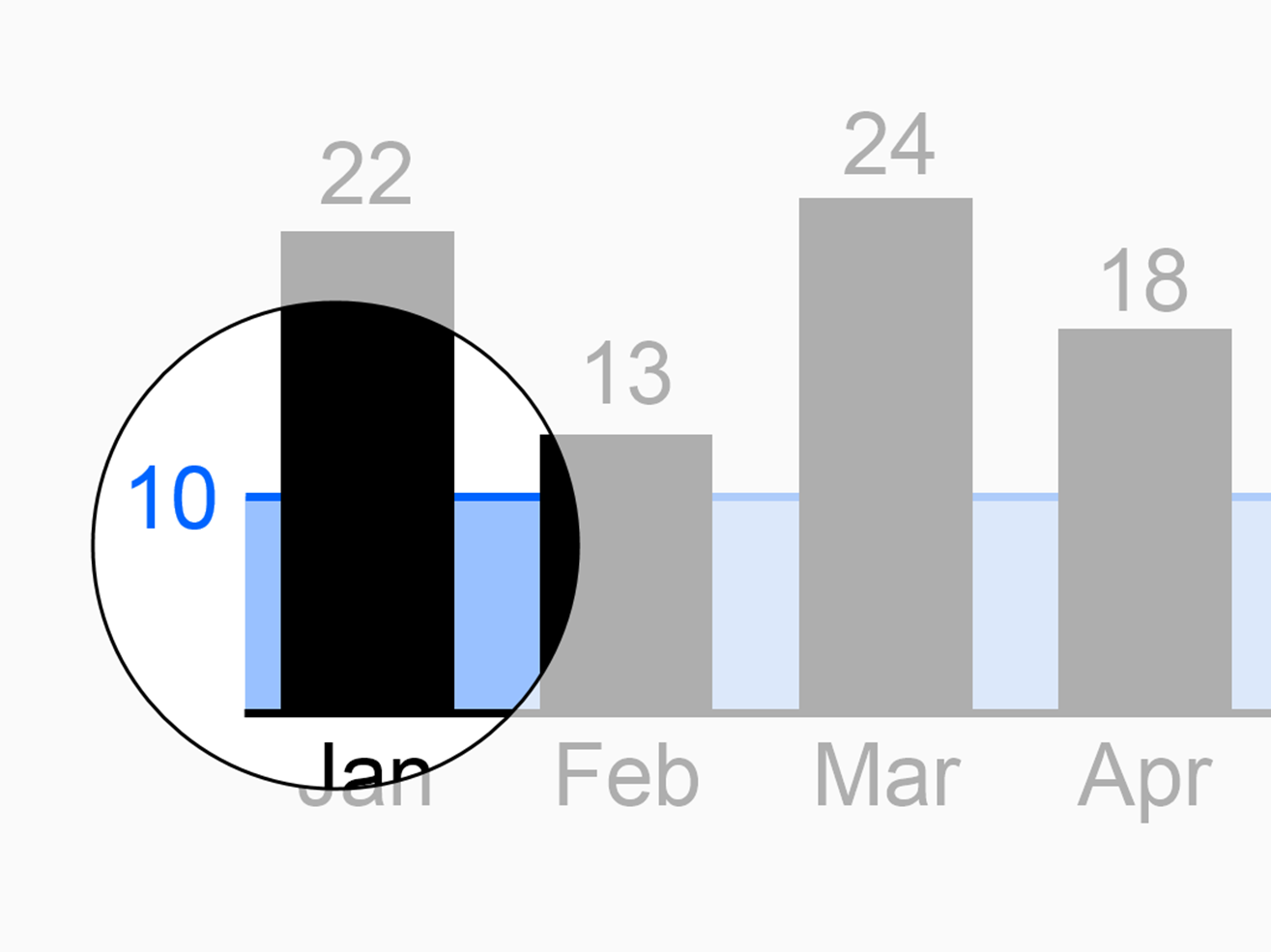
If helpful, fill the areas between the scaling lines and the category axes with light color. Use different colors for scaling lines and scaling areas used in order to represent different scales.
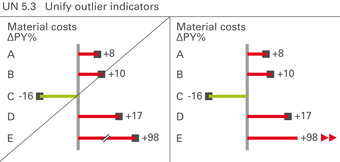
Sometimes values (mostly relative variances) can be very big in comparison to other values. If such an outlier is not important for business, e.g. a big relative variance of a small value, do not scale the whole chart to this outlier rather visualize unimportant outliers with outlier indicators.
Omit the pin head and add outlier triangles pointing in the direction of growth, see Figure UN 5.3.
Thanks for reading! Follow @ohmypy on Twitter to keep up with new stuff 🚀