15 KiB
CONDENSE – Increase information density
CONDENSE covers all aspects of increasing information density in reports and presentations.
Increasing information density means that all reports and presentations include all information that is necessary to understand the respective message on one page.
This chapter covers using small components, utilizing space, as well as adding data, elements, and objects.
CO 1 Use small components
The need for a higher level of information density requires to display all objects, elements, and signs as small as possible, while still being legible. Different technical parameters apply to printed material, screen displays, and projected slides.
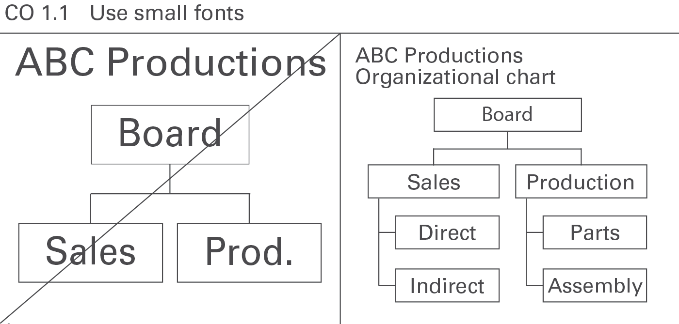
CO 1.1 Use small fonts
In general, avoid oversize fonts. They needlessly waste space, see Figure CO 1.1.
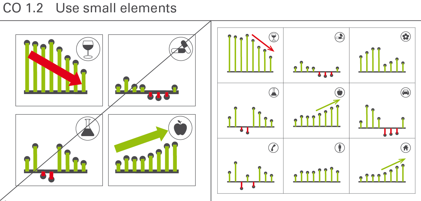
CO 1.2 Use small elements
Small elements increase clarity. Large-scale symbols and highlights are not more suitable than smaller symbols and highlights, see Figure CO 1.2.
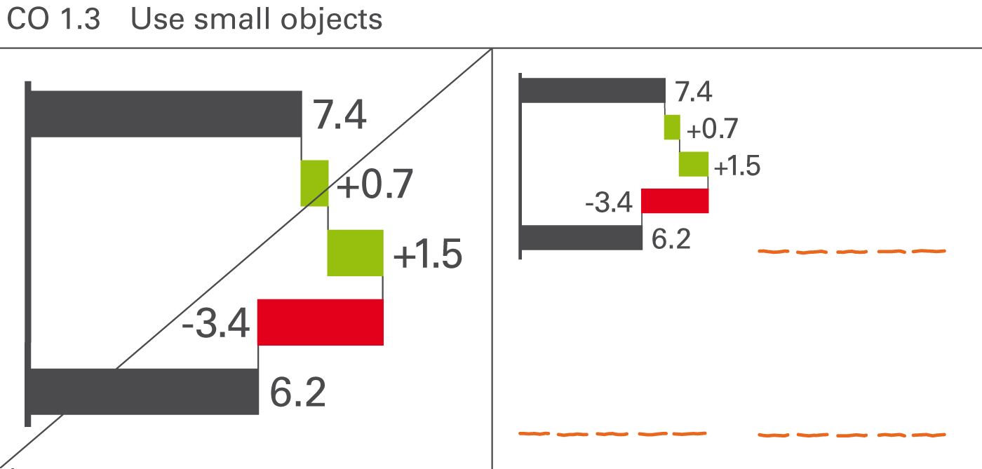
CO 1.3 Use small objects
The size of charts and tables in reports and presentations should not be as large as possible, rather as small as possible – yet only so small so that the objects and all its details and labels can be read easily. This provides room for more information and therefore better understanding of the context, see Figure CO 1.3.
CO 2 Maximize use of space
Utilizing free space is the fastest and easiest way to increase information density. Make better use of needlessly wide margins and frames, or blank or little used pages by filling them with helpful data pertaining to the context.
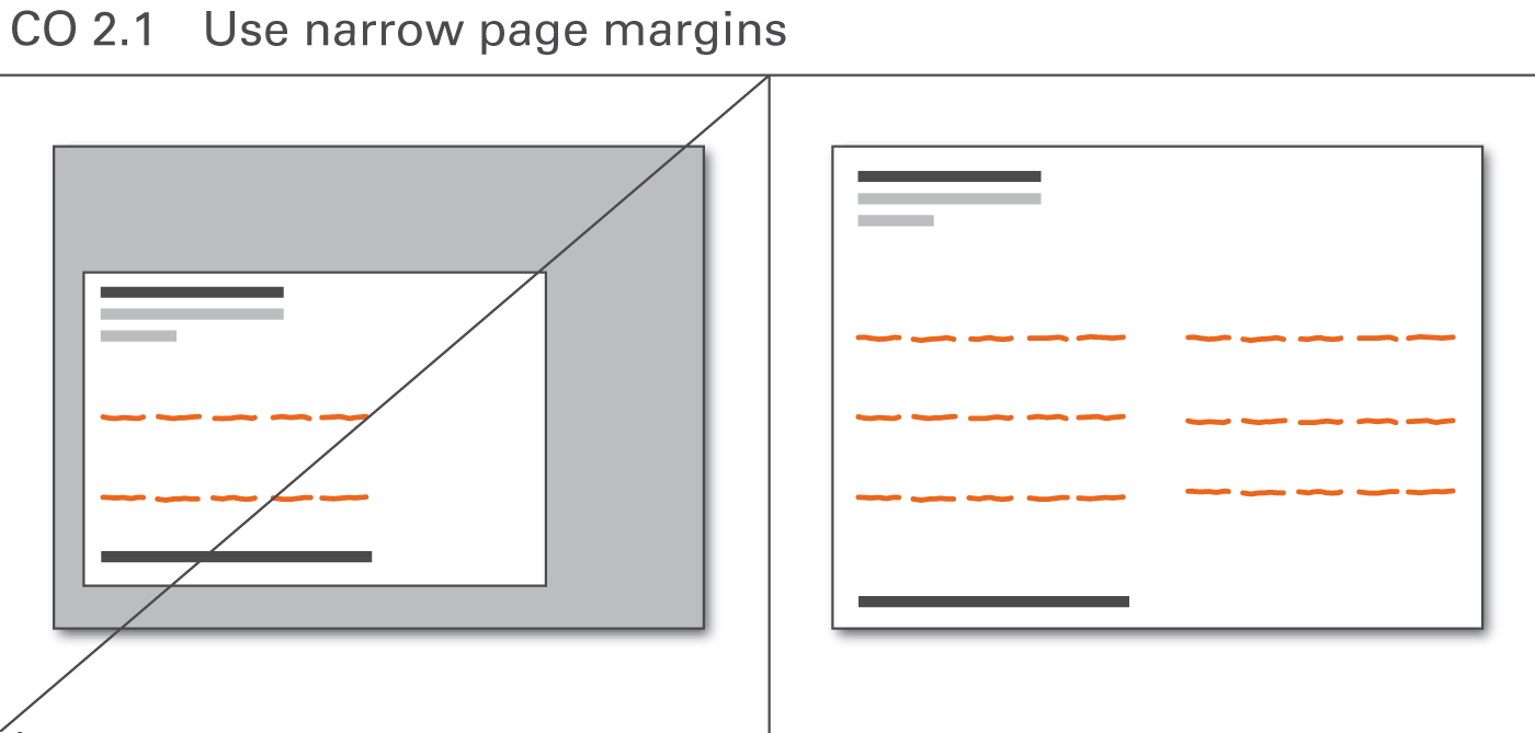
CO 2.1 Use narrow page margins
The page layout is often dominated by corporate design standards not made for high information density but for attractive design, sacrificing valuable space to layout elements such as extra wide page margins, see Figure CO 2.1.
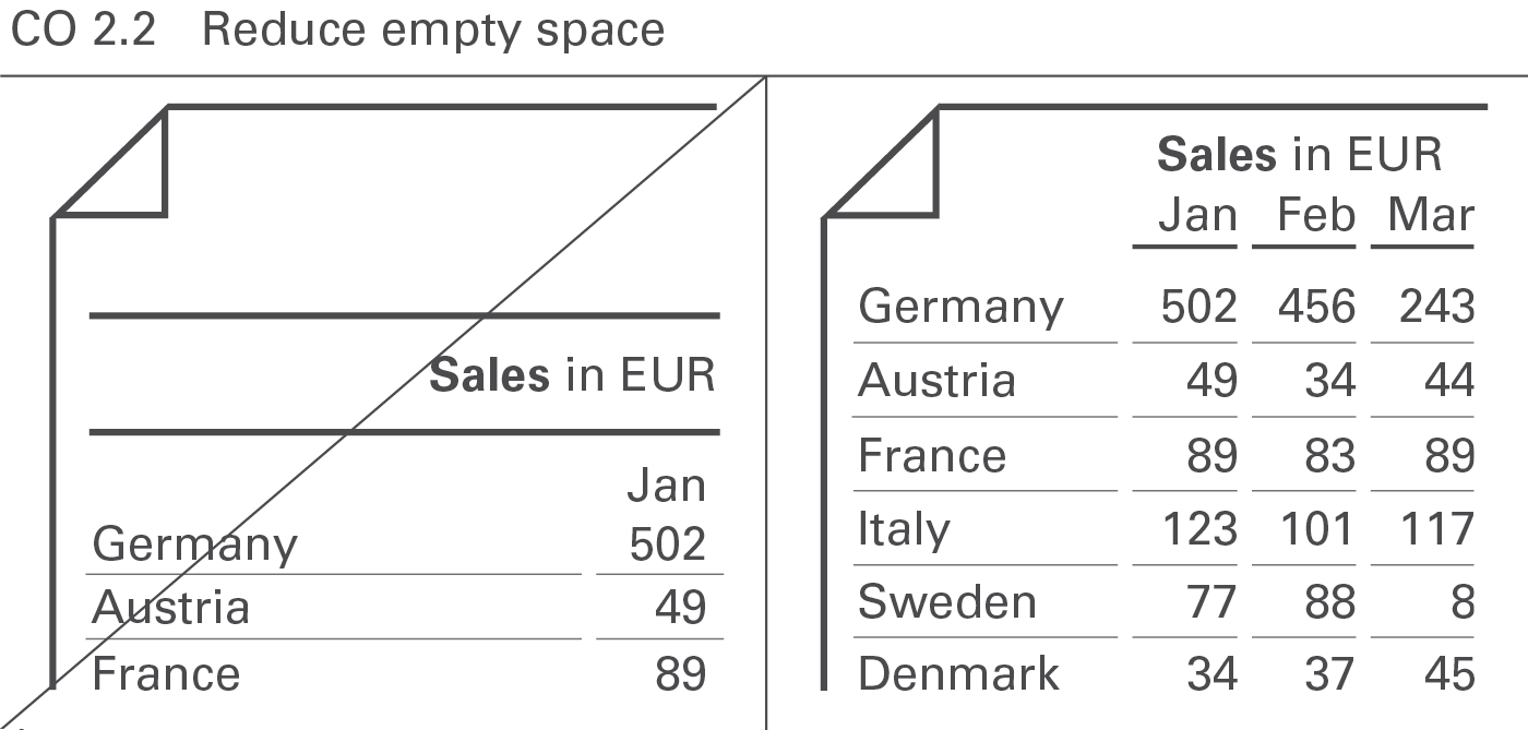
CO 2.2 Reduce empty space
Reduce empty space to increase information density. This applies not only to the page layout (see Figure CO 2.1) but also to the layout of report objects such as charts and tables (see Figure CO 2.2).
CO 3 Add data
Adding more data to an existing visualization increases information density and helps better understand the context.
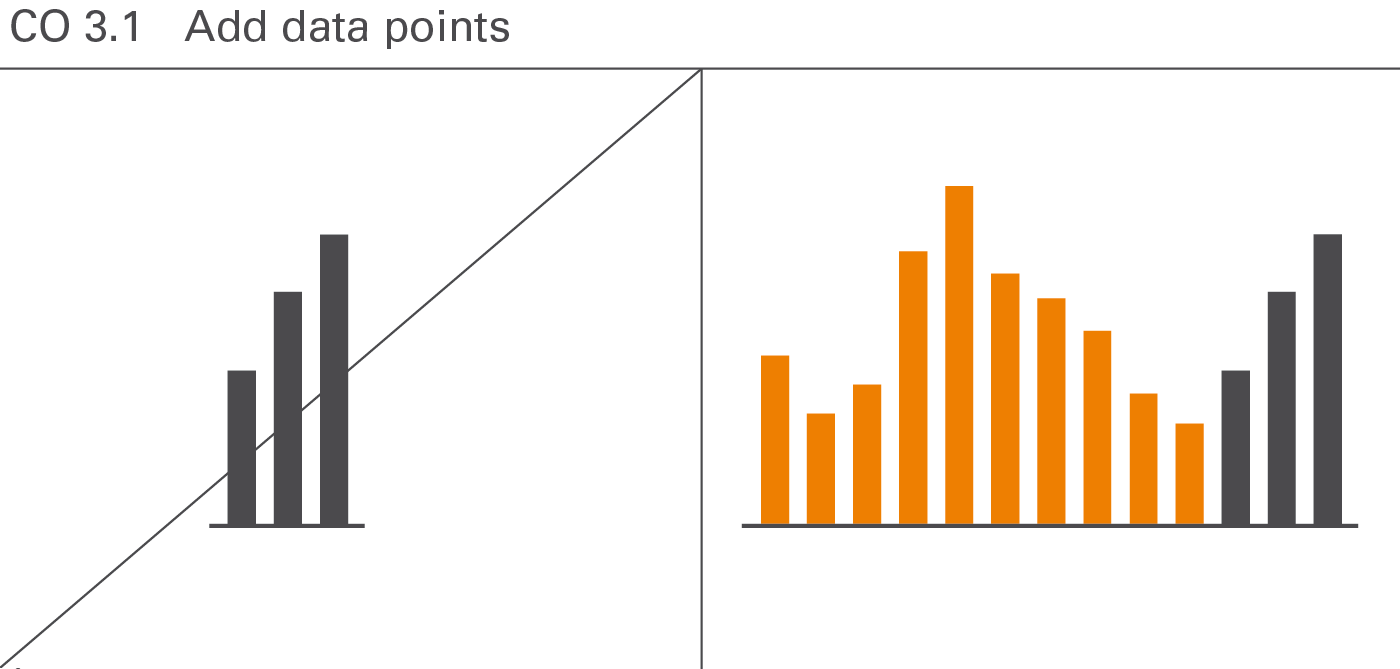
CO 3.1 Add data points
Displaying more data points does not jeopardize the comprehension of numerical data. For example, a monthly statistic of staff numbers over twelve months in a year would be understood just as quickly as for the same data series with twelve months for each of the last three years – in other words, a total of 36 data points instead of twelve. Usually, interesting relationships are only detected with an increased number of elements in a data series (see Figure CO 3.1).
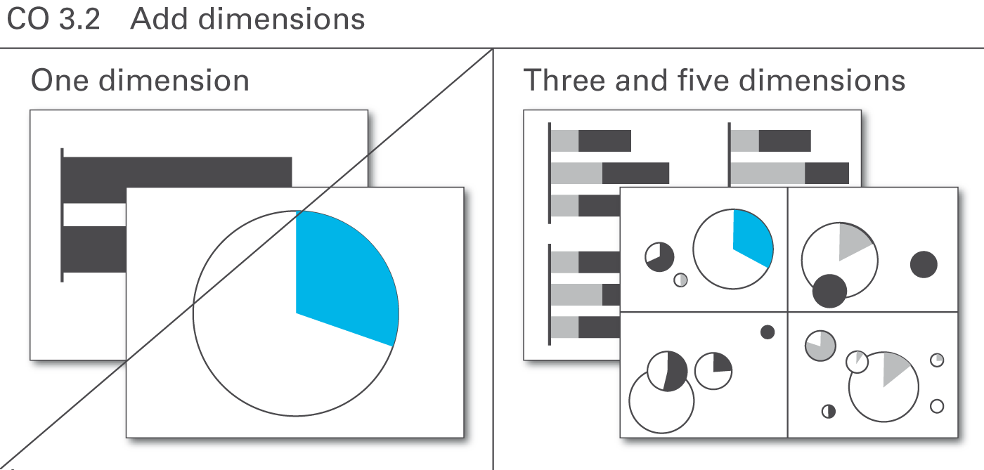
CO 3.2 Add dimensions
A very useful way to increase information density is to show more than two dimensions of a business situation. A chart with only one dimension (such as in a pie chart), visualizes only mundane things easily stated in a simple sentence. Already charts with two dimensions can yield very interesting relationships – yet those charts with three and more dimensions yield structures leading to completely new insights (see Figure CO 3.2).
CO 4 Add elements
It is often appropriate to use two or more basic chart types (either horizontal or vertical) to build combined charts with a higher information density. Combined charts are treated as one entity as opposed to multiple charts. Combined charts can be built both out from horizontal or vertical charts.
There are three types of combined charts depending on their type of combination: Overlay charts, multi-tier charts, and extended charts. Additionally, chart elements can be embedded in tables and explanations can be integrated.
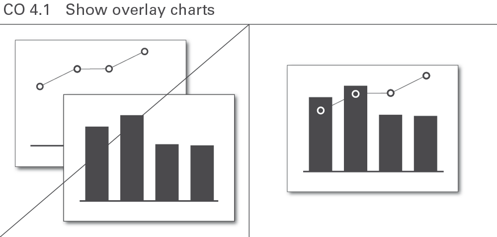
CO 4.1 Show overlay charts
In an overlay chart, two or more basic charts overlap. These overlapping charts always use the same category axis.
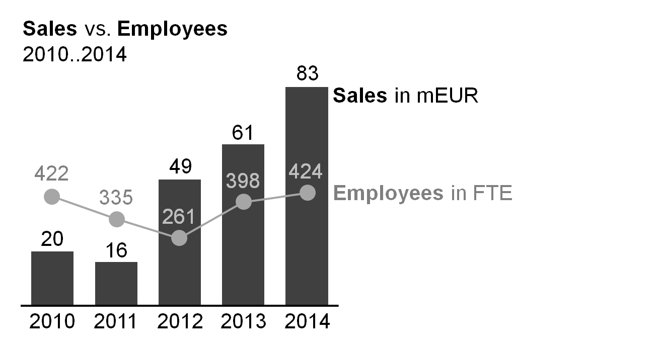
Overlay charts can facilitate comprehension such as in the combination of the development of sales (a series of columns) and the return on sales in percent (a line). However, this approach can only be used for a few chart combinations, see Figure CO 4.1.
Overlay charts frequently use different value axes. A column chart representing a measure (e.g. sales) combined with a line chart representing another measure (e.g. employees) is a typical example.
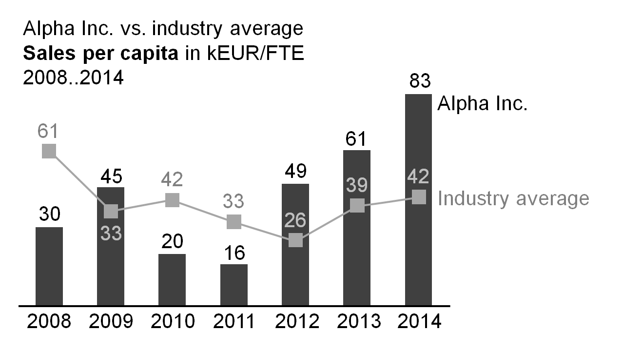
Sometimes, the same value axis is used as well. A column chart representing a measure (e.g. sales) combined with a line chart representing the same measure (e.g. industry average) is a typical example for such an overlay chart.
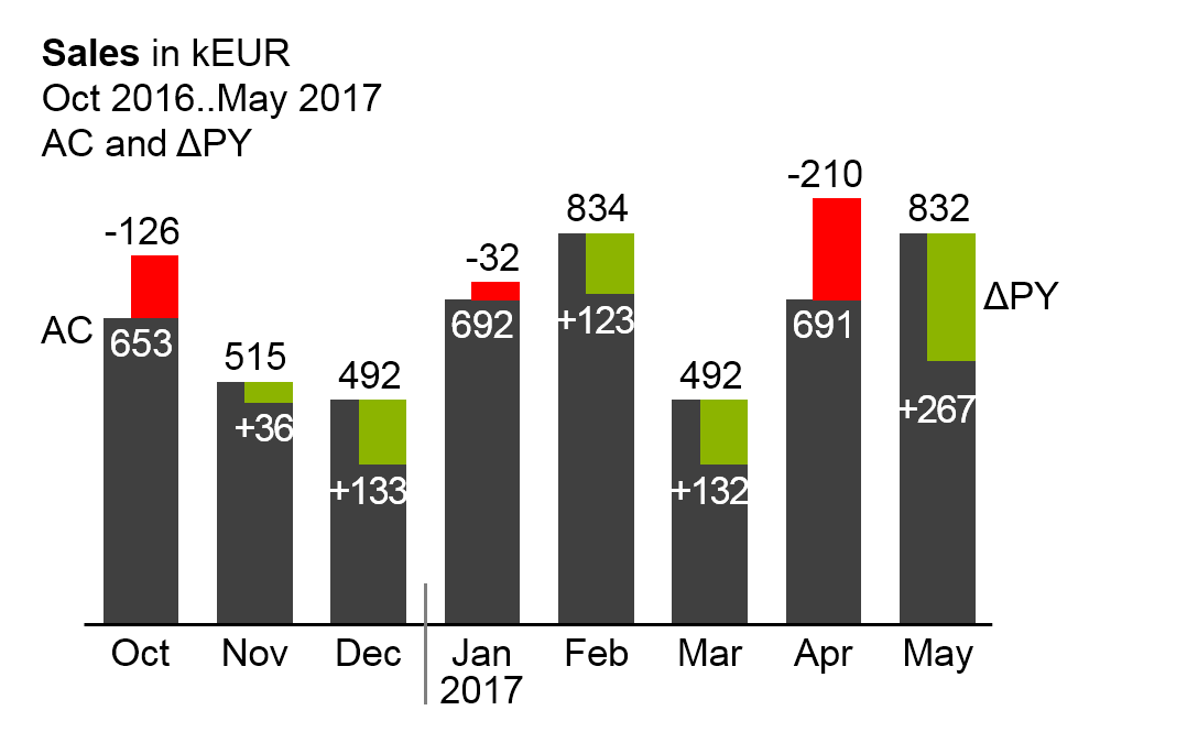
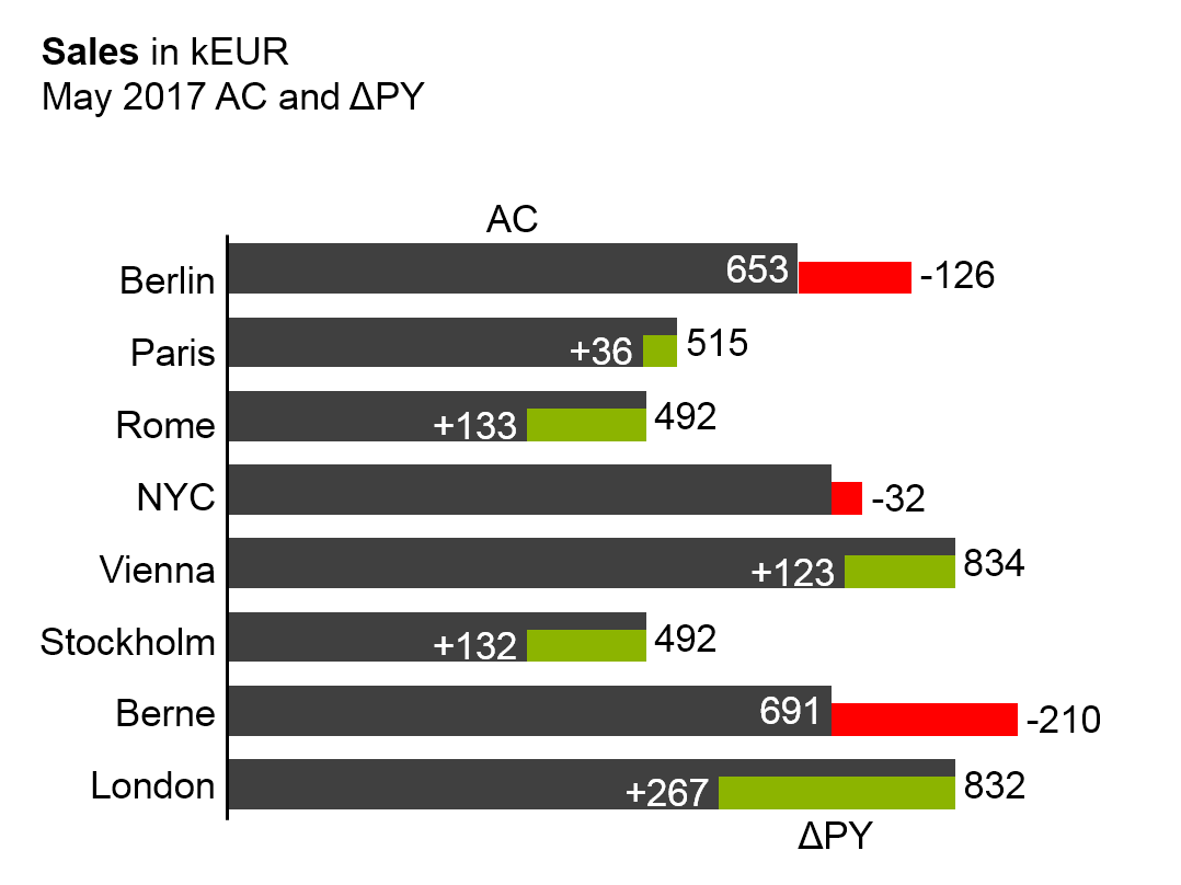
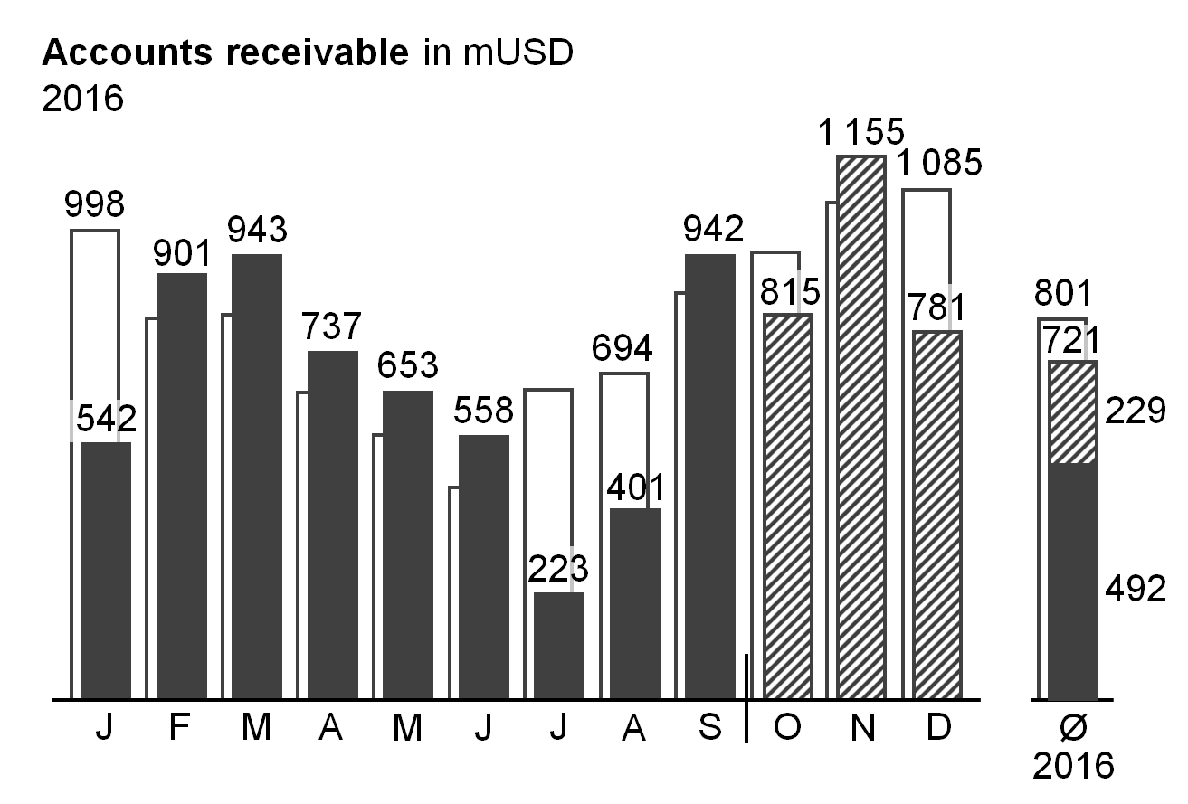
Column or bar charts with integrated variances (variances displayed within the columns or bars) are other typical example for overlay charts using the same value axis (see the last two figures).
Compared to two-tier charts, this presentation of two data series uses much less space. The disadvantages, though, are twofold: First, it is difficult to label the data of both the primary and secondary chart. Second, the development over time (horizontal axis) respectively the structure (vertical axis) of the primary chart is difficult to see.
Suggestion: If there is enough space, use multi-tier charts instead.
CO 4.2 Show multi-tier charts
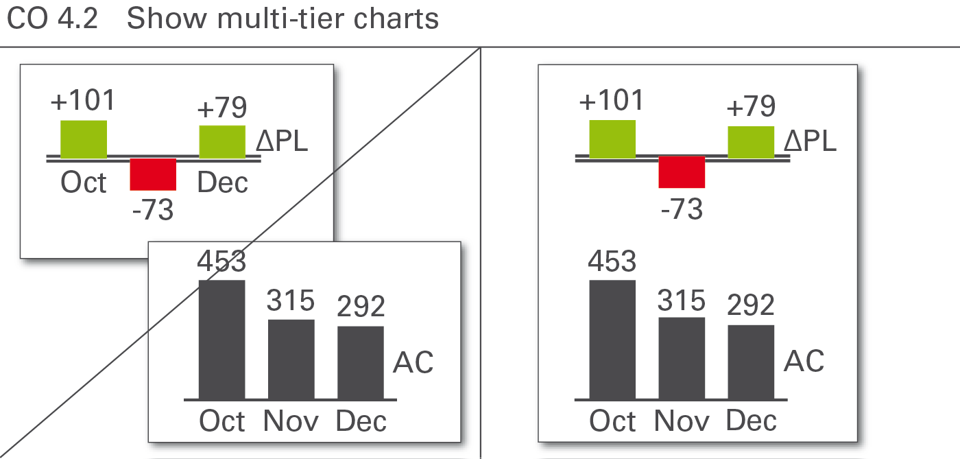
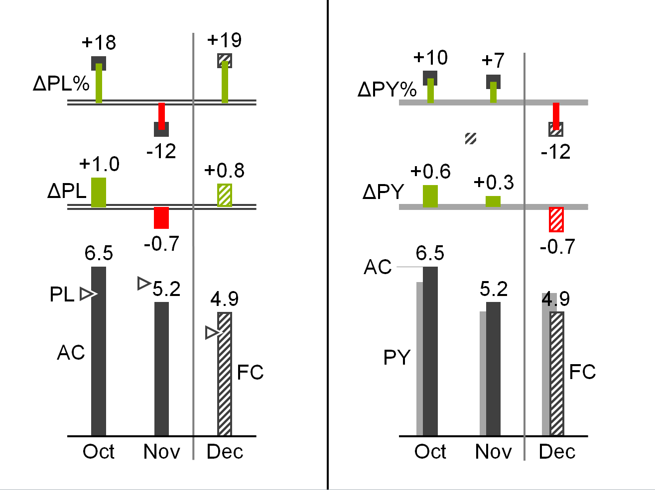
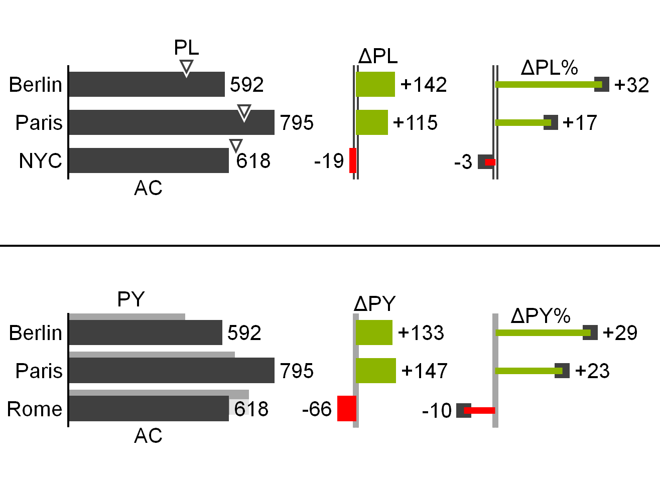
Use multi-tier charts to increase information density by adding additional tiers to the same category axis for analyses on the same basic data. Multi-tier charts are most frequently used for displaying variances along with the basic values, see Figure CO 4.2.
In a two-tier chart, a secondary chart is shifted in parallel to the category axis of the primary chart. For horizontal charts the secondary chart appears above the primary chart, for vertical charts the secondary chart appears to the right of the primary chart.
In both cases, the category axes of the primary charts are reduplicated in the secondary charts, usually having a different semantic scenario design.
Both the primary and the secondary charts have their own value axes. Value axes showing the same currency or the same physical unit should be scaled identically.
In a three-tier chart a third chart appears above a horizontal or to the right of a vertical two-tier chart. In special cases, more than three tiers can be combined.
Improve the interpretation of a primary chart showing grouped bars for actual and plan data by adding variances. In the second and third figure a secondary chart with absolute variances and a tertiary pin chart with relative variances are combined.
CO 4.3 Show extended charts
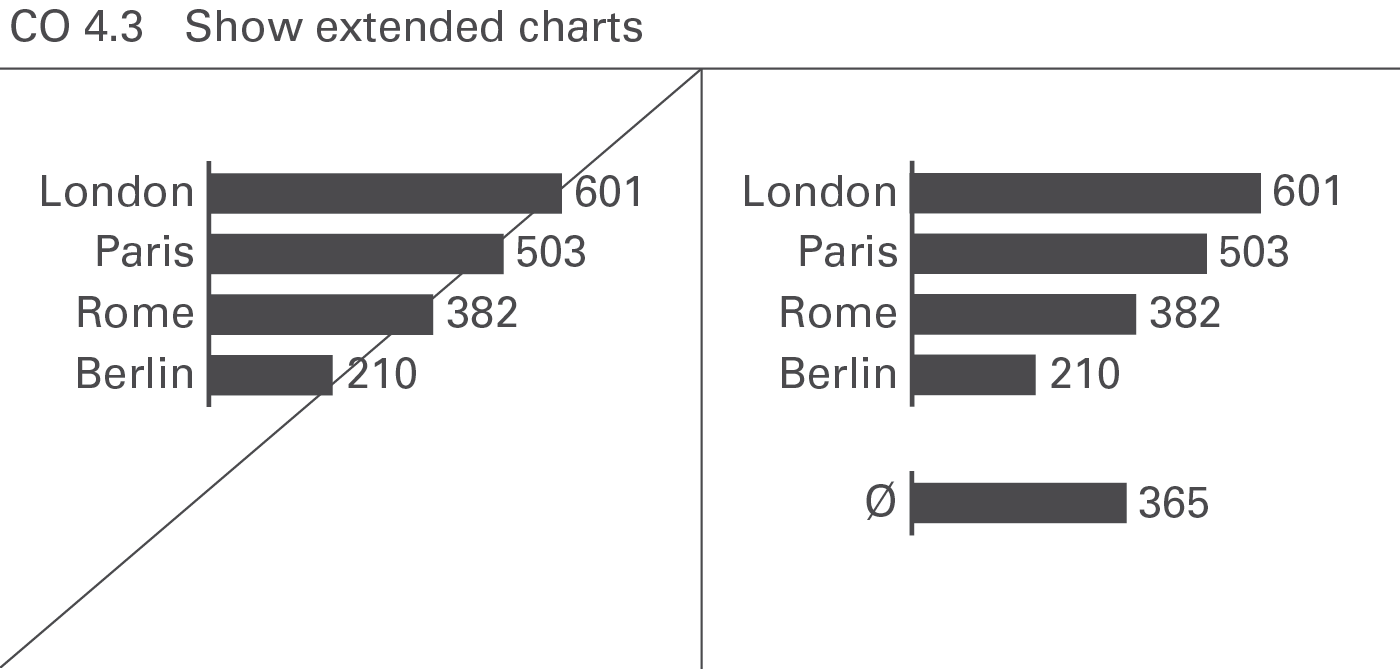
An extended chart, arranges additional charts next to the primary chart by virtually extending the category axis. This way of increasing information density often is used when displaying context information such as market averages or competitor figures, see Figure CO 4.3.
For horizontal charts, additional charts appear to the left or right of the primary chart, for vertical charts, above or below. In both cases, position the category axes of the additional charts on a virtual extension of the category axes of the primary chart.
In an extended chart, use the same value axis for both the primary and the additional charts.
Improve the interpretation of a primary chart by adding extended charts showing the same values from a different perspective. In the figure on the left, a secondary grouped column chart at the right hand side shows the monthly average.
CO 4.4 Embed chart elements in tables
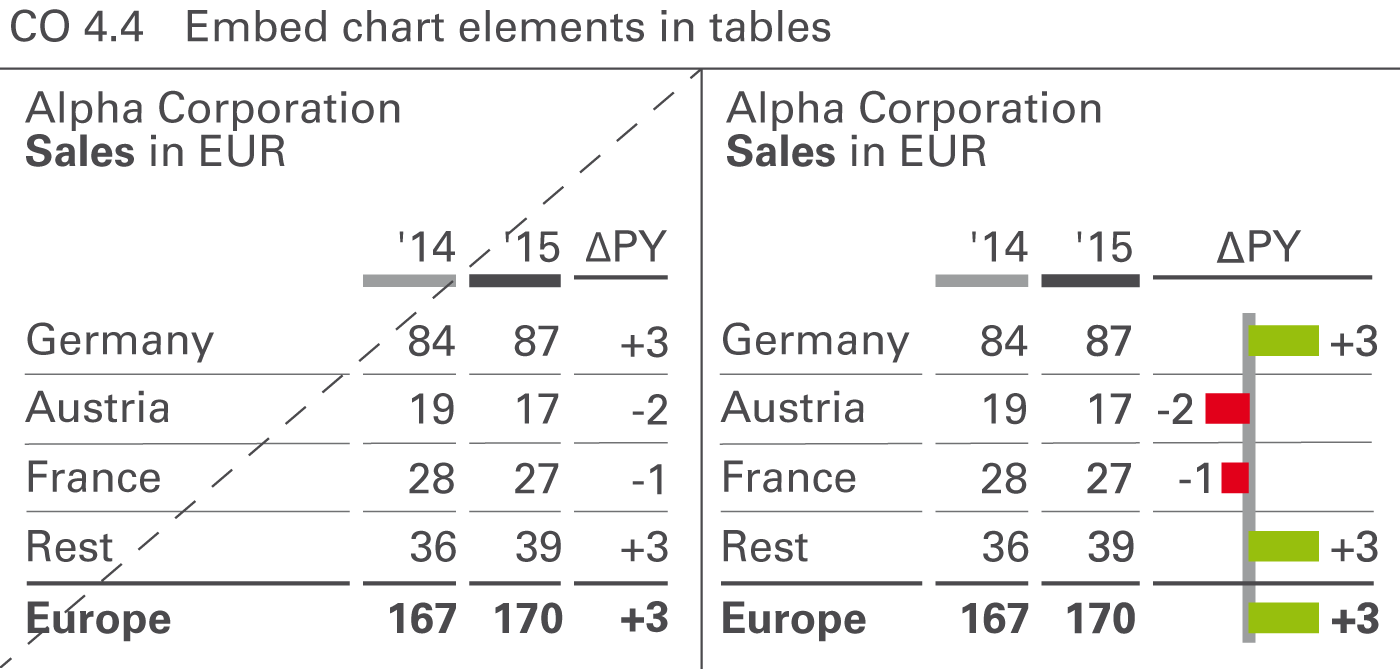
Increase the information density of tables by using chart elements, see Figure CO 4.4. Bars, warning dots, sparklines, and traffic lights are the predominant chart element types in tables.
Table bars
Table bars are bar charts integrated into tables. The categories of these bar charts must correspond to the rows of a table. Both single bar charts with single bars or pins and waterfall bar charts are powerful means to visualize the absolute figures and variances in tables. Most recommendations concerning vertical chart types can be applied to table bars.
Warning dots
Not to be confused with traffic lights, warning dots can be a good solution in highlighting important negative, positive, or questionable parts of a table. It is important to use only very few warning dots in one table.
Sparklines
Omit sparklines if not scaled properly. Individually scaled sparklines can be misleading because small fluctuations in a series of other small fluctuations look the same as big fluctuations in a series of big fluctuations. However, sparklines with proper scaling (e.g. indexed) can be helpful.
Traffic lights
Traffic lights contain little information, as they represent no more than three (red, green, yellow) states. Use them only if there is no more information to be conveyed than those two or three states (e.g. “yes” or “no”). In all other cases, replace traffic lights with more suitable means of representation, such as table bars.
CO 4.5 Embed explanations
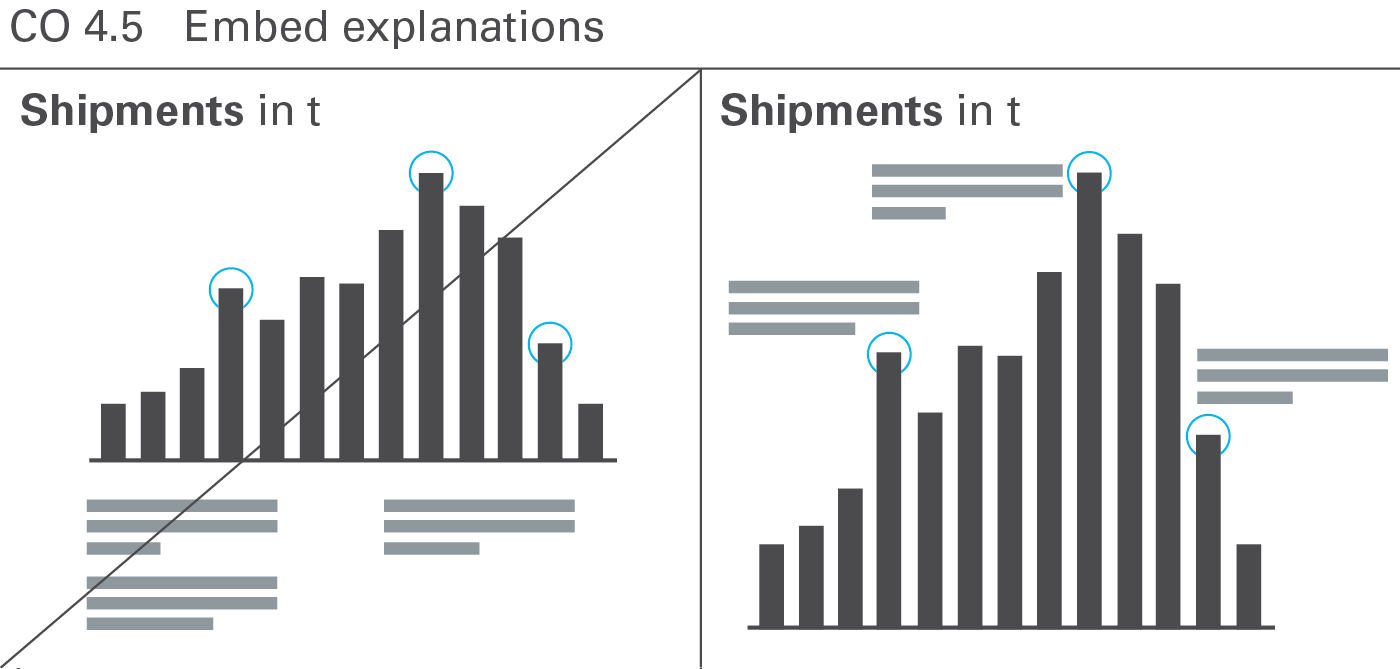
Both the density of information and the level of comprehension increase when explanations are embedded into charts and tables (this applies to written reports and handouts only). When the explanation refers directly to the visual presentation in question, it helps to establish a connection and speeds up comprehension, see Figure CO 4.5.
CO 5 Add objects
Reports and presentation material consist of one or more pages. The content of one page can be viewed together without referring to other content, e.g. flipping to other pages.
Reports and presentation material often arrange more than one chart on one page. While this increases information density and fosters a higher level of comparability, it presents a design challenge: A uniform notation concept and consistent scaling are even more important than on pages with single charts.
The most important types of pages with multiple objects are small multiples and multi-charts (including ratio trees).
CO 5.1 Show small multiples
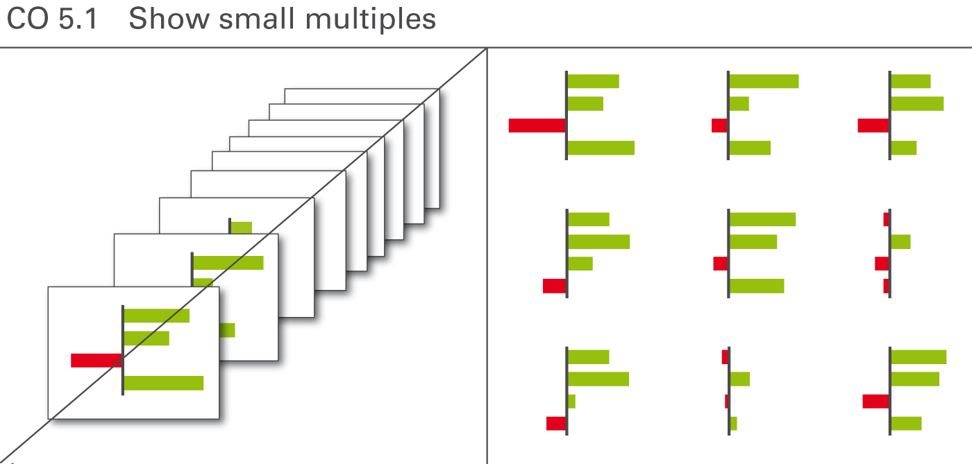
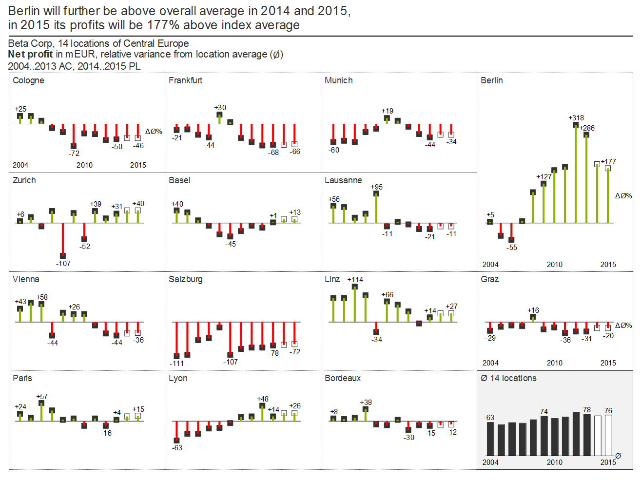
Substantially improve the comprehension of complex relationships by displaying charts of the same type and the same scale on the same page. These charts are called small multiples, see Figure CO 5.1.
Typical applications are charts with different countries, products, or projects placed next to each other. Of course, there is an upper limit to the number of charts on one page, depending mainly on the page- and font-size used.
Showing small multiples is a good way to compare a set of up to around 25 charts. Instead of exceeding this number on one page, a new chart called “Others” containing the accumulation of all other elements could be a solution.
As mentioned in the chapter “CHECK – Ensure visual integrity”, all small multiples must use the identical scale.
Working with small multiples can be difficult if certain charts show significantly bigger values than others. Using a different scale for a chart with bigger values is not a feasible option, increase the size of this chart instead.
CO 5.2 Show related charts on one page
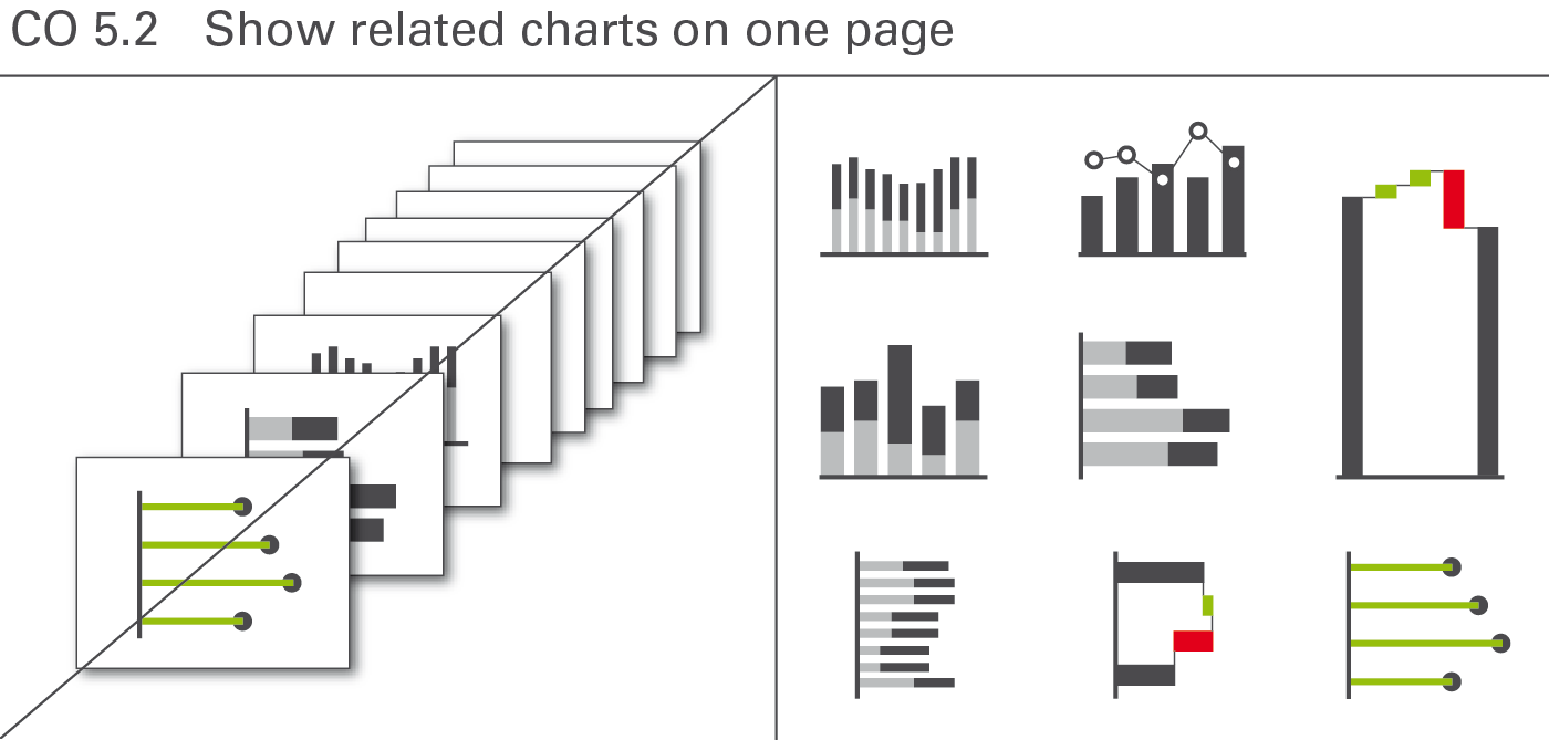
Different from small multiples, related charts cover different topics (different measures) on one page. They mostly use different scales, too. This arrangement of charts on one page is sometimes called multi-charts. But the term multi-charts fails to underline the fact that these charts must have a useful relationship. It does not make sense to arrange several, completely unrelated charts on one page.
This approach offers high data density and a higher level of comparability – but it can be a demanding visual and technical challenge as a uniform notation concept, clear terms, and an understandable scaling prove even more important (see Figure CO 5.2).
Consistent scaling of multi-charts can be difficult. Sometimes different scales for the same unit or measure are inevitable. In this case, clearly indicate the use of a different scale by an appropriate mean, e.g. scaling indicators.
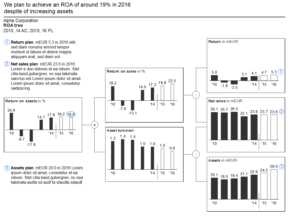
Ratio trees are multi-charts showing root causes. Use ratio trees to prove or explain a specific issue. Pointing out the assumptions and root causes of variances or temporal evolvements improves understanding and is more convincing, too. In general, the ratio is broken down into its components (mostly from left to right). Thus individual charts, preferably identical size, are arranged in a tree shape structure.
Consistent scaling of ratio trees can be difficult. Sometimes different scales for the same unit or measure are inevitable. In this case, clearly indicate the use of a different scale by an appropriate mean, e.g. scaling indicators.
A typical example of a page showing a ratio tree is the “Return on asset” tree.
CO 5.3 Show chart-table combinations
Combining charts and tables on a page is not to be confused with the integration of chart elements in tables.
Chart-table combinations cover situations where a separate chart is added to a page with a table or vice versa. In general, such a combination is very useful if both objects display supplementary data. Tables simply listing the numbers of a chart are superfluous in most cases (see also UN 2.3 “Unify the position of legends and labels.
CO 5.4 Show charts and tables in text pages
Embedding illuminating charts and tables in the text of a written report helps the reader understanding the message.
Always position charts and tables in close proximity to the phrase carrying the message, which the chart or table supports.
Text pages should contain a title element like other pages. Also use a title – and, if possible, a message – for every chart and table embedded in a text page.
