46 KiB
EXPRESS – Choose proper visualization
EXPRESS covers all aspects of choosing the proper visualization in reports and presentations.
Proper visualization means that reports and presentations contain charts and tables, which convey the desired message along with the underlying facts as quickly as possible.
This chapter covers utilizing the correct types of charts and tables, replacing inappropriate visualizations and representations, adding comparisons, and explaining causes.
- Use appropriate object types
- Replace inappropriate chart types
- Replace inappropriate representations
- Add comparisons
- Explain causes
EX 1 Use appropriate object types
Choosing the appropriate object type is of prime importance for the comprehension of reports and presentations.
We use tables when looking up data. Tables have a high information density. They are clear, they are honest, they do not want to highlight, and they typically do not want to visually convey a certain message. So they do not compete with charts.
Charts on the opposite are always biased. It is the selection of data, the selection of the chart type, and the usage of highlighting which makes the difference. We evaluate charts by asking whether they transfer the intended message effectively and in a proper way. So charts cannot be replaced by tables.
The following section is about choosing the appropriate types of charts and tables. It presents in detail different types, layouts, and examples as well as their proper application.
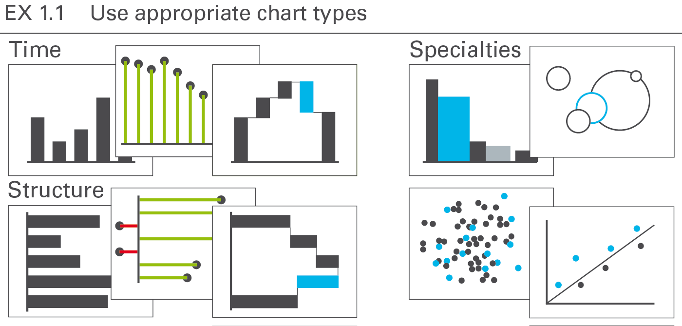
EX 1.1 Use appropriate chart types
A chart is a graphical object, in which visualization elements such as columns, bars, and lines represent data.
This section discusses the types, layout, and examples of single charts. Overlay charts and multiple charts are discussed in the CO 4 “Add elements” and CO 5 “Add objects”.
The most important groups of business charts are those showing development over time (charts with horizontal category axes), those showing structural relationships (charts with vertical category axes), and those showing x‑y charts, scatter plots, and bubble charts (charts with two value axes), see Figure EX 1.1.
Other chart types are of lesser interest in business communication and will be treated in a later version of the standards.
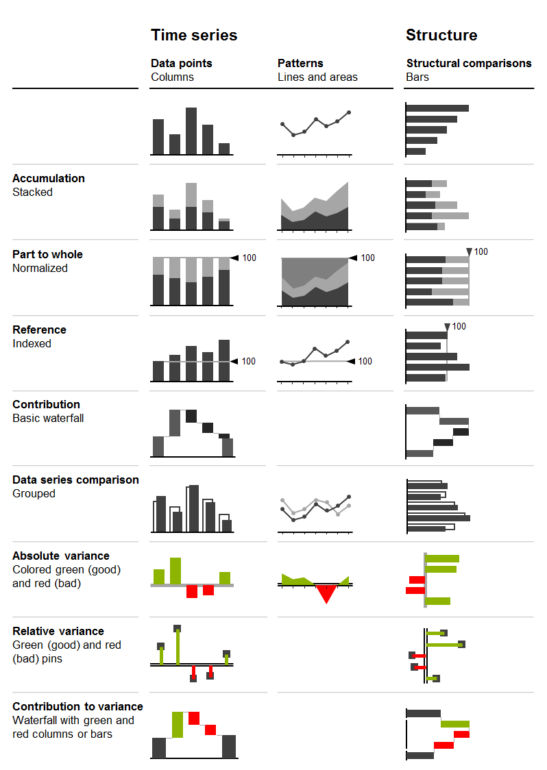
Looking at charts with horizontal and vertical category axes, the chart selection matrix displayed in the figure aids in selecting the right chart type for time series and structure analyses.
In the following sections, the correct usage of charts with horizontal category axes, charts with vertical category axes, and charts with two value axes is discussed in greater detail.
Charts with horizontal category axes
Charts with horizontal category axes (short: horizontal charts) typically display time series. Use the horizontal category axis as a time axis. Vertically, the visualization elements represent the data per time period or point of time (there is no need to show a vertical value axis as the visualization elements carry their own values). Time category axes run from left to right and show characteristics of period types (e.g. months or years) or points of time (dates).
In general, the data series of a horizontal chart is represented by columns (single, stacked, grouped), vertical pins, horizontal waterfalls, or lines. Vertical pins can be considered very thin columns. Because of their importance, they are dealt with in a separate section.
Here follows the grouping of horizontal chart types:
Single column charts
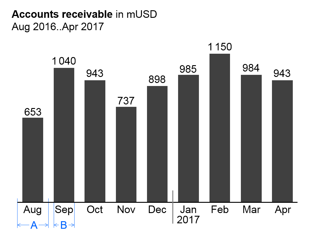
In general, single column charts (short: single columns) are used to display the temporal evolvement of one data series.
Single columns consist of:
-
Horizontal category axis: The horizontal category axis represents with its labels the respective time periods or points of time. The part on “Semantic rules” suggests to use the category width (see width A in the figure) for identifying the period type (see UN 3.3 “Unify time periods”).
-
Columns: One column per time period or point of time extends from the category axis in accordance with the respective value. Columns are displayed in the foreground of the category axis, so that the length of the column is not hidden. The part on “Semantic rules” suggests that the ratio of column width to category width (see ratio B/A in the figure) represents information about the measure type (see UN 3.1 “Unify measures”).
-
Legends: As there is only one data series, the legend (name of the data series) is part of the chart title.
-
Data labels: Data labels name the values of the data series corresponding to the length of the respective columns. Position the labels of positive values above their respective columns, the labels of negative values below.
Stacked column charts
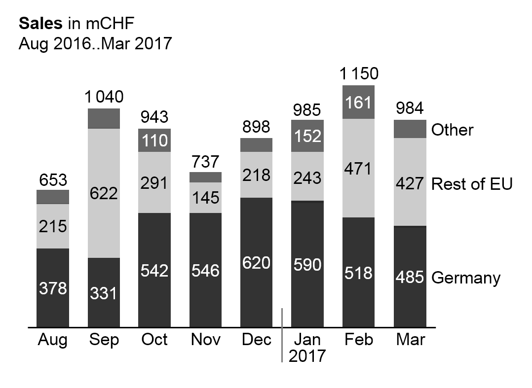
Stacked column charts (short: stacked columns) represent more than one data series (e.g. multiple products, countries, or divisions), see the figure on the left.
Stacked columns consist of:
-
Horizontal category axis: See single column charts.
-
Columns: The columns (see single column charts) are divided into segments (Excel names them “data points”) representing the data series (stacked columns).
-
Legends: Legends (names of the data series) are positioned either on the far left side with right-aligned text or on the far right side with left-aligned text. The column segments define their vertical position, centered vertically with the data labels of the respective column segment. If a segment at the far left or far right is missing or has a very small size, its legends might need assisting lines.
-
Data labels: Data labels name the values of the data series corresponding to the length of the respective column segments. If the sum of the column segments of a category is positive (column pointing upward), the label of the sum is positioned above the respective column, if negative (column pointing downward), it is positioned below.
It must be pointed out that stacked columns should only be used if all chart values are either positive or negative.
This chart type might also not be a good choice if the values of each data series vary too much. The maximum number of data series (segments of a stacked column) to be shown depends on the range of how much the values of each data series vary: More than 5 data series will only work well in the case of little variations.
Position the data series of central importance or interest directly on the axis in order to best see its development over time.
Grouped column charts
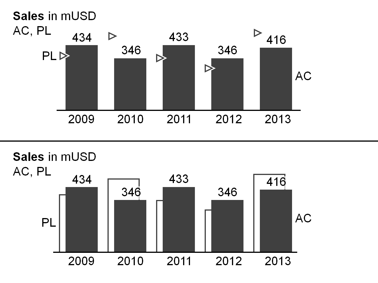
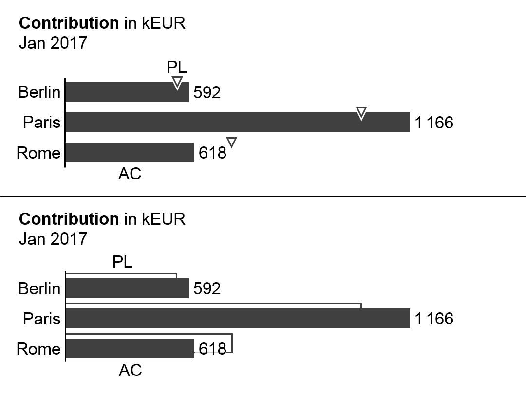
Grouped column charts (short: grouped columns) show, in general, time series for a primary scenario (e.g. AC or FC) in comparison with a reference scenario (e.g. PY or PL). Two columns per category (grouped columns) represent these two scenarios.
The columns of the primary scenario and the reference scenario overlap, the reference scenario placed behind the primary scenario – either to the left or right of the primary scenario (see bottom chart of the figure as well as the paragraph on ”Scenario comparisons” in UN 4.1 “Unify scenario analyses”). A third scenario could be displayed using a reference scenario triangle. All other elements of a grouped column chart are identical to single column charts.
Instead of using grouped columns, the primary scenario can be represented with a single column with the reference scenario represented by reference scenario triangles (see top chart of the figure).
Horizontal pin charts
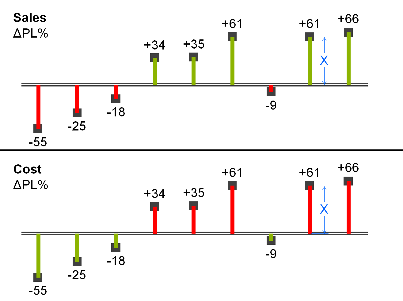
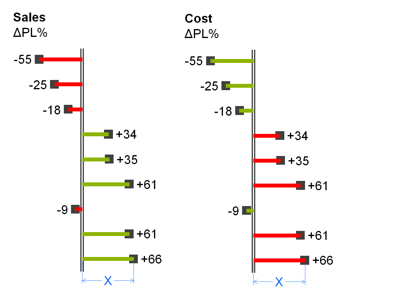
Horizontal pin charts (short: horizontal pins) are used for the visualization of relative variances in a time series analysis.
Horizontal pins consist of:
-
Horizontal category axis: see single column chart.
-
Pins: One pin per time period or point of time extends from the category axis to the respective length. The pin has the size of a very thin column. Color the pin green or red corresponding with positive or negative relative variances respectively. The fill of the pinhead represents the primary scenario (see the paragraph on “Scenario comparisons” in UN 4.1 “Unify scenario analyses”). Display the pin in the foreground, so that the length of the pin (see length X in the figure) is not hidden.
-
Legends: As there is only one data series, the legend (name of the data series) is part of the chart title.
-
Data labels: Data labels name the values of the data series consistent with the length of the respective pins. Position the labels of positive values above the respective pins, labels of negative values below.
Horizontal waterfall charts
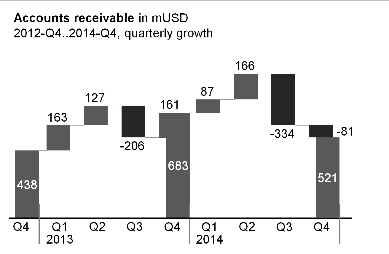
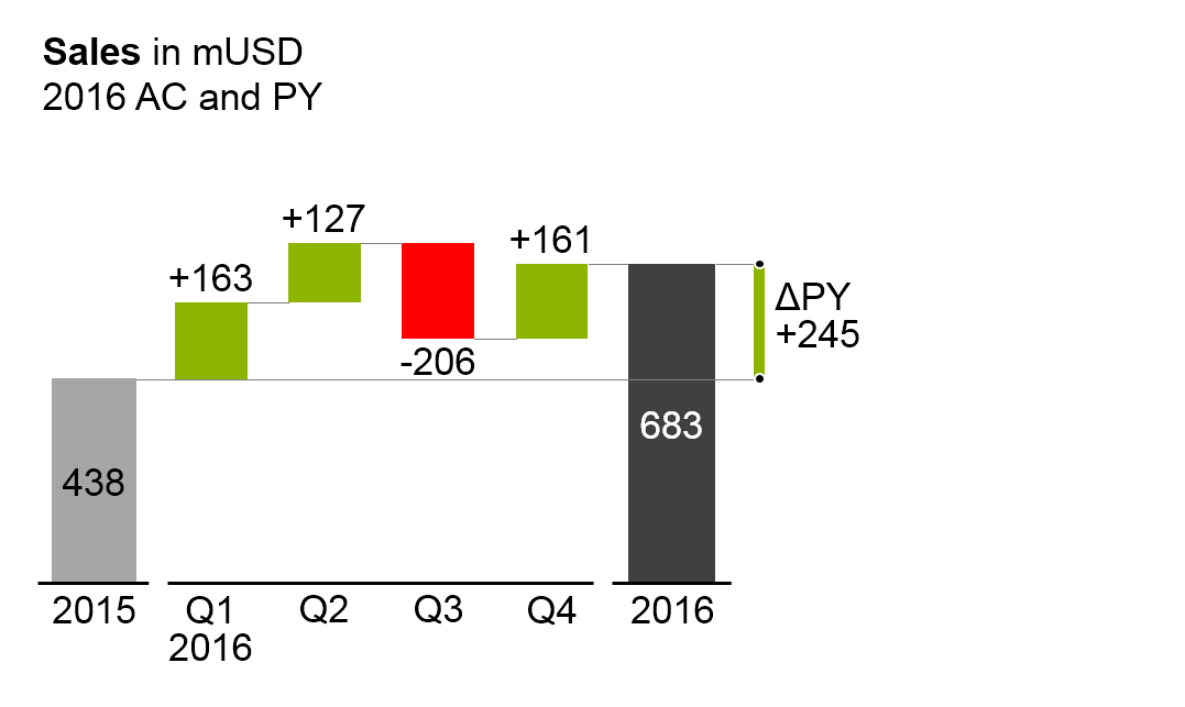
Horizontal waterfall charts (short: horizontal waterfalls or column waterfalls) analyze root causes, over time, for the change or variance between two or more statuses. Accordingly, horizontal waterfalls consist of two or more base columns and totals columns. In between a base column and a totals column there are contribution columns demonstrating what led to the difference between these two columns. The contribution columns start at the end value, i.e. the height, of the preceding column, and show the positive or negative contribution as well as the accumulated contribution of all columns up to the respective point of time.
There are two types of horizontal waterfalls:
Growth waterfalls: In growth waterfalls, base columns and totals columns represent a stock measure (e.g. headcount, accounts receivable) at different points in time (e.g. end of Q4 2012, 2013 and 2014). The contribution columns in between represent the changes (increases and decreases) over time of this stock measure.
(There is no vertical equivalent to the horizontal growth waterfall.)
Horizontal variance waterfalls: In horizontal variance waterfalls, base columns and totals columns represent a flow measure (e.g. sales) at different periods in time (e.g. 2015 and 2016) and/or regarding different scenarios (e.g. PL and AC). The contribution columns in between represent the periodical variances between the different time periods and/or scenarios.
The elements of a horizontal waterfall chart are the same as the elements of single column charts. In addition, assisting lines connect the end of a column to the beginning of the succeeding column.
Line charts
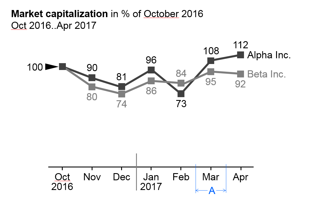
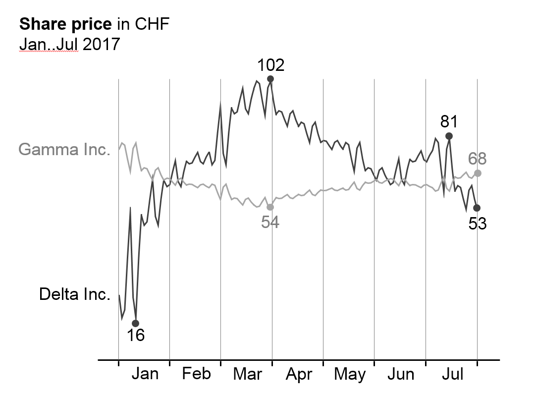
In general, line charts are used for the display of the temporal evolvement of data series with many data points.
Many data points lead to small category widths. The advantage of line charts over column charts is the simplified display of data (better data-ink-ratio). In addition, they can better represent positive and negative values of more than one data series than columns. On the other hand, lines tend to imply a continuous timeline – practically non-existent in business communication. Therefore lines should not be used for the presentation of data series with only a few values.
Line charts cannot be “stacked” in order to show structure like in stacked column charts. In the place of line charts for “stacked data”, area chartsoffer a good solution (there is no layout concept for area charts in this version of the guide yet).
Line charts with more than three intersecting lines tend to be confusing. Instead, several smaller charts with one line each could be placed next to one another (small multiples), particularly when the general trends of the lines are to be analyzed – not the direct comparison of two data series (e.g. in comparing seasonal developments of several years), see also EX 2.4 “Replace spaghetti charts”.
Line charts consist of:
-
Horizontal category axis: See single column chart. The semantic rules in part 3 suggest to use the category width (see width A in the first figure) for identifying the period type (see UN 3.3 “Unify time periods”).
-
Lines: One or more lines with line markers represent the values of the respective data series. Use line thickness, line color, and line markers for meaning, see part “Semantic rules”.
-
Legends: Legends label the data series. If the line chart shows only one data series, include the legend in the chart title. If the line chart shows two or more data series, the legend should be positioned to the right of the far right data point (left-aligned text, see first figure) or the left of the far left data point (right-aligned text, see second figure). Alternatively position legends close to the lines at any other place in the chart.
-
Data labels: Data labels name the values of the respective data points. If possible, label maximum values (peaks) above the line markers and minimum values (valleys) below the line markers. In many practical applications it is not necessary to clutter the line chart by labeling every data point, see second figure on the left and SI 5.3 “Avoid unnecessary labels”.
Other horizontal charts
Other chart types with horizontal category axes are boxplot charts (range charts) and area charts. There is no specific notation concept for these chart types yet however it can be easily derived from the notation concept of column and line charts.
Charts with vertical category axes
Charts with vertical category axes (vertical charts) typically show structural data. In general, present structural data of one period or one point of time in the form of bars.
Use the vertical category as a structure axis. Horizontally, the visualization elements represent the data per structure element (there is no need for a horizontal value axis as the visualization elements carry their own values). Structure axes run from top to bottom and show characteristics of structures (e.g. products or countries). The sequence of these elements depends on the intended analysis; see the UNIFY section about “Structure analyses”.
In general, the data series of a vertical chart is represented by (horizontal) bars (single, stacked, grouped), by horizontal pins, or by waterfall bars. Do not use lines in vertical charts as they could be interpreted as trends or developments, which do not exist in structure analyses.
Horizontal pins can be considered very thin bars, but because of their importance are dealt with in a separate section. A chart with horizontal pins is called a vertical pin chart.
Here follows the grouping of vertical chart types:
Single bar charts
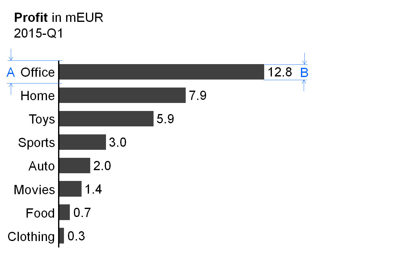
In general, single bar charts (short: single bars) are used for the structural analysis of one data series (e.g., products, countries, or divisions) for one period or one point in time.
Single bar charts consist of:
-
Vertical category axis: The vertical category axis with its labels represents the respective structure elements such as countries, products, etc. The category width (see width A in figure) should be the same for corresponding analyses.
-
Bars: One bar per structure element extends from the category axis to the length representing the respective value. Display the bars in the foreground of the category axis, so that the length of the bar is not hidden. The part on “Semantic rules” suggests that the ratio of bar width to category width (see ratio B/A in figure) represents information about the measure type (see UN 3.1 “Unify measures”).
-
Legends: As there is only one data series, the legend (name of the data series) is part of the chart title.
-
Data labels: Data labels name the values of the data series consistent with the length of the respective bars. Position the labels of positive values at the right hand side of the respective bars, the labels of negative values at the left hand side.
Stacked bar charts
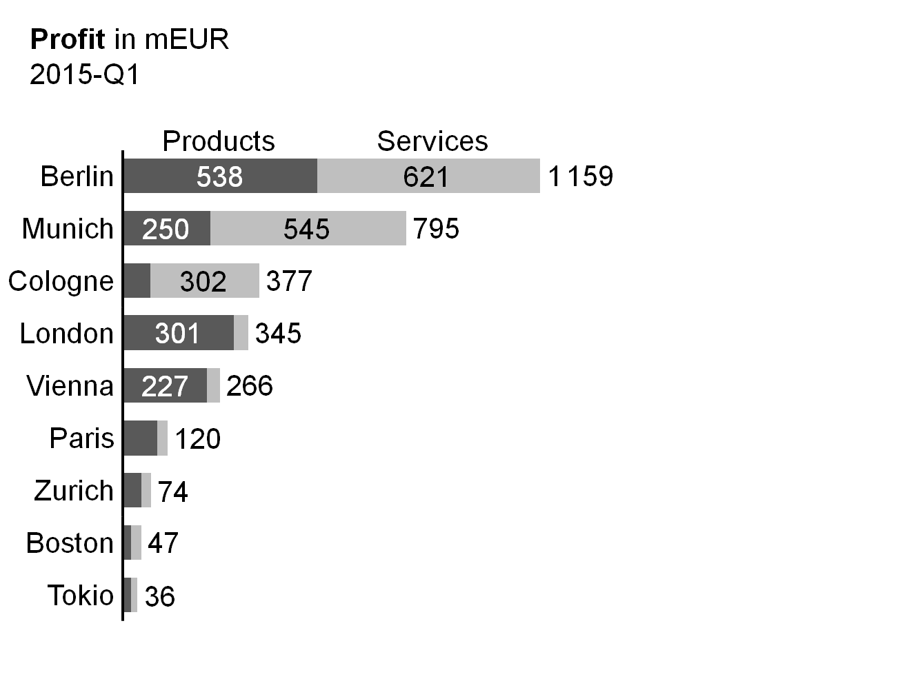
Stacked bar charts (short: stacked bars) represent more than one data series (e.g., products, countries, or divisions) for one period or one point in time.
Stacked bar charts consist of:
-
Vertical category axis: See single bar charts.
-
Bars: The bars (see single bar charts) are divided into segments (Excel names them “data points”) representing the data series (stacked bars).
-
Legends: Legends (names of the data series) are positioned either above the top stacked bar or below the bottom stacked bar, with the bar segments defining their horizontal position: they are horizontally centered with the data labels of the respective bar segment. If a segment at the top or bottom is missing or has a very small size, its legend might need assisting lines.
-
Data labels: Data labels name the values of the data series corresponding to the length of the respective bar segment. If the sum of the bar segments of a category is positive (bar pointing to the right), the label of the sum is positioned to the right hand side of the respective bar. If the sum is negative (bar pointing to the left), the label of the sum is positioned to the left hand side of the respective bar.
It must be pointed out that stacked bars should only be used if all chart values are either positive or negative.
This chart type might also not be a good choice if the values of each data series vary too much. The maximum number of data series (segments of a stacked bars) to be shown depends on the range of how much the values of each data series vary: More than 5 data series will only work well in the case of little variations.
Position the data series of central interest directly at the axis in order to best see its structure.
Grouped bar charts
In general, grouped bar charts (short: grouped bars) show structure analyses for a primary scenario (e.g. AC or FC) in comparison to a reference scenario (e.g. PY or PL). Two bars per category (grouped bars) represent these two scenarios.
The bars of the primary scenario and the reference scenario overlap, the reference scenario placed behind the primary scenario – either above or below (see the bottom chart of the figure as well as the paragraph on “Scenario comparisons” in UN 4.1 “Unify scenario analyses”).
A third scenario could be displayed using a reference scenario triangle. All other elements of a grouped bar chart are identical to a single bar chart.
Alternatively, instead of grouped bars, the primary scenario can be represented with a single bar and the reference scenario by reference scenario triangles (see top chart of figure).
Vertical pin charts
Vertical pin charts (short: vertical pins) are used for the visualization of relative variances in a structure analysis.
Vertical pins consist of:
-
Vertical category axis: see single bar chart.
-
Pins: One pin per structure element extends from the category axis to the respective length. The pin has the size of a very thin bar. It is colored green or red when representing positive or negative relative variances respectively. The fill of the pinhead represents the primary scenario (see the paragraph on “Scenario comparisons” in UN 4.1 “Unify scenario analyses”). Display pins in the foreground, so that the length of the pin (see length X in the figure) is not hidden.
-
Legends: As there is only one data series, the legend (name of the data series) is part of the chart title.
Data labels: Data labels name the values of the data series corresponding to the length of the respective pins. Position the labels of positive values at the right hand side of the respective pins, the labels of negative values at the left hand side.
Vertical waterfall charts
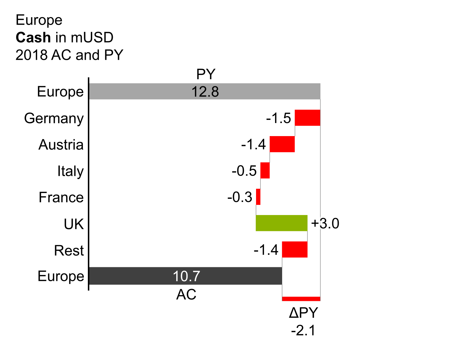
Vertical waterfalls charts (in short: vertical waterfalls or bar waterfalls) analyze structural root causes for the difference between two or more statuses. Accordingly, vertical waterfalls consist of two or more base bars and totals bars. In between a base bar and a totals bar there are contribution bars representing the contribution to the difference between these two bars. Starting from the top base bar, contribution bars always start at the end of the preceding bar, showing positive or negative individual contributions of the respective structure element as well as the accumulated contribution resulting in the next totals bar.
There are two types of vertical waterfalls:
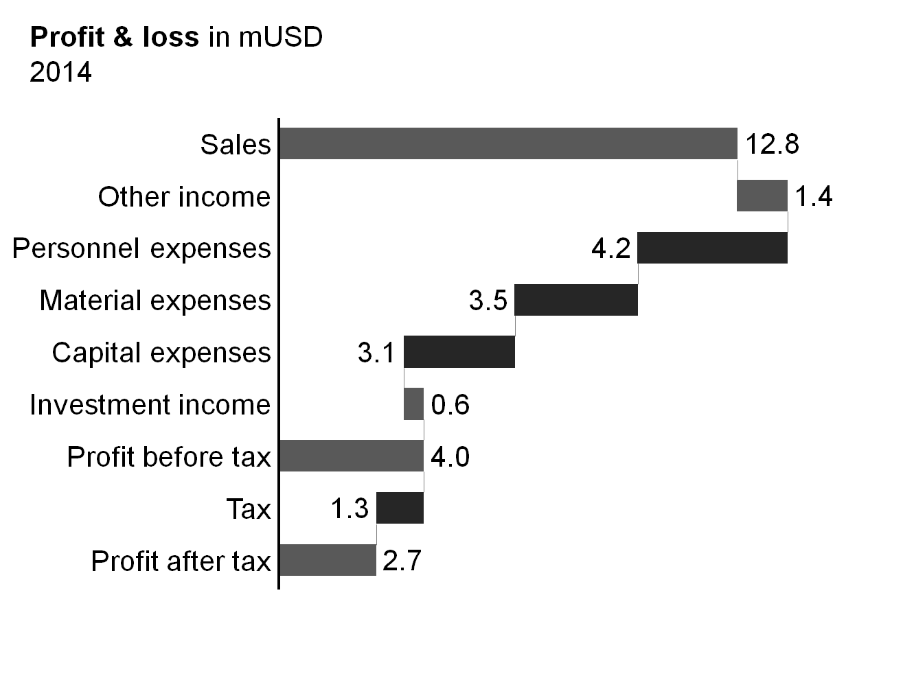
Calculation waterfalls: In calculation waterfalls, base bars and totals bars represent base and result measures (e.g. sales and EBIT) whereas the contribution bars in between represent the additions and subtractions of other measures (e.g. financial income and direct cost) in a calculation scheme. More complex calculation schemes (e.g. profit and loss calculation) can have intermediate subtotals bars.
(There is no horizontal correspondence to the vertical calculation waterfall.)
Vertical variance waterfalls: In vertical variance waterfalls, base bars and totals bars represent values at different periods or points in time (e.g. January 1, 2013 and January 1, 2014) and/or different scenarios (e.g. PY and AC). The contribution bars in between represent the variances in structure between the different times and/or scenarios.
The elements of vertical waterfalls are the same as the elements of single bar charts. In addition, assisting lines connect the end of a bar with the beginning of the succeeding bar.
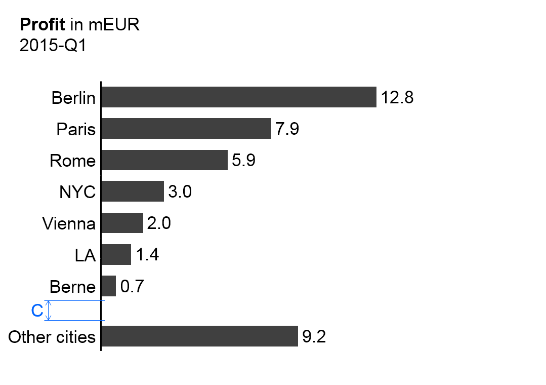
Remainder bar
If a large number of elements need to be presented, then only the most important elements can be displayed in one chart or on one page. In order to make the analyses exhaustive, sort the elements by descending size, accumulating the smallest elements, which cannot be depicted, in a remainder bar (“rest of…”). Separate the remainder bar from the other bars by a wider gap (see gap C in the figure on the left).
Note: This remainder bar has to be excluded from some Structure analyses such as averaging, ranking, and selecting.
Other vertical charts
Other chart types with vertical category axes are vertical boxplot charts (range charts). There is no specific notation concept for this chart type yet however it can be derived from the notation of the standard bar charts.
In general, do not use lines and areas in vertical charts as they might underline a continuum of data non-existent in business communication.
Charts with two values axes
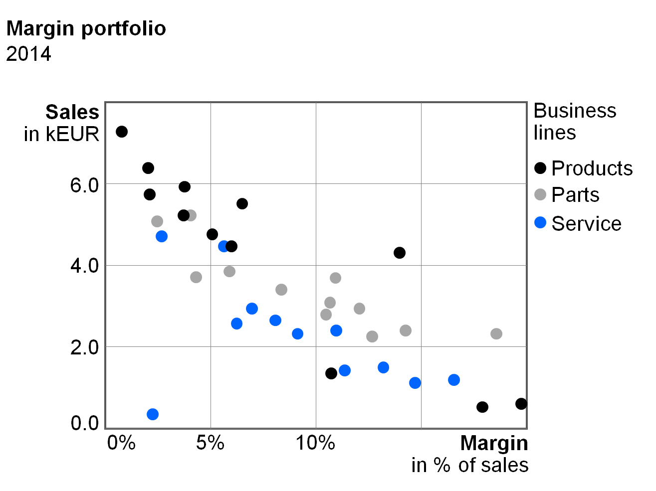
Charts with two value axes show two-dimensional positioning of visualization elements, which can provide new and interesting insights. Scattergrams arrange points in a two-dimensional coordinate system.
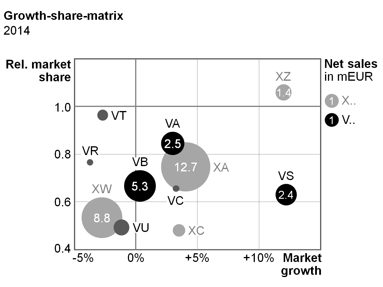
Bubble charts (portfolio charts) have bubbles instead of points and use the bubble area to show a third dimension. A fourth dimension could be presented via pie segments within the bubbles (bubble pie charts).
Besides scattergrams and bubble charts there are other chart types with two value axes, e.g. charts with horizontal axes representing a continuous timeline (instead of fixed time categories) and charts with columns or bars of variable width.
There are no specific notation rules for charts with two value axes yet. An appropriate notation concept for these chart types can be derived from the notation of column charts, bar charts and line charts with their data visualization elements, legends, data labels, and axes.
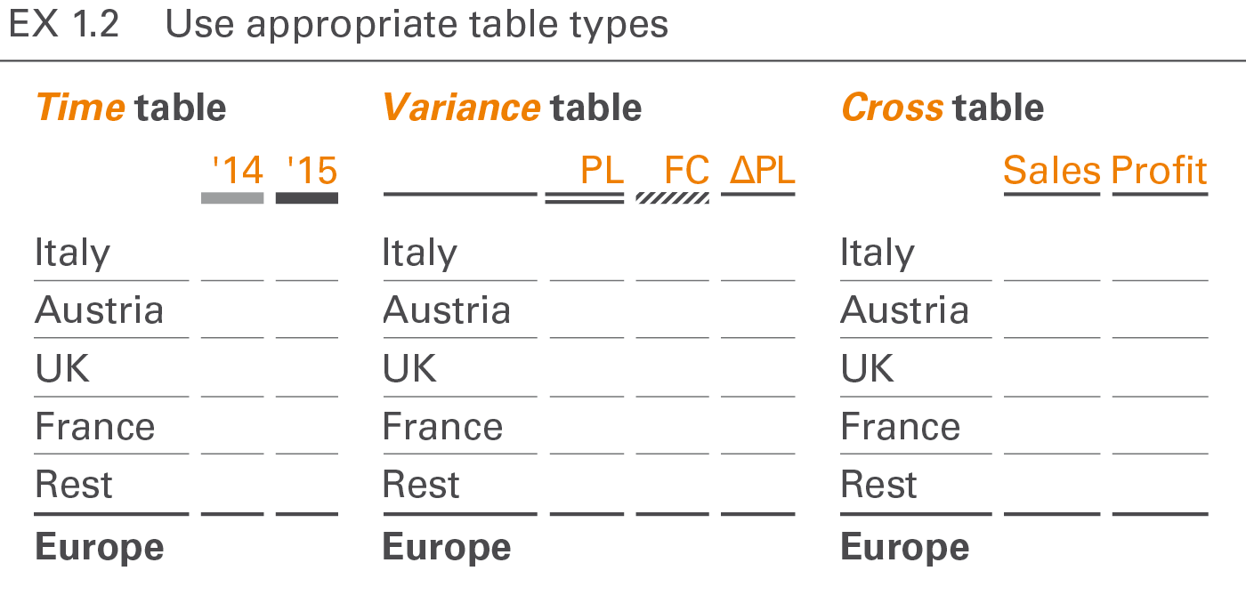
EX 1.2 Use appropriate table types
A table is a communication object in which data is arranged in two dimensions, i.e. (vertical) columns and (horizontal) rows. The row header (row name) describes the content of a row, the column header (column name) the content of a column. The data are positioned at the intersections of rows and columns called table cells.
“One-dimensional tables” (tables with one or more columns but without row headers) are called lists and are not covered here.
Table types are defined by a set of columns and a set of rows in order to fulfill specific analytic and/or reporting purposes.
Column types
Column types are columns with similar content falling under similar column headers. Typical column types are time columns (with monthly or yearly data), scenario columns (with actual or plan data) and variance columns (ΔPL or ΔPY).
The following layout principles apply to all column types:
-
Width: Columns belonging to a certain column type should have an identical width. This column width should not depend on the text length of the respective column header.
-
Orientation: Right-align columns with numerical data. Left-align columns with non-numerical data (e.g. texts or product names). Column headers have the same orientation as the rest of the column. Headers for combined columns can be centered or even left-aligned to increase legibility.
-
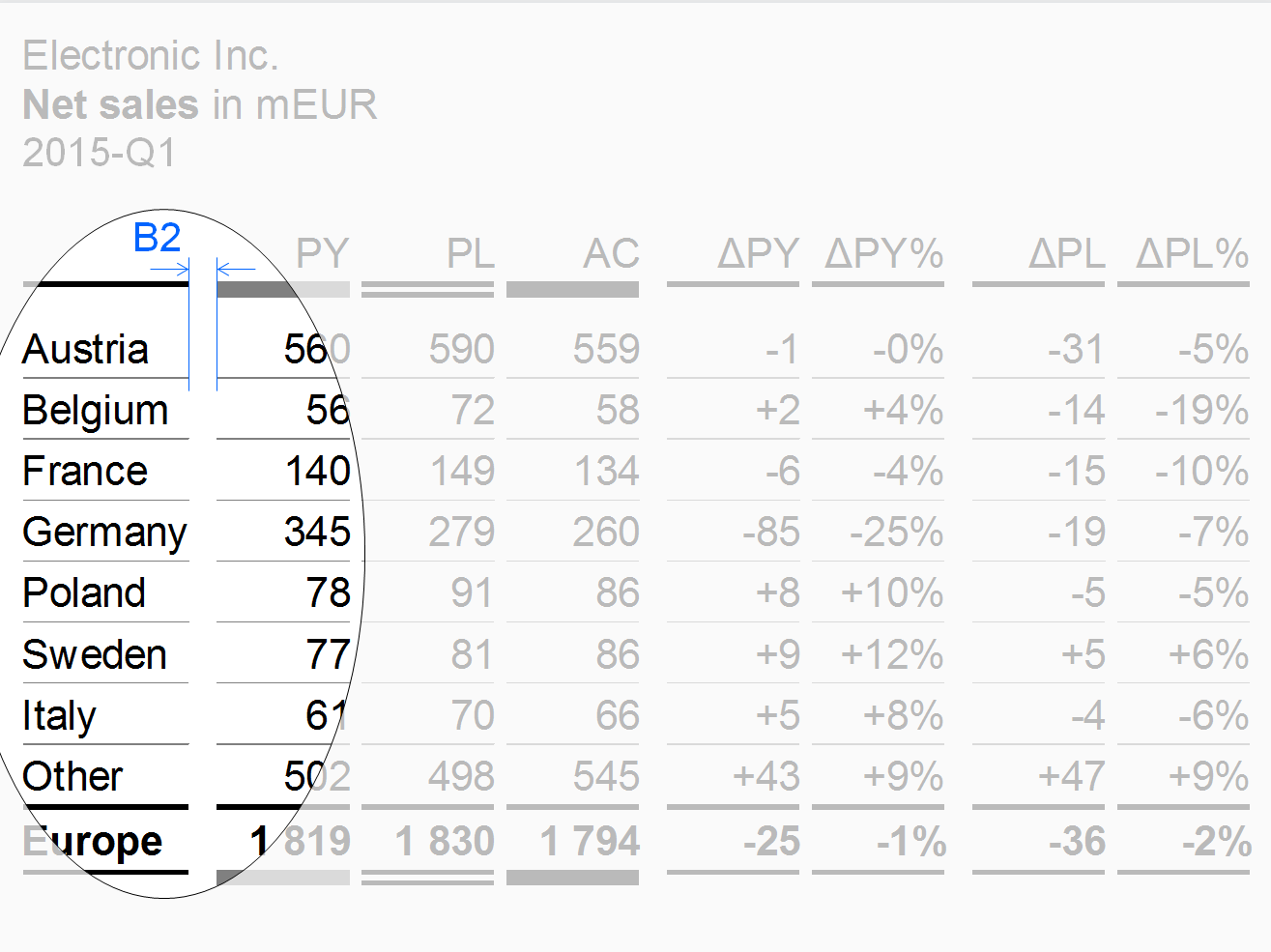
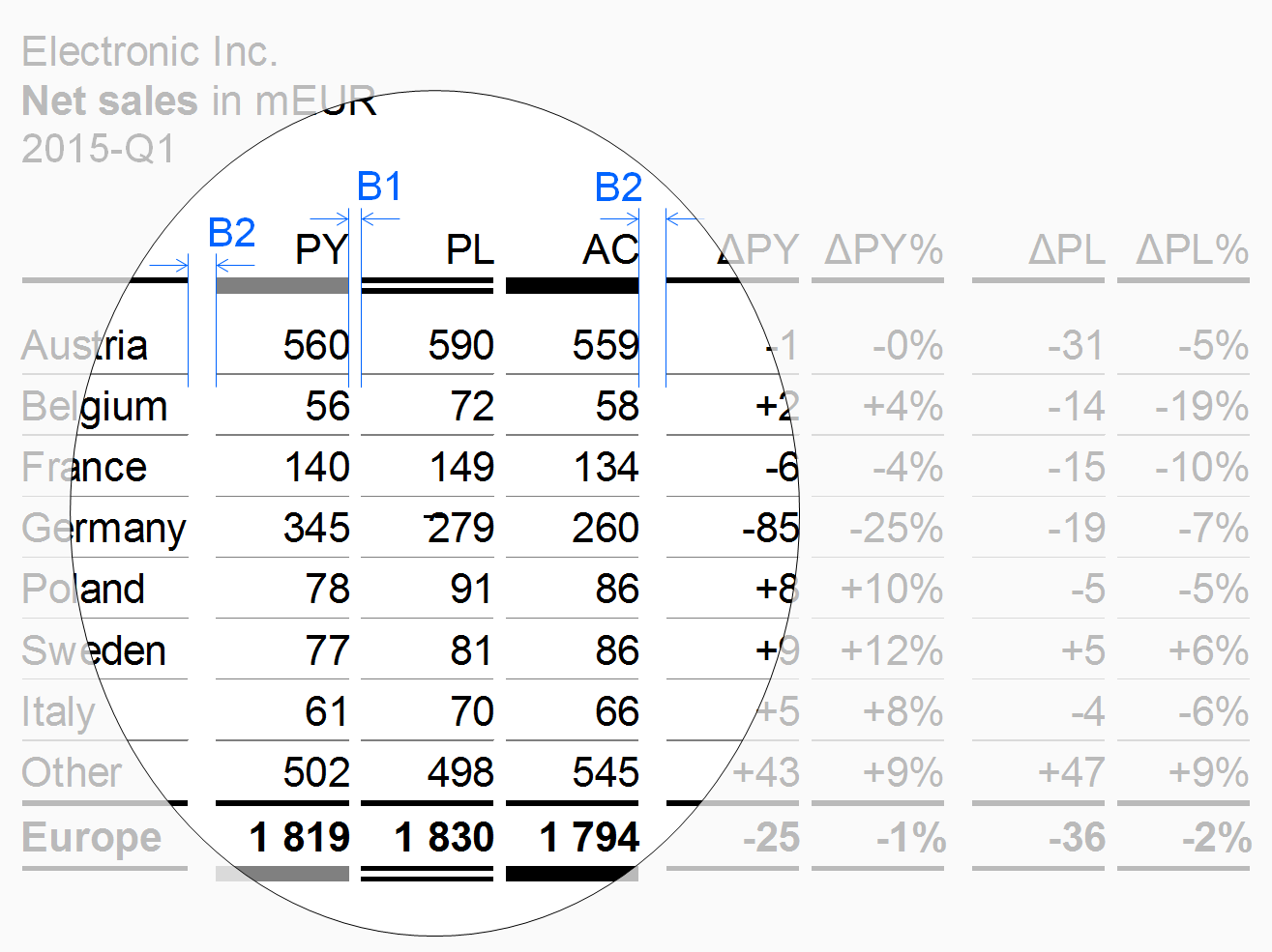
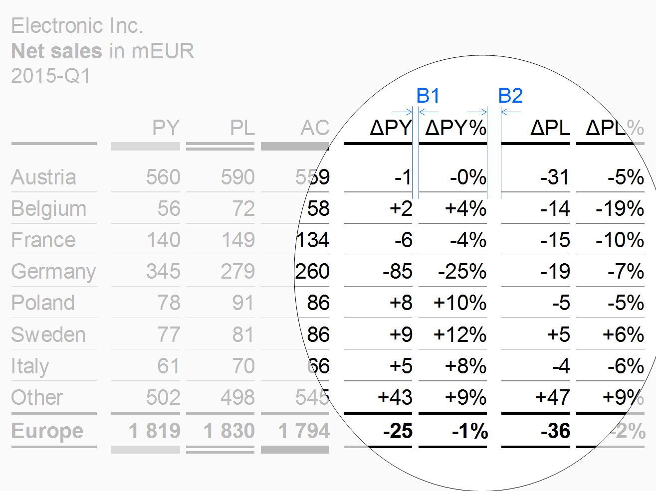
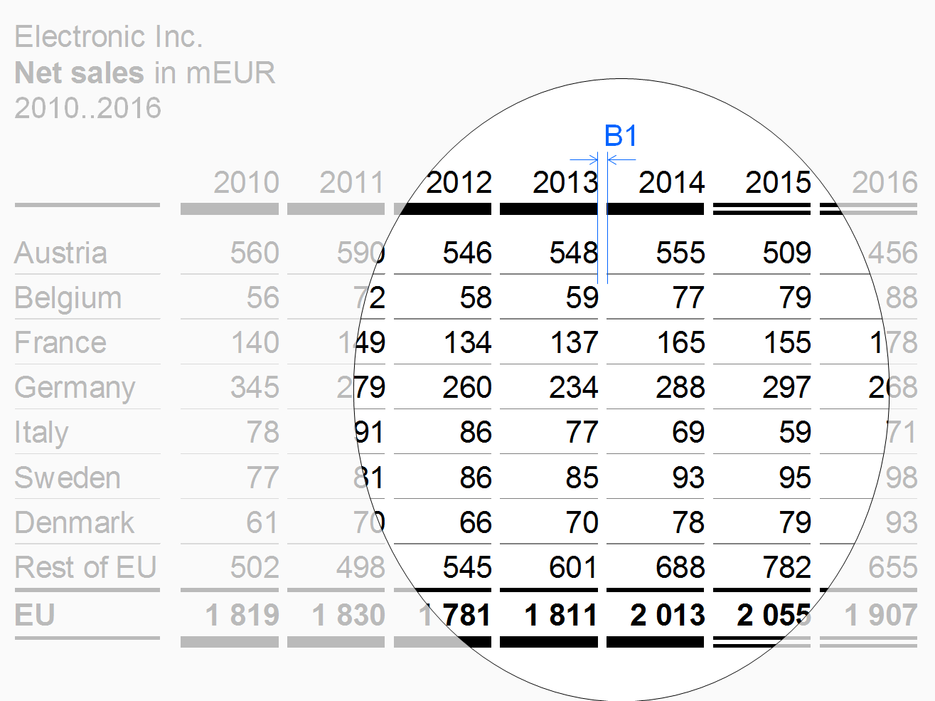
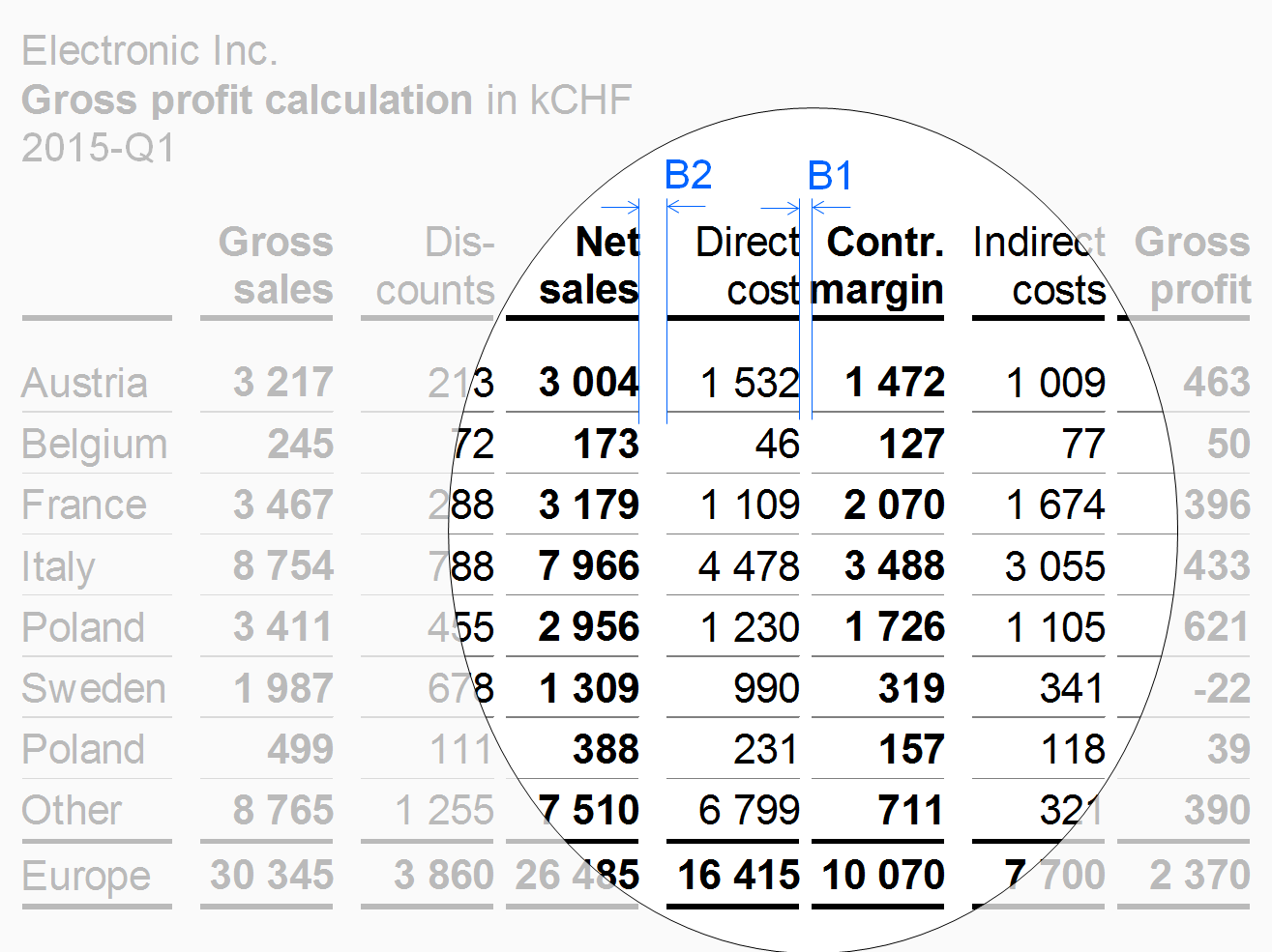
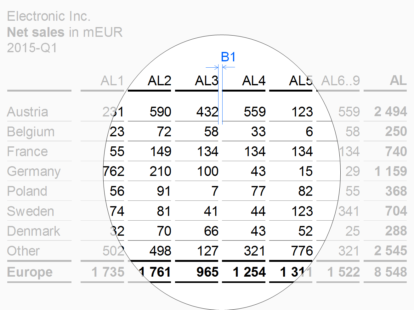
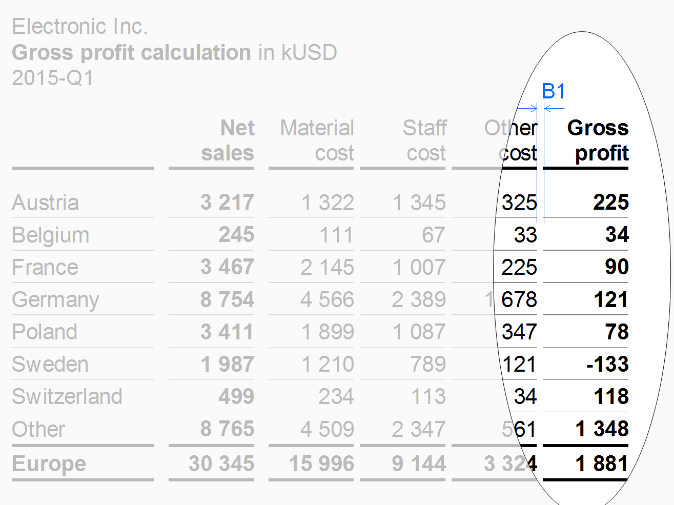
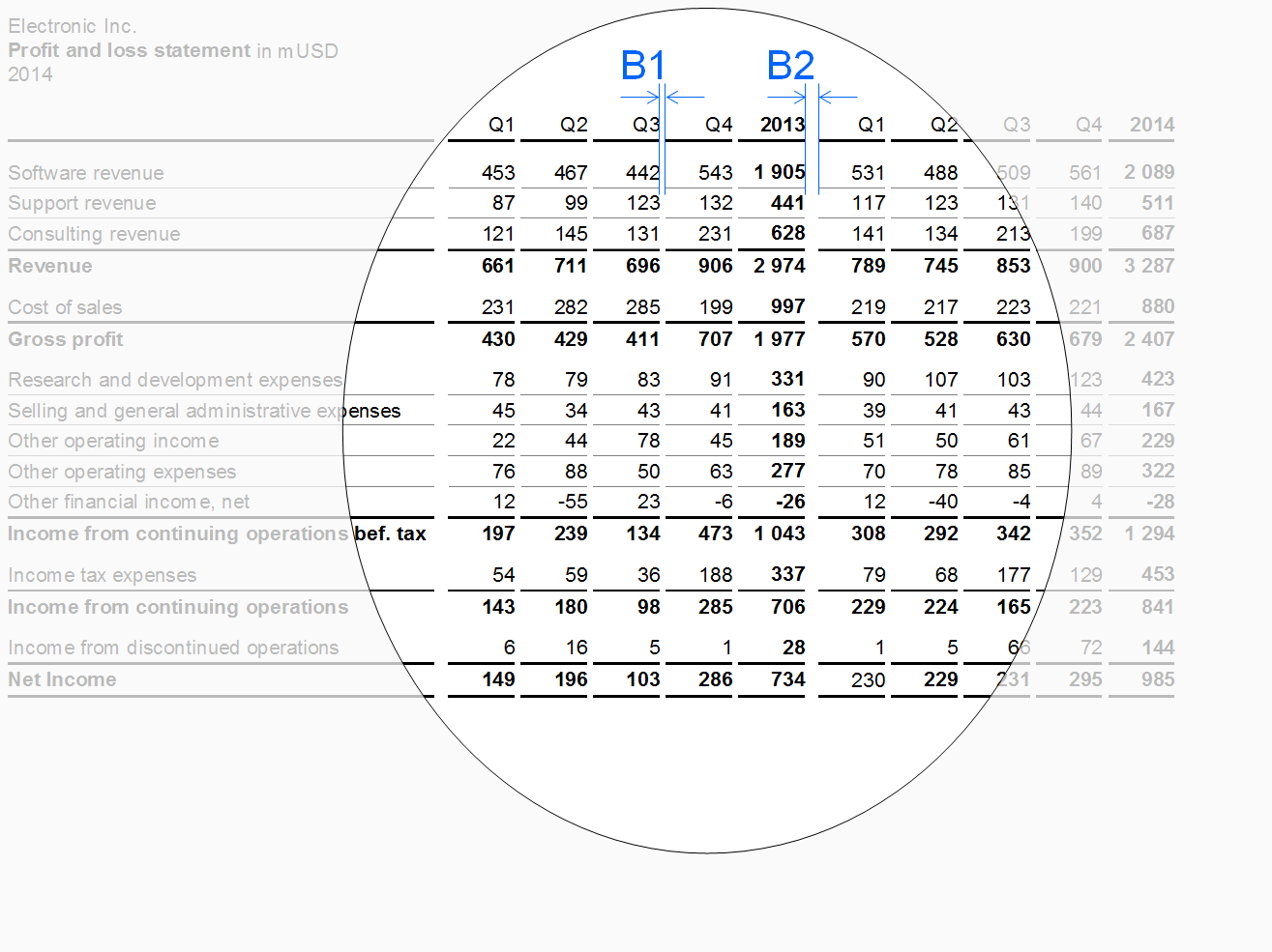
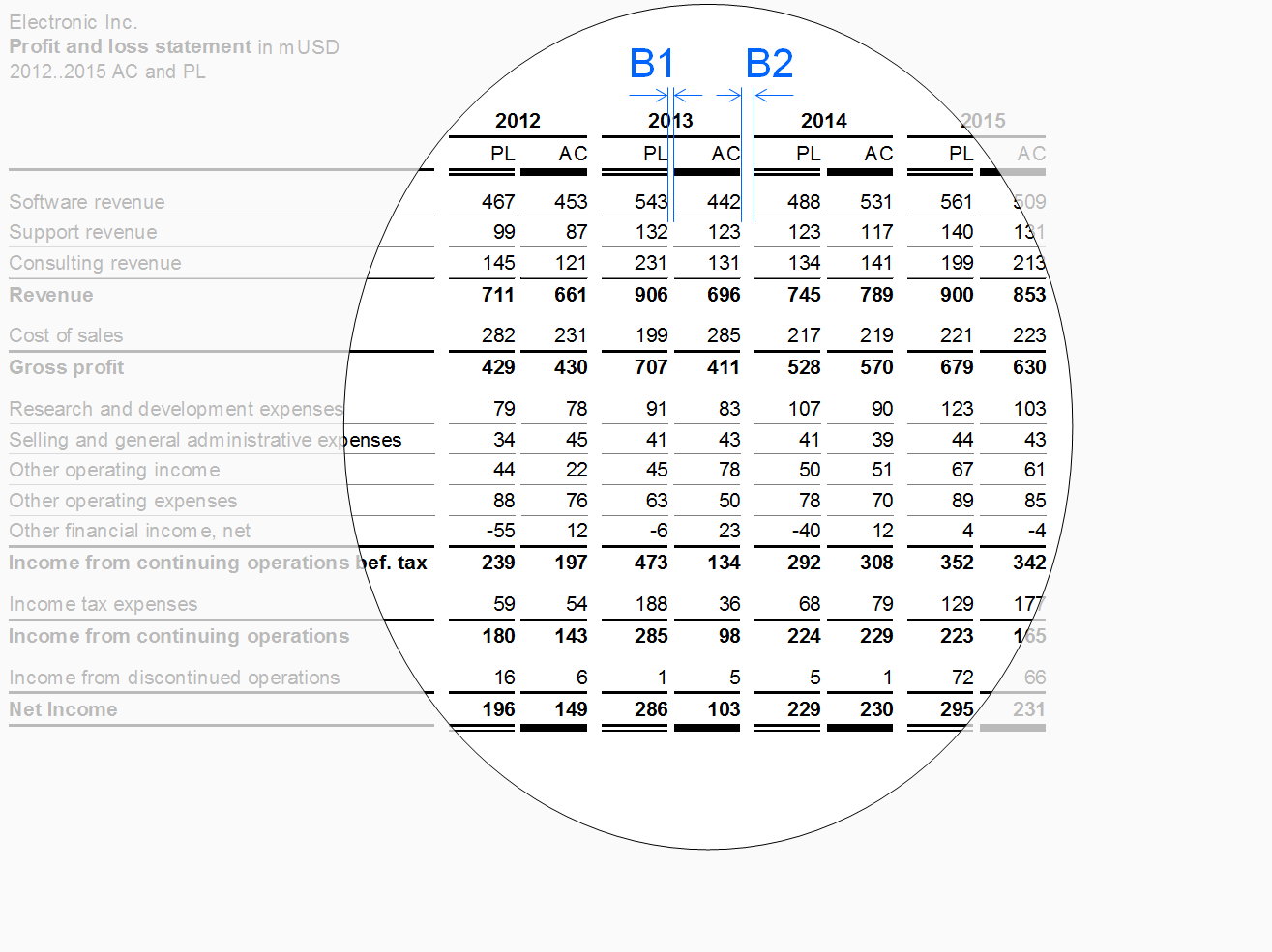
Vertical lines and gaps: Vertical lines separating different columns should be very light or even omitted. Use white vertical lines or white vertical gaps to mark the columns. In the following figures, different widths of these white lines resp. gaps are being used to separate and group columns. Separate columns of the same type by a narrow gap (see gap B1 in the figure in section “Scenario columns” et seq.). Use a wider gap to separate a group of similar columns from the next group (see gap B2 in the figure in section “Row header columns” et seq.).
Additional layout principals depend on the column types described below.
Row header columns
Row header columns contain the header texts of the rows. Often, these columns are positioned at the very left of a table. In most cases, row header columns are much wider than other column types.
Keep the texts of the row headers short by using abbreviations or footnotes in order to omit too wide tables.
Use a wider gap (see width B2 in the figure) to separate the row header column from columns with numbers.
Scenario columns
Scenario columns show data for scenarios (e.g. previous year, plan, actual). Use the same width for all scenario columns (depending on the number of digits).
For the sequence of scenario columns see UN 4.1 “Unify scenario analyses”.
Variance columns
Variance columns show data of absolute variances (e.g. ΔPL, ΔPY) or relative variances (e.g. ΔPL%, ΔPY%).
Time columns
Time columns show time periods (for flow measures) or points of time (for stock measures).
Use a temporal order – from left to right – for the sequence of the time columns (e.g. Jan, Feb, Mar, or 2013, 2014, 2015).
Measure columns
Measure columns show measures such as sales, headcount, or equity.
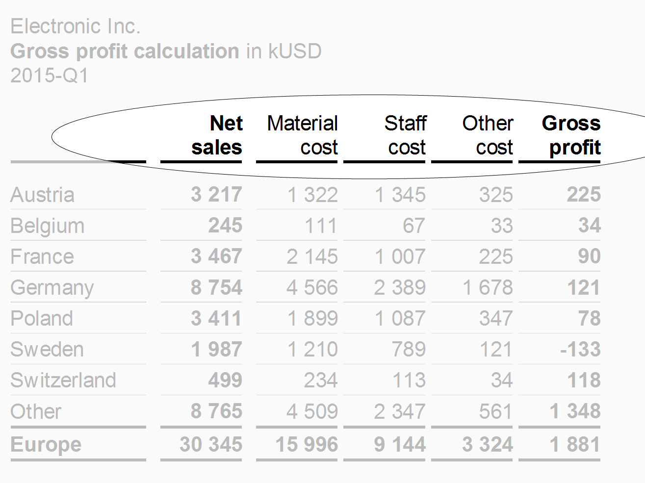
Displaying long measure names in column headers can be challenging. As the column width should not depend on the length of the measure name, use the abbreviations defined in the glossary instead.
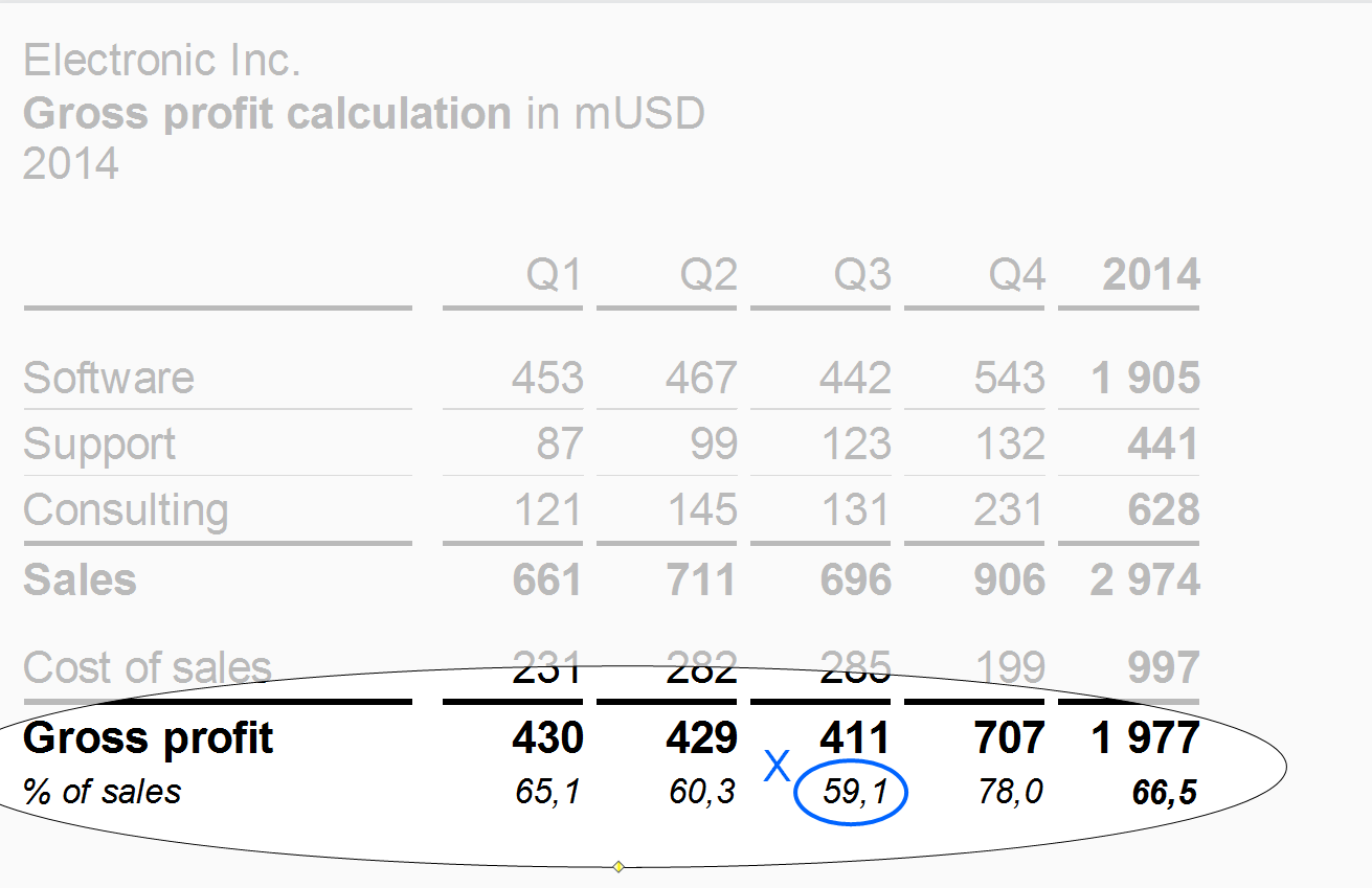
Use a wider gap after intermediate results to expose the calculation scheme (see width B2 in the figure on the left).
Structure columns
Structure columns show the elements of a structure dimension (e.g. countries or products).
“Thereof” columns
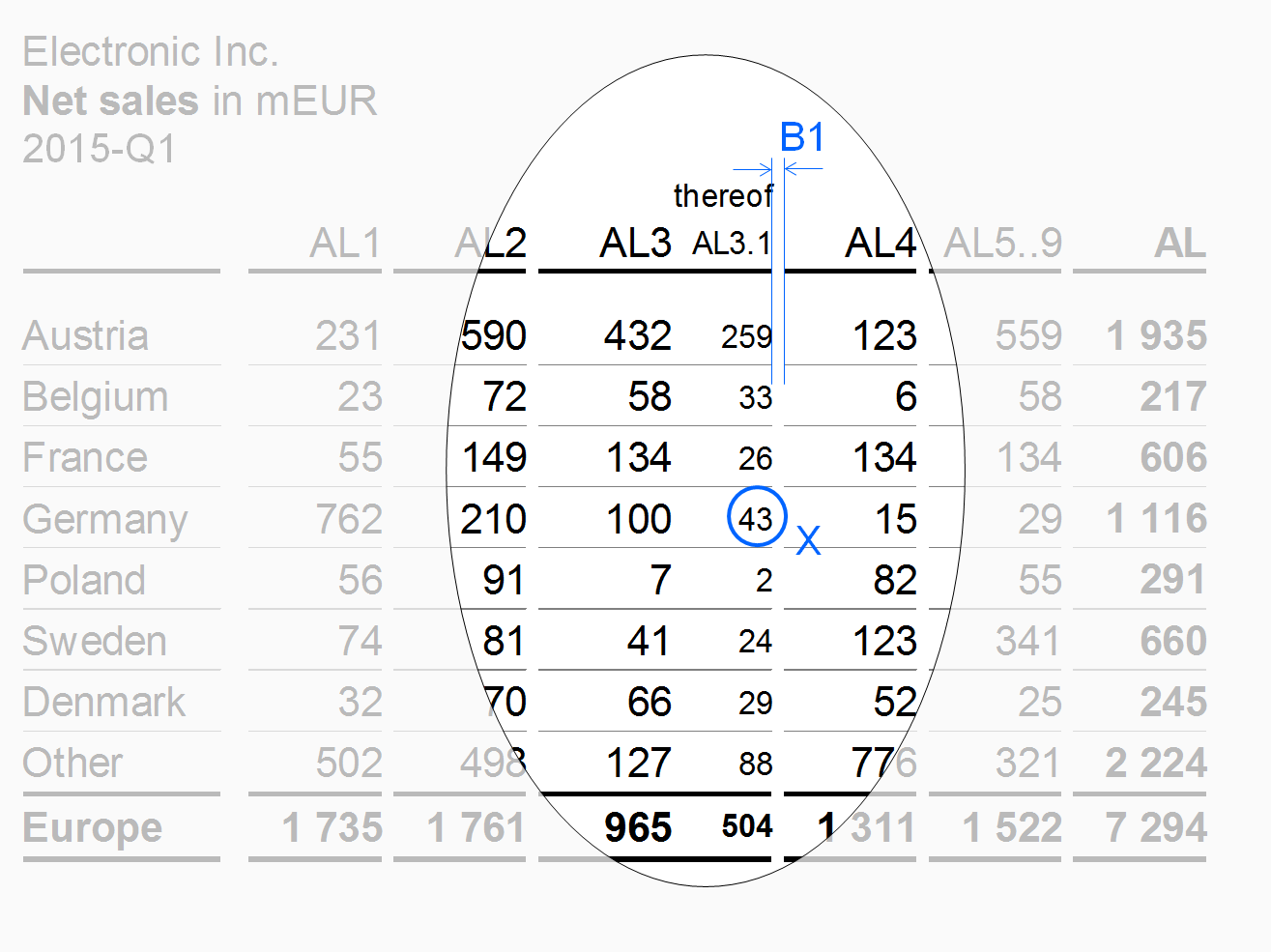
If details of an aggregated column are shown in one or more column not totaling to the aggregated column, these columns are called “thereof” columns.
The design of the thereof columns should differ from other columns. E.g. use a smaller font (see X in the figure) to expose a thereof column and do not separate it from the mother column (see columns AL3 and AL3.1 in the figure) in order to show that it is part of it. A thereof column is positioned at the right hand side of the mother column.
Remainder columns
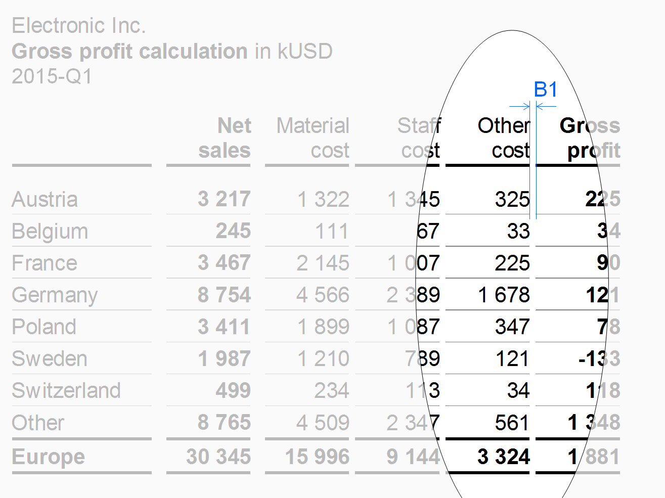
If the set to be presented in the columns has too many elements, accumulate the less important or smaller elements in a remainder column (e.g. 10 columns for the top 10 countries and a remainder column titled “Rest of world” or “RoW”).
In the figure, the remainder column “Other cost” has the same vertical gaps B1 as the other measure columns.
“Percent of” columns
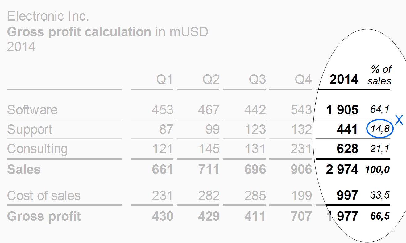
Use “Percent of” columns to present important data of another column as shares of a given total. A typical example for a “percent of” column is data of a profit and loss statement as a percentage of sales.
“Percent of” columns have a smaller font size (see X) than the other columns.
Totals columns
Position columns displaying totals of a group of columns (e.g. quarters totaling in years or products totaling in product groups) at the right hand side of the columns belonging to this group. The design of the totals columns should differ from other columns, e.g. highlighted by bold fonts or by light gray background.
The column types described before refer to single columns. The following paragraphs present combined columns i.e. hierarchical and nested columns.
Hierarchical columns
Hierarchies in dimensions may call for columns showing multiple levels. If possible, the sibling elements belonging to the same parent element of a dimension should be homogenous, mutually exclusive, and collectively exhaustive.
Separate parents by appropriate means, e.g. wider gaps. Display the parent columns at the right hand side of their child columns (like totals columns).
In the figure, a wider gap B2 separates the two years (with four quarters each) from each other.
Nested columns
In nested columns, two column types are combined in such a way that the columns of one type repeat iteratively within every column of the other type. Separate the resulting groups of columns by appropriate means, e.g. wider gaps.
In the figure, wider gaps B2 separate the four years (with AC and PL data each) from each other.
Row types
Row types are rows with similar content falling under similar row headers. Typical row types are measure rows (e.g. sales, cost, profit) or structure rows (e.g. Italy, France, UK).
The following layout principles apply to all row types:
-
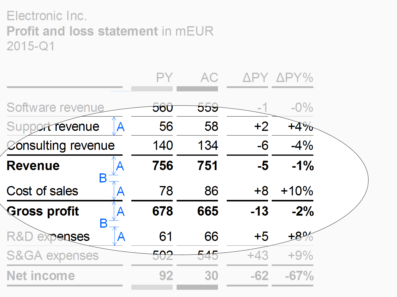
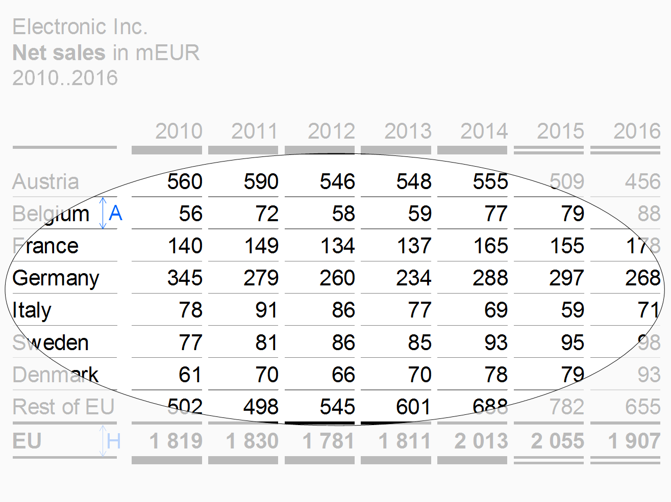
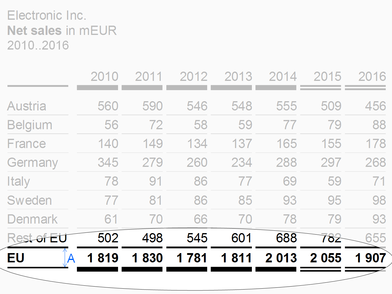
Height: Rows belonging to a row type should have an identical height (see height A in the figure in section “measure rows” et seq.).
-
Horizontal lines: Separating rows by light horizontal lines will increase the legibility.
Additional layout principals depend on the row types described below.
Time periods and points of time, scenarios, and variances should be displayed in columns rather than in rows.
Column header rows
Column header rows contain the header texts of the columns. In most cases, these rows are positioned at the very top of a table. In order to group columns two and more column header rows might be necessary. If necessary, abbreviate column header texts in order to fit in the preferred column width. Alternatively keep column headers short by using footnotes.
In the figure the column header row uses two lines in order to fit the column header texts in the narrow columns.
Measure rows
Measure rows show measures such as sales, headcount, or equity.
Separate rows showing final or intermediate results of a calculation scheme (results rows or totals rows) by solid lines. Display results rows in bold font or highlight them with light gray background. An additional gap B below a results row will increase legibility.
Structure rows
Structure rows show elements of a structure dimension (e.g. countries or products).
“Thereof” rows
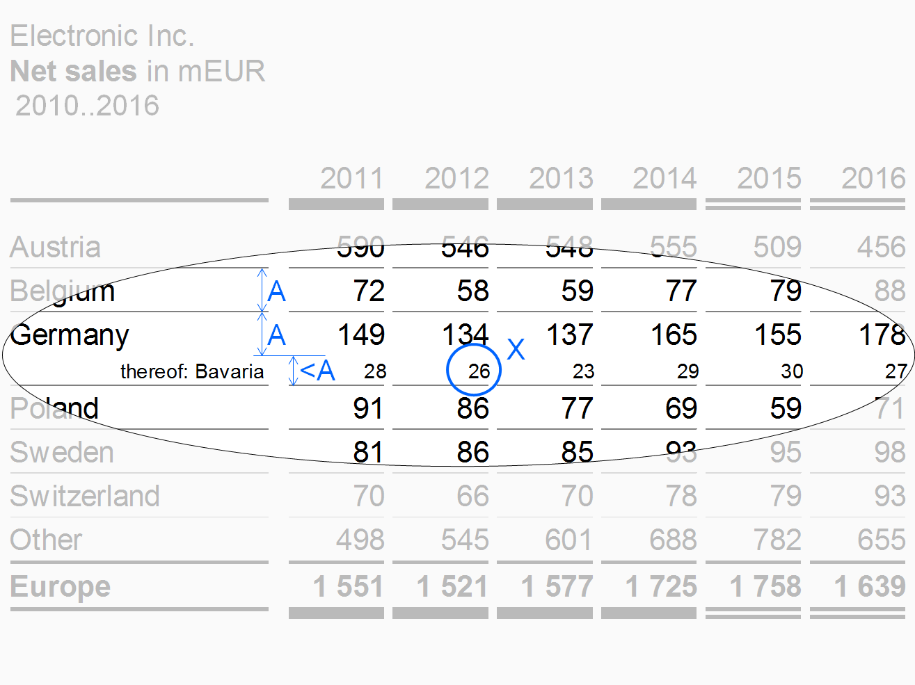
If details of an aggregated row are shown in one or more rows not totaling to the aggregated row, these rows are called “thereof” rows. Place the aggregated above the “thereof” rows (in contrast to the totals row positioned below the rows of its group).
The design of the thereof rows should differ from other rows. E.g. in the figure, the thereof row is of smaller height, written in a smaller font (see X), not separated by a horizontal line, and has a right-aligned row header.
Remainder rows
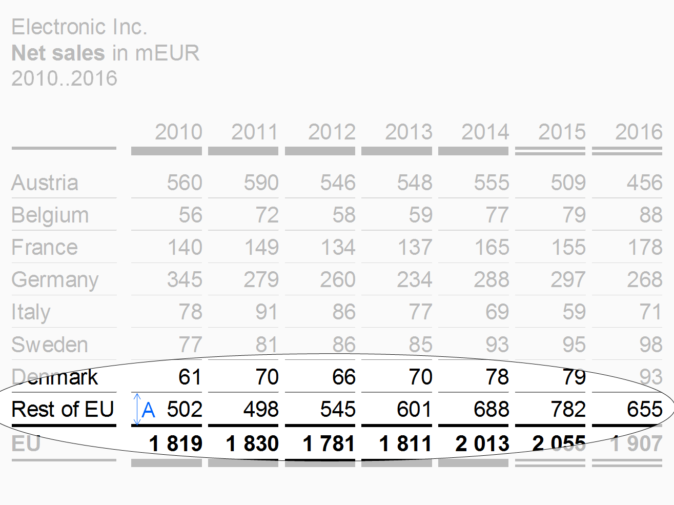
If the structure dimension to be presented in the rows outline has too many elements, accumulate the less important or smaller elements in a remainder row (e.g. 7 rows for the top 7 countries and a remainder titled “Rest of world”).
Exclude remainder rows from some of the Structure analyses such as averaging, ranking, and selecting.
In the figure, the remainder row has the same row height A as the other structure rows of this table example.
“Percent of” rows
Use “Percent of” rows to present important data of another row as shares of a given total. A typical example for a “percent of” row is gross profit as a percentage of sales.
“Percent of” rows have a smaller font size (see X) than the other rows.
Totals rows
Place rows displaying totals of a group of rows (e.g. countries totaling in regions or products totaling in product groups) below the rows of this group and separated them by solid lines.
The design of the totals rows should differ from other rows, e.g. highlighted by bold fonts or by light gray background.
The row types described before refer to single rows. The following paragraphs present combined rows i.e. hierarchical and nested rows.
Hierarchical rows
Hierarchies in dimensions may call for rows showing multiple levels. If possible, the sibling elements belonging to the same parent element of a dimension should be homogenous, mutually exclusive, and collectively exhaustive.
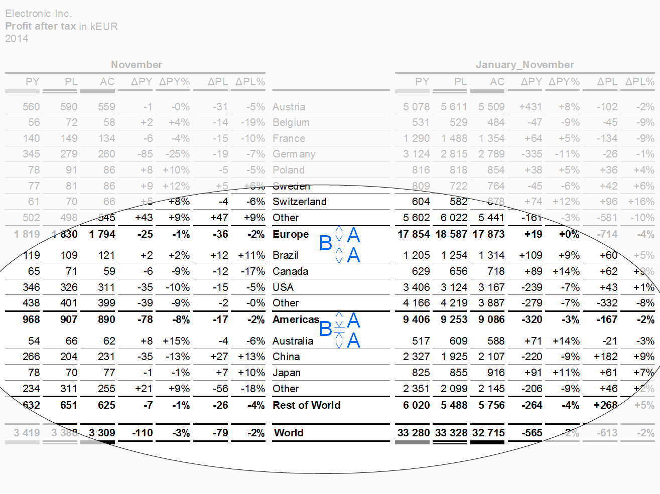
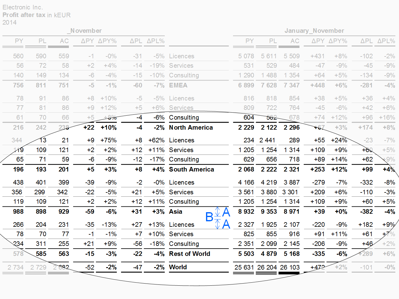
Separate parents by appropriate means, e.g. wider gaps (see additional gap B in the figure). Display the parent rows below their child rows (like totals rows).
Nested rows
In nested rows, two types of rows are combined in such a way that the rows of one type repeat iteratively within every row of the other row type.
Separate the resulting groups of rows by appropriate means, e.g. wider gaps (see additional gap B in the figure).
Table types
Table types are distinguished by their analytic purpose in time series tables, variance tables and cross tables. Tables serving more than one analytic purpose are called combined tables.
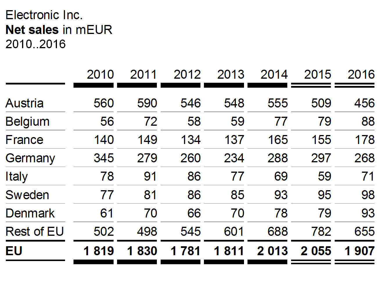
Time series tables
Time series tables are used for time series analyses, combining time columns with measure rows or structure rows.
A typical example for a time series table is a sales analysis by countries (rows) and years (columns).
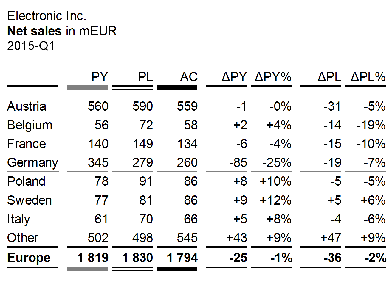
Variance tables
Variance tables are used for scenario analyses, combining scenario columns and variance columns with measure rows or structure rows.
A typical example for a variance table is a sales analysis by countries (rows) showing different scenarios and different variances (columns).
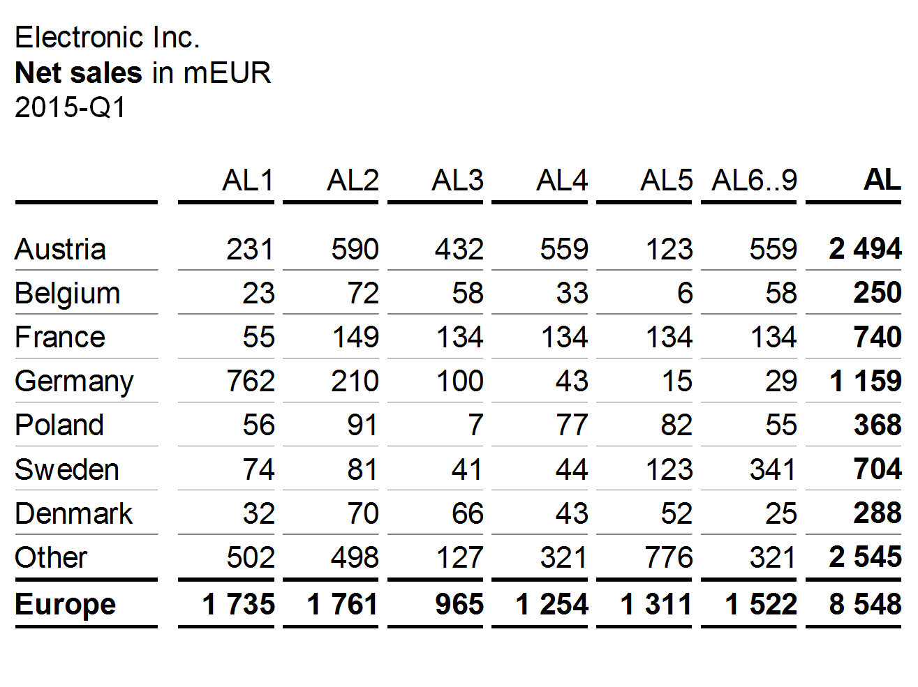
Cross tables
Cross tables are used for Structure analyses, combining structure columns with structure rows.
A typical example of a cross table is a sales table with countries in rows and products in columns.
Combined tables
Combined tables are used for multiple analyses. A combined table uses more than one column type and/or more than one row type presented either side by side or nested.
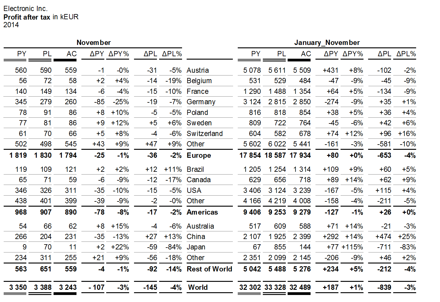
The first figure shows a hierarchical structure of countries on three levels in the rows. The columns are nested: scenarios and variances are the same for both time periods November and January_November.
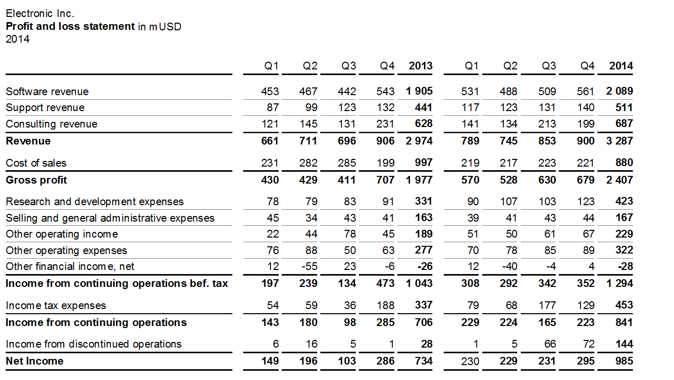
The second figure shows the measures of a calculation scheme in the rows. The columns are nested: The four quarters and the annual total are the same for both years.
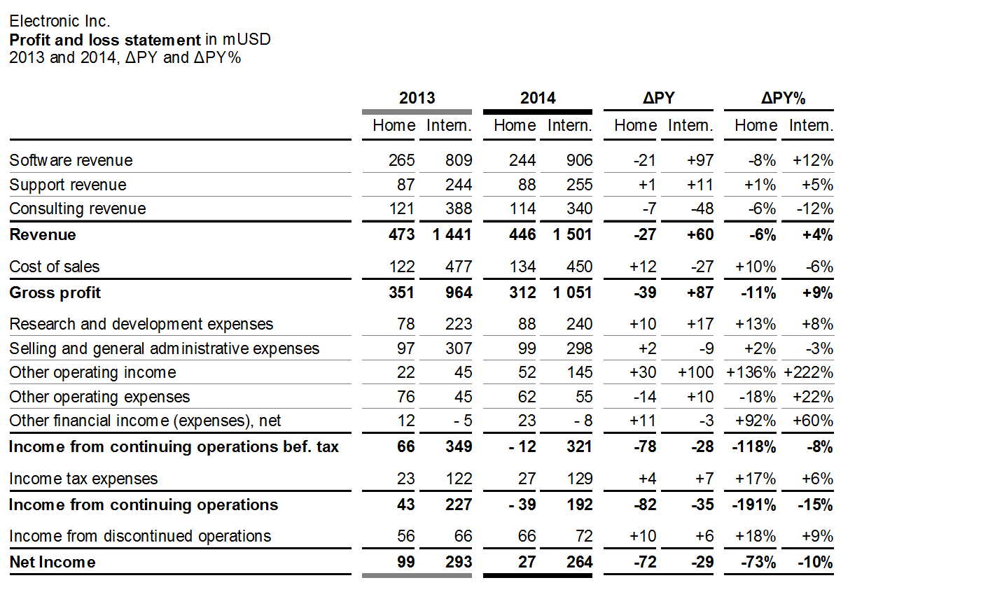
The third figure shows the same rows as the second one (measures of a calculation scheme). The nested columns now show PY and AC data as well as absolute and relative variances for two markets.
EX 2 Replace inappropriate chart types
Inappropriate charts make it hard to perceive the message. Knowing the correct usage of chart types helps in replacing inappropriate visualizations, such as pie charts, speedometer visualizations, radar charts, and spaghetti charts, with those chart types better suited.
EX 2.1 Replace pie and ring charts
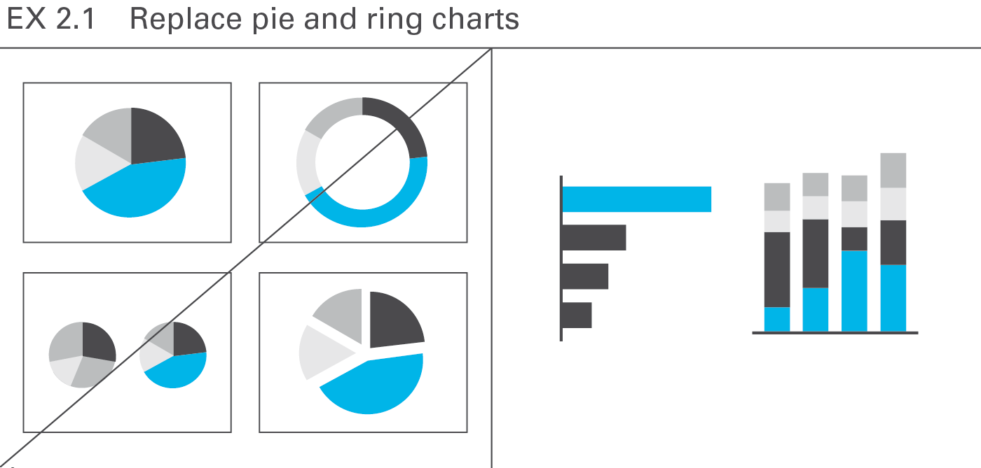
Pie and ring charts are circular charts dividing some total into sectors of relative proportion, but there are better ways to illustrate the numerical proportions of segments, e.g. bar charts or charts with stacked columns, see Figure EX 2.1.
Pie charts allow for one-dimensional analyses only, and therefore seldom convey revealing insights. However, some useful applications for pie charts exist, for example when market sizes and/or market shares for one period need to be allocated to certain regions on a map (see CH 3.3 “Avoid misleading colored areas in maps”). As opposed to column or bar charts, pie charts can be positioned on a specific point on a map.
EX 2.2 Replace gauges, speedometers
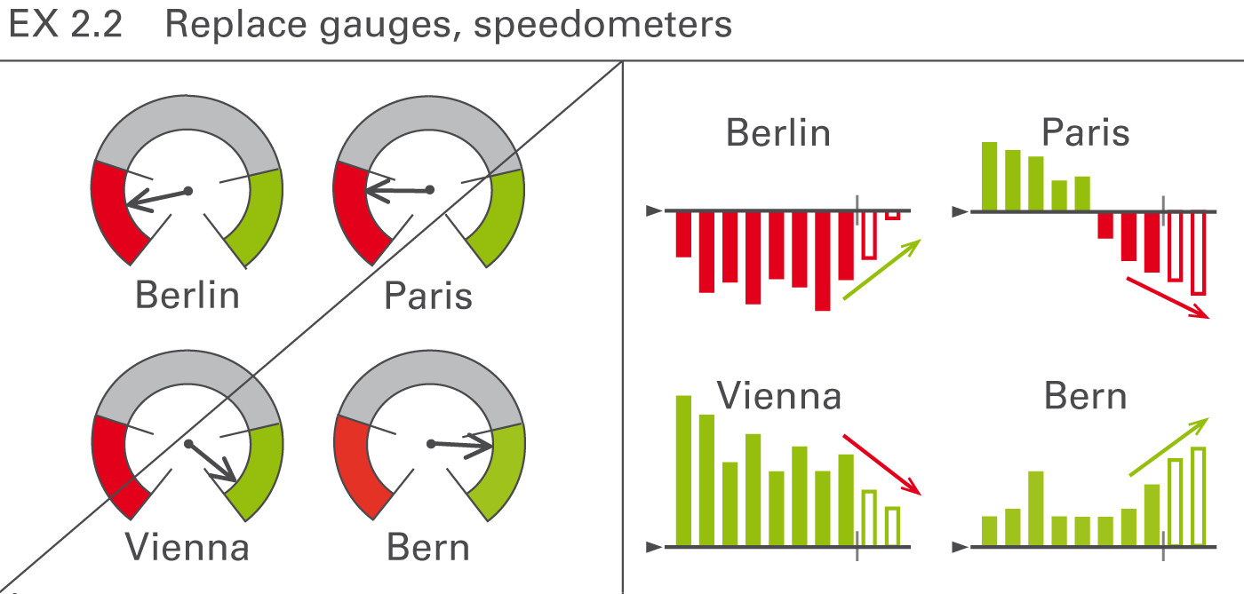
Often found as part of a so-called dashboard, speedometers are probably one of the most useless visualizations out there. They take up way too much space and have often confusing color coding and scaling. In general, bar charts showing the respective structures or columns charts showing the respective development over time are better choices, see Figure EX 2.2.
EX 2.3 Replace radar and funnel charts
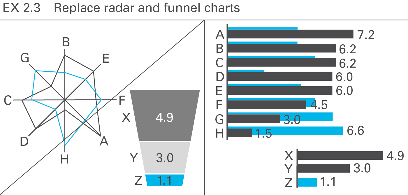
So-called radar charts (also called net charts or spider charts) are frequently used for evaluating purposes. Having no advantage over bar charts and having, actually, many weaknesses, use them only for two-dimensional analyses (e.g. comparing young-old with rich-poor). Willard C. Brinton wrote almost 100 years ago: “This type of chart should be banished to the scrap heap. Charts on rectangular ruling are easier to draw and easier to understand.”
Of course, if the circular arrangement has meaning (such as the compass direction), this kind of chart can be very valuable, but these types of analysis are not typical in business reporting.
Funnel charts are misleading when the size of the area displayed does not correspond to the respective numerical values – an issue applying also to other artificial chart forms (e.g. spheres) in which the length, area, or volume do not correspond to the numerical values.
EX 2.4 Replace spaghetti charts
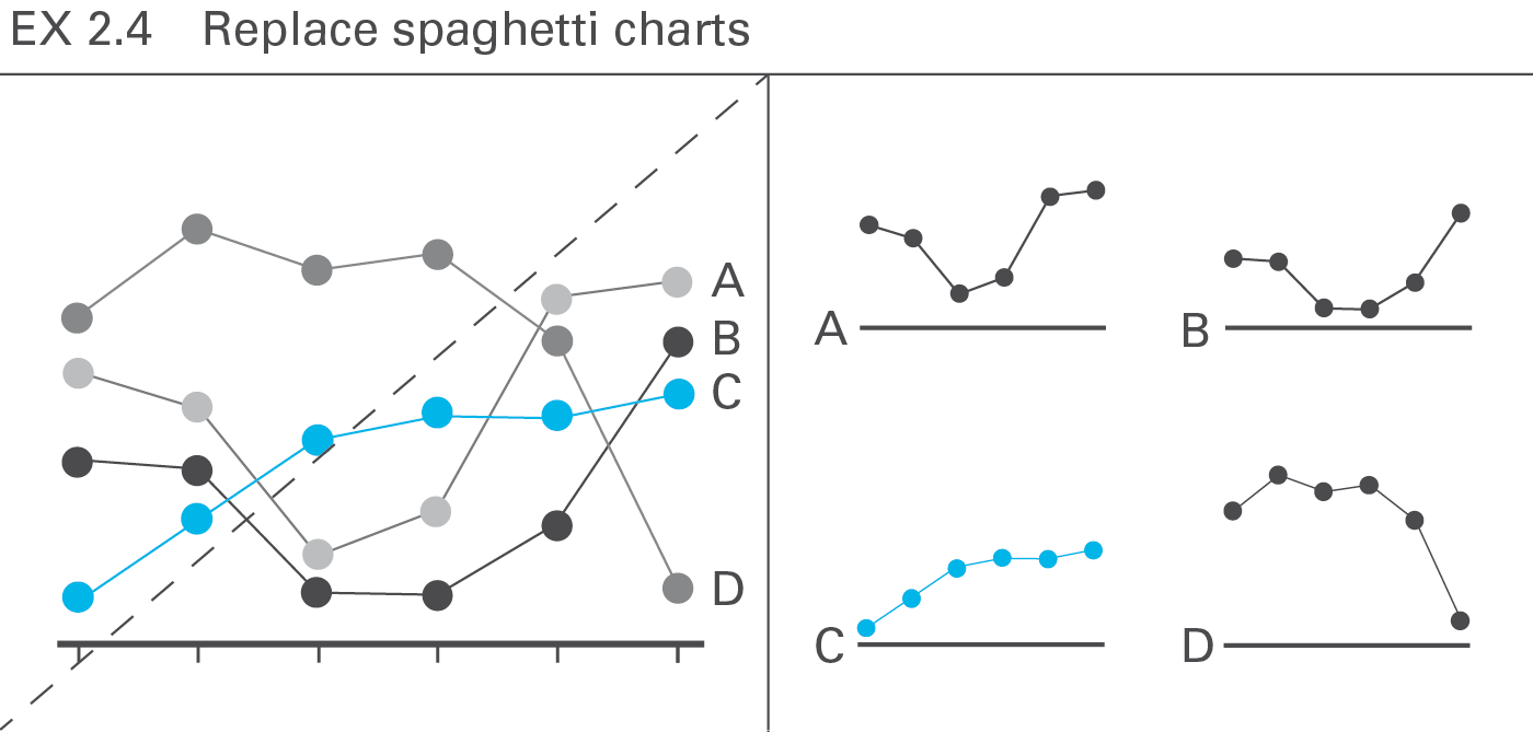
A chart with more than three or four intersecting lines (“spaghetti chart”) can be more confusing than several smaller charts with one line each placed next to one another (small multiples), particularly when evaluating the shape or the trend of the lines, see Figure EX 2.4.
However, when needing to compare exactly the height of data points of several lines, spaghetti charts cannot be avoided.
EX 2.5 Replace traffic lights
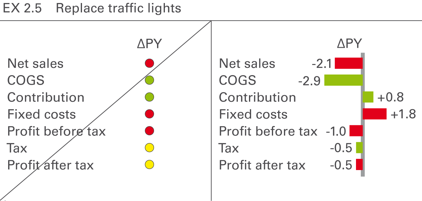
“Traffic lights” with green, red, and yellow areas are a popular form of visualization but contain little information per area used. However, they can be used for analyses showing “yes or no” decisions or situations similar to real traffic lights. In all other cases replace them with more suitable means of (analog) representation such as bar charts, see Figure EX 2.5.
EX 3 Replace inappropriate representations
From a perceptual perspective, avoid all visual representations requiring time consuming analyses or additional explanations, particularly the popular use of merely conceptual representations and all forms of texts, including bullet lists.
EX 3.1 Prefer quantitative representations
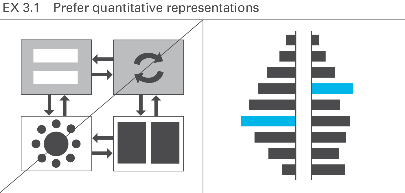
Due to the time constraints usually involved with presentations, conceptual graphs prove less suitable than charts, photos, maps, etc. For a one-hour presentation, do not use more than three or four conceptual representations. Do this only if they are absolutely essential for comprehension. The audience will understand charts and pictures (photos, drawings, etc.) better and faster, see Figure EX 3.1.
EX 3.2 Avoid text slides in presentations
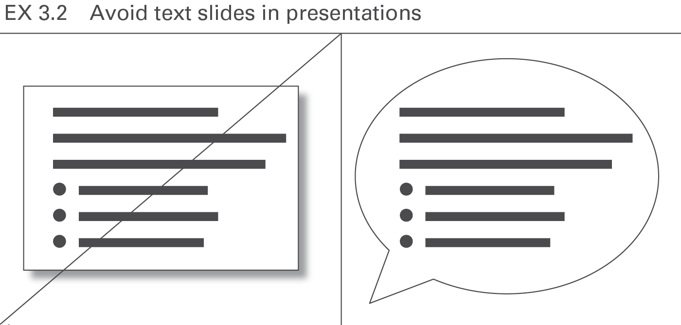
Avoid all forms of text slides in presentations. Texts should either be recited or written in a handout. A few exceptions to this rule are specific texts being discussed such as definitions, quotes, etc. In general, all forms of lists (bullet points) should appear only in the written handout, not projected on the screen. True, if someone sees and hears something simultaneously, he remembers it better than when he just hears it, but bear in mind texts are not considered something merely to be seen – they must be read and understood, see Figure EX 3.2.
EX 4 Add comparisons
Visual perception is strongly based on setting one perceived object in relation to another. Adding meaningful comparisons helps the eye evaluate faster, the main purpose of charts.
EX 4.1 Add scenarios
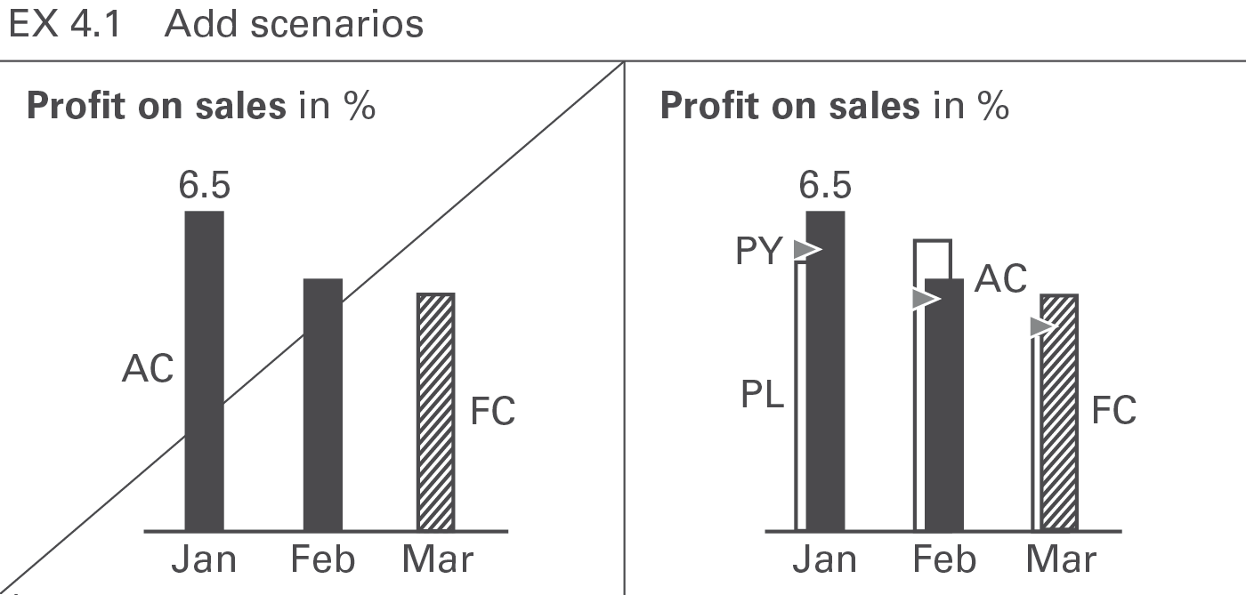
Scenarios such as “plan” and “previous year” are the most common references for comparison purposes. Add them whenever available. Use a standardized scenario notation for faster comprehension, see Figure EX 4.1.
EX 4.2 Add variances
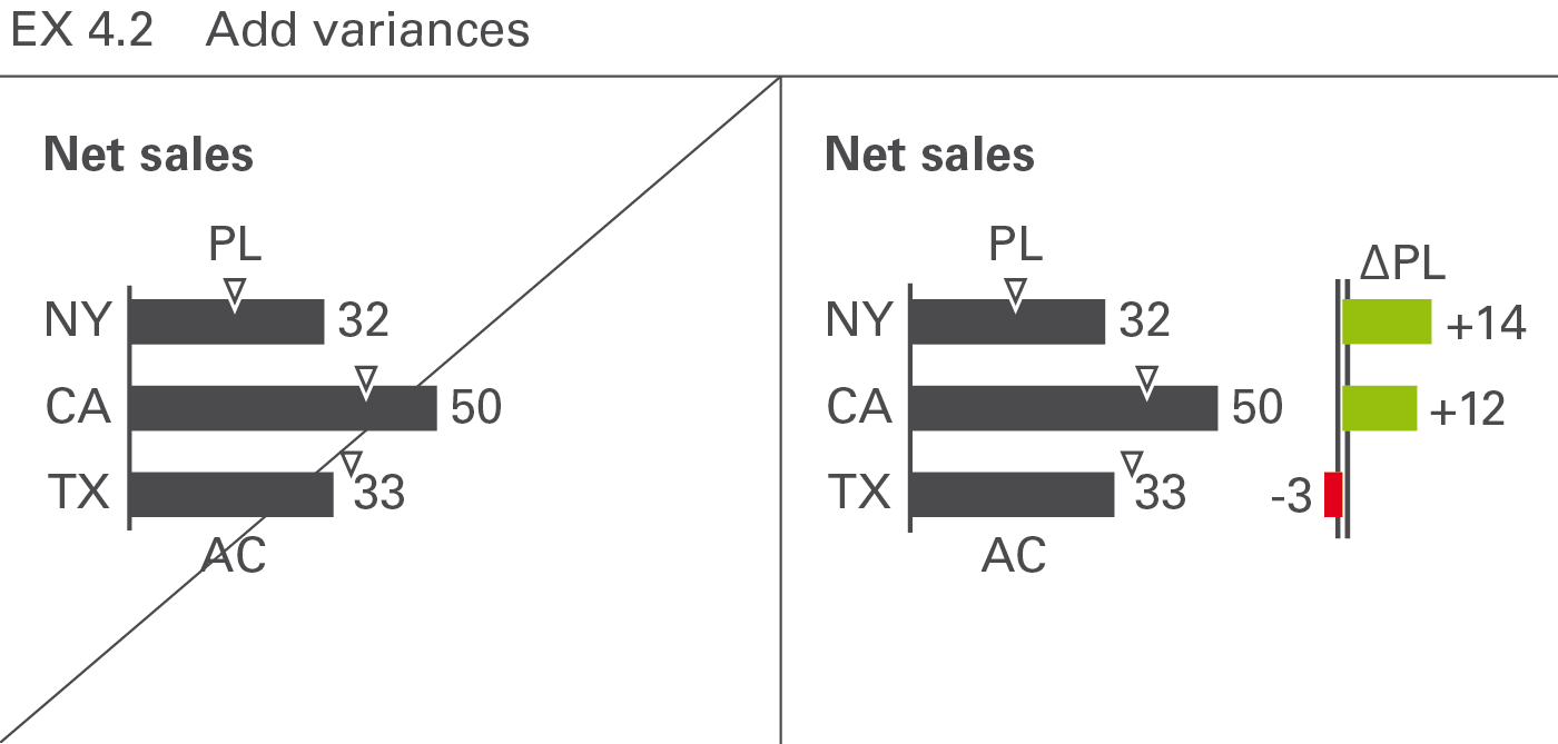
Having added scenarios for comparison purposes, the visualization of variances makes it easier to evaluate the situation. Use a standardized notation of variances for faster comprehension, see Figure EX 4.2.
EX 5 Explain causes
Present data more understandable by showing interrelations, i.e. causes and dependencies. Seeing the entire context, especially extreme values and deviant values, helps to explain causes. Details increase not only the level of credibility but also comprehension. Use charts to prove, explain, and render something plausible, not to serve merely as decoration. This section focuses on the explanation of causes by using tree structures, clusters, and correlations. A more structured approach to increasing information density is discussed in the chapter “CONDENSE – Increase information density”.
EX 5.1 Show tree structures
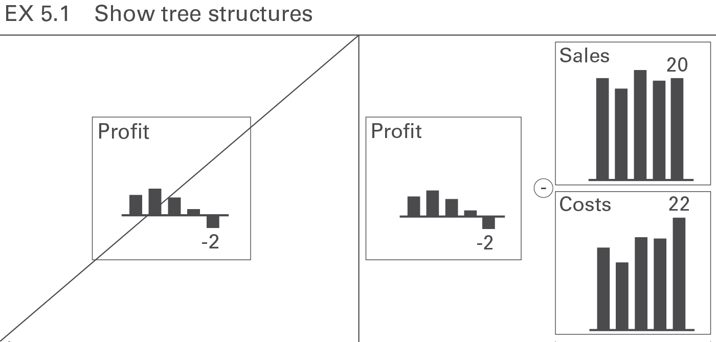
The presentation of the assumptions or basic data upon which a business analysis is based, results not only in better understanding, but also makes it more convincing. A good choice is the display of calculated measures in a tree structure, see Figure EX 5.1 (see also CO 5.2 “Show related charts on one page”).
EX 5.2 Show clusters
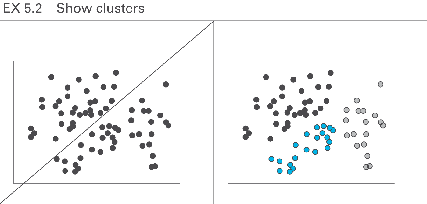
With the help of clusters in two-dimensional and three-dimensional forms, large amounts of data very often can provide interesting and new insights, see Figure EX 5.2.
EX 5.3 Show correlations
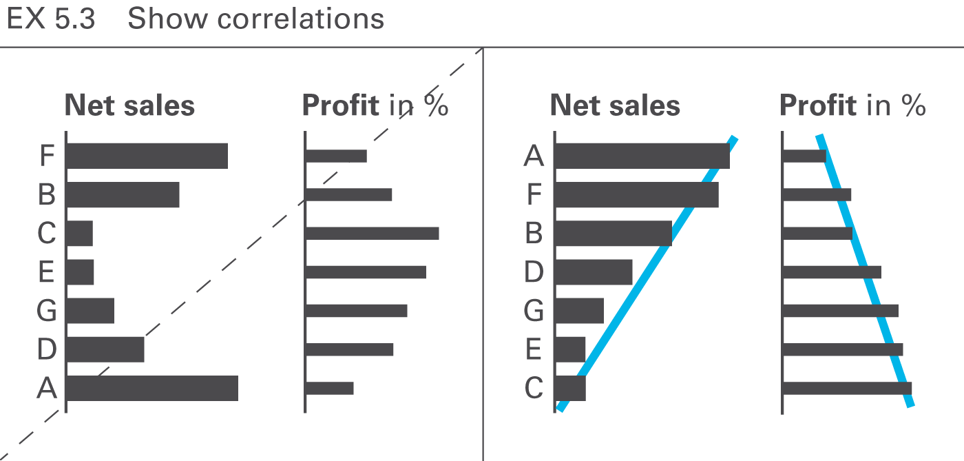
When comparing several data series, correlations are often sought in order to better understand the interrelations. Suitable rankings and comparisons can facilitate the understanding of patterns, see Figure EX 5.3.
