4928a1566fa32ef2e022e352582612b2d232a978
Data Visualization Guide for Presentations, Reports, and Dashboards
Based on International Business Communication Standards 1.1 by IBCS Association, licensed under CC BY-SA 4.0. Adapted for the web and other formats by Anton Zhiyanov.
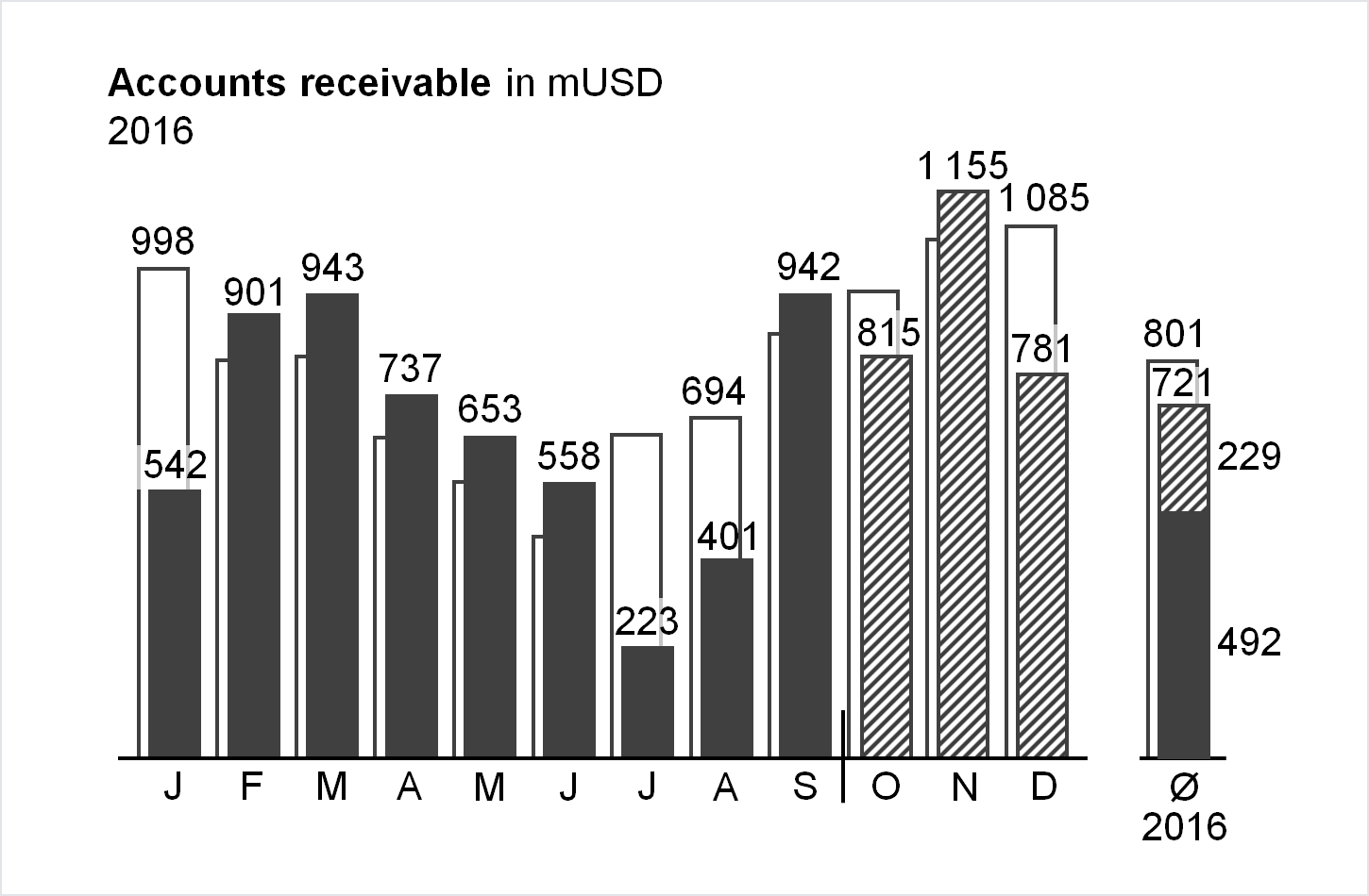
This is a highly practical and example-based guide on visually representing data in reports and dashboards. It is based on the work of authors such as Barbara Minto, Edward Tufte, and Stephen Few.
The guide consists of seven chapters:
- Convey a message
- Organize content
- Choose proper visualization
- Avoid clutter
- Increase information density
- Ensure visual integrity
- Apply semantic notation
Applied together, they will help you to design concise, clear, and actionable reports.
Description
Languages
Python
84.4%
Shell
15.6%
