50 KiB
UNIFY – Apply semantic notation
UNIFY covers all aspects of applying semantic notation in reports and presentations.
Applying semantic notation means that reports and presentations follow this governing principle: Similar content should be visualized in a similar manner; what looks the same should also mean the same. On the flip side: If the content is not the same, it should not look the same.
In many specialized disciplines such as engineering, music, and architecture, semantic notation standards are a matter of course. The world of business communication lacks such notation standards, one of the main reasons management reports are sometimes hard to understand. For example, no common agreement on the meaning of various style elements such as titles, line markers, axes, highlighting indicators, etc. used in business charts exists yet.
This chapter covers semantic rules for all important and frequently recurring aspects of meaning in the context of business communication, such as terminology (e.g. words, abbreviations, number formats), descriptions (e.g. messages, titles, legends), dimensions (e.g. measures, scenarios, time periods), analyses (e.g. comparisons and variances), and indicators for highlighting, scaling and other purposes.
UN 1 Unify terminology
Terms are the non-visual part of business communication. Unified terms and abbreviations as well as unified formats for numbers, units and dates accelerate understanding.
UN 1.1 Unify terms and abbreviations
The standardization of terms and abbreviations in reports and presentations is achieved by using an unambiguous language (see SA 4.2 “Speak with precise words“) and by unifying the usage of terms (glossary).
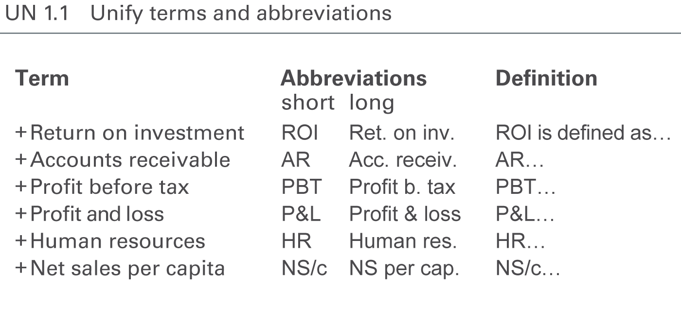
Unify, compile and explain all terms and abbreviations used in reports and presentations in a clearly arranged glossary including abbreviations and definitions, see Figure UN 1.1.
A glossary with terms and abbreviations in more than one language might be necessary in order to avoid different translations.
Often the names of business measures are too long for charts and tables. Use abbreviations instead. It might be a good solution to define short abbreviations (e.g. to A/R for Accounts Receivable be used in table column headers) and long abbreviations (e.g. Acc. Receiv. to be used in table row headers).
Unified terms and abbreviations for the notation of scenarios and time periods are covered in the respective sections.
UN 1.2 Unify numbers, units, and dates
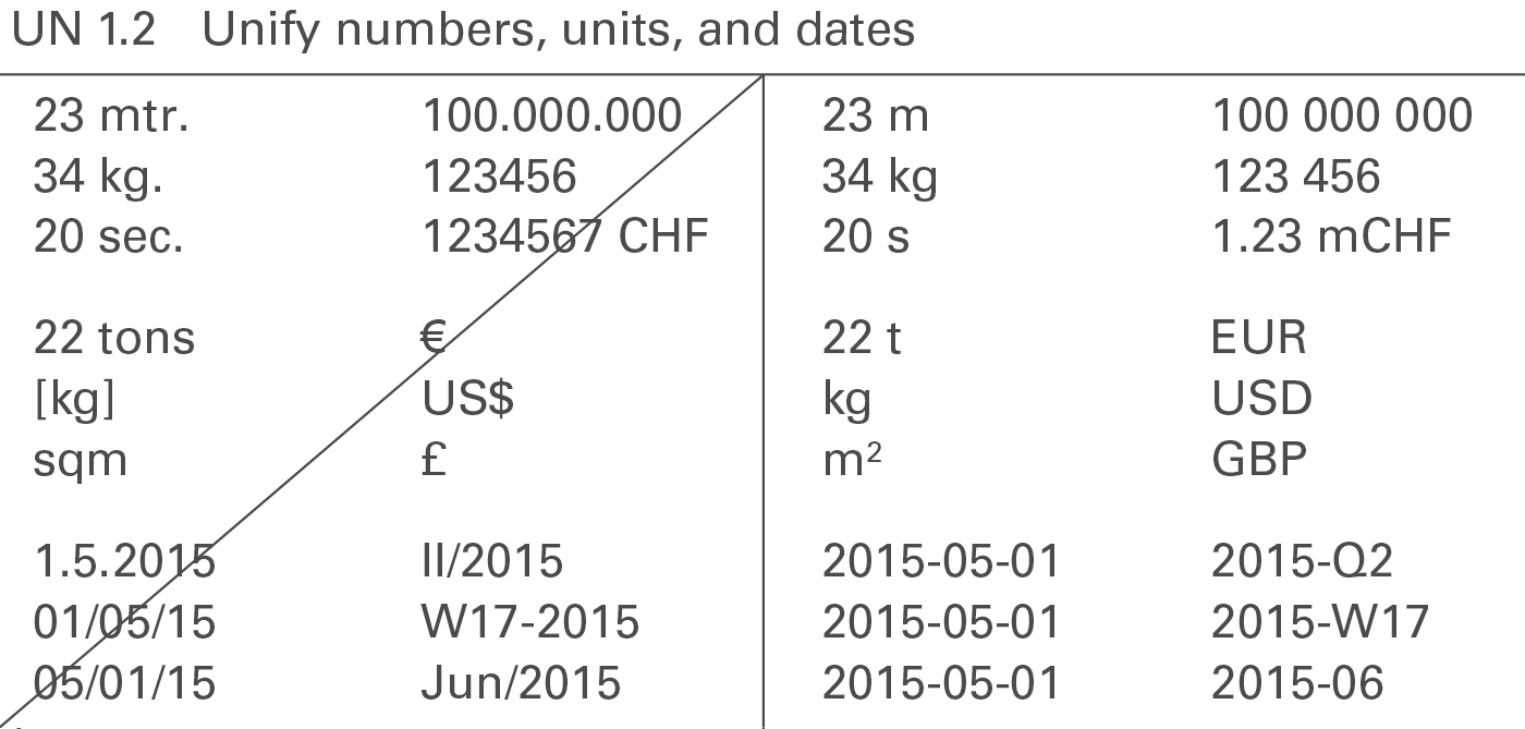
The uniform use of formats for numbers, units and dates will enhance legibility, see Figure UN 1.2.
Numbers
Different languages and countries use different number formats, e.g. 1.234.567,00 (D); 1,234,567.00 (USA); 1’234’567,00 or 1’234’567.00 (CH).
It is important to unify the number formats in all reports and presentations. The International System of Units (SI) as described in “ISO 80000-1” recommends the following notation:
- Thousand delimiter: 1 234 (blank space)
- Decimal sign: 1,23 or 1.23 (SI allows both versions)
Do not use long numbers in order to avoid distraction and to concentrate on the essentials, see also SI 5.2 “Avoid long numbers”. Use currency prefixes and metric prefixes to limit the number of digits to a maximum of three in charts and four in tables.
The most common formats for negative values are “-123” and “(123)”. Use the same format for all negative values.
Positive values do not have a plus sign, unless they represent variances.
Currencies
Use the standard currency abbreviations based on ISO 4217. ISO 4217 provides a set of currency abbreviations using three-letter acronyms such as EUR, CHF, USD, and GBP. The use of special currency symbols such as €, $, and ₤ is not recommended if a report includes many different currencies.
Use “metric prefixes” in combination with the currency units for monetary values expressed in thousands or millions. Use lower case characters to differentiate the prefixes from the currency abbreviations and use single digit metric prefixes to save space, such as “k” for thousand, “m” for million and “b” for billion. The following shows the correct use of currency metric prefixes with EUR:
1 bEUR = 1 000 mEUR = 1 000 000 kEUR = 1 000 000 000 EUR
(The metric prefixes for physical units are “M” for “millions”and “G” for “billions”. Nevertheless, this guide suggests using “m” and“b” for currency metric prefixes, as “mEUR” and “bEUR” which is easier to understand than MEUR and GEUR.)
Physical units
For physical units use the International System of Units (SI) such as kg, t, m, km, etc.
In the case of non-monetary values expressed in thousands or millions, use metric prefixes suggested by the International System of Units such as “G” for billion, “M” for million, and “k” for thousand.
Dates
Dates are best displayed using ISO 8601, an international standard covering the exchange of date and time-related data: YYYY-MM-DD, e.g. “2015-12-31”.
Other significant notation principles regarding time-related aspects will be dealt in UN 3.3 “Unify time periods”.
UN 2 Unify descriptions
Descriptions are textual elements that describe the visual elements in reports and presentations facilitating comprehension. The following suggests unified layouts for every kind of descriptions.
UN 2.1 Unify messages
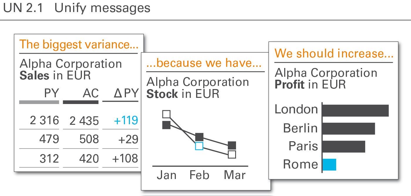
The message the author intends to convey to the reader or audience is best recognized, if the position and the layout of the message is always the same, see Figure UN 2.1.
The notation of messages should be two text lines at the top of a report or presentation page, either a) above the title (see figure on the left) or b) right of the title. Position b) is not structured as clearly as position a) but it helps saving valuable vertical space especially on pages in landscape format.
UN 2.2 Unify titles and subtitles
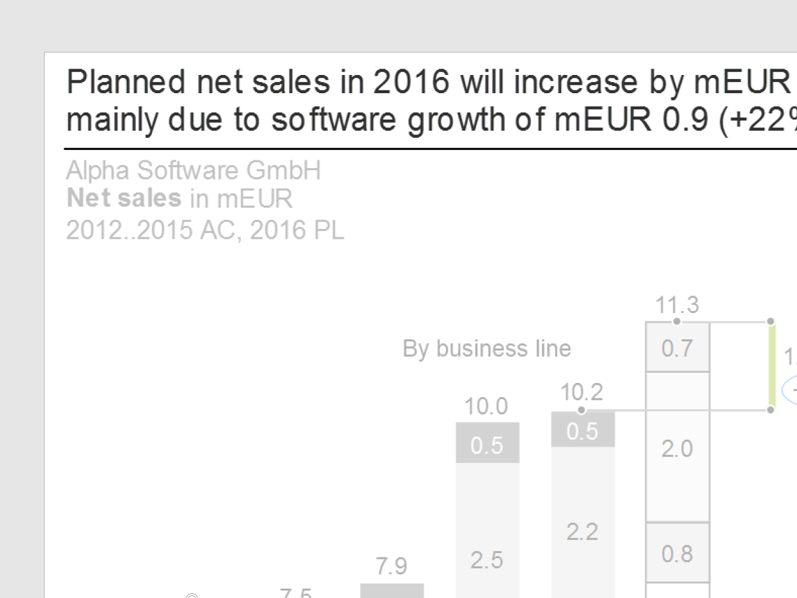
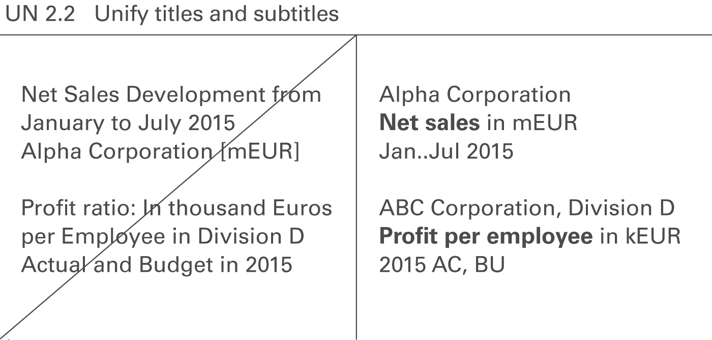
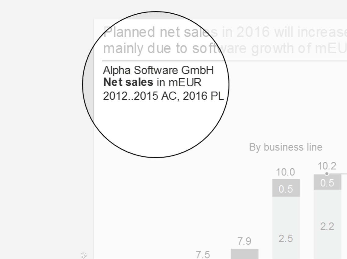
Titles identify the content of pages and their objects in its entirety, omitting nothing necessary to understand the content, see Figure UN 2.2. In contrast to messages, titles do not contain any evaluating aspects, such as interpretations, conclusions, or propositions.
If there is more than one object on a page, use page titles for entire pages, slides, or screens and sub titles for different objects on a page.
Page titles
Page titles identify the content of a page. In general, three lines suffice to completely describe the content of a page:
Title line 1: Reporting unit
Element(s) of a structure dimension representing the object of the report, typically a legal entity, an organization unit, a line of business, a project, etc. or combinations thereof, e.g.
- ABC Corporation
- ABC Corporation and its main competitors
- ABC Corporation, European division
- ABC Corporation, European division, Project B
Add filter information if the elements are not exhaustive, e.g.
- International Chocolate Corporation, top ten clients
- International Chocolate Corporation, divisions with negative EBIT in 2016
If title line 1 becomes too long its content can be split into two lines, e.g.
International Chocolate Corporation, European division
Top ten clients
Title line 2: Business measure(s)
Element(s) of the measure dimension such as sales, profit, and shipment. Business measures are measured either in currency units (e.g. EUR, USD) or in physical units (e.g. #, kg, t). Use metric prefixes (e.g. k, m, b) where appropriate. Measures are written in bold font, their units are written in regular font. Examples are:
- Net sales in mEUR
- Net sales in mEUR, margin in %
- Headcount in #
Use a suiting name for a set of measures, if more than two measures have to be presented on one page. Examples are:
- Income statement in kEUR
- ROI tree in mEUR
- Balanced scorecard
- Product market portfolio
Use footnotes if parts of the measures are redundant or if parts of the measures are of minor importance for understanding. Examples are:
- Net sales in mEUR (without intercompany sales) – simpler: Net sales* in mEUR
- Operating margin in mEUR (non-IFRS) – simpler: Operating margin* in mEUR
Additional information about the way presenting the content can help to understand better the respective page. They might concern structure dimensions, e.g.
- Profit in mUSD, by products
- Net sales in kEUR, by products and by countries
or they might be analytical annotations, e.g.
- Net sales in mEUR and profit in mEUR, sorted by net sales (↓)
- Full time equivalents in #, indexed (2012 = 100%)
- Gross margin in kUSD, top ten
or even combinations of structure dimensions and analytical annotations, e.g.
- Net sales in mEUR, by countries, sorted by net sales (↓)
- Full time equivalents in #, by offices, indexed (2012 = 100%)
If title line 2 becomes too long its content can be split into two lines, e.g.:
**Full time equivalents** in #, by offices
Indexed (2012 = 100%)
**Net sales** in mEUR, by countries
Sorted by net sales (↓)
Title line 3: Time period(s) scenario(s), and variance(s)
Element(s) of the time dimension (e.g. years, months), of the scenario dimension (e.g. actual, plan), and variances (e.g. ΔPL, ΔPL%) if necessary.
In general, elements of the time dimension (e.g. 2016, 2016-Q1) are necessary for understanding. Elements of the scenario dimension (e.g. AC, PL, FC) and variances are added if they help to understand the page content faster. If only actual values are presented, the attribute AC can be omitted.
Display the time element first if both time and scenario elements are shown in title line 3.
Use “&” (ampersand sign) when title elements together make up a time series, e.g. “AC&PL” (without blanks) if the first 8 months of a year present AC values and the last 4 months present PL values.
Use “and” when different elements are presented for all time periods, e.g. “AC and PY” if all 12 months of a year present both AC and PY values.
Examples of alternative arrangements in title line 3 are:
- 2017-Q1
- 2016-03..2017-02
- 2017 AC and PL
- 2017 AC&FC and PY
- 2016 AC, 2017..2021 PL, or: 2014..21 AC&PL, or: 2014..21
- 2016 AC and PL and ΔPL, or: 2016 AC and PL, or: 2016
Keep it clear and easy to understand – too many elements tend to be confusing. In many cases the information depicted in column headers of tables and legends of data series in charts are sufficient and give better and quicker insight than long texts in title line 3. In any case, rules for abbreviating time periods and dates as well as the rules for abbreviating scenarios and variances must be followed.
In general, position page titles at the very upper left corner of a page, directly underneath the message (if a message exists). Alternatively, position them at the same height as the message if there is not enough space – preferably on the left hand side of the message.
Here are some typical examples of page titles:
Chocolate Corp.
**Gross profit** in mUSD
2016
Construction Inc., Division EMEA
**Net sales** in mEUR, **profit margin** in %
\_2016-Q3 (AC, PL)
Beverage Corporation
**Product market portfolio**
2015 and 2016
Milk & Cheese Corp.
**Shipments** in t, by product, by country
2016-W01..10
Subtitles
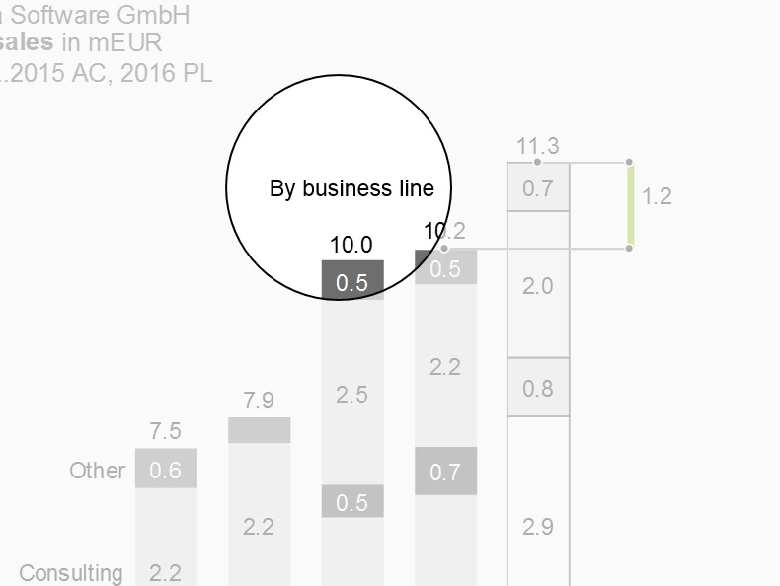
Subtitles identify either page segments or objects (e.g. charts and tables) within a page with multiple objects. They complement the identification information already given in the page title. Subtitles display identifiers that differ from object to object on a page. Put identifiers that are identical for all objects of a page in the page title and not in the subtitles.
In most cases, one line is sufficient for subtitles because different elements of only one dimension have to be identified. Typical examples are:
**Revenue** in mEUR
Apples
2014..2016
**Sales** in SKU
Pears
2016-Q1..Q4
**Avg. price** in EUR/SKU
Oranges
2016-10..12
Subtitles are positioned above the respective objects (charts, tables, etc.) which they identify – either centered or left-aligned.
Titles on screen pages
Unlike titles on printed pages, the layout of titles on screen pages can depend on the device (responsive design). For small devices in landscape format e.g. writing the three title lines in one line separated by a “|” (pipe sign) is a valid solution.
Titles on screen pages can also mutually interfere with interactive navigation objects such as drop-down boxes for selection and check boxes for filtering. These navigation objects can contain redundant title information, but they cannot replace the title or parts of it. Hide these navigation objects when they are not in use or when the screen page is being printed.
UN 2.3 Unify the position of legends and labels
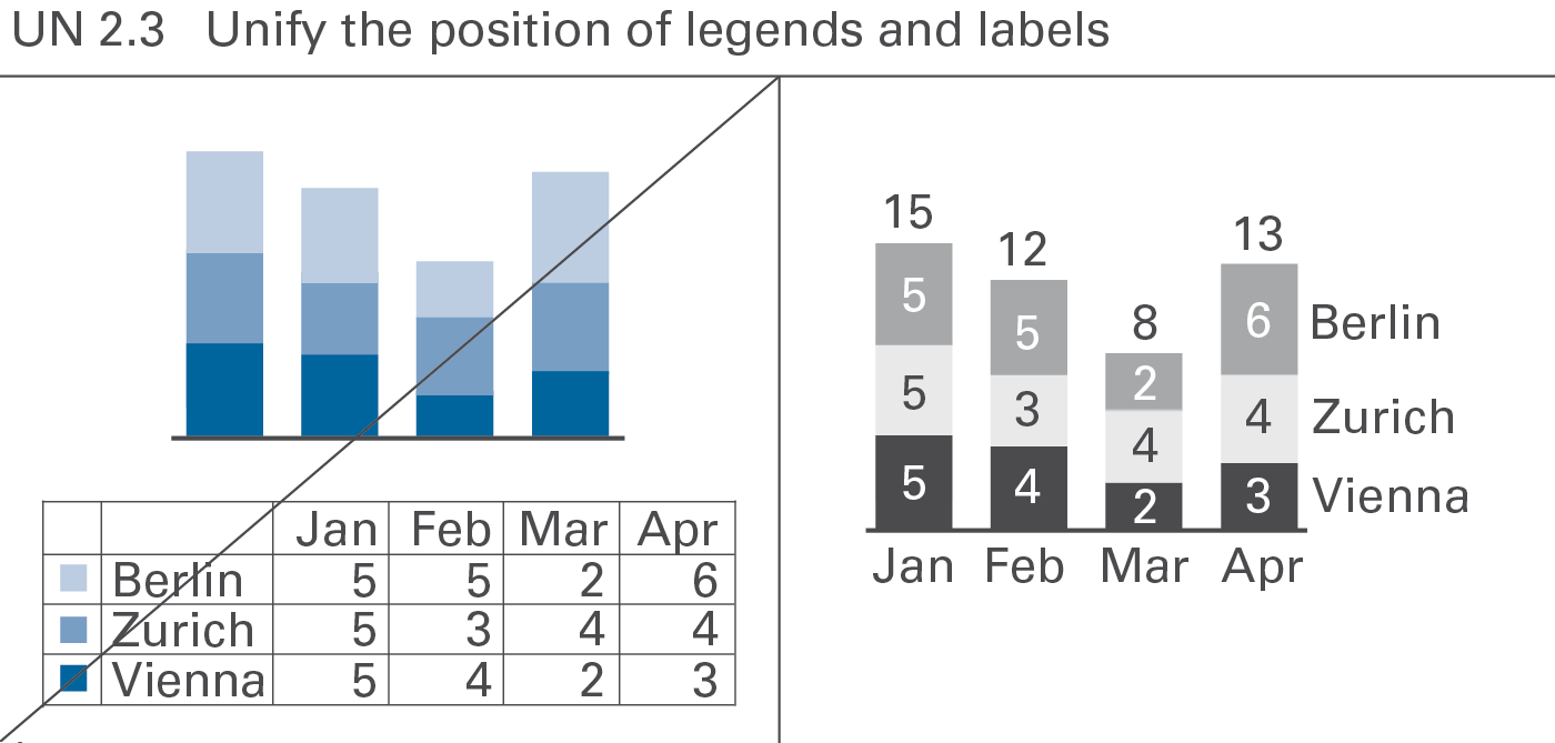
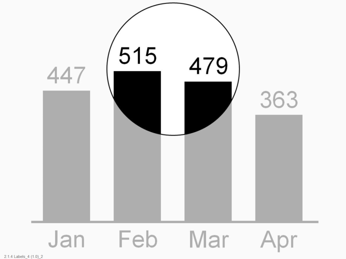
A standardized notation of legends and labels will improve legibility and speed up comprehension of charts, see Figure UN 2.3.
Legends
Legends (also called “data series labels”) identify data series.
If possible, integrate legends into charts, not positioned externally. Write legends horizontally for better legibility.
Legends for single column charts and single bar charts are best integrated into the title.
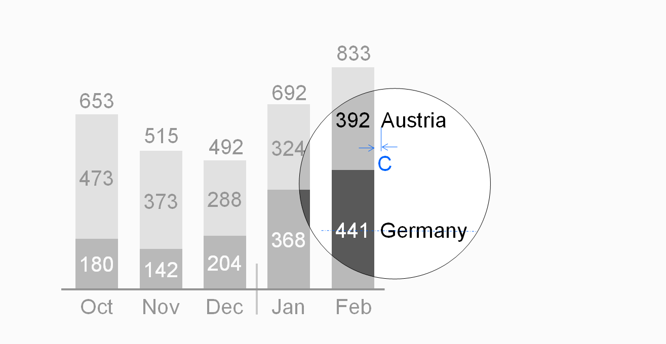
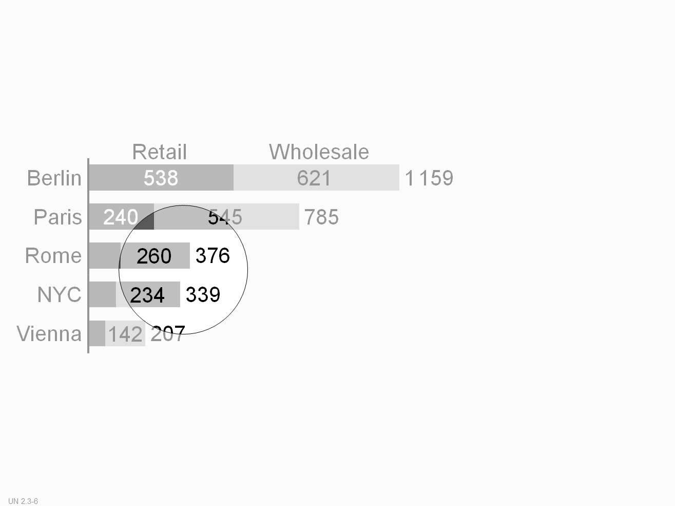
In stacked column charts, position legends either to the left of the leftmost column or to the right of the rightmost column.
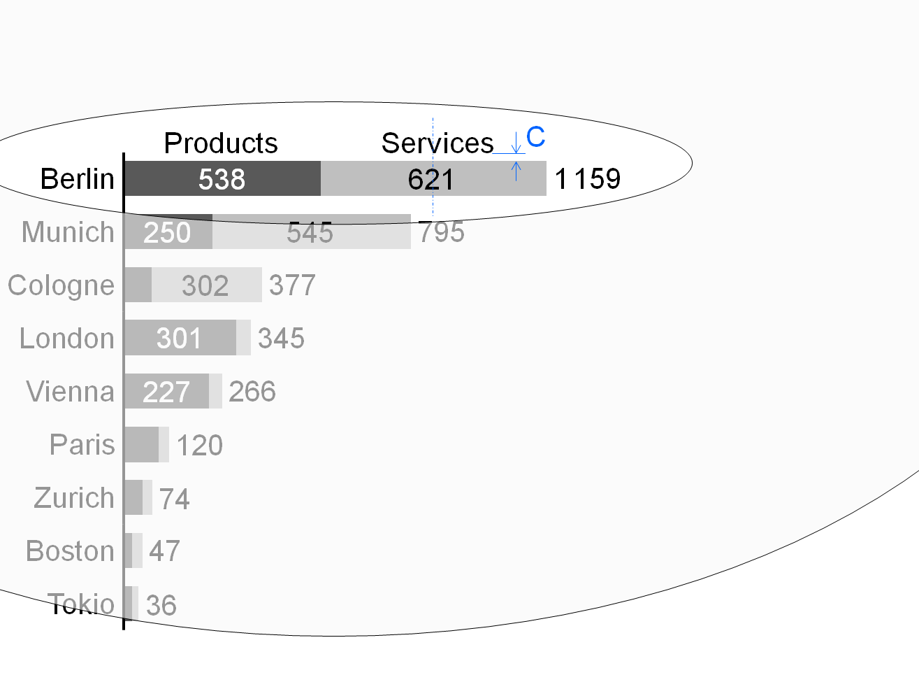
Center legends of stacked bar charts above the top bar.
Assisting lines can help to assign the legends to the correct visualization elements. In grouped column charts and grouped bar charts, assisting lines can also help to assign the legends to the correct visualization elements.
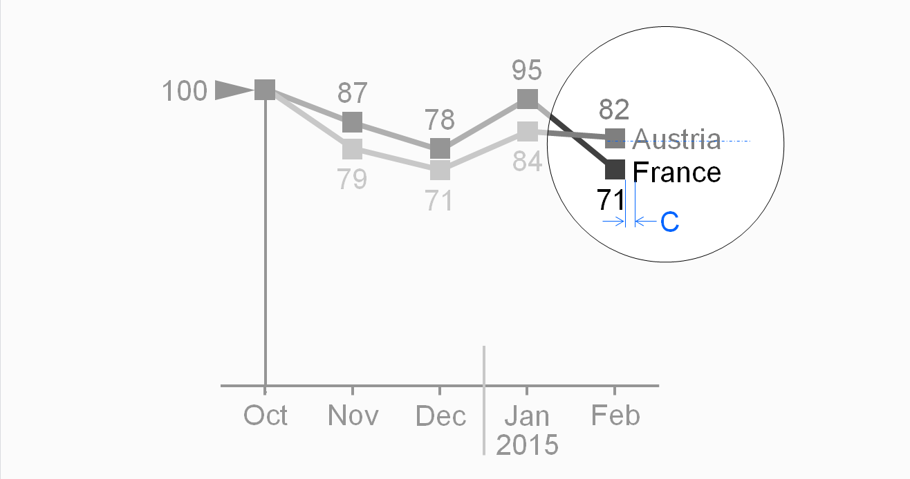
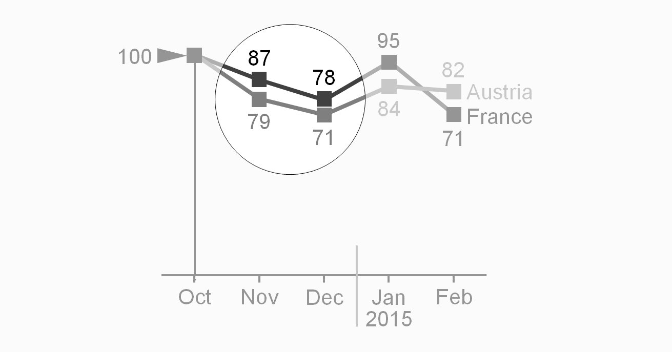
In line charts, position legends either to the right of the line end or close to the course of the line.
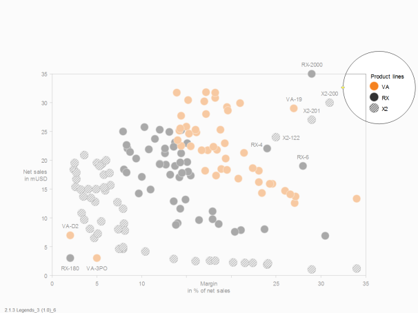
For charts with two value axes, externally positioned legends next to symbols can be a good choice. When helpful, integrate these legends into the chart by positioning them next to typical points or bubbles.
Labels
Labels (more precise: data labels) assign the data values to the respective visualization elements.
Omit labels of small visualization elements, use labels with not more than three digits, and avoid unnecessary and distracting labels (see also the SIMPLIFY rules SI 5 “Avoid distracting details”).
Write labels horizontally for better legibility.
Position labels next to their visualization elements. If this is not possible, use lines connecting the labels to the correct visualization elements.
In charts with horizontal category axes, position labels above or below the visualization elements, see the first and second figure. In stacked columns, either center labels in the data points (if the data points are large enough) or position them outside of the data points.
In charts with vertical category axes, position labels right or left of the visualization elements. In stacked bars, either center labels in the data points (if the data points are large enough) or position them outside of the data points.
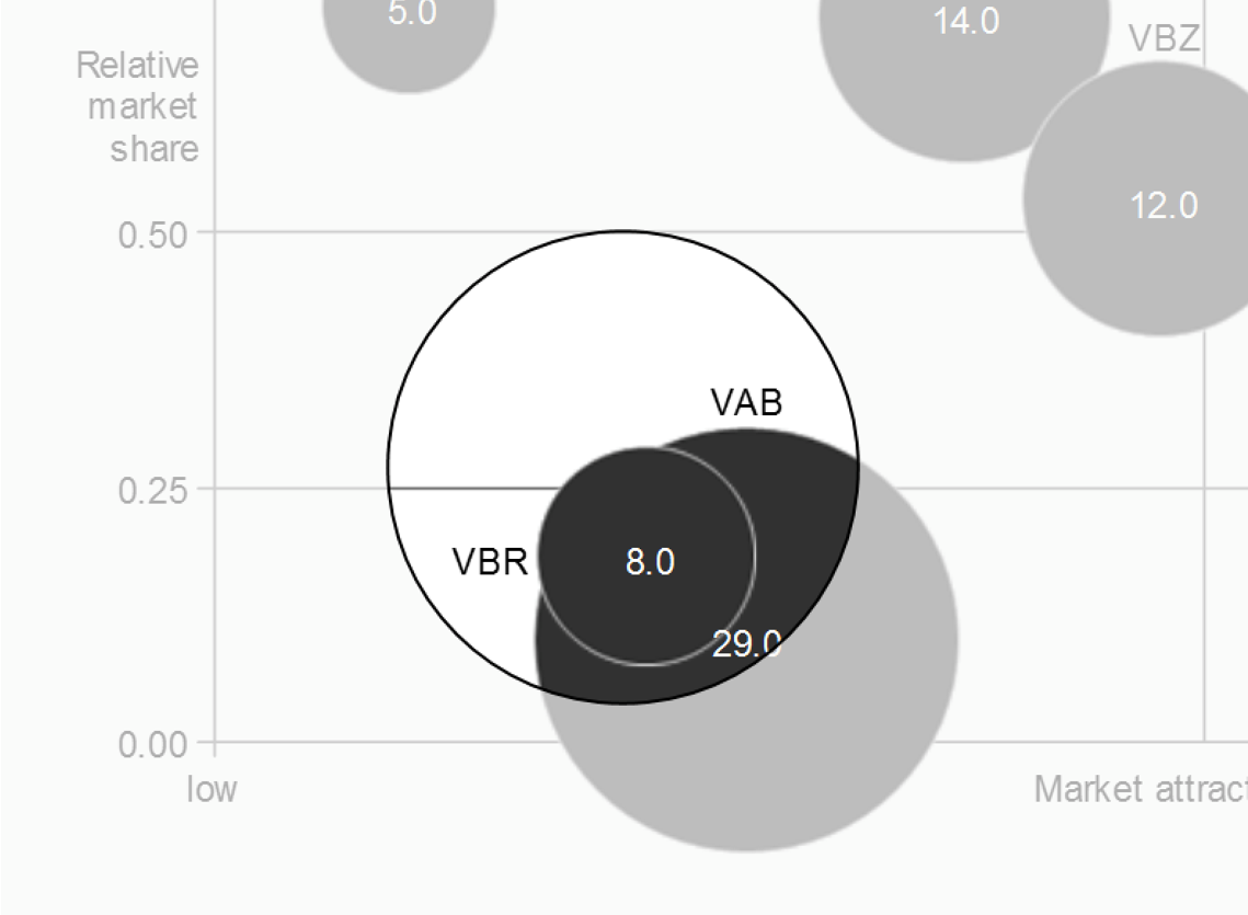
In charts with two value axes, position labels next to the visualization elements (above or below, right or left). Large bubble visualization elements labels can also have centered labels.
UN 2.4 Unify comments
Mainly in static reports, comments detail other elements (e.g. definitions of data series) and objects such as charts and tables. Sometimes comments also refer to complete pages.
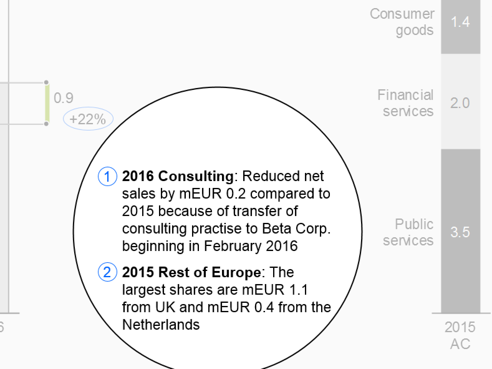
The level of comprehension increases when comments refer directly to the visual representation. Therefore, comments on an object (e.g. chart) are integrated into that object when possible. Comment elements should be linked to the content of tables, charts, etc. through comment references.
UN 2.5 Unify footnotes
Footnotes, a special type of comments, provide general explanations, explanations of abbreviations, and information that increases the credibility of the content such as the sources or the dates of retrieval and printing. They can be omitted from slides projected on the wall, but must be included in written material.
Position footnotes at the bottom of a page.
UN 3 Unify dimensions
Data in reports and presentations can be viewed from various perspectives called dimensions. For example, all business measures, such as sales, profit, margin, etc., constitute a measure dimension, all months, quarters, years, etc., a time dimension.
Identifying dimensions via uniform visualization will help to understand reports and presentations.
This section suggests visualization standards for measures, scenarios, time periods, and structure dimensions.
UN 3.1 Unify measures
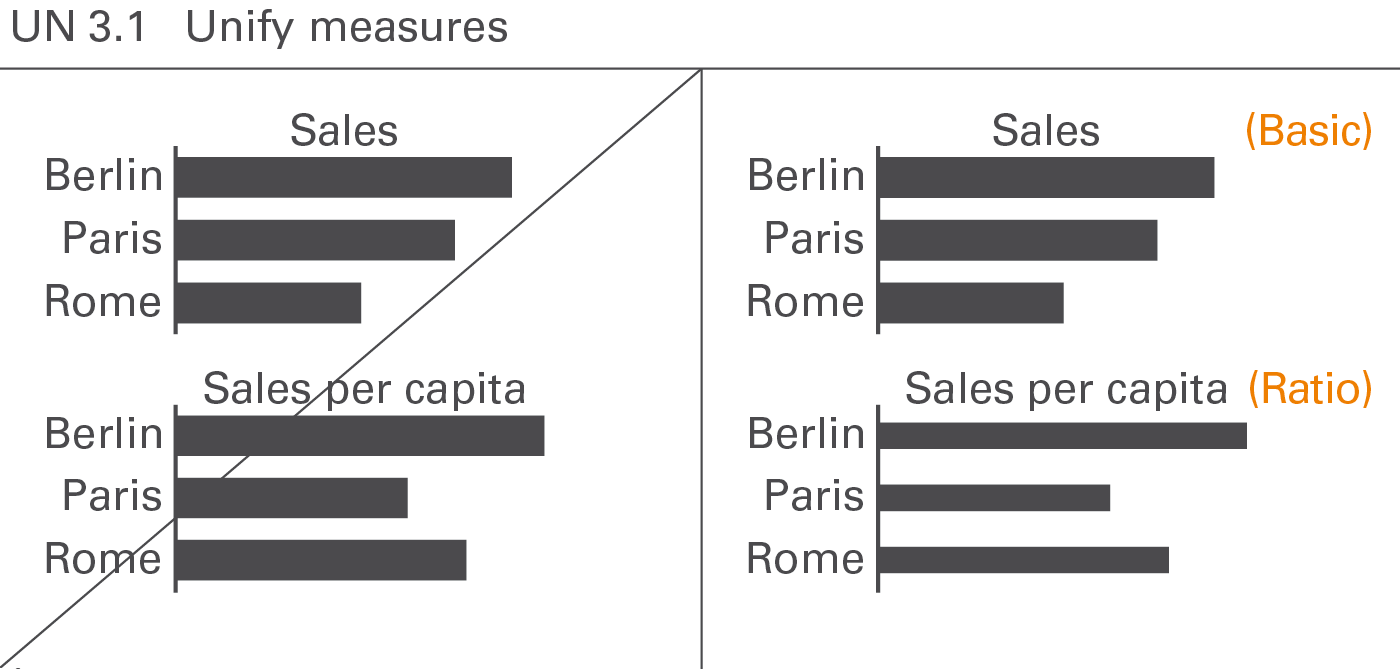
Business measures such as sales, profit, margin, etc. describe, report, and calculate business situations. A standardized notation will help to comprehend the specific characteristics of measures, e.g. whether they are basic measures or calculated ratios of measures, whether they represent value or volume figures, flow or stock figures, or whether they have a positive or negative impact, see Figure UN 3.1.
The visualization of business measures is presented here. Their definition, generally given in accounting manuals or similar documentation, is not discussed here.
Basic measures and ratios
Basic measures such as “export sales” are directly derived from business processes. Ratios such as “return on sales” are quotients of two basic measures.
Basic measures
Basic measures have either currency units (e.g. EUR) or physical units (e.g. kg). They are neither shares of something (percentages) nor quotients of two measures.
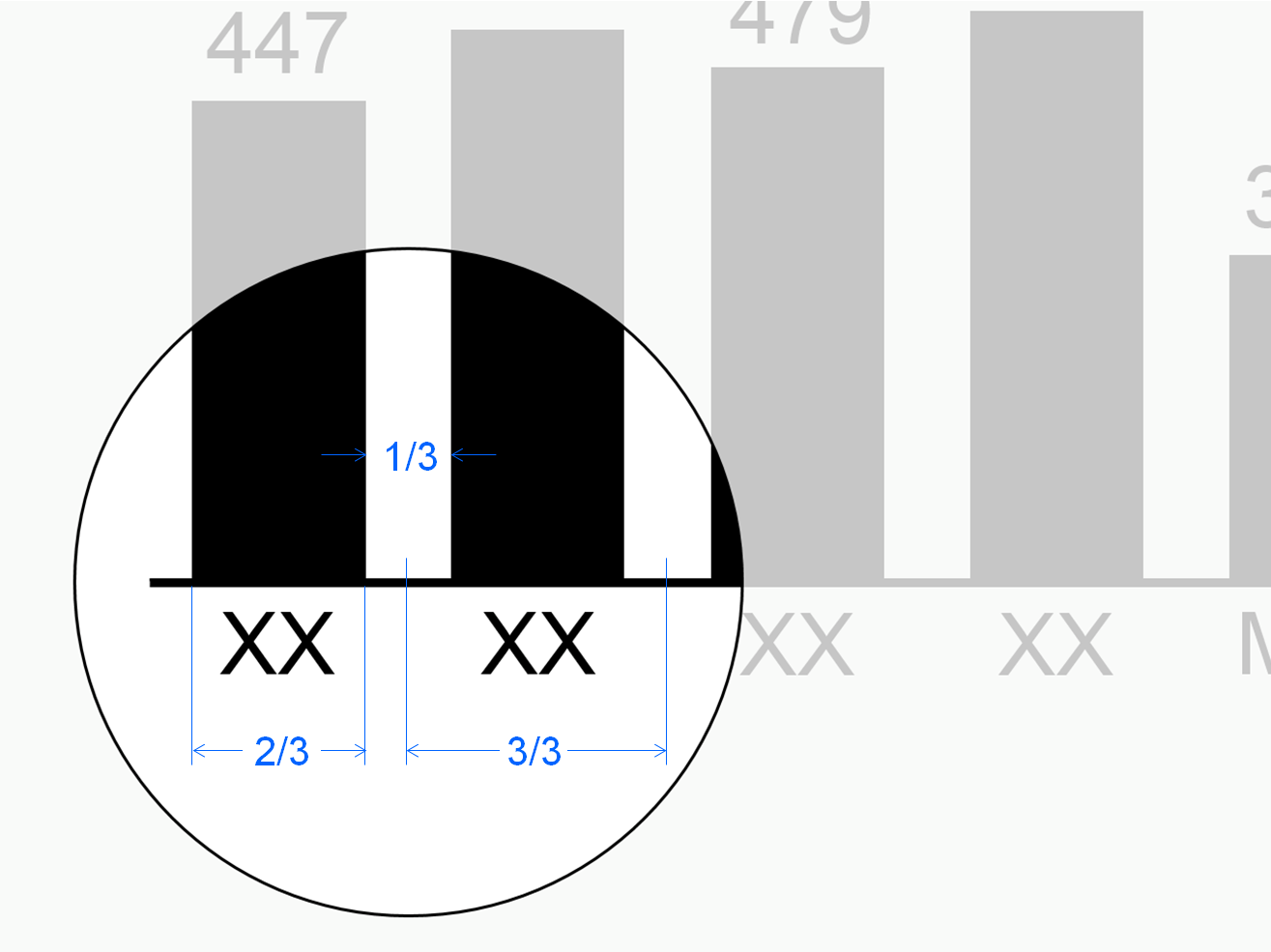
Use 2/3 of the category width for the column width in column charts and the bar width in bar charts to visualize basic measures.
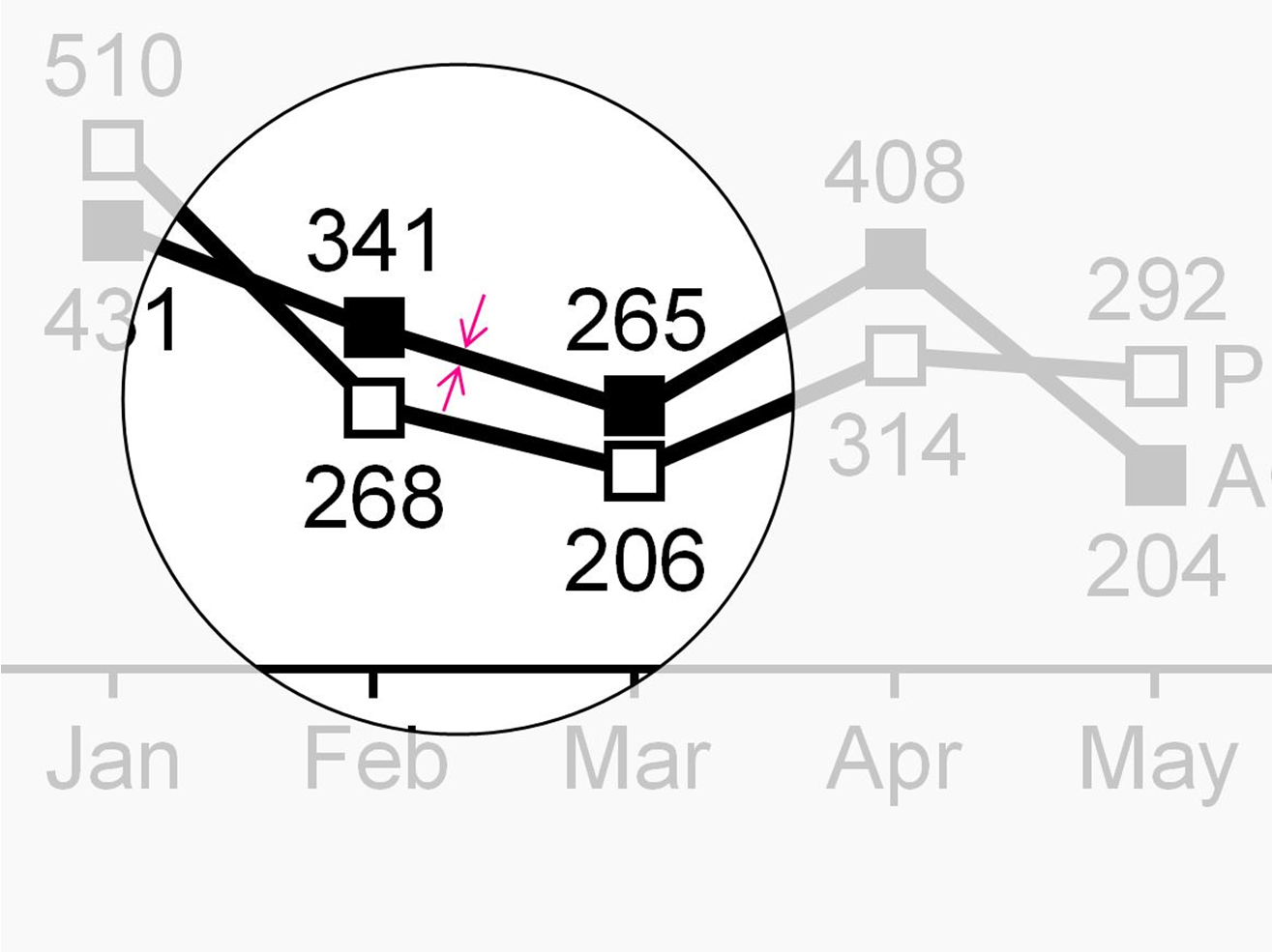
Use thick lines for representing basic measures in line charts.
Ratios
Ratios are quotients of two basic measures such as “return on sales”. In practice, few denominators exist: “Sales”, “units sold”, “headcount”, and “capital”constitute the majority of all business ratios.
If both the enumerator and denominator have the same unit the resulting ratio has no unit. It is expressed in percent (e.g. “profit in % of sales”).
In addition, if both enumerator and denominator have the same basic measure (e.g. “headcount”), it is called a share(e.g. “gender share”).
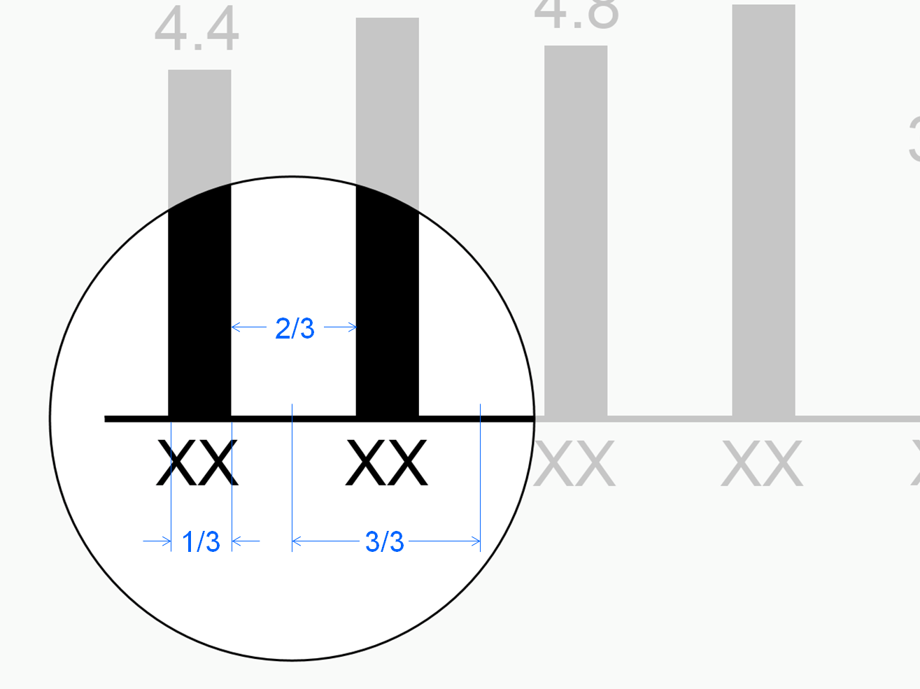
The width of both bars and columns representing ratios is 1/3 of the category width, i.e. 50% of the width of bars and columns representing basic measures.
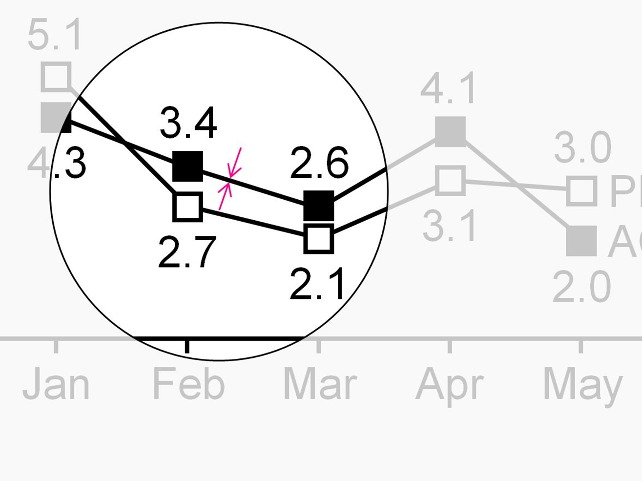
Represent ratios in line charts with thin lines (50% of thick lines).
Value and volume
Value measures such as “profit” and “capital” have currency units. Volume measures such as “shipment” and “headcount” have physical units.
Flow and stock
Flow measures like “net sales” relate to a certain time period such as months or years. Stock measures like “inventory” relate to a certain fixed date, such as December 31st of 2015 (at midnight).
Positive, negative, and neutral impact
An increase of a positive measure such as “profit” or “sales” positively impacts the organization’s result.
An increase of a negative measure such as “cost” or “waste” negatively impacts the organization’s result.
An increase of neutral measures such as “market size” or “investment” has no direct impact to the organization’s result.
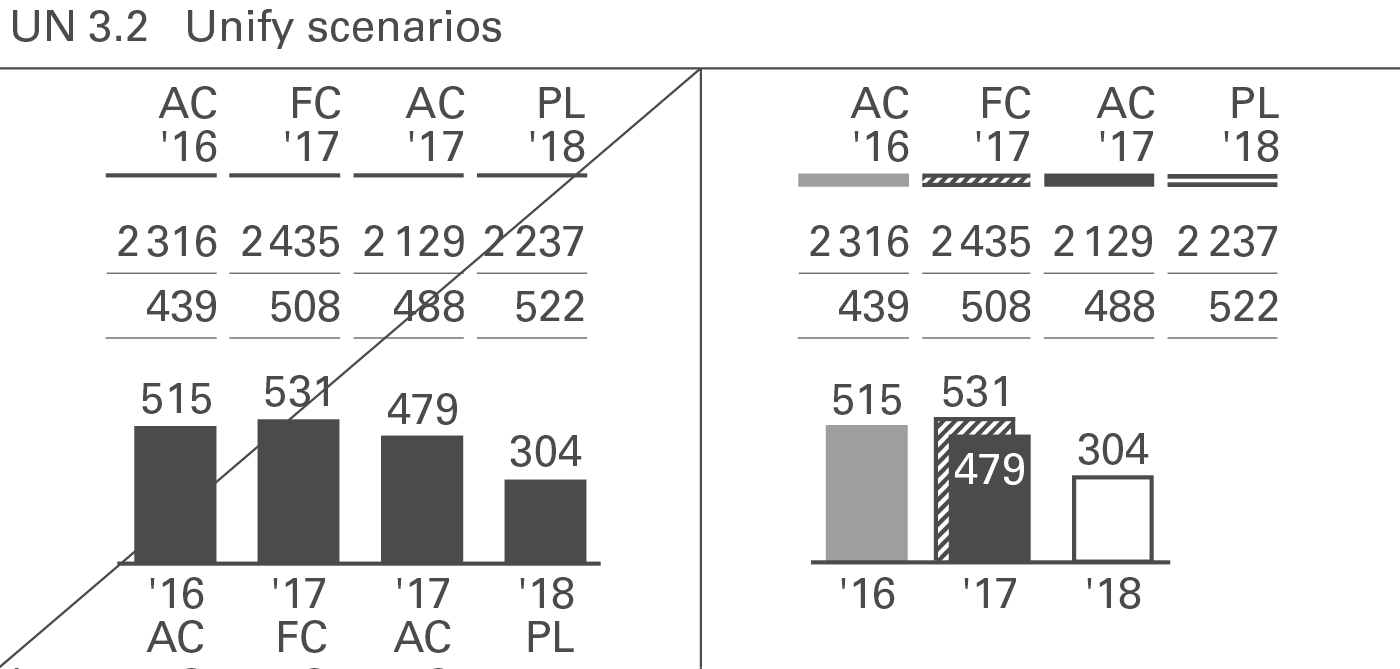
UN 3.2 Unify scenarios
Scenarios(also called data categories, data types, or versions) represent different layers of a business model. Typical scenarios are “Actual”, “Previous year”, “Plan”, “Budget”, and“Forecast”. In special cases benchmarks such as competitor data or market averages are also called scenarios.
Often comparisons and variances between different scenarios are presented to provide business insights.
There are two basic types of scenarios:
-
Actual scenarios refer to measured data about things that already happened in present or past time periods. These data might not be perfectly correct because of difficulties with systems, unclear definitions, and false data acquisition – but they are as correct as possible. The terms we use most often for scenarios of this type are ‘Actual’ and ‘Previous year’.
-
Planned scenarios refer to fictitious (not materialized) data. The terms we use most often for scenarios of this type are ‘Plan’ and ‘Budget’.
In-between those two basic scenario types there is a third one:
- Forecasted scenarios refer to expected data which are strictly speaking fictitious but already taking into account measured data. A typical example forexpected data is the sales forecast based on the measured order entry. Forecasted scenarios represent a higher level of certainty than scenarios with planned data but are not completely materialized yet. The term we use most often for scenarios of this type is ‘Forecast’.
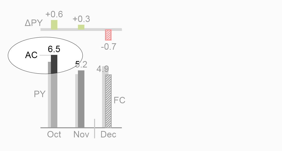
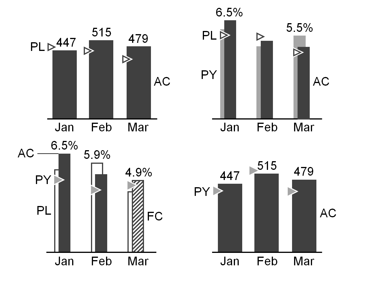
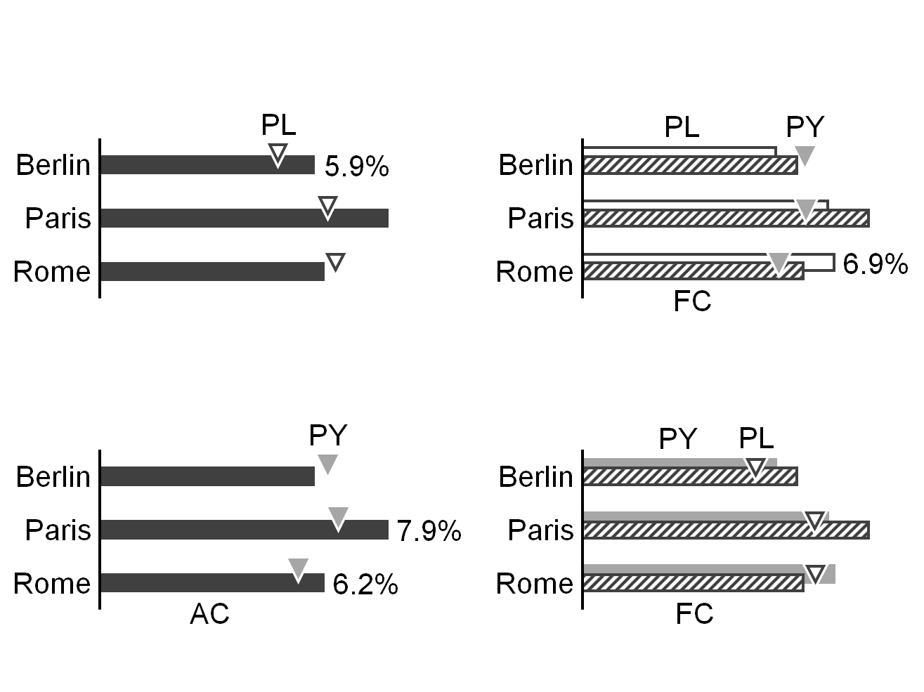
When analyzing charts and tables, it is very important to quickly recognize whether you look at measured, expected, or fictitious data. Readers can visually recognize these scenario types by looking at the area fill of a visualization element without having to read the labels. Typical chart visualization elements such as bars, columns, line chart markers, scenario triangles, etc. carry the semantic scenario notation.
In charts presenting variances, their axes carry the semantic scenario notation in order to show the respective reference scenario (see UN 4.1).
In charts with stacked columns, stacked areas, and charts with multiple lines or areas, the application of this semantic scenario notation can become a challenge. In these cases, applying the semantic notation to the axis instead of the columns etc. is a valid option.
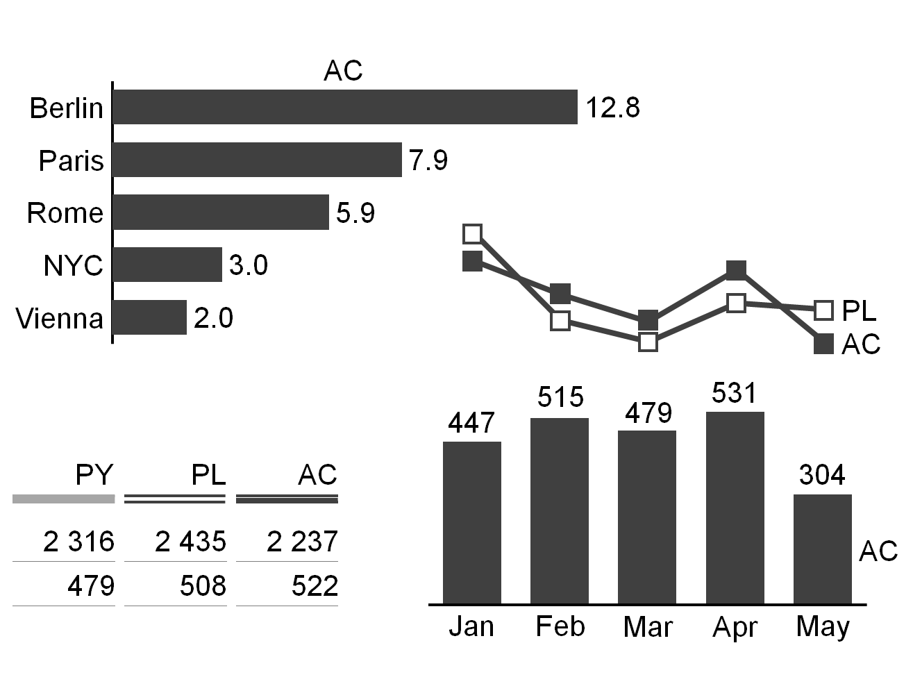
Actual scenarios: measured data
Scenarios with measured data are identified by a solid dark (e.g. black or dark gray) fill for the areas of the respective visualization elements.
If measured data of recent periods (“Actual”) are compared with measured data from earlier periods (e.g. “Previous year”,“Previous month’”, “Month YoY”) the areas representing the earlier periods are identified by a lighter solid fill (e.g. light gray).
The suggested two-letter codes for the most important measured data scenarios are “AC” for “Actual” and “PY” for “Previous Year”.
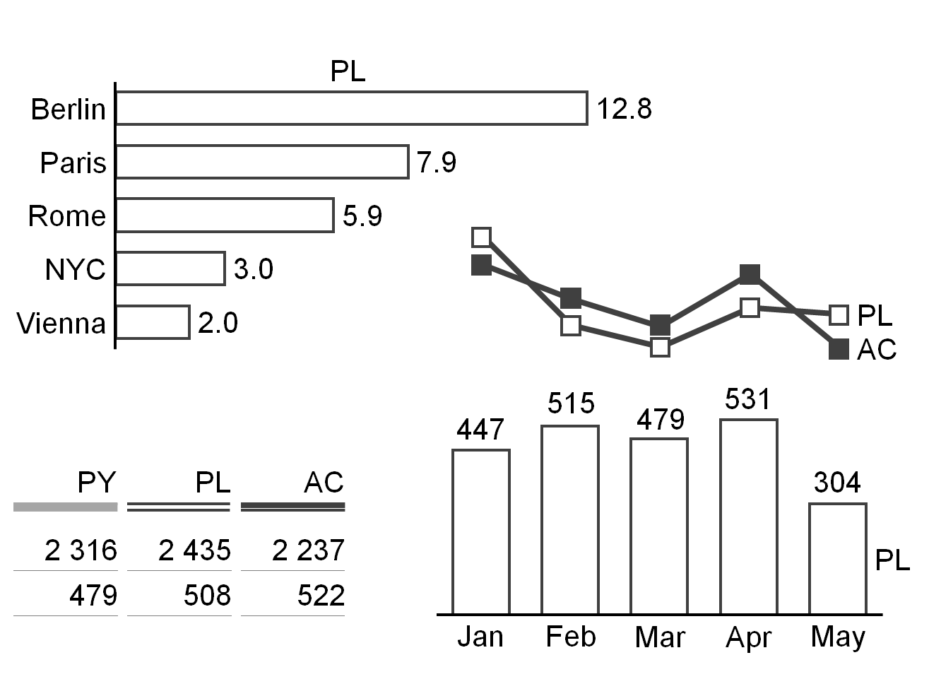
Planned scenarios: fictitious data
Scenarios with fictitious data are identified by bordered (outlined, framed) areas of the respective visualization elements. The areas within these borders literally “fill up when materializing”, e.g. when changing from fictitious data to measured data.
The suggested two-letter codes for the two most important fictitious data scenarios are “PL” for “Plan” and “BU” for“Budget”.
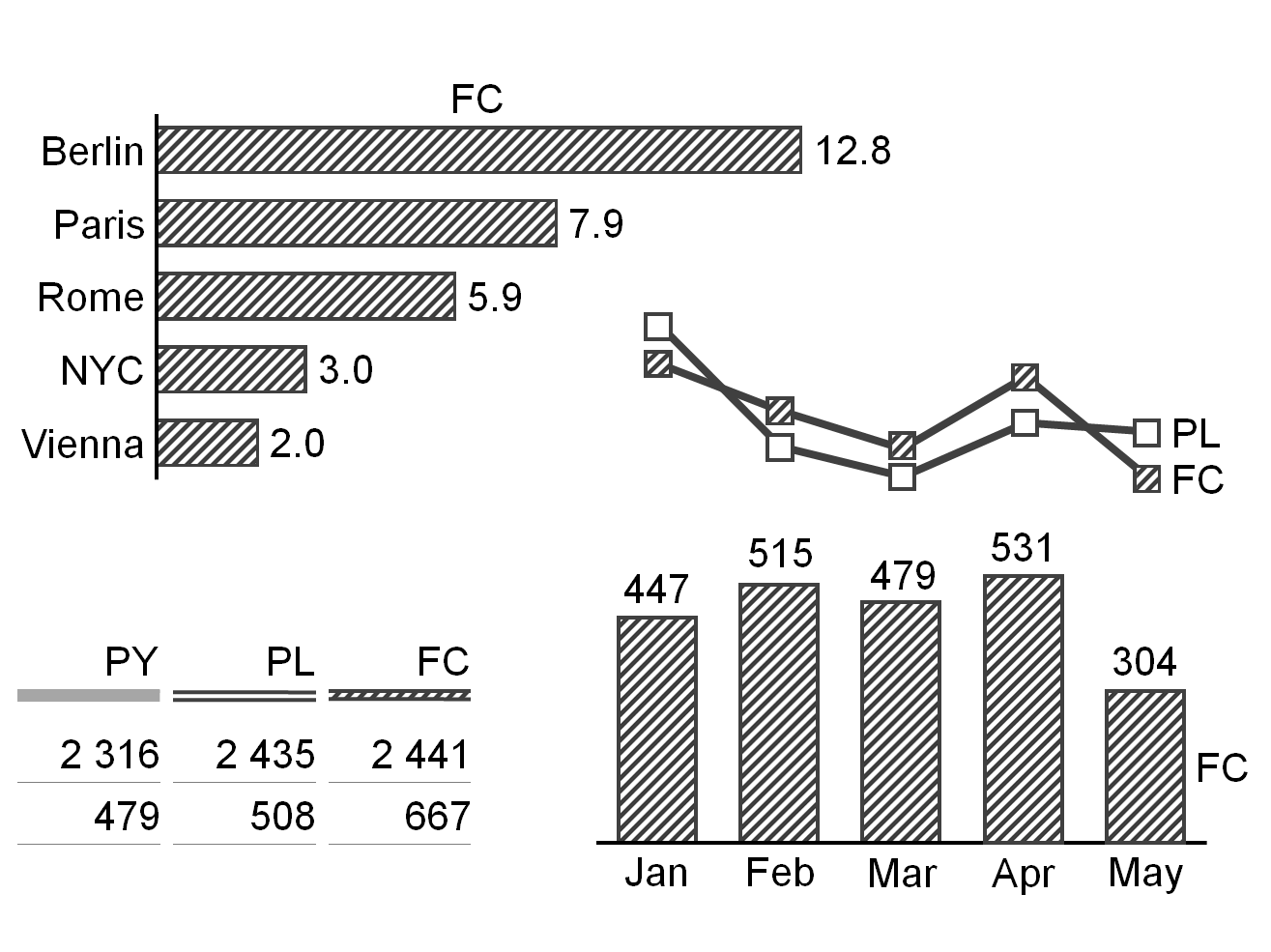
Forecasted scenarios: expected data
Expected data is strictly speaking fictitious, so they are also identified by bordered (outlined, framed) areas. However, as it is based on measured data, the area fill of the respective visualization elements becomes hatched. The color of the dark stripes correspond to the color of measured data (e.g. dark gray).
The suggested two-letter code for the most important expected data scenario is “FC” for “Forecast”.
UN 3.3 Unify time periods and points of time
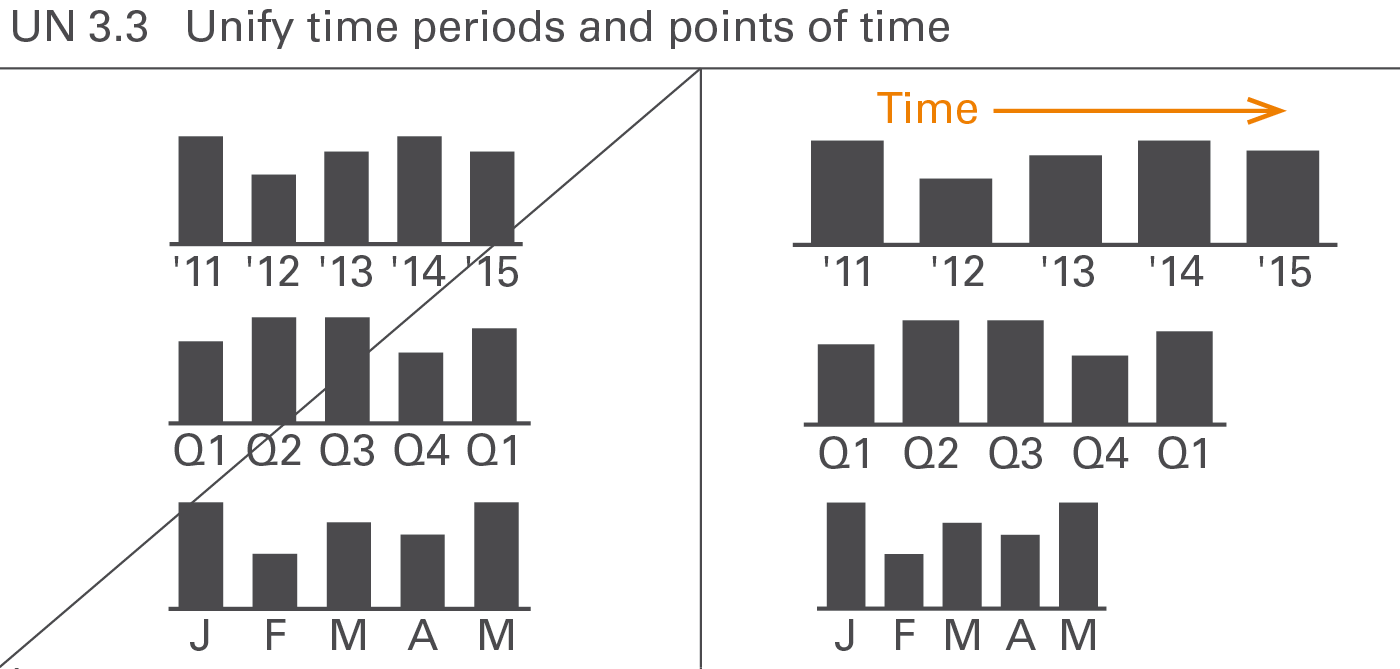
Using standard notations for time periods (for flow measures) and points of time (for stock measures) is important as they are frequently applied to all forms of business communication. This requires standard notations for the visual direction of time, time period and points of time abbreviations and – in charts with horizontal time axes – category widths, see Figure UN 3.3.
Visual direction of time periods
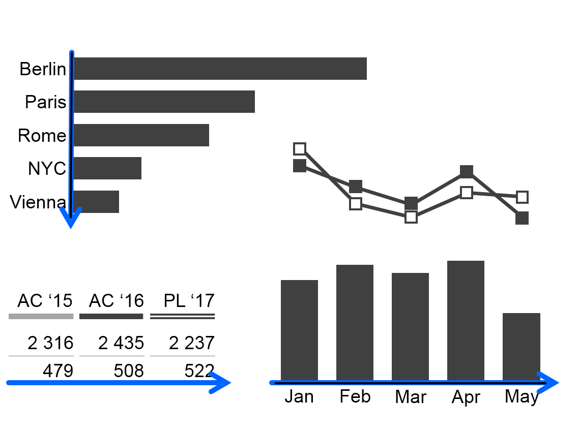
As opposed to structural comparisons, horizontal axes visualize data series over time. In tables, present data series over time in columns. In both cases time moves from left to right.
Time period and points of time abbreviations
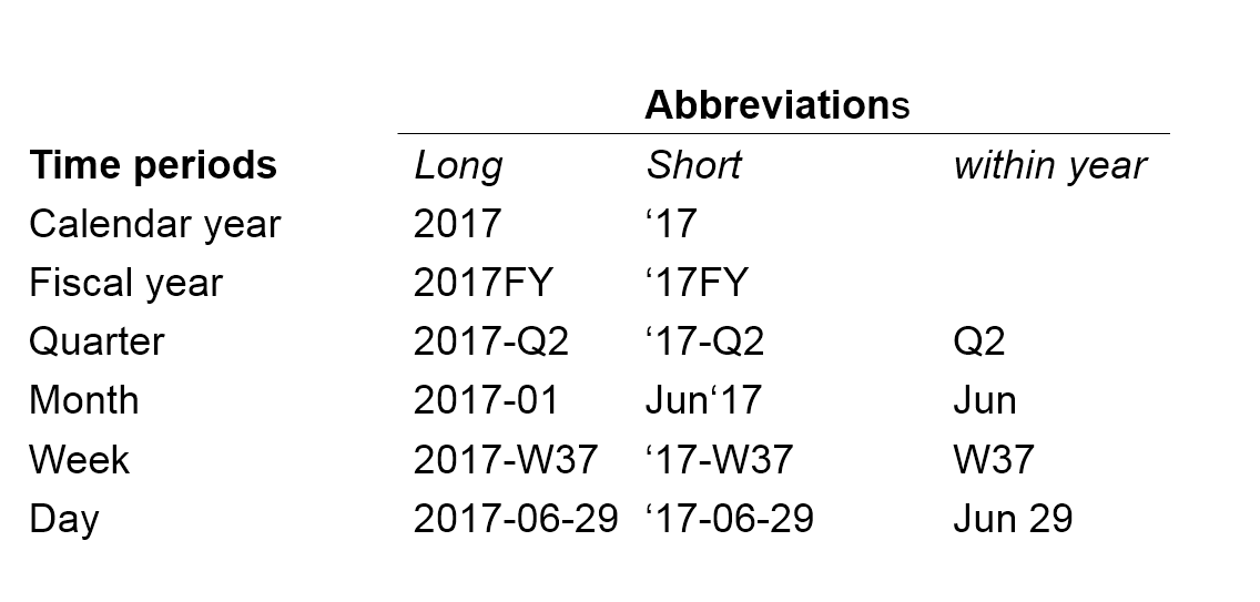
For a better understanding, use unified abbreviations for time periods and points in time. ISO 8601 recommends the following pattern for time periods: YYYY-MM-DD (e.g. 2017-05-13) for its unambiguousness and easy sorting. The abbreviations in the figure.
In some countries or organizations other abbreviations such as Oct 2017, Q2 2017, W07 2017 are common. They can also be used as long as they are used consistently.
A “.” (full-stop) before the period name indicates the first day of a time period, e.g. “.2017” for the first day of 2017 or “.Jun” for the first day of June.
Likewise, append “.” (full-stop) to the period name to visualize the last day of a time period, e.g. “2017.” for the last day of 2017 or “Jun.” for the last day of June.
The sign “..” (two full-stops) indicates a time span, e.g. “Jan..Mar” (without blanks) for “from January to March.”N.B.: Use two dots instead of three dots (“ellipsis”).
Category widths
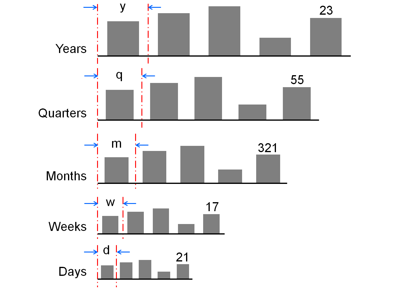
When helpful, differentiate different types of time periods with different category widths according to this rule: the longer the period the wider the category segments on the category axis.
It might be necessary to use rather wide category segments to label stacked columns or rather narrow category segments due to restricted dashboard space. In any case, if certain period types have been allocated certain category widths, this allocation should be the same for the entire report or presentation.
UN 3.4 Unify structure dimensions, use vertical direction
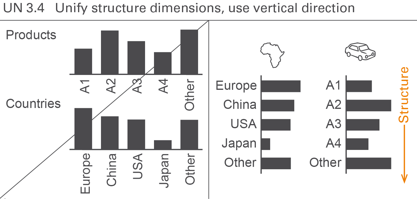
Structure dimensions are all dimensions that are not measures, scenarios, or time periods. In many cases, the following structure dimensions are used: regions, organization units, products, customers, channels, and accounts.
Display structures always in vertical direction. Use custom symbols if it is helpful to differentiate structure dimensions, see Figure UN 3.4.
UN 4 Unify analyses
Analyses are carried out in order to understand certain business situations, e.g. finding the greatest variances from a plan or calculating the monthly average.
This section comprises analyses regarding different dimensions such as scenario analyses, time series analyses, and structure analyses. A section covering different adjustment analyses is added.
UN 4.1 Unify scenario analyses
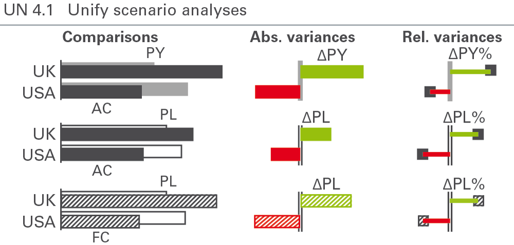
Analyze scenarios by comparing them and by calculating their absolute and relative variances. Notation standards for scenario analyses cover the labelling of variances and the semantic design of chart elements such as columns, bars, and axes, see Figure UN 4.1.
Scenario comparisons
Scenario comparisons place the data of different scenarios next to each other, for example actual data next to previous year or budget data. This is relevant for both charts and tables. In tables, scenarios usually are shown in columns.
Scenarios can be compared in an absolute or relative way:
Absolute variance = primary scenario – reference scenario
Relative variance = absolute variance / reference scenario
Arrange scenarios of different time periods (mainly years) in temporal ascending order either from left to right (horizontal axes) or from above to below (vertical axes), e.g. PY (= AC 2014), FC 2015, PL 2016.
No rule governs the sequence of scenarios referring to the identical time period – e.g. PL 2015, FC 2015, AC 2015, but the selected sequence should be kept the same in all charts and tables.
Scenario comparisons are visualized either by grouping columns or bars (e.g. overlapping columns of PY and AC or overlapping bars of PL and AC), or with scenario triangles using the respective area coding (e.g. solid light color for PY) to represent the reference scenario. Scenario triangles can also be added to overlapped bars or columns in order to show a third scenario.
The scenarios AC and FC stand in the foreground of other scenarios in grouped columns or bars.
Absolute variances
An absolute variance is the difference between two values of one measure from different scenarios.
The sign “Δ” represents the absolute variance as a prefix to the subtrahend of the respective difference, i.e. “ΔPL” for the absolute difference “AC minus PL” (AC-PL) or – if FC is compared to PL – “FC minus PL” (FC-PL).
The most common absolute variances are the following:
-
Plan variance: “ΔPL” for AC-PL or FC-PL (when comparing FC to PL)
-
Previous year variance: “ΔPY” for AC-PY or FC-PY (when comparing FC to PY)
If it is not clear whether AC or FC is compared to plan in ΔPL or ΔPY, use the following notation:
- Plan variance: “AC-PL” and “FC-PL”
- Previous year variance: “AC-PY” and “FC-PY”
Positive absolute variances (as well as positive percent variances) have a “+” to emphasis this aspect: “+13” always means a variance of 13, “13” means any absolute value of 13.
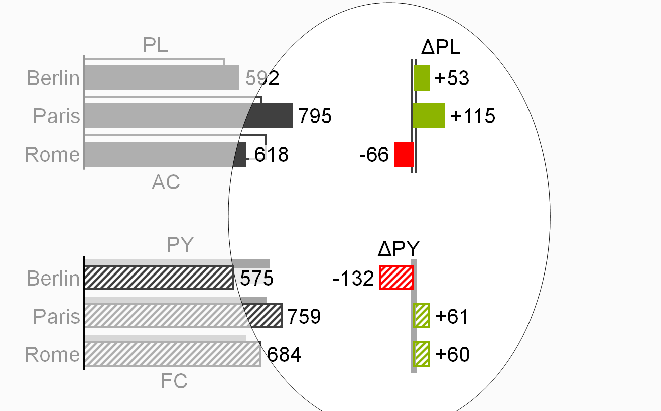
If absolute variances are displayed in columns or bars (“variance columns” or “variance bars”), these variance columns or bars have the same width and the same scale as the corresponding base value columns or bars.
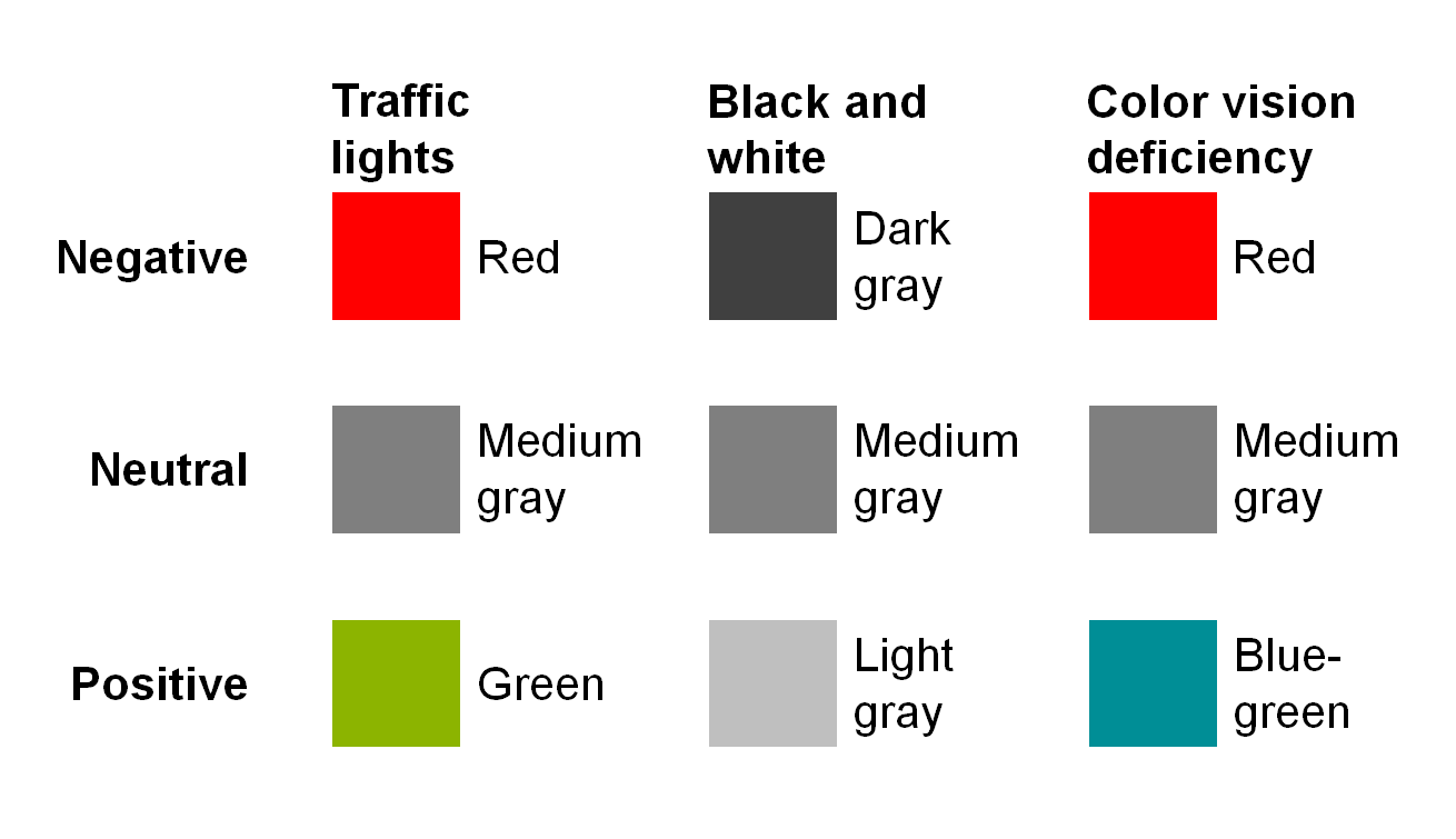
Variance bars and columns representing a positive impact on business issues (mainly result) are colored green, those representing a negative impact red, see figure on the left. Variance bars and columns representing a neutral impact are colored medium gray. If no color is available, replace red with dark gray, green with light gray. For readers with color deficiency, replace green with blue-green.
If it is helpful, numbers in tables representing variances are colored in the same way.
Note: These colors for positive, negative, or neutral variances must not be confused with red and green “traffic lights” (see also EX 2.5 “Replace traffic lights”).
In order to visualize the scenario to be analyzed (minuend), apply scenario notation to the fill of the variance columns or bars, e.g. solid green or red fill for AC and hatched green or red fill for FC. If in special cases the minuend is PL (e.g. variance of plan versus average) the variance columns and bars are outlined green or red.
Position data labels for variance columns and bars always outside of these visualization elements. These labels’ position aligns with the direction of positive or negative increase, i.e. the label of a positive variance (green) in a variance column is positioned above the column; the label of a negative variance (red) on the left hand side outside of the bar.
In order to visualize the reference scenario (subtrahend) of an absolute variance (in general PY, PL, or BU), apply scenario notation to the axis: For absolute variances to PY the axis is colored solid light, for absolute variances to PL or BU the axis takes an outline shape (two parallel lines).
Treat variances of ratios, e.g. percent values (profit on sales) in a special way: Absolute variances of percent values are called percent points, e.g. AC 50% – PL 40% = +10pp.
Relative variances
A relative variance is an absolute variance as a percentage of the subtrahend of the absolute variance.
For the textual notation of relative variances, use the sign “Δ”as a prefix to the subtrahend and the sign “%” as appendix, e.g. ΔPL% for the relative variance (AC-PL)/PL*100.
The most common relative variances are the following:
-
Plan variance: “ΔPL%” for (AC-PL)/PL*100 or (FC-PL)/PL*100 (when comparing FC to PL)
-
Previous year variance: “ΔPY%” for (AC-PY)/PY*100 or (FC-PY)/PY*100 (when comparing FC to PY)
Display “n.a.” (not available) if the calculated relative variance cannot be interpreted, as is often the case when a positive value is compared to a negative reference value (denominator):
Profit AC = 30
Profit PL = -30
ΔPL = +60
ΔPL% = 60 /
-30 = -200% => n.a.
Use the following notation, if it is not clear whether AC or FC is compared to Plan:
- Plan variance: “(AC-PL)%” and “(FC-PL)%”
- Previous year variance: “(AC-PY)%” and “(FC-PY)%”
Positive relative variances (as well as positive absolute variances) have a “+”-to emphasize this aspect: “+13%”always means a variance of 13%, “13%” means any kind of percentage such as ratio or a share.
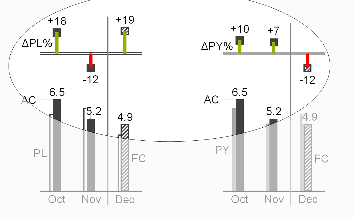
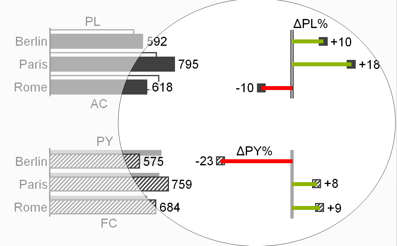
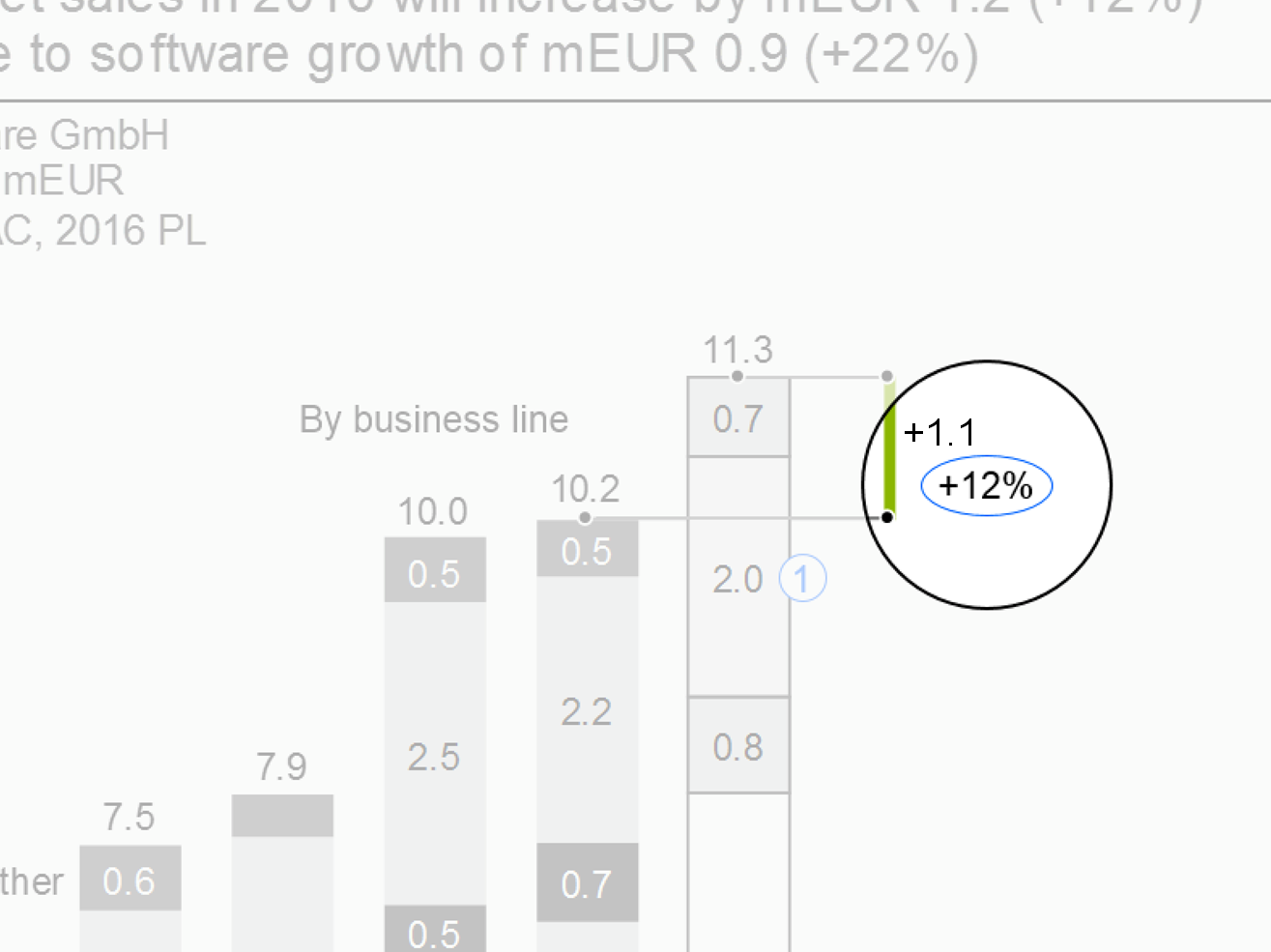
Relative variances are displayed in thin columns (vertical pins) or thin bars (horizontal pins), see the two figures on the left.
Pins representing a positive impact on business issues (mainly result) are colored green, those representing a negative impact red. Pins representing a neutral impact on business issues are colored medium gray. If no color is available, replace red with dark gray, green with light gray. For readers with color deficiency, replace green with blue-green.
The labels of pins and the numbers representing variances in tables can be colored in the same way.
Note: These colors for positive, negative, or neutral variances must not be confused with red and green “traffic lights” (see also EX 2.5 “Replace traffic lights”).
Position data labels of pins outside the pin in the direction of the positive or negative increase, e.g. position the label of a horizontal pin depicting “sales growth in %” (green) on the right hand side of the pin, position the label of a vertical pin depicting “cost decrease in %” (green) below the pin.
Add head markers to the pins to visualize the scenario to be analyzed (minuend). Apply the scenario notation to the fill of the heads, e.g. solid dark fill for AC and hatched fill for FC.
Apply the scenario notation to the axis in order to visualize the reference scenario for a relative variance (in general PY, PL, or BU): For relative variances to PY fill the axis solid light, for relative variances to PL or BU the axis takes an outline shape (two parallel lines).
Treat relative variances of percent values the same way as relative variances of absolute values, e.g. (AC 50% – PL 40%) / PL 40% * 100 = +25%.
UN 4.2 Unify time series analyses
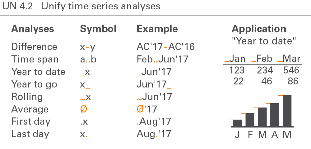
Notation for time series analyses covers year-to-date analyses, moving analyses, and temporal indexing, see Figure UN 4.2.
Year-to-date analyses
Year-to-date analyses (YTD) refer to the period from the beginning of the year to the present (YTD time span). The beginning of the year is not necessarily January 1. Some companies have fiscal years beginning at other dates.
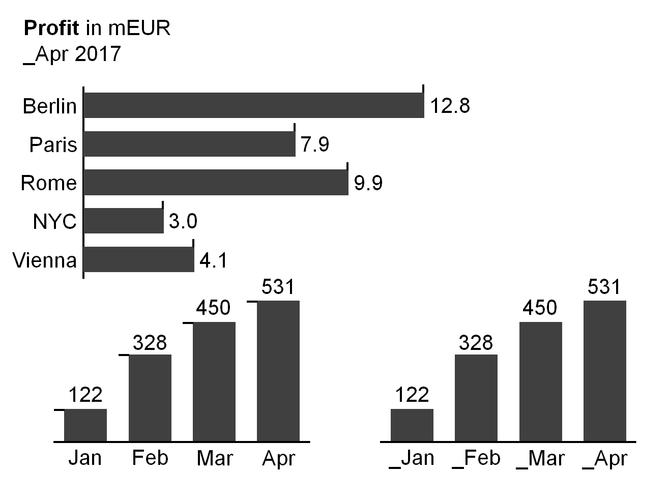
Where helpful, visualize analyses showing YTD values by prefixing an underscore to the time period name, e.g. “_Jun 2015”or “_Jun∅” respectively. Optionally, add the first period of the YTD time span, e.g. “January_June 2015”. In charts, add the underscores as a prefix at the left hand side of the end of the columns or at the upper side of the end of bars.
Year-to-date operations cover accumulation of values, calculation of averages, and picking of last date values.
YTD accumulation
In this context, accumulation means totaling successive time period values from the beginning of a calendar year or fiscal year to the present. In this stricter sense, accumulation applies only to flow measures, such as sales or costs.
If it is helpful, visualize analyses showing YTD accumulation with the underscore prefix (without additional notation) e.g. “_Jun 2015”.
YTD average
In this context, the average is calculated by dividing the YTD accumulation by the number of periods in the YTD time span. YTD average applies to both flow and stock measures.
If it is helpful, visualize analyses showing YTD averages with the underscore prefix and an appended “∅”sign, e.g. “_Jun 2015∅”.
Last date value
A special YTD analyses for stock measures is picking the value of the last date in the YTD time span.
If it is helpful, visualize analyses showing last date values with the underscore prefix and an appended full-stop, e.g. “_Jun 2015.”.
Year-to-go analyses
By analogy to year-to-date analyses, year-to-go analyses (YTG) refer to the period from the presence (now) to the end of the (fiscal) year.
Where helpful, visualize analyses showing YTG values by appending an underscore to the time period name, e.g.“Jun-2015_”.
Moving analyses
In general, moving analyses refer to the period of the previous twelve months.
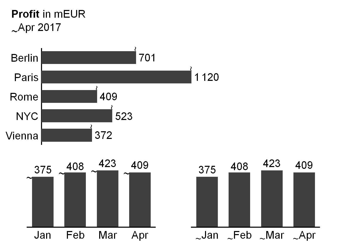
If it is helpful, visualize moving analyses by prefixing the time period name with a tilde, e.g. “~Jun 2015” or “~Jun∅” respectively. In charts, add the tilde as a prefix at the left hand side of the end of columns or the upper side of the end of bars.
Similar to year-to-date operations, moving analyses cover accumulation of values (moving annual total MAT), calculation of averages (moving annual average MAA), and picking of last date values.
The visualization concept for accumulation of values, calculation of averages, and picking of last date values is identical to the visualization concept of year-to-date analyses – the tilde simply replaces the underscore.
Temporal indexing
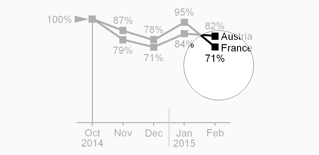
Using temporal indexing (indexing a time series), all period values are depicted in relation to the value of a chosen reference period (1 or 100%).
To visualize temporal indexing, position a black arrowhead pointing right at the left of the index point. “100%” or “100”is written left of the arrowhead. If helpful, add an assisting horizontal line.
UN 4.3 Unify structure analyses
Notation for structure analyses covers averaging, ranking, selecting, indexing, and normalizing.
Structural average
The term “average” usually refers to the mean of different values. The section time series analyses described temporal averages (e.g. monthly average of a year). Structural averages (e.g. average sales of several subsidiaries) are covered here. Typical structural averages are average by product, average by country, and average by customer.
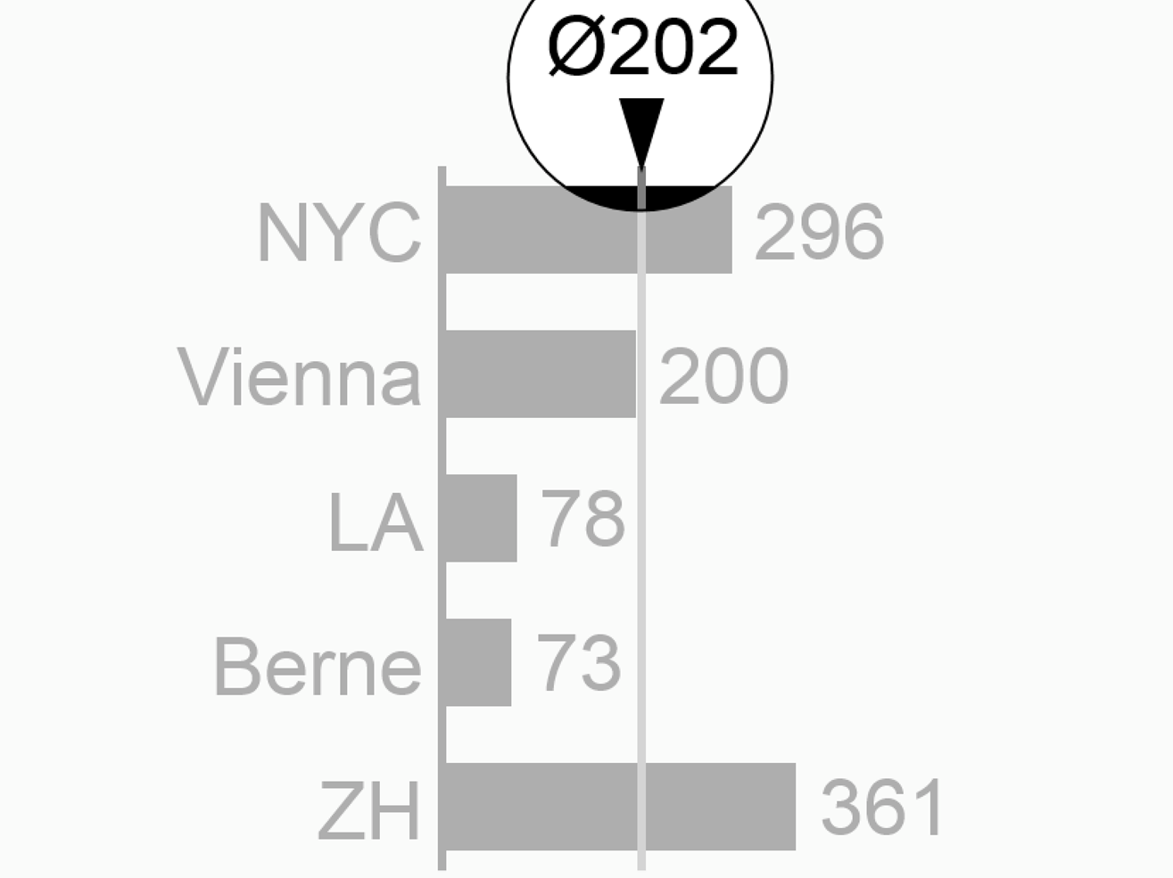
Visualize analyses showing structural averages with a “Ø” sign either appended or as a prefix, e.g. “EuropeØ” or “Ø464”. If needed, add an assisting line.
Ranking
Ranking analyses refer to descending or ascending rankings of structure elements. Words can be ranked in alphabetical order, numbers in numerical order.
If helpful, append an arrow sign to rankings, e.g. “country names↓” or “product sales↑”.
Selecting
The structure analysis selecting is related to the structure analysis ranking, used, in general, to determine either maximal (fastest, most expensive) elements or the minimal (slowest, cheapest) elements. Top ten, last ten, first quartile, last percentile, etc., are common forms of selecting.
Structural indexing
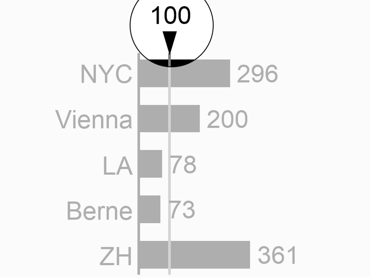
Structural indexing depicts all element values in relation to the value of a chosen reference element (=1 or 100%). Typical reference elements are the mean, the maximum, or a specific element in a given structure, e.g. “Germany = 100%”.
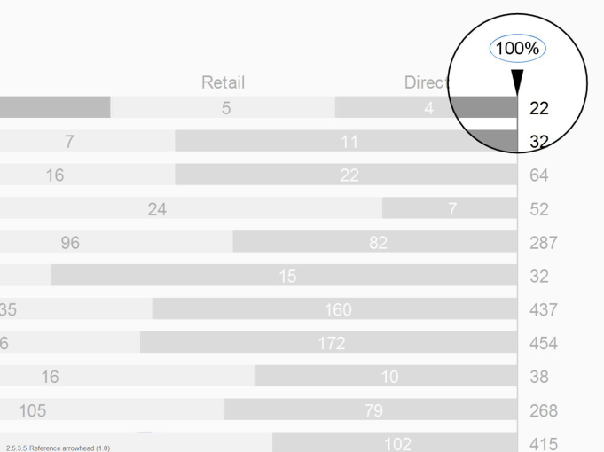
To visualize structural indexing, position a black arrowhead close to the index point. “100%” or “100”, is written next to the arrowhead. If helpful, add an assisting line.
Structural normalizing
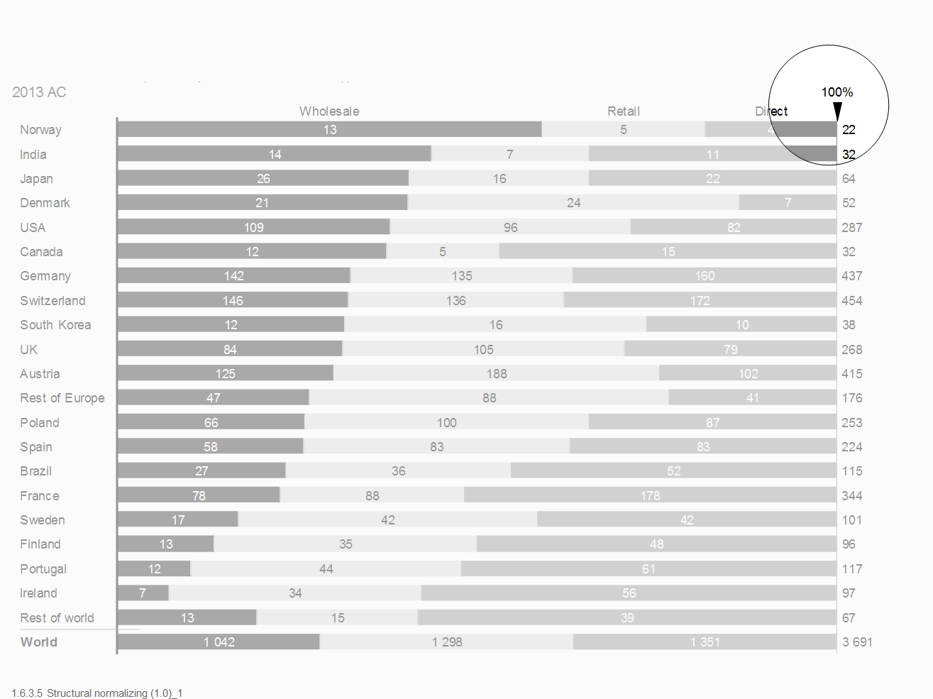
Structural normalizing refers to the comparison of several shares of some whole, e.g. shares of export to different countries. Indexing and normalizing are similar analyses, indexing refers to one element (e.g. a selected country), normalizing to the whole of several parts (e.g. country sales in % of Europe sales).
To visualize structural normalizing, add an assisting line representing 100%. Position a black arrowhead at one end of the assisting line. “100%” or “100”, is written next to the arrowhead.
UN 4.4 Unify adjustment analyses
Adjustment analyses can offer insight into root causes as they adjust values by neutralizing special effects. In general, adjustment analyses are used in conjunction with scenario analyses. Here the values of one scenario are recalculated with correction factors from another scenario: e.g., adjust AC sales for currency effects by re-measuring them with the PY exchange rates.
Typical adjustment analyses deal with currency, inflation, and seasonal effects.
UN 5 Unify indicators
Indicators in reports and presentations serve different purposes, e.g. highlighting and scaling. Using the indicator with the same design for the same purpose will help to identify the situation much faster.
UN 5.1 Unify highlighting indicators
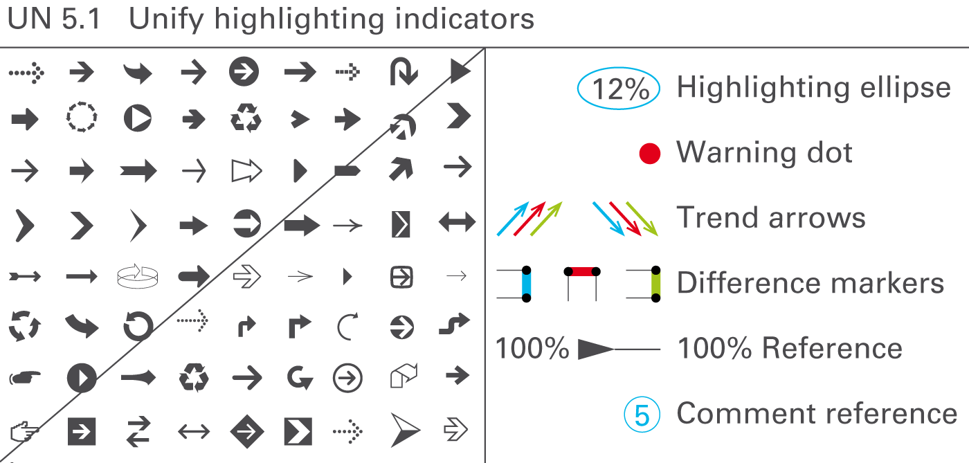
The message to be conveyed should be highlighted on the respective page by appropriate visual means. Highlighting elements enhance the meaning and importance of other elements. Use highlighting elements for assisting purposes, for visualizing differences and trends, for underlining values, for indicating a reference, or for linking comments, see Figure UN 5.1.
Assisting lines and areas
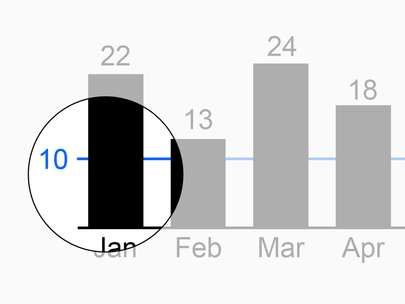
Use assisting lines for different highlighting purposes, e.g. for showing differences, for separating, arranging, or grouping data in charts or tables, or for coordinating visualization elements of different charts, see figure on the left.
Use assisting areas for different highlighting purposes, e.g. for highlighting words in a longer text, or for highlighting certain parts of charts or tables.
Difference markers
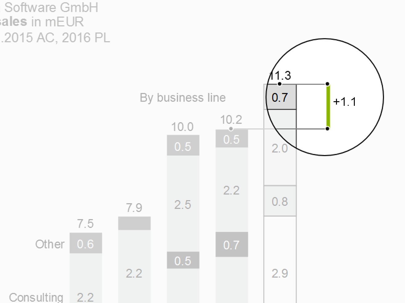
Highlight differences in charts by using two parallel assisting lines to project the respective lengths of two columns or bars to a difference marker highlighting the distance between the two assisting lines.
Position difference markers in a way that they can clearly highlight the respective difference.
Difference markers representing a positive impact on business issues (e.g. profit) are colored green; difference markers representing a negative impact on business issues (e.g. loss) are colored red. Difference markers representing neutral impacts on business issues are colored gray.
Trend arrows
Arrows can highlight trends in charts and (seldom) tables, too.
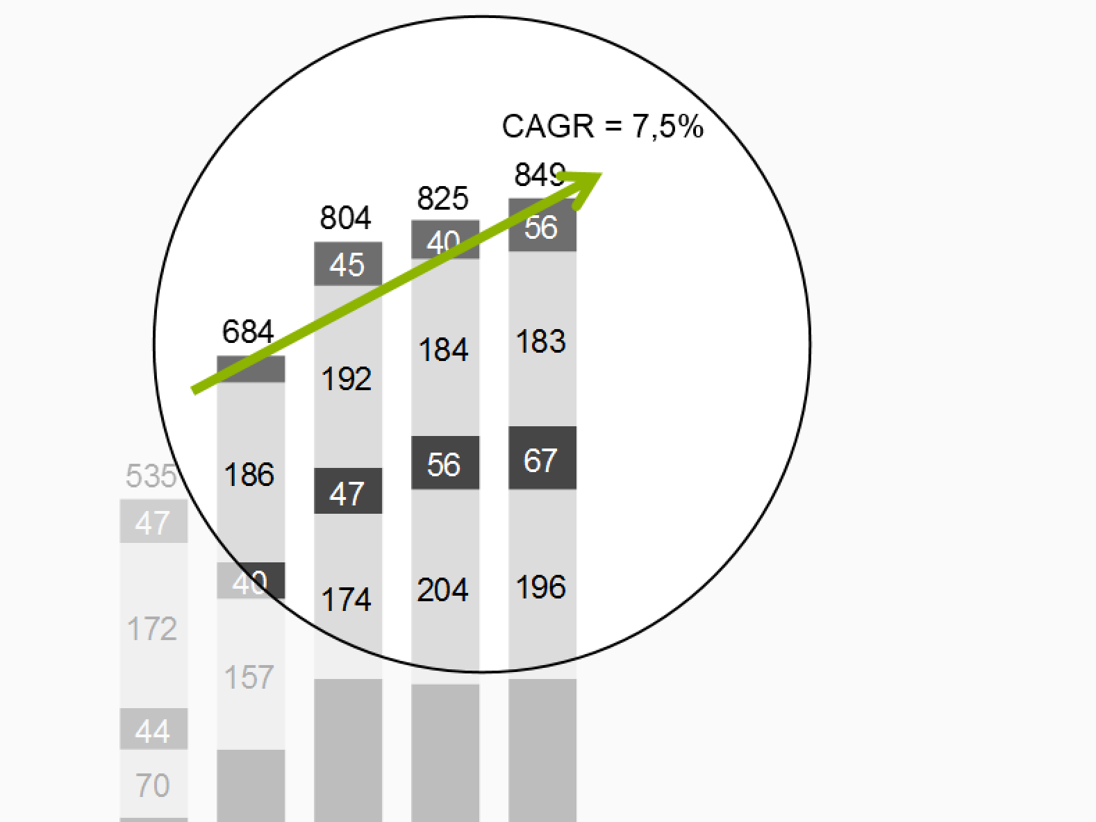
Position trend arrows in a way that they can clearly highlight the direction of the trend with the respective slope. The arrow starts at the first period and ends at the last period included in the calculation of the respective trend. The arrowhead is pointing in time direction. Adding a number and a designation for the calculation method (e.g. CAGR: 10.8%) will give additional insight.
Trend arrows representing a positive trend are colored green; trend arrows representing a negative impact on business issues (e.g. loss) are colored red. Trend arrows representing neutral impacts on business issues are colored gray.
Highlighting ellipses
Use highlighting ellipses to highlight single values. Good reasons for highlighting single values are e.g.
-
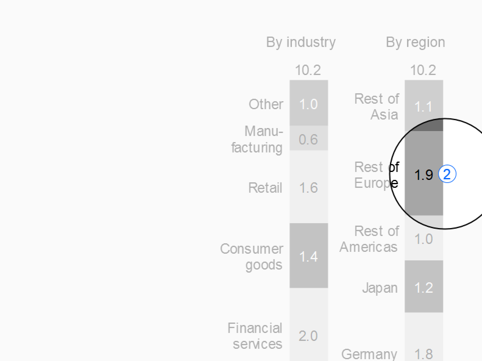
Highlighting messages: If the message refers to a specific value in a chart, table or graph, highlight this value with a blue ellipse.
-
Highlighting additional values: Sometimes it is helpful to add additional values (e.g. percent value) in charts or tables. In this case, use a black ellipse.
Reference arrowheads
Use reference arrowheads for highlighting a reference standard. Examples of reference standards are:
-
Indices: Either one value (e.g. the value of the year 2010) is set to 100%, or the total is set to 100% (see sections about time series analyses and Structure analyses).
-
Benchmarks: Popular benchmarks are market averages, competitors, or best practices.
Position the arrowhead close to the point representing the index or the benchmark. Write the label for the index (e.g. “100%” or “100”) or for the benchmark (e.g.“Market avg.”) next to the arrowhead. The arrowhead points in the direction of an imaginary index or benchmark line. If helpful, add an assisting line.
Comment references
Use comment references in pairs to link comments to the corresponding values or positions in a chart or a table.
Variance highlighting indicators
Highlight variances in tables by using visualization elements representing the magnitude of the variance, such as bars and pins (see also EX 2.5 “Replace traffic lights”). “Traffic lights” might be useful for highlighting single variances related to the message or to comments in tables without chart elements, though. Another means for highlighting single variances are “warning dots” positioned next to the value or text element needing attention.
Indicators highlighting variances representing a positive impact on business issues are colored light green, those representing a negative impact light red. If no color is available, replace red with dark gray, green with light gray. For readers with color deficiency, replace green with blue-green.
Use only few variance highlighting indicators per page.
Other highlighting
Add visualization elements for not-valid values, limits, or other relevant phenomena. Standardize and document these “signals” so that they become an effective means of communication.
UN 5.2 Unify scaling indicators
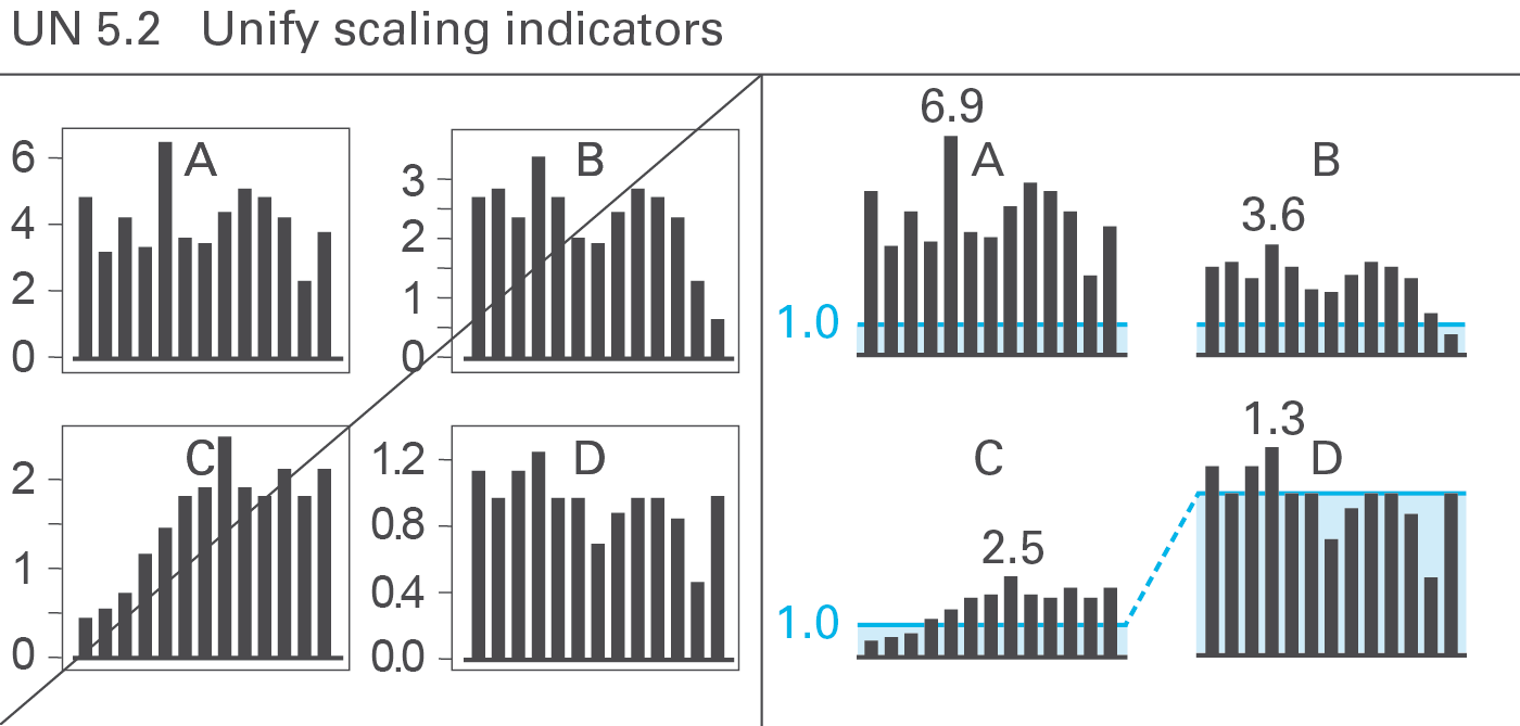
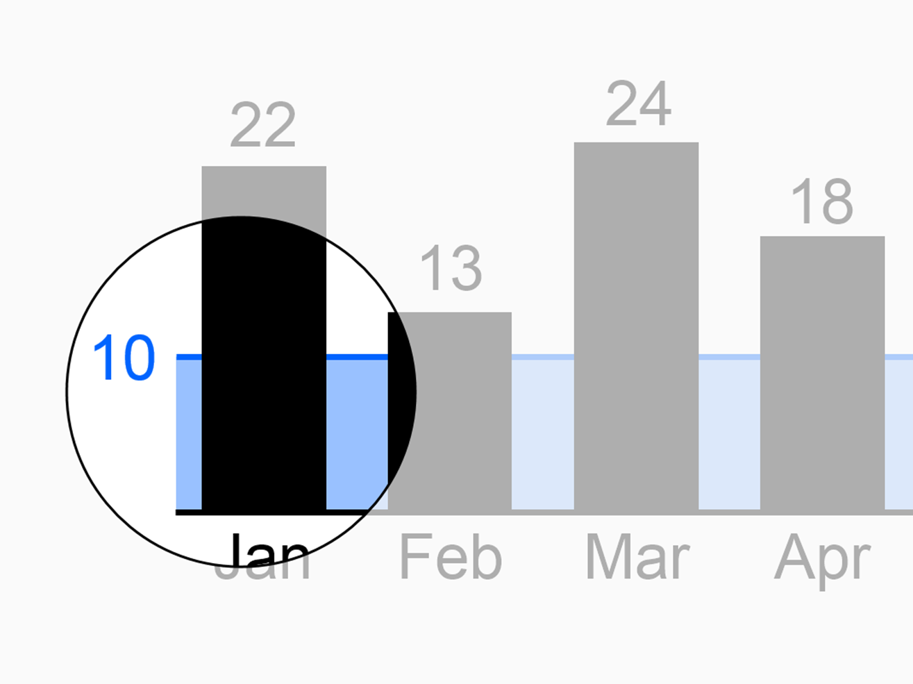
Proper scaling is very important for the creation of meaningful charts. Several semantic scaling indicators exist to deal with in challenging scaling problems. Use scaling lines and scaling areas (scaling bars) if necessary, see Figure UN 5.2.
Scaling lines
Use scaling lines when comparing multiple charts (with the same unit) having different scales. Position a scaling line parallel to the category axis at the same numerical height in all charts. If one chart among several other charts uses a different scale, this fact can easily be identified (in general, the differing scale uses a multiplier of ten).
Scaling areas
If helpful, fill the areas between the scaling lines and the category axes with light color. Use different colors for scaling lines and scaling areas used in order to represent different scales.
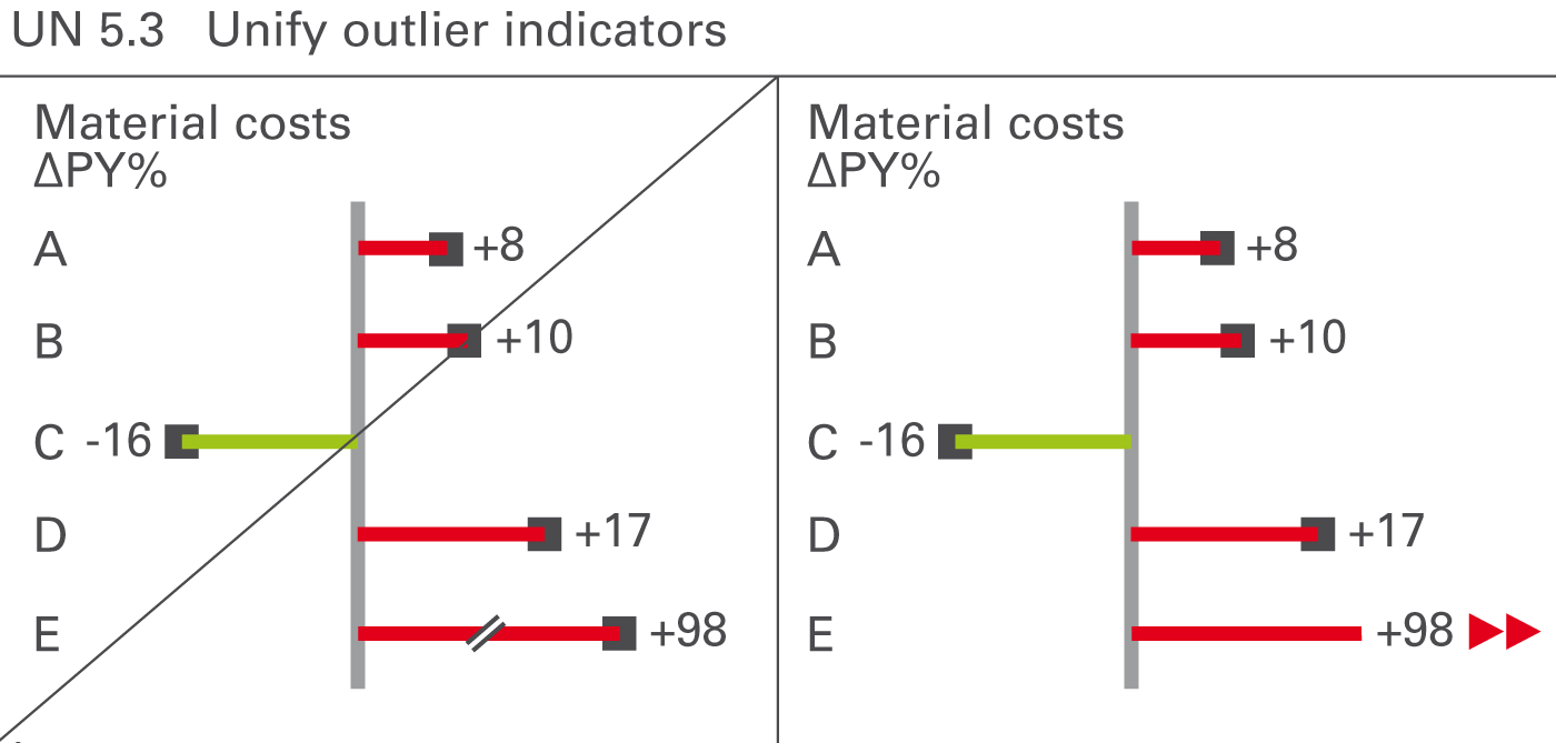
UN 5.3 Unify outlier indicators
Sometimes values (mostly relative variances) can be very big in comparison to other values. If such an outlier is not important for business, e.g. a big relative variance of a small value, do not scale the whole chart to this outlier rather visualize unimportant outliers with outlier indicators.
Omit the pin head and add outlier triangles pointing in the direction of growth, see Figure UN 5.3.
