6.6 KiB
SIMPLIFY – Avoid Clutter
SIMPLIFY covers all aspects of avoiding clutter in reports and presentations.
Avoiding clutter means that reports and presentations avoid all components and characteristics, which are too complicated, redundant, distracting or merely decorative.
This chapter covers avoiding unnecessary and decorative components and replacing them with cleaner layouts, avoiding redundancies and distracting details.
- Avoid unnecessary components
- Avoid decorative styles
- Replace with cleaner layout
- Avoid redundancies
- Avoid distracting details
SI 1 Avoid unnecessary components
Completely avoid components, such as pictures, backgrounds, and logos, not contributing to the comprehension of a report or presentation.
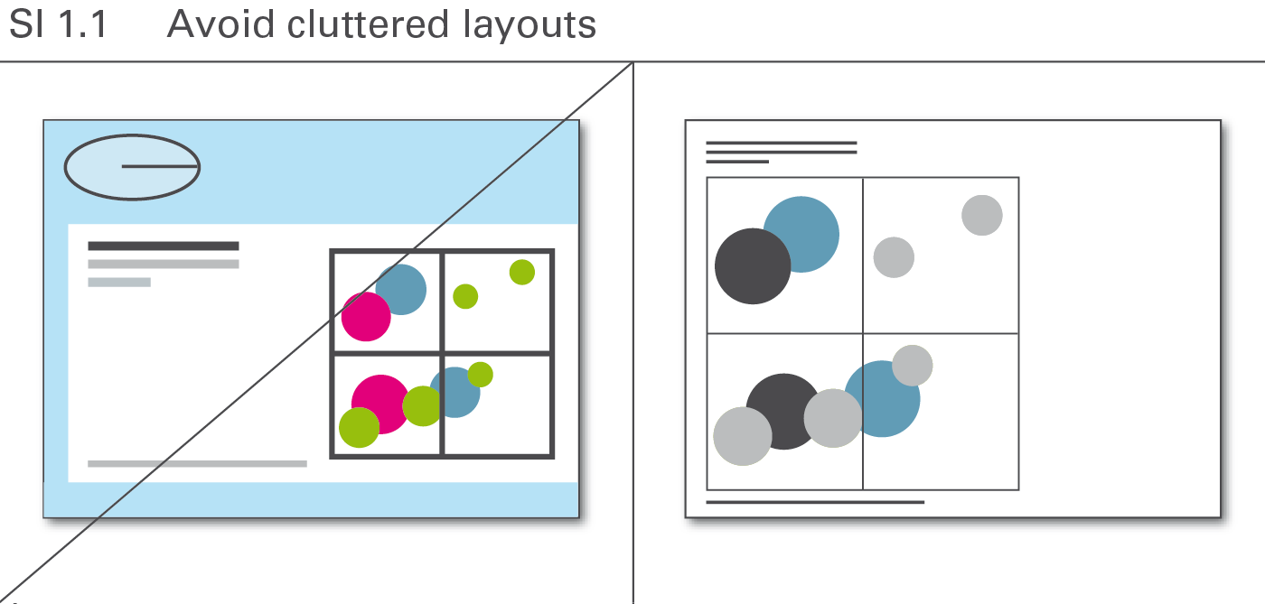
SI 1.1 Avoid cluttered layouts
Layout concepts often contain elements that lack meaning but merely conform to corporate design or personal taste. Avoid all these elements, see Figure SI 1.1.
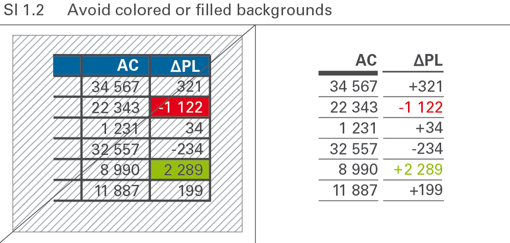
SI 1.2 Avoid colored or filled backgrounds
Numbers and labels are easiest to read when depicted in black on a white background. Any type of background color or pattern makes something harder to read, see Figure SI 1.2.
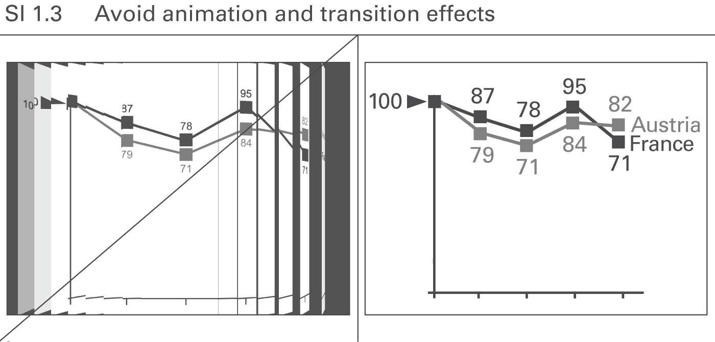
SI 1.3 Avoid animation and transition effects
Animated PowerPoint slides are not useful if the animation has no meaning and does not support the message, see Figure SI 1.3. They merely distract and confuse. Only the “appear” function is recommended to be used for the gradual development of a slide.
SI 2 Avoid decorative styles
Simplify complicated visualizations in order to facilitate and accelerate their comprehension. Whereas the section “Avoid unnecessary components” involves omitting entire layout elements, the aim here is to find the most suitable and simplest possible style of visualization elements.
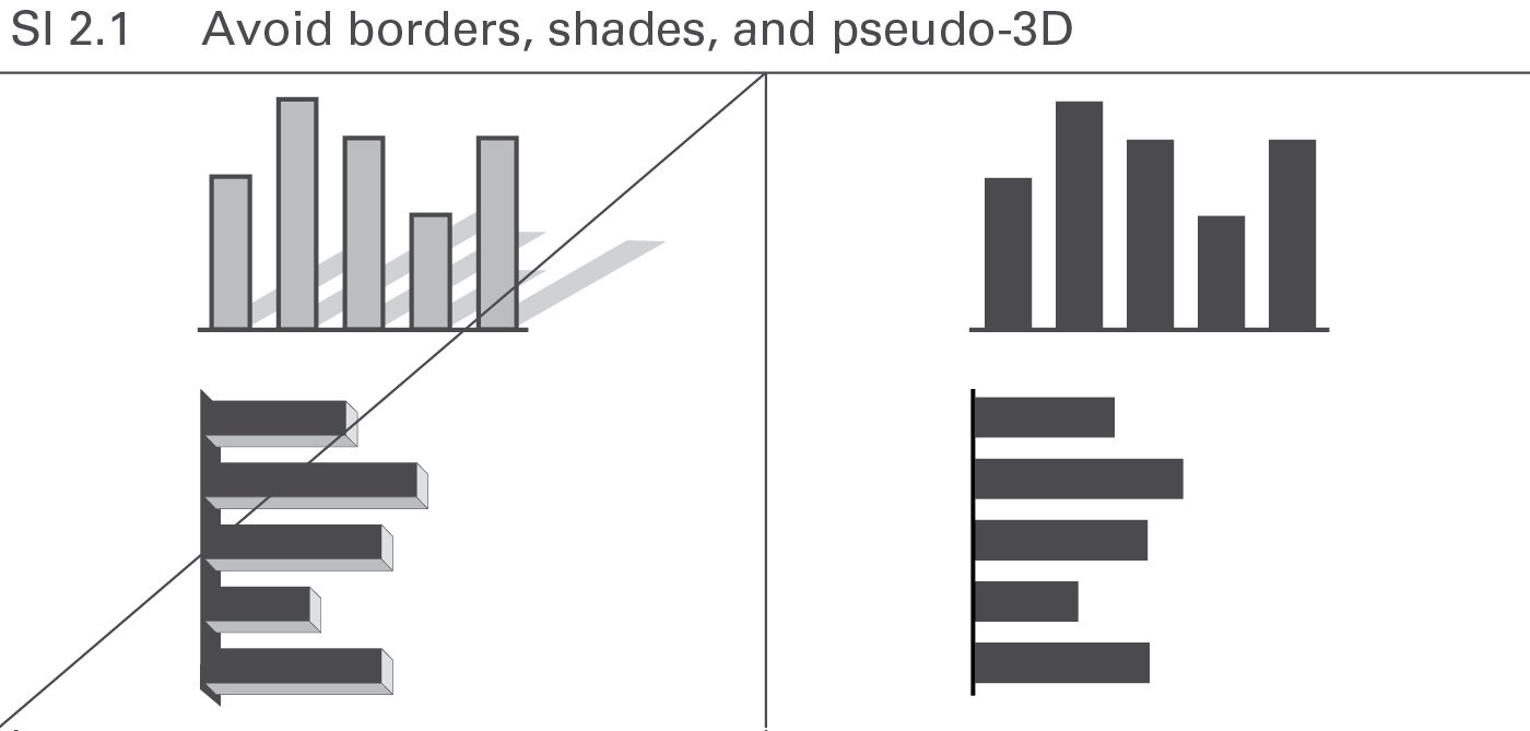
SI 2.1 Avoid borders, shades, and pseudo-3D
In general, borders, shades, and pseudo-3D convey no meaning and make comprehension more difficult. Shades and pseudo-3D might even give a false visual impression. Avoid them because they do not add value, see Figure SI 2.1.
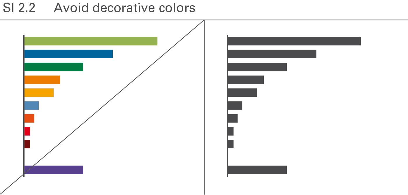
SI 2.2 Avoid decorative colors
If colors serve merely decorative purpose in one instance, using them for meaning in another instance (e.g. for highlighting) becomes difficult. Therefore use colors only if they convey meaning, see Figure SI 2.2.
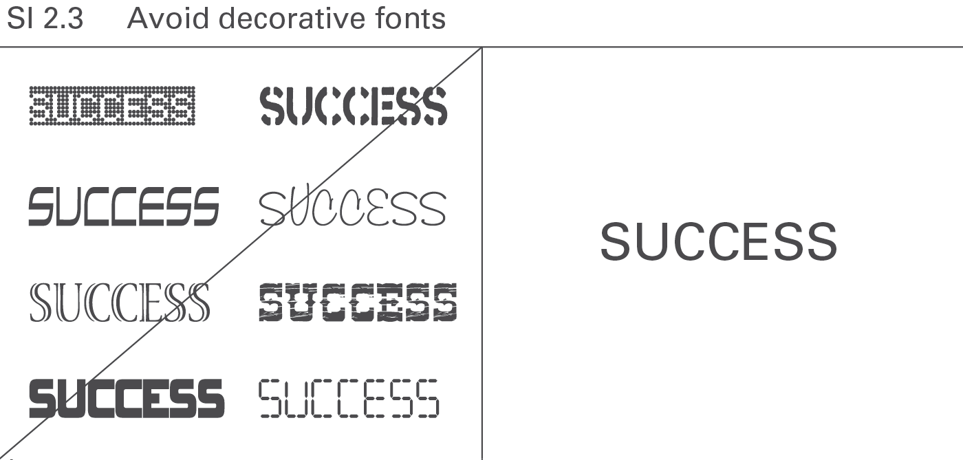
SI 2.3 Avoid decorative fonts
A normal typeface and clear fonts increase legibility. Save bold and cursive fonts for making distinctions, see Figure SI 2.3.
SI 3 Replace with cleaner layout
Using a cleaner method of visualization decreases the amount of ink necessary to convey a message.
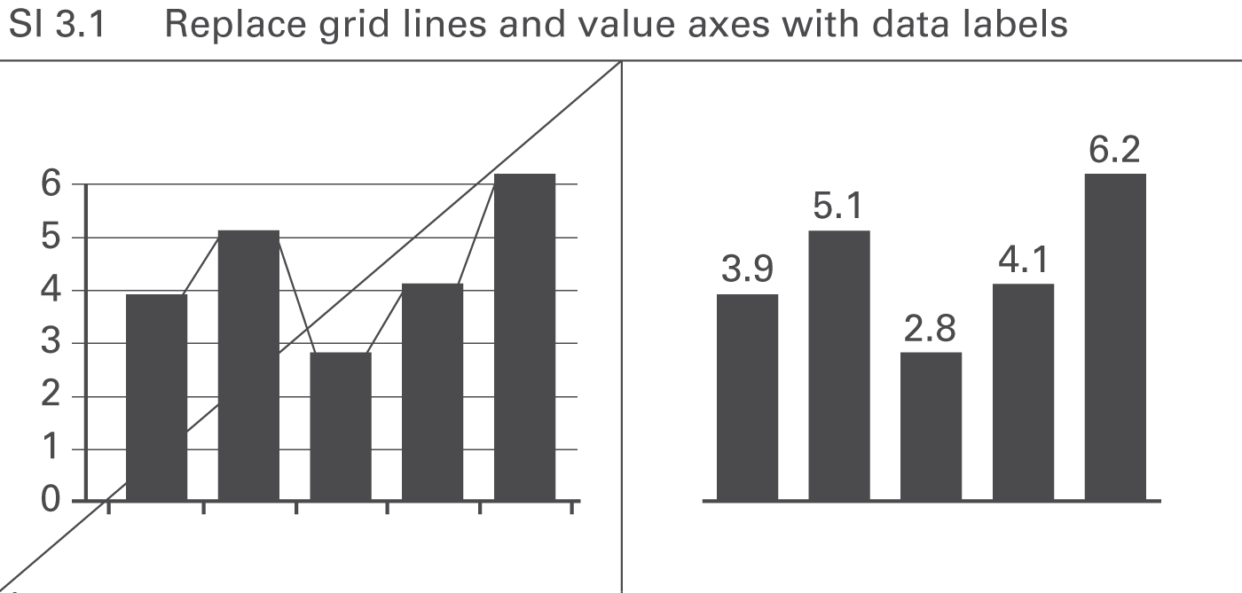
SI 3.1 Replace grid lines and value axes with data labels
Using integrated data labels can make value axes, tick marks, and gridlines superfluous, see Figure SI 3.1. Gridlines, however, can be useful in charts with missing reference points as might be the case in charts with many data series and data points, or in small charts (e.g. small multiples).
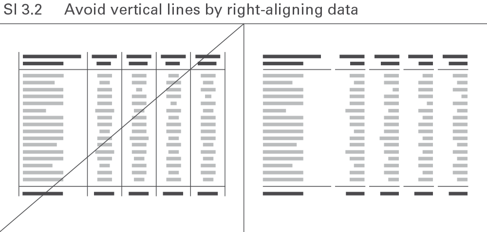
SI 3.2 Avoid vertical lines by right-aligning data
Omit all avoidable elements to make tables more straightforward. Avoid vertical lines by right-aligning numerical values and the corresponding column headers, see Figure SI 3.2.
SI 4 Avoid redundancies
Avoiding redundant terms usually increases the legibility of charts and tables. In some cases, a certain amount of redundancy can be helpful like when the time period named in the chart title also appears in said chart. But unnecessary redundancy impedes comprehension like when naming the year twelve times in a chart with twelve monthly category labels.
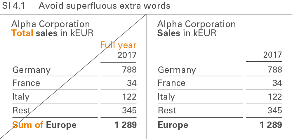
SI 4.1 Avoid superfluous extra words
Extra words such as “sum” and “total” are redundant because they add no value to the meaning of the term they accompany. No difference exists between “Europe” and “Sum of Europe”. Extra words make it harder to read text elements, see Figure SI 4.1.
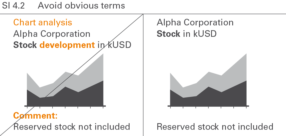
SI 4.2 Avoid obvious terms
Terms such as “chart analysis”, “development”, or “comment” are redundant because they name something already shown, see Figure SI 4.2. Other obvious terms in charts and tables are “table”, “statistics”, “report”, “visualization”, “structure”, or “trend”.
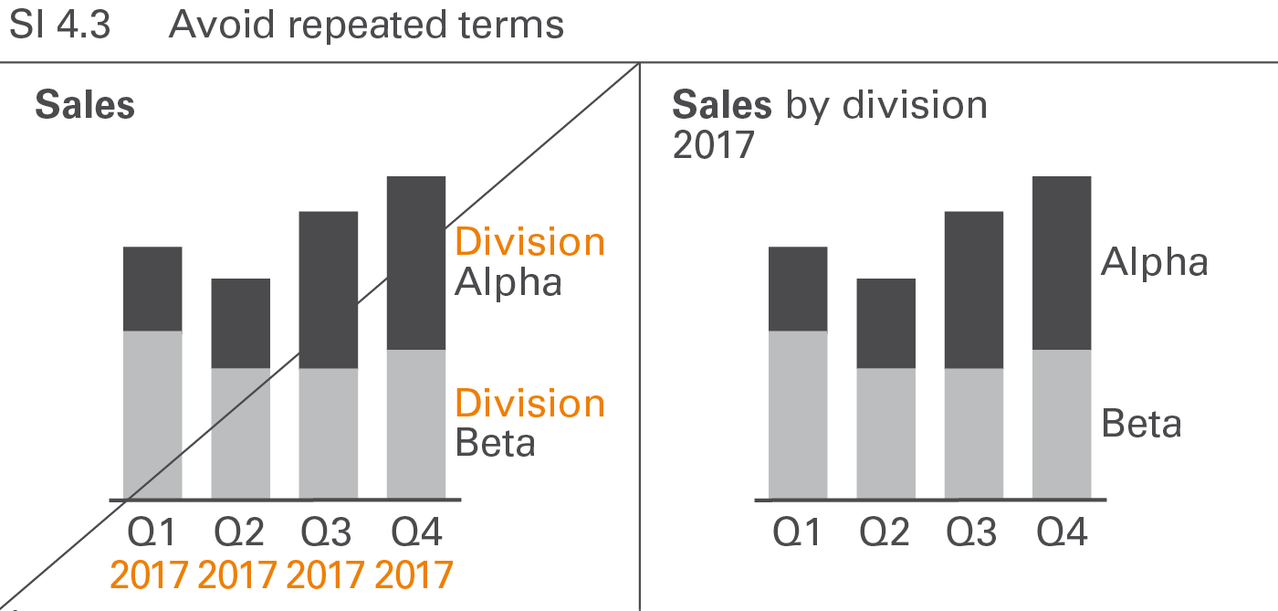
SI 4.3 Avoid repeated words
Repeated words in legends, axis labels, row headers, etc. such as “division” in “division A”, “division B”, etc. or “2017” in “Q1 2017”, “Q2 2017”, etc. should be avoided, see Figure SI 4.3. Omitting repeated words usually increases the degree of legibility.
SI 5 Avoid distracting details
In addition to avoiding noise and redundancy, omitting nonessential, distracting information details facilitates comprehension. Examples include unnecessarily large numbers and disproportionately detailed information in project or product overviews.
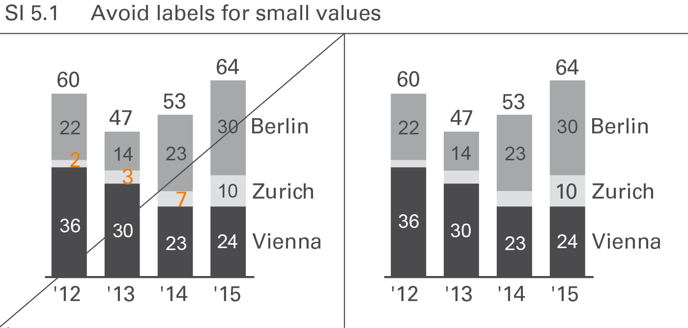
SI 5.1 Avoid labels for small values
Labels of small values are often hard to position and rarely contribute to the comprehension of the message. Therefore they can be avoided in most cases, see Figure SI 5.1. However, add them when special reference is made to them. If it is necessary to label these small values or small visualization elements, assisting lines might be necessary.
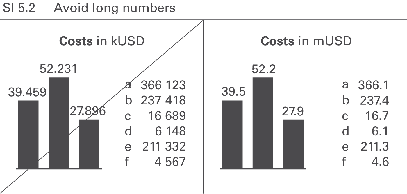
SI 5.2 Avoid long numbers
Numbers with more than three digits in charts and four digits in tables are hard to read; moreover, such precision is seldom necessary to understand the message, see Figure SI 5.2.
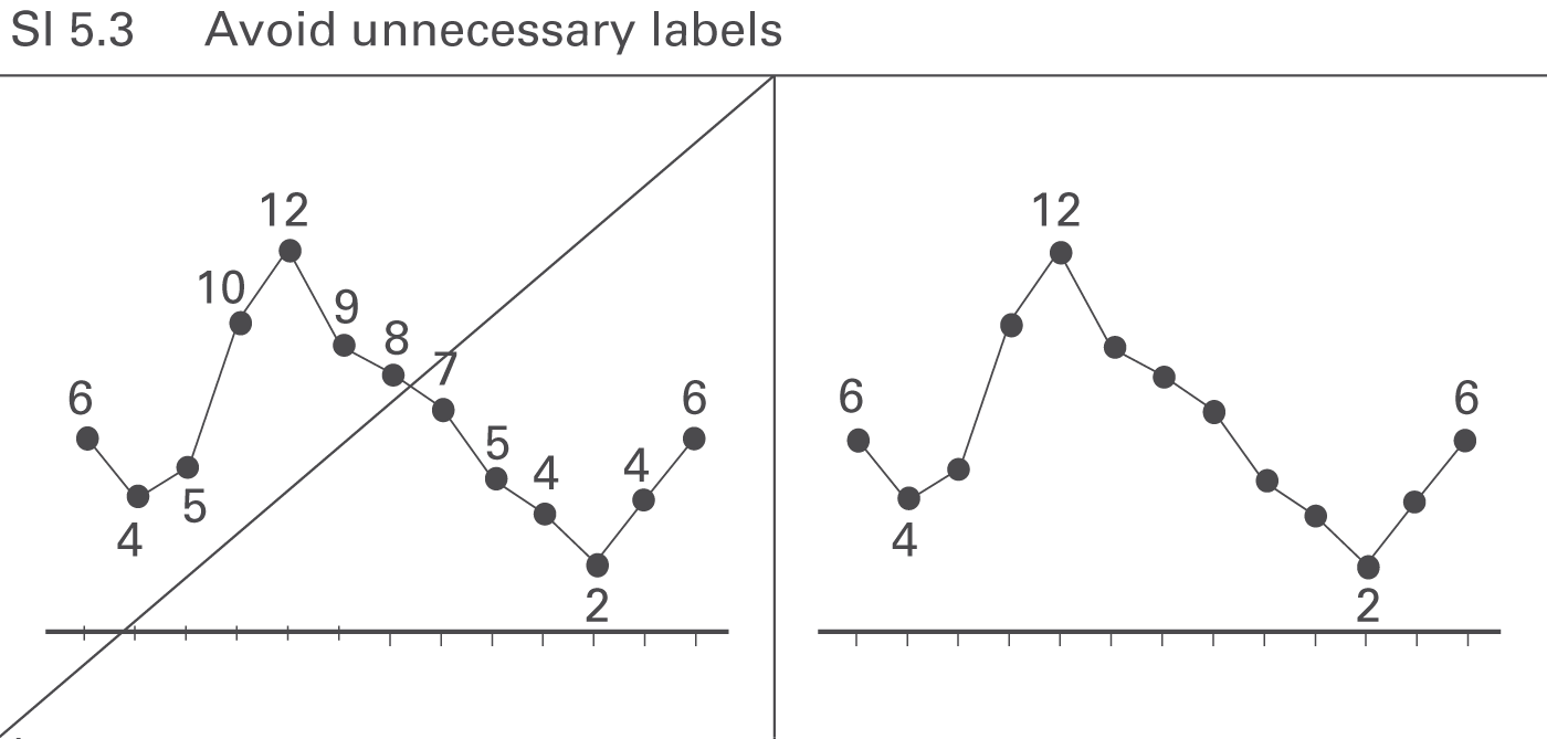
SI 5.3 Avoid unnecessary labels
Omit labels for data points that do not represent extreme values or values of special importance, see Figure SI 5.3.
← Choose proper visualization | Increase information density →
