8.4 KiB
CHECK – Ensure visual integrity
CHECK covers all aspects of ensuring visual integrity in reports and presentations.
Ensuring visual integrity means that reports and presentations present information in the most truthful and the most easily understood way by avoiding misleading visuals.
This chapter covers avoiding manipulated axes and visualization elements, using the same scales, and showing data adjustments.
- Avoid manipulated axes
- Avoid manipulated visualization elements
- Avoid misleading representations
- Use the same scales
- Show data adjustments
CH 1 Avoid manipulated axes
Charts serve as a means to visually compare numerical values. Manipulated axes defeat this purpose of explaining actual interrelations.
CH 1.1 Avoid truncated axes
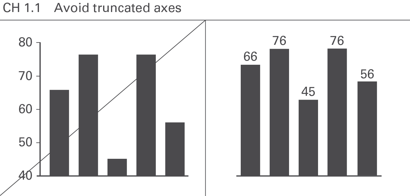
Charts with value axes not starting at zero (“cut” axes) are not “wrong” in and of themselves, but the message to be visually conveyed then does not correspond to the numerical values upon which the chart is based. Therefore, value axes should generally start at zero, see Figure CH 1.1.
One exception to this rule exists: charts with indexed data (e.g. if the value for the index period is set to 100%) with only small variances from 100%. Here “zooming in” on the variances could be of greater value than indicating the absolute values (starting at zero). In this case, position the category labels at the 100% line in order to avoid misinterpretations.
CH 1.2 Avoid logarithmic axes
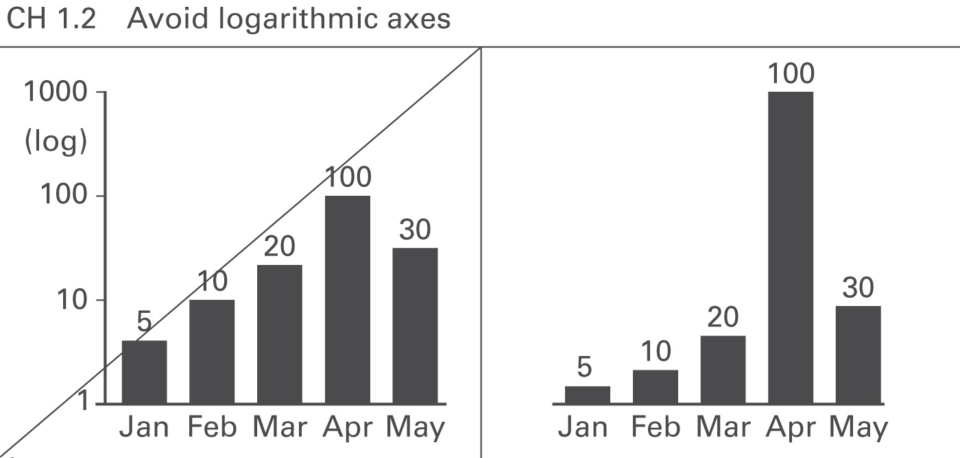
Avoid logarithmic scales because they do not allow the visual comparison of values, see Figure CH 1.2. In business, very few applications for logarithmic axes exist (e.g. comparing growth rates of different stocks in percent).
CH 1.3 Avoid different class sizes
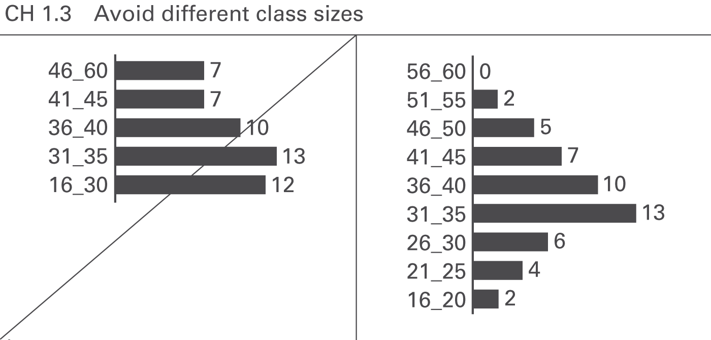
If the categories represent ordered classes of elements (e.g. age classes) as used for the visualization of distributions in histograms, use class sizes of identical width (e.g. ten years). Otherwise, true visual comparability is impossible, see Figure CH 1.3.
CH 2 Avoid manipulated visualization elements
Displaying values differing by orders of magnitude can be challenging. Use creative solutions instead of clipping visualization elements or cutting value axes.
CH 2.1 Avoid clipped visualization elements
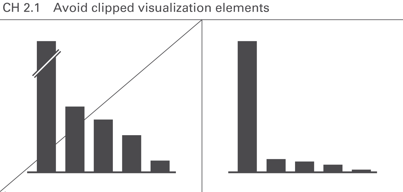
Similar to “cut” axes, clipped visualization elements such as broken columns make visual comparisons impossible, see Figure CH 2.1.
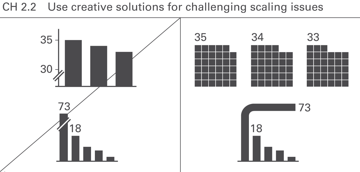
CH 2.2 Use creative solutions for challenging scaling issues
Creative visualization elements can be used to compare extreme values, e.g., displaying data in two-dimensional or even three-dimensional visualization elements allows the comparison of values differing by orders of magnitude, see Figure CH 2.2.
This rule must be clearly separated from the rules of section CH 3 “Avoid misleading representations” where area and volume visualizations are used improperly.
CH 3 Avoid misleading representations
Graphical representations are misleading if the visual impression for the observer differs from the underlying values.
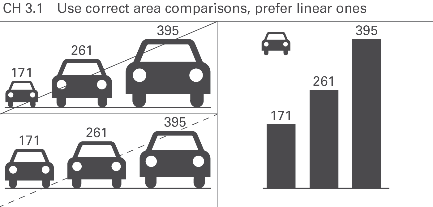
CH 3.1 Use correct area comparisons, prefer linear ones
Using two-dimensional representations (areas of circles, icons, or emblems) for the visualization of data is only valid, if the size of these areas corresponds to the underlying values. The visual perception will be misleading if the diameters of circles or the heights of icons represent the values, see Figure CH 3.1.
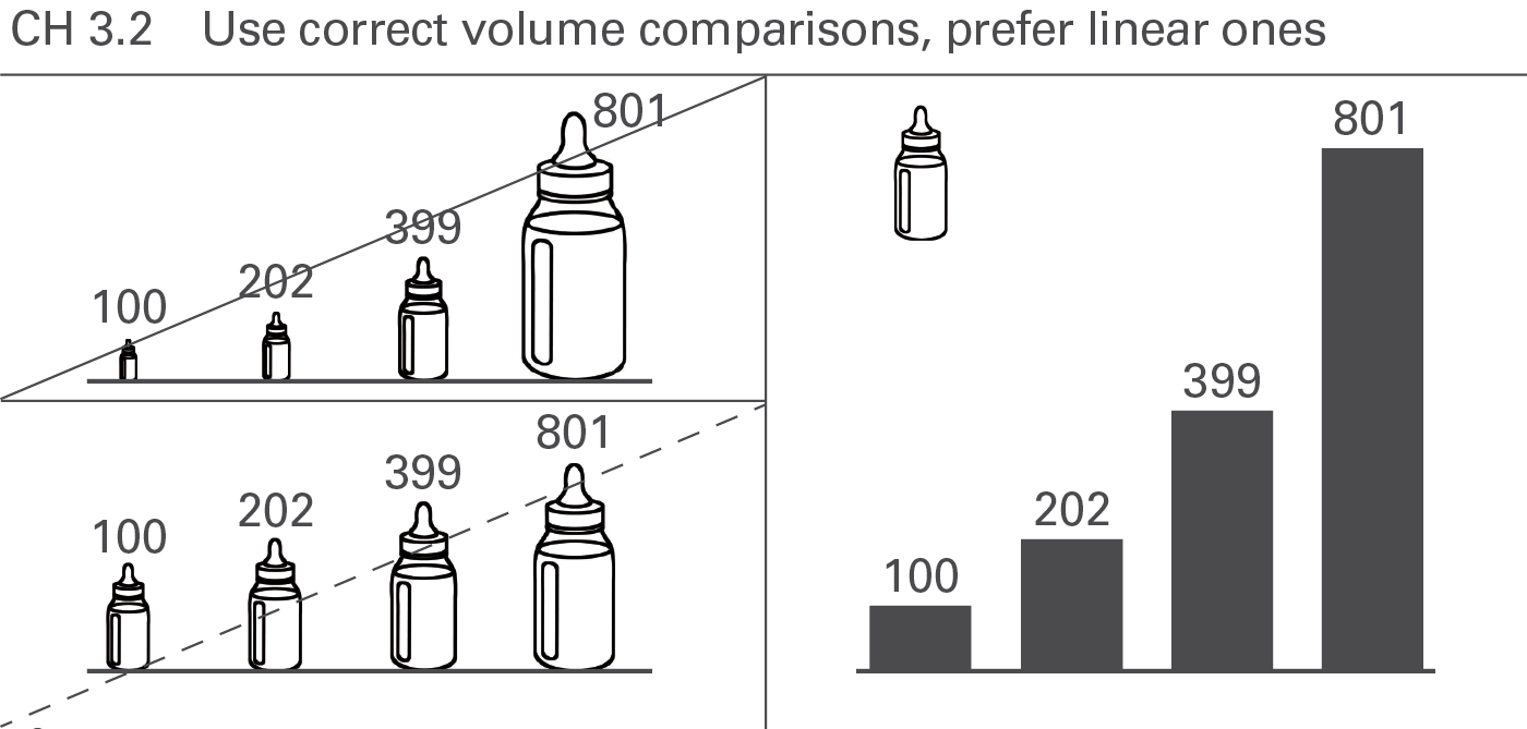
CH 3.2 Use correct volume comparisons, prefer linear ones
Similar to areas, the visual perception will be misleading, if the (one-dimensional) diameters or the (two-dimensional) areas of three-dimensional visualization elements (spheres, cubes, etc.) represent the values, see Figure CH 3.2. Even if their volumes represent the values, it is hard to perceive them properly. Prefer linear comparisons instead.
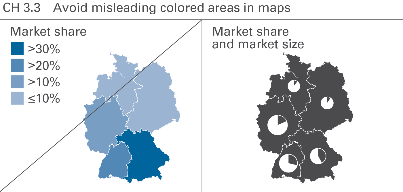
CH 3.3 Avoid misleading colored areas in maps
Different colored areas can be helpful to visualize the precipitation per square meter or the population density. However, do not use colored areas for the visualization of non-area-related figures such as market shares or return on sales. Position columns or bars of identical scale in maps instead. By the way, pie charts also work well here (an exception to the EX 2.1 “Replace pie…” because they can be placed precisely at one point, like a city (see Figure CH 3.3).
CH 4 Use the same scales
Proper visual comparison requires the usage of identical scales for identical measure units, or – if this is not possible – a clear indication of the difference. If possible, use a consistent scaling concept for the complete report or presentation material.
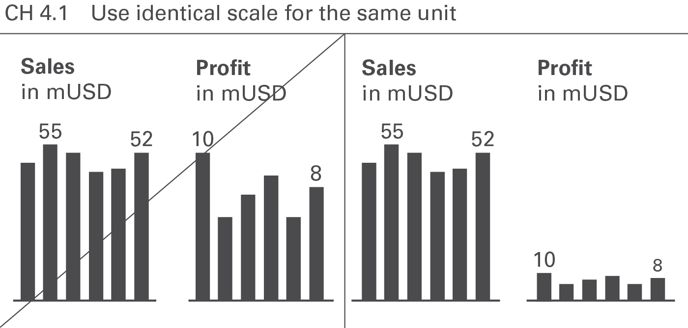
CH 4.1 Use identical scale for the same unit
If presenting more than one chart of the same unit on one page, use the identical scale for these charts, see Figure CH 4.1. In extreme situations identical scales might not be desirable. In these exceptional cases the use of scaling indicators (see CH 4.3 and UN 5.2) can be helpful.
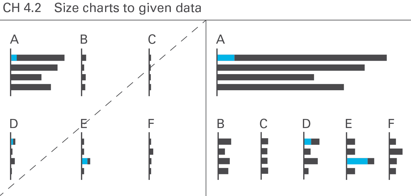
CH 4.2 Size charts to given data
Using identical scales in multiple charts can be demanding if the values in the charts differ by orders of magnitude. A good solution is adapting the chart size to the given data, see Figure CH 4.2.
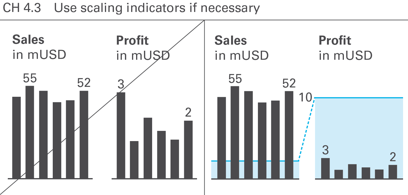
CH 4.3 Use scaling indicators if necessary
There are several ways to overcome challenging scaling problems. Scaling indicators, such as scaling lines and scaling areas indicating the same numerical height (typically a power of 10) in all charts are helpful to assist in comparing multiple charts (of the same unit) with different scales, see Figure CH 4.3.
This guide suggests a semantic design for scaling lines and scaling areas, see UN 5.2 “Unify scaling indicators”.
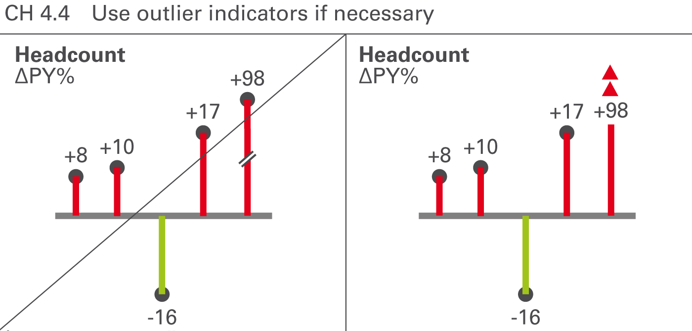
CH 4.4 Use outlier indicators if necessary
Certain values that are very big in comparison to other values are called outliers. If an outlier is not important for business, e.g. a big relative variance of a small value, then it is not appropriate to scale the whole chart to this outlier. Therefore, use outlier indicators for unimportant outliers, see Figure CH 4.4.
This guide suggests a semantic design for outlier indicators, see UN 5.3 “Unify outlier indicators”.
CH 4.5 Use magnifying glasses
Another way to assist in scaling problems is to use “magnifying glasses” for zooming in on a part of a chart with a bigger scale. Use an appropriate visualization element to mark the part of a chart to be zoomed in and to link it to a second chart displaying the zoomed part on a bigger scale.
CH 5 Show data adjustments
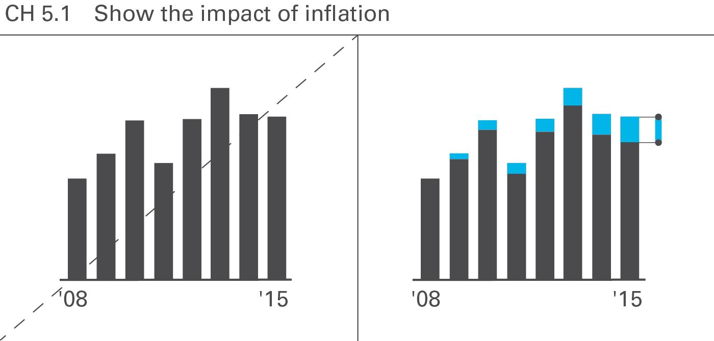
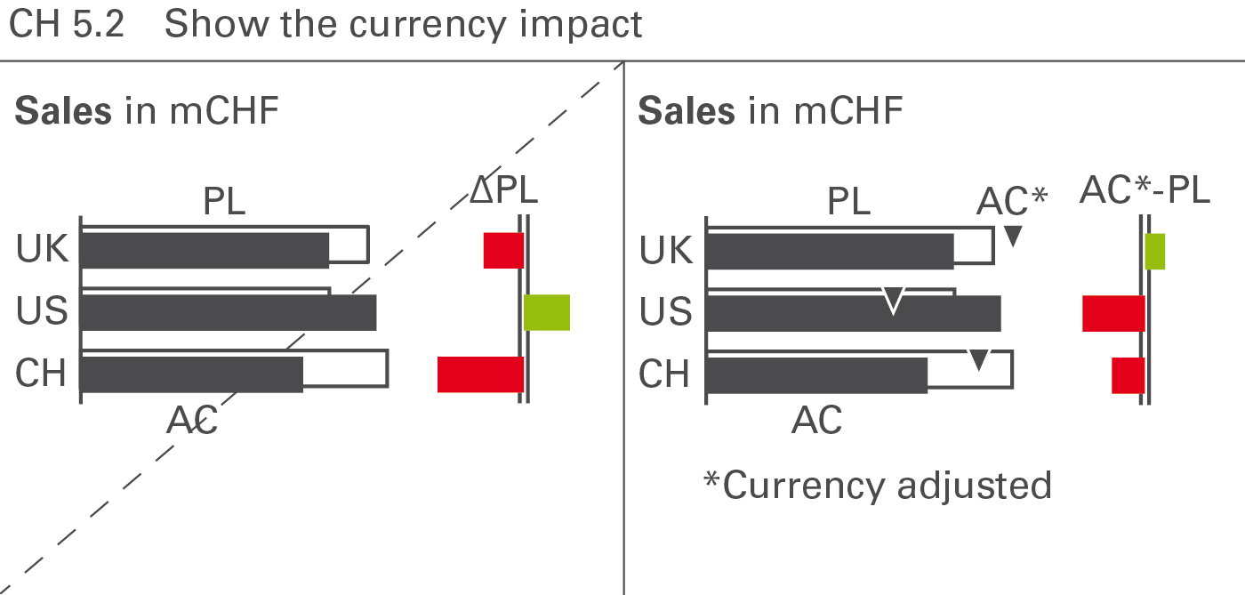
For longer time series, currency and inflationary effects can bias the visual impression, hiding the real development of business.
CH 5.1 Show the impact of inflation
Making inflation effects transparent helps avoid misinterpretations of time series visualizations, see Figure CH 5.1.
CH 5.2 Show the currency impact
Similar to inflation effects, the adjustment of currency effects can help to avoid misinterpretations, see Figure CH 5.2.
